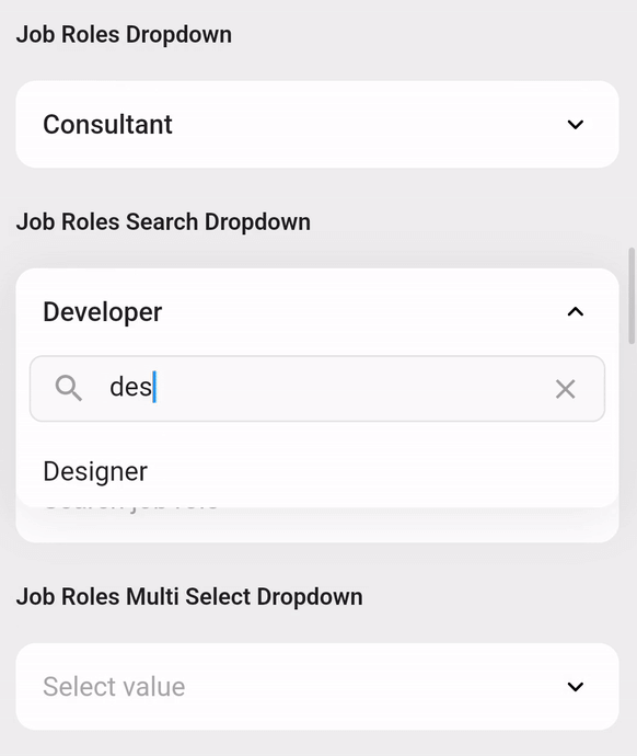
dropdown_flutter는 검색 가능한 목록, 네트워크 기반 검색 및 다중 선택을 지원하는 사용자 정의 가능한 드롭다운 컴포넌트를 제공하는 Flutter 패키지입니다. 필터링과 동적 로딩을 통해 대규모 데이터셋에서 효율적인 데이터 선택을 가능하게 하여 사용자 경험을 향상시킵니다. 이 패키지는 Android, iOS, Web, macOS, Windows, Linux 등 모든 주요 플랫폼과 호환되어 크로스플랫폼 애플리케이션에 이상적입니다. 깔끔한 API와 유연한 디자인으로 Flutter 앱에 고급 드롭다운 기능을 쉽게 통합할 수 있습니다.
사용 사례
대규모 데이터 세트를 포함한 폼 입력
API에서 동적 데이터 선택
대시보드에서 다중 선택 필터
관리 패널 내 검색 가능한 드롭다운
사용자 선호도 선택기
주요 기능
검색 가능한 목록 입력
네트워크 기반 검색 지원
다중 선택 기능
크로스 플랫폼 호환성
사용자 정의 가능한 UI 스타일링
실시간 필터링
적합한 대상
데이터가 많은 양의 폼을 개발하는 개발자
동적 드롭다운이 필요한 앱
크로스 플랫폼 Flutter 프로젝트
사용자 인터페이스 중심의 애플리케이션 디자이너
재사용 가능한 드롭다운 컴포넌트가 필요한 팀
고려 사항
대규모 데이터 세트를 처리할 때는 주의 깊은 상태 관리가 필요합니다
복잡한 테마를 위해 추가 스타일링이 필요할 수 있습니다
네트워크 검색 구현은 외부 API의 구조에 따라 달라집니다
제한된 내장 검증
페이지 없이 매우 큰 목록에서의 성능 영향
원본 README
연결된 소스 저장소의 README 원문 스냅샷입니다. 최신 내용은 저장소에서 확인하세요.
Dropdown Flutter
A customizable Flutter dropdown — search, network search, multi-select and form validation built in.
Install
Requires Flutter 3.27+ and Dart 3.6+. The original
custom_dropdown.dart import remains supported.
That is the whole setup — no builders, controllers or config required.
Constructors
Constructor
Use it for
DropdownFlutter()
A plain list of items
.search()
Filtering a local list as the user types
.searchRequest()
Fetching results from an API
.multiSelect()
Selecting several items with checkboxes
.multiSelectSearch()
Multi-select over a filtered local list
.multiSelectSearchRequest()
Multi-select over API results
Choose the constructor for your data source and selection mode. Search options
apply to search constructors; select-all and list validation apply to multi-select.
The multiSelect* variants report through onListChanged; the rest use
onChanged.
Screenshots
Multi-select
Grouped
Highlighting
Dark theme
Usage
Search — local and network
Plain String items search out of the box. For your own type, mix in
CustomDropdownListFilter and decide what counts as a match.
classMemberwithCustomDropdownListFilter{
constMember(this.name, this.role);
finalString name;
finalString role;
// toString() supplies the row label; filter() decides what matches.@overrideStringtoString() => name;
@overrideboolfilter(String q) => name.toLowerCase().contains(q.toLowerCase()) ||
role.toLowerCase().contains(q.toLowerCase()); // "engineer" finds them all
}
DropdownFlutter<Member>.search(items: members, onChanged: print);
DropdownFlutter<Member>.searchRequest( // same, but from an API
futureRequest: (query) async => api.searchMembers(query),
futureRequestDelay: constDuration(milliseconds: 300),
onChanged: print,
);
Validation and controllers
final controller = SingleSelectController<String?>('Medium');
// MultiSelectController<String>(['Medium']) for multi-selectDropdownFlutter<String>(
items: priorities,
controller: controller, // read and set from anywhere
validator: (value) => value == null ? 'Required' : null,
validateOnChange: true, // listValidator for multi-select
onChanged: print,
);
controller.value = 'High';
controller.clear();
Custom rows
toString() gives the default label. For anything richer, supply a
listItemBuilder — headerBuilder, hintBuilder and noResultFoundBuilder
work the same way.
The features below are opt-in. Default surfaces and text follow the app theme;
fields support Tab focus and Enter/Space activation. Escape dismisses a menu and
returns focus to the field. Multi-select menus include a selection count and
Done button by default; choices are applied immediately, and Done closes the menu.
Use doneText to localize its label or showMultiSelectFooter: false to hide it.
Property
Effect
groupBy
Splits the list into labelled sections
highlightMatchedText
Emphasises the matched substring in results
recentSelectionsMaxCount
Pins recently picked items to the top
showSelectAll
Adds a select-all / clear-all row (multi-select)
selectAllText / clearAllText
Relabel that row
enableKeyboardNavigation
Arrow keys move, Enter selects, Escape closes
enableHapticFeedback
Light impact on open, click on select
animationDuration / animationCurve
Tunes the open/close animation
DropdownFlutter<Member>(
  items: members,
  groupBy: (member) => member.team,             // any combination works
  recentSelectionsMaxCount: 3,
  enableKeyboardNavigation: true,
  onChanged: print,
)
Styling
decoration covers colors, borders, shadows and text styles; the builders
replace widgets outright. Colors fall back to the ambient ColorScheme, so
dropdowns follow a dark theme with no extra configuration.
Size is controlled by overlayHeight, listItemPadding and listItemHeight
— the last defaults to null so rows fit their content; setting it lets the list
scroll more efficiently. Menus also respect available viewport space and keyboard
insets, including short lists with tall custom rows.
State and lifecycle
Create controllers once in State, and dispose them in your dispose() method.
The dropdown only disposes controllers it creates itself. Controllers may be
replaced or removed during rebuilds.
initialItem / initialItems seed an uncontrolled dropdown. Changing these
properties resets its selection; with a controller, set controller.value.
Do not supply both a controller and initial selection.
Multi-select values are immutable, duplicate-free snapshots. Use add, remove,
clear, or assign a new list to value; do not mutate controller.value.
Local initial selections must all belong to items. Custom objects should
implement consistent == and hashCode. Replace item lists when data changes.
If a selected item is removed, clear/update the controller explicitly.
FormState.reset() restores the initial selection (or the value present when
a controller was attached) and clears errors. Disabled fields do not validate.
Select-all acts on the current filtered/fetched results, preserving selections
outside those results. Clear-all removes only the current results.
Network search runs for nonempty queries. Clearing cancels pending debounce
timers and restores the supplied seed items. Old requests may finish, but
cannot overwrite newer results or update a disposed dropdown. Before typing,
an empty remote menu shows searchHintText instead of a no-results message.
Failed requests show a Retry action that repeats the current query. Customize
or localize this state with searchRequestErrorBuilder(context, error, retry);
raw exception details are not displayed by the default UI.
closeDropDownOnClearFilterSearch closes the menu when its clear button is used.
Reduced-motion settings skip the menu animation.
Builder callbacks have public types such as DropdownListItemBuilder<T> and
DropdownHeaderBuilder<T> for reusable builders.
Development
flutter pub get
flutter analyze
flutter testcd example
flutter test
Run the package regression/UX suites and example gallery together on an Android
emulator (from example/):
flutter emulators --launch <emulator-id>
flutter test integration_test/dropdown_flutter_test.dart -d <device-id>
Use flutter emulators and flutter devices to find the IDs.
CI checks the minimum supported Flutter version and stable Flutter.
All properties
Group
Properties
Items
items, initialItem / initialItems, excludeSelected, and the onChanged / onListChanged callbacks
Text
hintText, searchHintText, noResultFoundText, maxlines (line limit on the closed header)