패키지, 저장소 및 앱 카테고리 검색

dynamic_tabbar 표지
패키지 상세v1.0.9

dynamic_tabbar

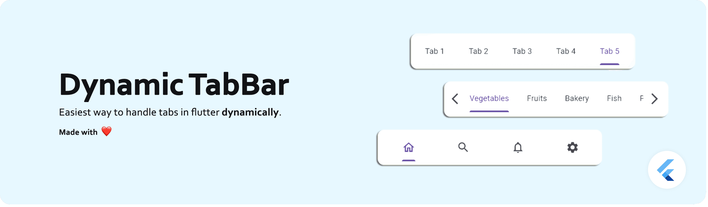
가장 간단한 방식으로 동적 탭(TabBar 및 TabBarView)을 처리하기 위한 Flutter 패키지입니다.

AndroidiOSWeb
30일 다운로드
3.6천
좋아요
125
Pub 점수
150

패키지 설치

flutter pub add dynamic_tabbar

패키지 개요

공개 정보를 바탕으로 생성한 선택 가이드입니다.

TabBar와 TabBarView를 사용하여 동적 탭을 생성하고 관리하는 것을 단순화하는 플러터 패키지입니다. 개발자는 복잡한 상태 관리 없이 런타임에 탭을 쉽게 추가, 삭제 또는 업데이트할 수 있습니다. 이 패키지는 탭 탐색, 뷰 전환 및 상태 보존을 원활하게 처리하여 유연한 탭 레이아웃이 필요한 앱에 이상적입니다. 간단함을 중심으로 설계되어 봐일러플레이트 코드를 줄이고 개발 생산성을 향상시킵니다. Android, iOS 및 웹 플랫폼과 호환됩니다.

사용 사례

  • 동적 대시보드 인터페이스 구축
  • 사용자 정의 가능한 탭 기반 탐색 만들기
  • 사용자 중심의 탭 추가/제거 구현
  • 다중 섹션 콘텐츠 뷰 개발
  • 실시간 탭 업데이트 지원

주요 기능

  • 런타임 탭 조작
  • 자동 상태 보존
  • 최소한의 보일러플레이트 코드
  • 크로스 플랫폼 지원 (Android, iOS, Web)
  • 탭 추가/제거를 위한 간단한 API

적합한 대상

  • 간편한 탭 관리를 원하는 개발자
  • 변동하는 탭 수를 가진 앱
  • 반응형 탭을 필요로 하는 동적 UI
  • Flutter 탭 패턴을 배우는 초보자
  • 경량 탭 솔루션이 필요한 프로젝트

고려 사항

  • 기본 탭 스타일링을 초과한 맞춤 설정은 제한적
  • 스와이프 제스처에 내장된 지원 없음
  • 탭별 로직을 수동으로 처리해야 합니다
  • 매우 복잡한 탭 계층 구조에는 적합하지 않습니다
  • 고급 사용 사례를 위해 외부 상태 관리에 의존합니다

원본 README

연결된 소스 저장소의 README 원문 스냅샷입니다. 최신 내용은 저장소에서 확인하세요.

dynamic_tabbar

Dynamic TabBar

A Flutter package that simplifies the implementation of dynamic TabBar in your application.

With DynamicTabBarWidget, users can effortlessly manage and navigate through a list of Tabs. The widget is designed to auto-update as Tabs are added or removed, providing a seamless and dynamic user experience.

🚀 Demo: Dynamic Tabbar

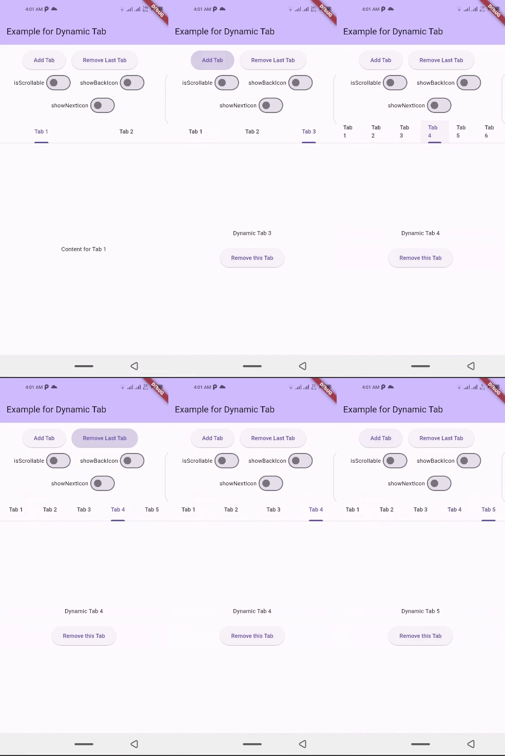
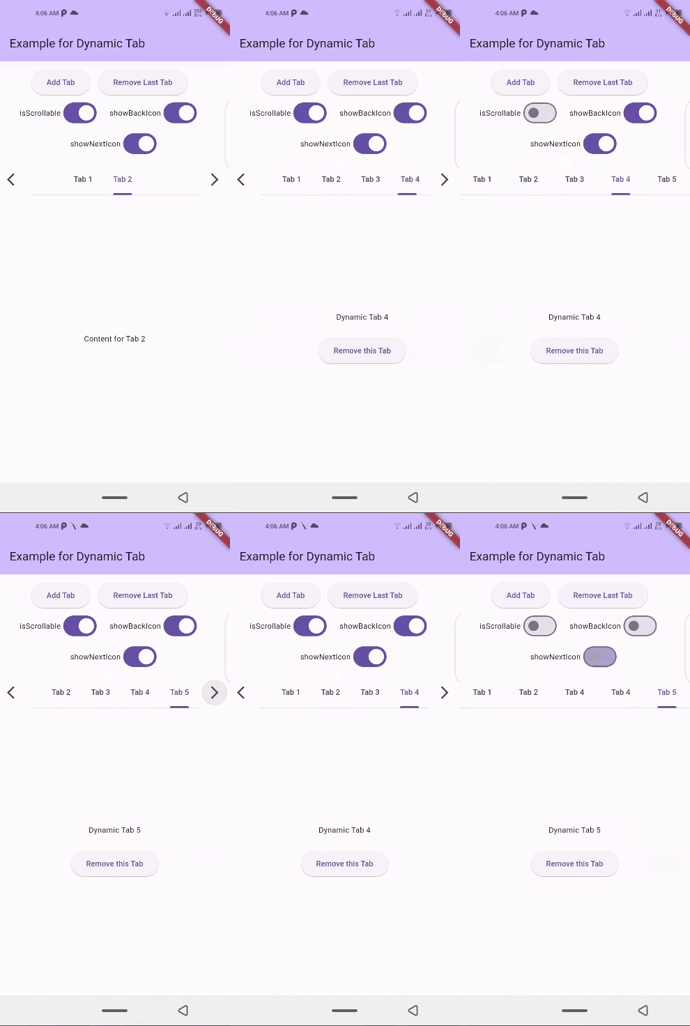
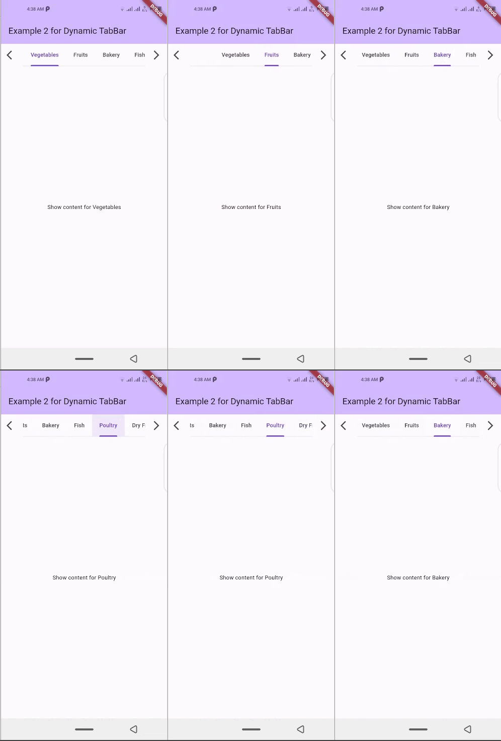
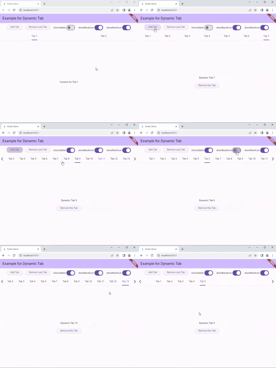
📱 Screenshots

dynamic_tabbar Demo 1 dynamic_tabbar Demo 2 dynamic_tabbar Demo 4 dynamic_tabbar Web Demo

🛠 Installation

  1. Add dependency to pubspec.yaml file:
    Get the latest version from the 'Installing' tab on pub.dev
dependencies:
  dynamic_tabbar: ^latest_version
  1. Import the package
import 'package:dynamic_tabbar/dynamic_tabbar.dart';
  1. Adding DynamicTabBarWidget

With required parameters

 DynamicTabBarWidget(
    dynamicTabs: tabs,
);

With optional parameters

 DynamicTabBarWidget(
    dynamicTabs: tabs,
    isScrollable: isScrollable,
    onTabControllerUpdated: (controller) {},
    onTabChanged: (index) {},
    onAddTabMoveTo: MoveToTab.last,
    onAddTabMoveToIndex : null,
    backIcon: Icon(Icons.arrow_back),
    nextIcon: Icon(Icons.arrow_forward),
    showBackIcon: showBackIcon,
    showNextIcon: showNextIcon,
    leading : leadingWidget,
    trailing : trailingWidget,

    // Default Tab properties can also be updated
    padding: padding,
    indicatorColor: indicatorColor,
    automaticIndicatorColorAdjustment: automaticIndicatorColorAdjustment,
    indicatorWeight: indicatorWeight,
    indicatorPadding: indicatorPadding,
    indicator: indicator,
    indicatorSize: indicatorSize,
    dividerColor: dividerColor,
    dividerHeight: dividerHeight,
    labelColor: labelColor,
    labelStyle: labelStyle,
    labelPadding: labelPadding,
    unselectedLabelColor: unselectedLabelColor,
    unselectedLabelStyle: unselectedLabelStyle,
    dragStartBehavior: dragStartBehavior,
    overlayColor: overlayColor,
    mouseCursor: mouseCursor,
    enableFeedback: enableFeedback,
    onTap: onTap,
    physics: physics,
    splashFactory: splashFactory,
    splashBorderRadius: splashBorderRadius,
    tabAlignment: tabAlignment,

    // Default TabBarView properties can also be updated
    physicsTabBarView: physicsTabBarView,
    dragStartBehaviorTabBarView: physicsTabBarView,
    viewportFractionTabBarView: viewportFractionTabBarView,
    clipBehaviorTabBarView: clipBehaviorTabBarView,
);

🌟 Features

  • Dynamic Tab Management: Users can push or pop items in the List<TabData> tabs array, and the DynamicTabBarWidget will auto-update accordingly.

  • Tab Navigation: Implement the onTabChanged callback to handle tab change events.

  • Customization Options: Customize the appearance and behavior of the DynamicTabBarWidget using parameters like backIcon, nextIcon, showBackIcon, and showNextIcon.

  • Tab Position : Specify the position to which cursor moves to after adding new Tab using the onAddTabMoveTo property.

🧰 Parameters
  • dynamicTabs: List of TabData objects representing the dynamic tabs.

  • isScrollable: Set to true to enable scrollable tabs.

  • onTabChanged: Callback function triggered when a tab is changed.

  • onAddTabMoveTo: Enum value (MoveToTab.idol, MoveToTab.last) specifying where a tab navigator should move when Tab is added.

  • backIcon: Custom icon for the "Back" button, If isScrollable is false, this property is ignored.

  • nextIcon: Custom icon for the "Next" button.

  • showBackIcon: Boolean to show or hide the Back icon button, If isScrollable is false, this property is ignored.

  • showNextIcon: Boolean to show or hide the Next icon button, If isScrollable is false, this property is ignored.

  • leading: Custom leading Widget if needed.

  • trailing: Custom trailing Widget if needed.

  • TabBar default properties...

  • and TabBarView default properties...

📚 How to use

isScrollable
isScrollable: false isScrollable: true
isScrollable.false isScrollable.true
showBackIcon

If isScrollable is false, this property is ignored.

showBackIcon: false showBackIcon: true
isScrollable.true isScrollable.true
showNextIcon

If isScrollable is false, this property is ignored.

showNextIcon: false showNextIcon: true
isScrollable.true isScrollable.true
backIcon

We can use custom Icon for back button, If isScrollable is false, this property is ignored.

backIcon: Icon() backIcon: null
Icon(Icons.keyboard_double_arrow_left) Default back icon will be used
isScrollable.true isScrollable.true
nextIcon

We can use custom Icon for next button, If isScrollable is false, this property is ignored.

nextIcon: Icon() nextIcon: null
Icon(Icons.keyboard_double_arrow_right) Default back icon will be used
nextIcon_custom default_icons

💻 Example

Check out the example app in the example directory for a complete example with additional parameters.

import 'package:flutter/material.dart';
import 'package:dynamic_tabbar/dynamic_tabbar.dart';


class DynamicTabExample extends StatefulWidget {
  const DynamicTabExample({super.key});
  @override
  State<DynamicTabExample> createState() => _DynamicTabExampleState();
}

class _DynamicTabExampleState extends State<DynamicTabExample> {
  bool isScrollable = false;
  bool showNextIcon = true;
  bool showBackIcon = true;

  List<TabData> tabs = [
    TabData(
      index: 1,
      title: const Tab(
        child: Text('Tab 1'),
      ),
      content: const Center(child: Text('Content for Tab 1')),
    ),
    TabData(
      index: 2,
      title: const Tab(
        child: Text('Tab 2'),
      ),
      content: const Center(child: Text('Content for Tab 2')),
    ),
    // Add more tabs as needed
  ];


  @override
  Widget build(BuildContext context) {
    return Scaffold(
      appBar: AppBar(
        title: Text('Example for Dynamic Tab'),
      ),
      body: Column(
        mainAxisSize: MainAxisSize.min,
        children: <Widget>[
          Padding(
            padding: const EdgeInsets.all(8.0),
            child: Wrap(
              direction: Axis.horizontal,
              alignment: WrapAlignment.center,
              children: [
                ElevatedButton(
                  onPressed: addTab,
                  child: const Text('Add Tab'),
                ),
                const SizedBox(width: 12),
                ElevatedButton(
                  onPressed: () => removeTab(tabs.length - 1),
                  child: const Text('Remove Last Tab'),
                ),
                const SizedBox(width: 16),
                Row(
                  mainAxisSize: MainAxisSize.min,
                  children: [
                    const Text('isScrollable'),
                    Switch.adaptive(
                      value: isScrollable,
                      onChanged: (bool val) {
                        setState(() {
                          isScrollable = !isScrollable;
                        });
                      },
                    ),
                  ],
                ),
                const SizedBox(width: 16),
                Row(
                  mainAxisSize: MainAxisSize.min,
                  children: [
                    const Text('showBackIcon'),
                    Switch.adaptive(
                      value: showBackIcon,
                      onChanged: (bool val) {
                        setState(() {
                          showBackIcon = !showBackIcon;
                        });
                      },
                    ),
                  ],
                ),
                const SizedBox(width: 16),
                Row(
                  mainAxisSize: MainAxisSize.min,
                  children: [
                    const Text('showNextIcon'),
                    Switch.adaptive(
                      value: showNextIcon,
                      onChanged: (bool val) {
                        setState(() {
                          showNextIcon = !showNextIcon;
                        });
                      },
                    ),
                  ],
                ),
              ],
            ),
          ),
          Expanded(
            child: DynamicTabBarWidget(
              dynamicTabs: tabs,
              isScrollable: isScrollable,
              onTabControllerUpdated: (controller) {},
              onTabChanged: (index) {},
              onAddTabMoveTo: MoveToTab.last,
              showBackIcon: showBackIcon,
              showNextIcon: showNextIcon,
            ),
          ),
        ],
      ),
    );
  }

  void addTab() {
    setState(() {
      var tabNumber = tabs.length + 1;
      tabs.add(
        TabData(
          index: tabNumber,
          title: Tab(
            child: Text('Tab $tabNumber'),
          ),
          content: Column(
            mainAxisAlignment: MainAxisAlignment.center,
            children: [
              Text('Dynamic Tab $tabNumber'),
              const SizedBox(height: 20),
              ElevatedButton(
                onPressed: () => removeTab(tabNumber - 1),
                child: const Text('Remove this Tab'),
              ),
            ],
          ),
        ),
      );
    });
  }

  void removeTab(int id) {
    setState(() {
      tabs.removeAt(id);
    });
  }
}

📝Contribution

Of course the project is open source, and you can contribute to it repository link

  • If you found a bug, open an issue.

  • If you have a feature request, open an issue.

  • If you want to contribute, submit a pull request.

💳 License

This project is LICENSED under the MIT License. Use it freely, but let's play nice and give credit where it's due!

🎉 Conclusion

I will be happy to answer any questions that you may have on this approach,
If you liked this package, don't forget to show some ❤️ by smashing the ⭐.

카테고리

소스 저장소

이 패키지를 사용하는 프로젝트

아직 데이터가 없습니다.