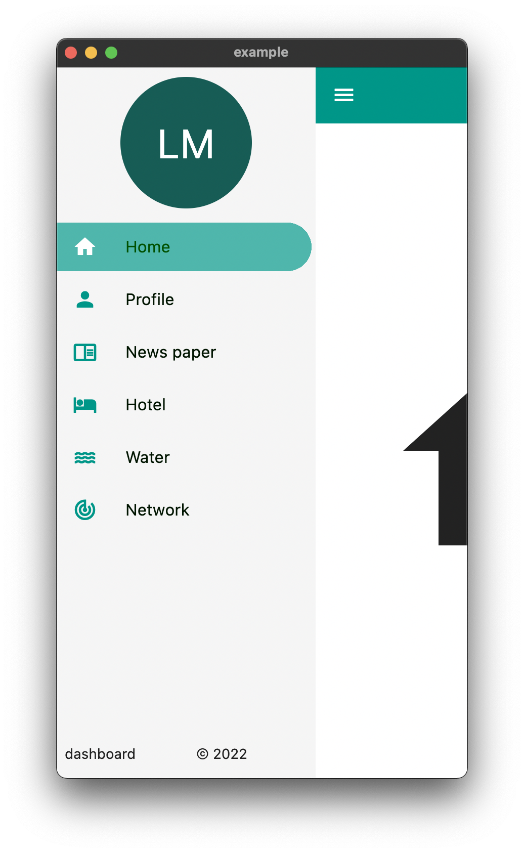
Easy Dashboard는 반응형 대시보드 레이아웃과 탐색 인터페이스를 쉽게 만들 수 있도록 설계된 Flutter 패키지입니다. 모바일에서 웹 및 데스크톱에 이르기까지 다양한 기기에서 원활하게 작동하는 적응형 UI 구축 과정을 간소화합니다. 내장된 반응형 디자인 패턴 지원을 통해 일관된 레이아웃과 탐색 흐름으로 대시보드를 신속하게 구성할 수 있습니다. 복잡한 대시보드 시스템을 구현할 때 발생하는 반복 코드를 줄이고 개발 생산성을 향상시키는 데 중점을 두고 있습니다.
사용 사례
관리 패널 구축
반응형 데이터 대시보드 만들기
다중 화면 탐색 설계
크로스플랫폼 모니터링 앱 개발
레이아웃 기반 대시보드 구현
주요 기능
반응형 레이아웃 지원
내장된 탐색 유틸리티
크로스 플랫폼 호환성
필요한 최소 설정
Flexible widget 조합
적합한 대상
Flutter 개발자가 관리 인터페이스를 구축하고 있습니다
빠른 대시보드 프로토타이핑이 필요한 팀
다양한 기기에서 반응형 UI가 필요한 프로젝트
UI 일관성에 중점을 둔 개발자
복잡한 탐색 구조를 가진 앱
고려 사항
매우 독특한 레이아웃에 맞게 맞춤 설정이 필요할 수 있습니다
기본 예제 외에 문서가 제한적
표준 대시보드 패턴에 가장 적합
다시보드가 아닌 UI에는 적합하지 않음
Flutter 렌더링 성능에 의존합니다
원본 README
연결된 소스 저장소의 README 원문 스냅샷입니다. 최신 내용은 저장소에서 확인하세요.
Easy Dashboard
Provides an easy way to build dashboard layout for your app , but still yet very customizable .
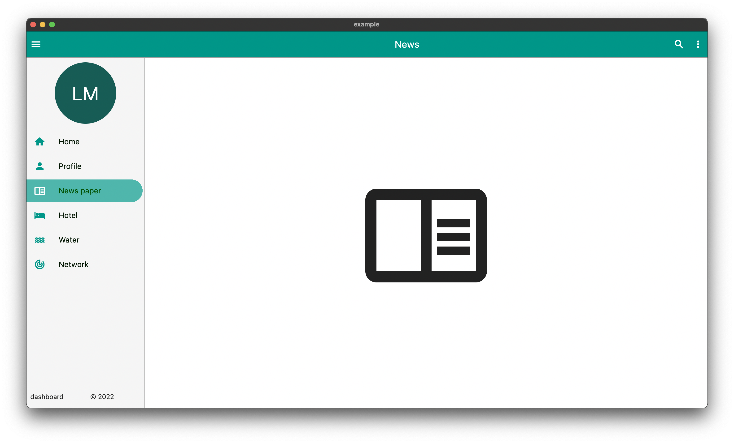
DeskTop
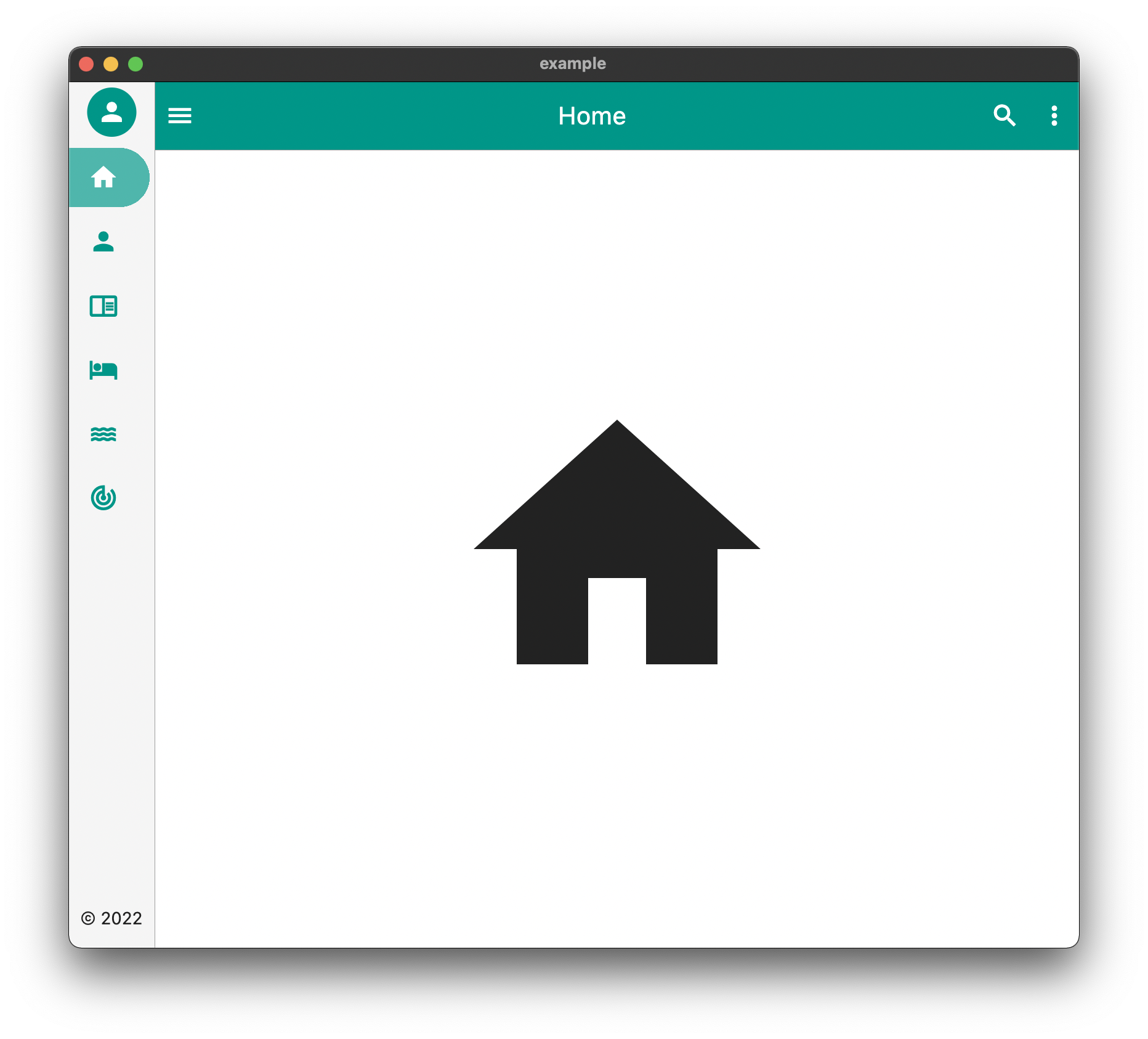
Tablet
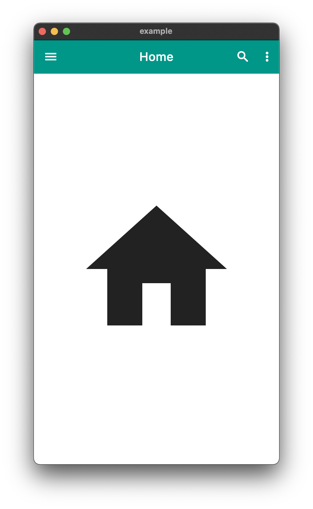
Mobile
The above is an example of an app created with the package
The above example can be found in the /example folder
API
component
usage
body
The default body for the dashboard
duration
The Duration of the animation when the [EasyDashboard] is opened or closed among others.
mobileBreakpoint
The pixels at which the ui breaks into the mobile view
tabletBreakpoint
The pixels at which the ui breaks into the tablet view
mobileView
Display properties while in tablet view such as dashboard style
tabletView
Display properties while in tablet view such as dashboard style
desktopView
Display properties while in desktop view such as dashboard style
tabletMode
What to show when the mobile break point is reached,
mobileMode
What to show when the tablet break point is reached
desktopMode
What to show when the desktop break point is reached
floatingActionButtonLocation
Floating Action Button Location
floatingActionButton
Floating Action Button
systemOverlayStyle
System Overlay Style
floatingActionButtonAnimator
Floating Action Button Animator
appBarHeight
The height of the app bar
centerTitle
Whether or not the appbar title is centered
backgroundColor
General background color of the [EasyDashboard]
navigationIcon
The icon that will control the responsive navigation of the [EasyDashboard]
navigationIconSplashRadius
The splash radius of the navigation icon when pressed
appBarColor
The color of the app bar
sideBarColor
The color of the sidebar navigation
appBarActions
A list of Widgets for the [AppBar]actions
drawer
An drawer widget that will be displayed on the left side of the [EasyDashboard]. You can use the pre-built [EasyDrawer] to create a faster easier drawer .
Issues and Feedback
This is a fairly new package
Please feel free to report any issues you face
Also PR's and additional feedback is appreciated