연결된 소스 저장소의 README 원문 스냅샷입니다. 최신 내용은 저장소에서 확인하세요.
EasyImageViewer
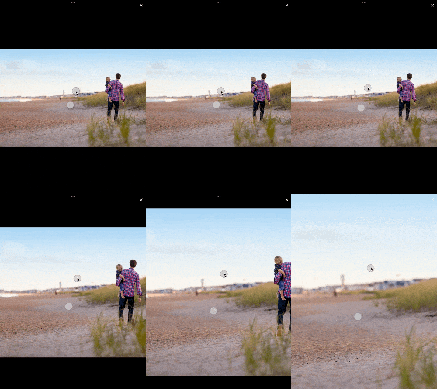
An easy way to display images in a full-screen dialog, including pinch & zoom.



Features
- Show a single image or a swipeable list of images
- Use pinch & zoom to zoom in and out of images
- Optionally allow "double tap to zoom" by passing in
doubleTapZoomable: true
- Optionally allow "swipe down to dismiss" by passing in
swipeDismissible: true
- No dependencies besides Flutter
- Callbacks for
onPageChanged and onViewerDismissed
- Fully customizable loading/progress indicator
Requirements
EasyImageViewer requires Flutter 3.7.0 and Dart 2.19.0 or higher.
Usage
Show a single image:
final imageProvider = Image.network("https://picsum.photos/id/1001/5616/3744").image;
showImageViewer(context, imageProvider, onViewerDismissed: () {
  print("dismissed");
});
Show a bunch of images:
MultiImageProvider multiImageProvider = MultiImageProvider([
  const NetworkImage("https://picsum.photos/id/1001/4912/3264"),
  const NetworkImage("https://picsum.photos/id/1003/1181/1772"),
  const NetworkImage("https://picsum.photos/id/1004/4912/3264"),
  const NetworkImage("https://picsum.photos/id/1005/4912/3264")
]);

showImageViewerPager(context, multiImageProvider, onPageChanged: (page) {
  print("page changed to $page");
}, onViewerDismissed: (page) {
  print("dismissed while on page $page");
});
Usually you'll want to implement your own EasyImageProvider. Suppose you have
a list of Products, each of which has an imagePath property with the path
to a local image file. You could create an EasyImageProvider that takes a list
of Products like this:
class ProductsImageProvider extends EasyImageProvider {

  final List<Product> products;
  final int initialIndex;

  ProductsImageProvider({ required this.products, this.initialIndex = 0 });

  @override
  ImageProvider<Object> imageBuilder(BuildContext context, int index) {
    String? localImagePath = products[index].imagePath;
    File? imageFile;

    if (localImagePath != null) {
      imageFile = File(localImagePath);
    }

    ImageProvider imageProvider = imageFile != null ? FileImage(imageFile) : AssetImage("assets/images/product_placeholder.jpg") as ImageProvider;

    return imageProvider;
  }

  @override
  int get imageCount => products.length;
}
You could then use it like this:
ProductsImageProvider productsImageProvider = ProductsImageProvider(products: products);

showImageViewerPager(context, productsImageProvider, onPageChanged: (page) {
  print("page changed to $page");
}, onViewerDismissed: (page) {
  print("dismissed while on page $page");
});
Customizing Progress Indicator and Image Widget
You can subclass EasyImageProvider and override progressIndicatorWidgetBuilder. That way you can
provide your own progress indicator when an image is loading. Here's an example for using a
linear progress indicator with a label:
class CustomImageWidgetProvider extends EasyImageProvider {
@override
final int initialIndex;
final List<String> imageUrls;
CustomImageWidgetProvider({required this.imageUrls, this.initialIndex = 0})
: super();
@override
ImageProvider<Object> imageBuilder(BuildContext context, int index) {
return NetworkImage(imageUrls[index]);
}
@override
Widget progressIndicatorWidgetBuilder(BuildContext context, int index, {double? value}) {
return Column(
mainAxisAlignment: MainAxisAlignment.center,
children: [
LinearProgressIndicator(
value: value,
),
Text(
"${(value ?? 0) * 100}%",
style: const TextStyle(
color: Colors.white,
fontWeight: FontWeight.bold,
fontSize: 20,
),
)
],
);
}
@override
int get imageCount => imageUrls.length;
}
You can also adjust animationDuration and animationCurve for the transition that is used
to fade in the loaded image.
Finally, you can even override the imageWidgetBuilder method and completely customize the
appearance of each individual image. Keep in mind that it should be an "image-like" widget
since it will be treated as such: the user can pinch&zoom the returned widget etc.
Customizing Error Widget
You can subclass EasyImageProvider and override errorWidgetBuilder. That way you can
provide your own error widget when an image fails to load. Here's an example that simply displays a centered red error message:
class CustomImageProvider extends EasyImageProvider {
  @override
  final int initialIndex;
  final List<String> imageUrls;

  CustomImageProvider({required this.imageUrls, this.initialIndex = 0})
      : super();

  @override
  ImageProvider<Object> imageBuilder(BuildContext context, int index) {
    return NetworkImage(imageUrls[index]);
  }

  @override
  Widget errorWidgetBuilder(BuildContext context, int index, Object error, StackTrace? stackTrace) {
    return const Center(
      child: Text(
        "Error loading image",
        style: TextStyle(fontSize: 50, color: Colors.red),
      ),
    );
  }

  @override
  int get imageCount => imageUrls.length;
}
The default error widget shows a red Icons.broken_image and '🖼️💥🚫' (image, boom, no entry) as a message underneath.

Using Infinite Scroll for Multiple Images
You can use infinitelyScrollable: true to create a "looping" effect with the images. This means that when you reach the end of the image list, you will be taken back to the beginning. This can be useful if you have a small number of images and want to allow the user to scroll through them continuously.
MultiImageProvider multiImageProvider = MultiImageProvider([
  const NetworkImage("https://picsum.photos/id/1001/4912/3264"),
  const NetworkImage("https://picsum.photos/id/1003/1181/1772"),
  const NetworkImage("https://picsum.photos/id/1004/4912/3264"),
  const NetworkImage("https://picsum.photos/id/1005/4912/3264")
]);

showImageViewerPager(context, multiImageProvider, onPageChanged: (page) {
  print("page changed to $page");
}, onViewerDismissed: (page) {
  print("dismissed while on page $page");
}, infinitelyScrollable: true);
How to release a new version on pub.dev
- Update the version number in
pubspec.yaml.
- Add an entry for the new version in
CHANGELOG.md.
- Make sure
flutter test and flutter analyze pass without any issues.
- Run
dart pub publish --dry-run to ensure all publishing checks pass.
- If you haven't installed the pana package analysis tool yet, install it with
dart pub global activate pana.
- Make sure all changes are committed and run
pana . inside the project directory. We are aiming for the highest score.
- Address any issues reported by pana.
- Create a new branch for your changes, for example by running
git checkout -b release-1.1.0.
- Commit your changes (formatting changes separately from other changes).
- Open a PR with your changes.
- Once approved, merge the PR.
- Run
dart pub publish to publish the new version.
- On GitHub, create a new release by visiting Releases. The tag should have the format of
v plus the version number, for example v1.1.0. The title of the release should be the version number without a v. Add what you've added to the changelog as the release's description.
- That's it.
Credits
EasyImageViewer is a project by TSG, a full-service digital agency taking software from concept to launch.
Our powerhouse team of designers and engineers build iOS, Android, and web apps across many industries.