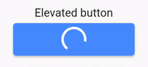
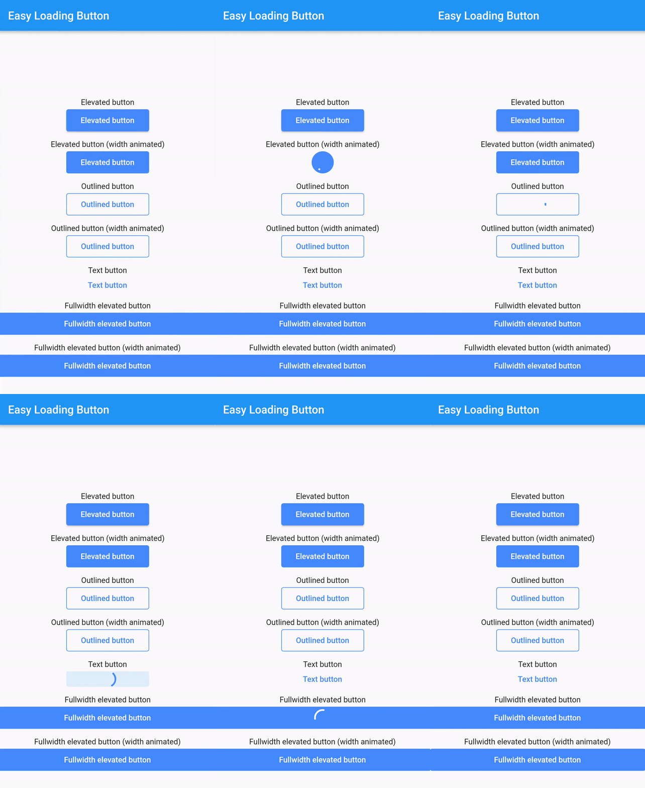
EasyLoadingButton은 에레베이티드, 아웃라인, 텍스트 버튼 등 다양한 스타일을 지원하는 간단하고 사용자 정의 가능한 진행률/로딩 버튼을 제공하는 Flutter 패키지입니다. 비동기 작업 중에 로딩 상태를 원활하게 표시함으로써 사용자 경험을 향상시킵니다. 버튼은 쉽게 통합하고 구성할 수 있으며, 일반 상태와 로딩 상태 사이에 부드러운 전환을 제공합니다. 폼, 액션 및 처리 중 피드백이 필요한 모든 UI 요소에 적합합니다.
사용 사례
양식 제출
비동기 작업 트리거
로그인/가입 버튼
결제 처리
데이터 저장 작업
주요 기능
여러 가지 버튼 스타일
사용자 정의 가능한 로딩 표시기
부드러운 상태 전환
간편한 통합
모든 플러터 플랫폼을 지원합니다
사용자 지정 가능한 색상 및 크기
적합한 대상
초보자 플러터 개발자
간단한 앱 인터페이스
빠른 프로토타이핑
사용자 친화적인 폼
비동기 작업 중 명확한 피드백이 필요한 앱
고려 사항
제한된 고급 사용자 정의 옵션
복잡한 디자인을 위해 추가적인 스타일링이 필요할 수 있습니다
매우 동적 또는 애니메이션 버튼에 적합하지 않음
Material 디자인 원칙에 의존합니다
표준 Material 기반 앱에서 가장 잘 사용됩니다
원본 README
연결된 소스 저장소의 README 원문 스냅샷입니다. 최신 내용은 저장소에서 확인하세요.
easy_loading_button
easy_loading_button is a simple, easy to use, and customizeable progress/loading Material Flutter Button that supports variety of button styles (elevated, outlined, text).
EasyButton(
type: EasyButtonType.elevated,
// Content inside the button when the button state is idle.
idleStateWidget: constText(
'Elevated Button',
style: TextStyle(
color: Colors.white,
),
),
// Content inside of the button when the button state is loading.
loadingStateWidget: constCircularProgressIndicator(
strokeWidth: 3.0,
valueColor: AlwaysStoppedAnimation<Color>(
Colors.white,
),
),
// Whether or not to animate the width of the button. Default is `true`.// If this is set to `false`, you might want to set the `useEqualLoadingStateWidgetDimension` parameter to `true`.
useWidthAnimation: true,
// Whether or not to force the `loadingStateWidget` to have equal dimension. Default is `true`.// This is useful when you are using `CircularProgressIndicator` as the `loadingStateWidget`.// This parameter might also be useful when you set the `useWidthAnimation` parameter to `true` combined with `CircularProgressIndicator` as the value for `loadingStateWidget`.
useEqualLoadingStateWidgetDimension: true,
// If you want a fullwidth size, set this to double.infinity
width: 150.0,
height: 40.0,
borderRadius: 4.0,
// The elevation of the button.// This will only be applied when the type parameter value is EasyButtonType.elevated
elevation: 0.0,
// The gap between button and it's content.// This will be ignored when the `type` parameter value is set to `EasyButtonType.text`
contentGap: 6.0,
// Color for the button.// For [EasyButtonType.elevated]: This will be the background color.// For [EasyButtonType.outlined]: This will be the border color.// For [EasyButtonType.text]: This will be the text color.
buttonColor: Colors.blueAccent,
onPressed: () {},
),