ElTooltip은 Flutter 애플리케이션용 사용자 정의가 가능하고 스마트하게 위치 조정되는 툴팁 위젯입니다. 개발자가 툴팁 내에 개인화된 콘텐츠를 표시할 수 있도록 하며, 가용 공간과 화면 경계를 기반으로 자동으로 위치를 조정합니다. UI를 혼잡하게 만들지 않고 맥락 정보를 통해 사용자 경험을 향상시키는 데 이상적입니다. 이 패키지는 Android, iOS, 웹, macOS, Windows, Linux 등 여러 플랫폼을 지원하여 다양한 장치에서 일관된 동작을 보장합니다. pub add를 통한 간단한 통합으로 최소한의 설정으로 툴팁을 추가하는 우아한 솔루션을 제공합니다.
사용 사례
컨텍스트 도움말 텍스트 추가
호버 또는 탭 시 추가 정보 표시
UI 접근성 향상
상호작용 요소에 대한 피드백 제공
다중 플랫폼 앱에서 툴팁 만들기
주요 기능
스마트 자동 위치 지정
사용자 정의 가능한 툴팁 콘텐츠
크로스 플랫폼 호환성
pub와의 간편한 통합
터치 및 호버 상호작용을 지원합니다
필수 구성 최소화
적합한 대상
경량 툴팁을 찾는 개발자
접근성 UI 향상이 필요한 앱
다중 플랫폼을 대상으로 하는 프로젝트
유연한 툴팁 스타일링을 원하는 디자이너
빠른 구현을 우선시하는 팀
고려 사항
복잡한 레이아웃의 경우 수동 처리가 필요할 수 있습니다
툴팁의 표시 여부는 부모 위젯의 제약 조건에 따라 달라집니다
제한된 내장 애니메이션 옵션
간단하거나 중간 정도로 복잡한 툴팁에 적합
고주기 사용 사례에서의 성능 영향
원본 README
연결된 소스 저장소의 README 원문 스냅샷입니다. 최신 내용은 저장소에서 확인하세요.
ElTooltip - a smart positioned tooltip
Why el_tooltip?
📦 Add widget elements to your tooltip
↔️ Chose the preferred position for the tooltip to appear relative to the button
↩️ The position changes automagically if the desired one doesn't fit the screen
✅ No external dependencies
❤️ Customizable layout
🛡️ Null safety
Getting Started
🍭 Installation
Add to your pubspec.yaml
dependencies:el_tooltip:<last_version>
Import the library and call the Widget ElTooltip() with the required fields child and content
Widget that represent the button to activate the tooltip (no click method required).
color
false
Colors.white
Background color of the bubble and the arrow.
distance
false
10.0
Space between the child button and the tooltip.
padding
false
EdgeInsets.all(14.0)
Tooltip padding around the content widget.
position
false
topCenter
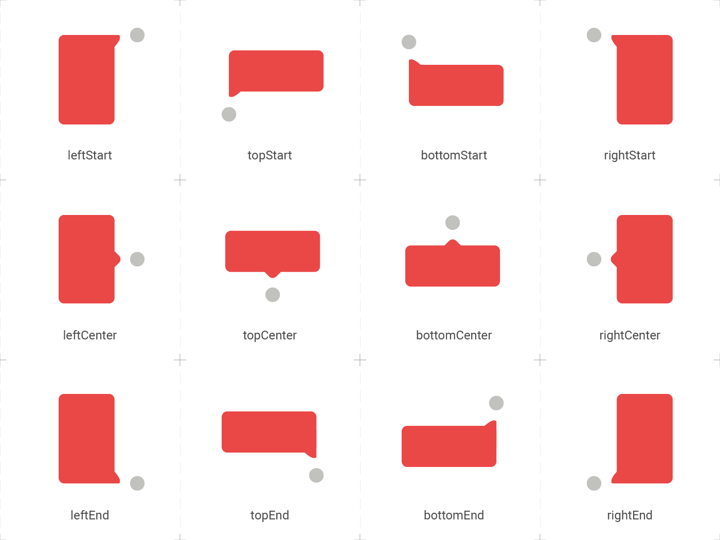
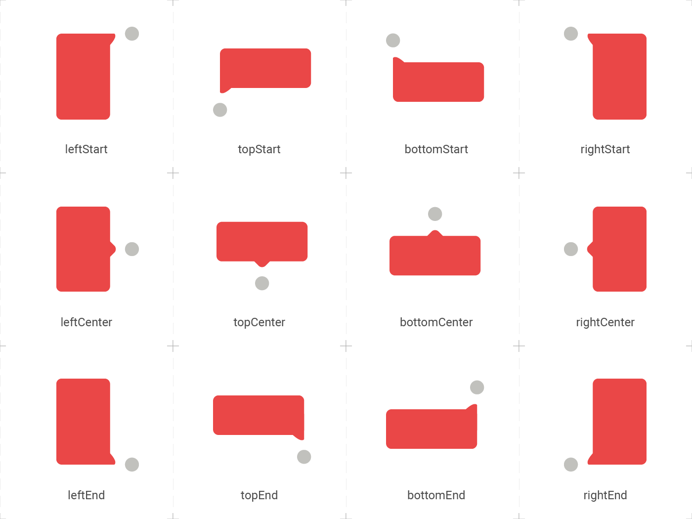
Desired position based on the Enum ElTooltipPosition. Can be topStart, topCenter, topEnd, rightStart, rightCenter, rightEnd, bottomStart, bottomCenter, bottomEnd, leftStart, leftCenter, leftEnd,
radius
false
Radius.circular(8.0)
Border radius of the tooltip.
showModal
false
true
Displays a fullscreen dark layer behind the tooltip.
showArrow
false
true
Displays the arrow pointing to the child widget.
showChildAboveOverlay
false
true
Repeats the child above the tooltip overlay.
modalConfiguration
false
ModalConfiguration()
Configures the modal color and opacity if showModal is true.
timeout
false
Duration.zero (only disappears on click)
How many time to wait for the tooltip to disappear.
appearAnimationDuration
false
Duration.zero (does not animate)
Fade In animation duration.
disappearAnimationDuration
false
Duration.zero (does not animate)
Fade Out animation duration.
controller
false
null
ElTooltipController to show and hide the tooltip.
↔️ El Tooltip available positions
El tooltip header image was created using macrovector illustration on Freepik