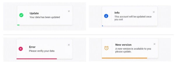
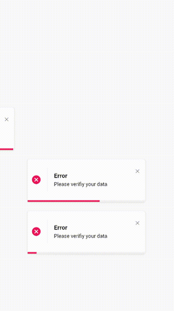
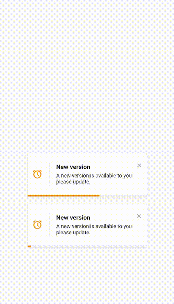
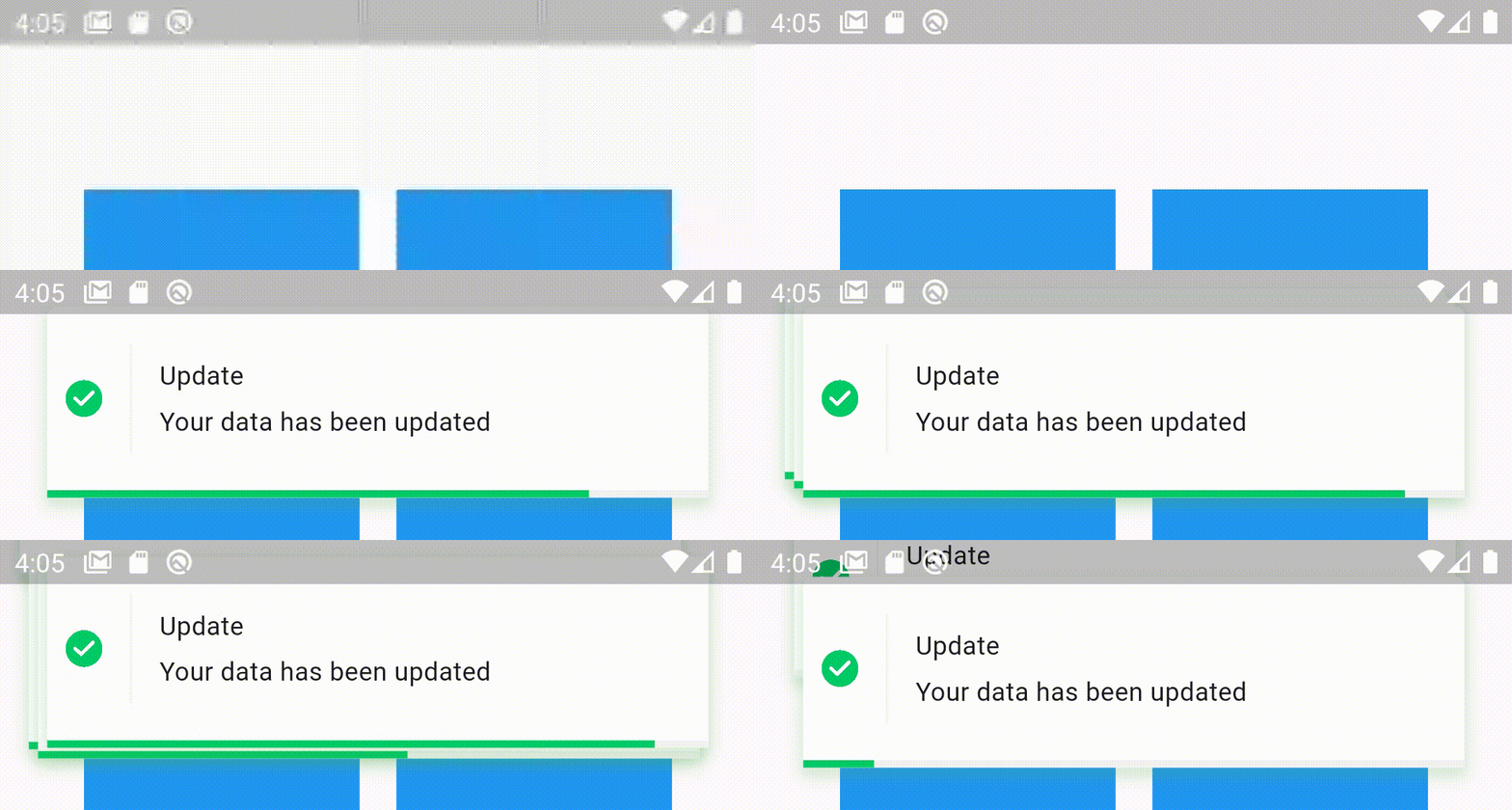
Elegant Notification은 화면 상단에 고도로 사용자 정의 가능하고 시각적으로 매력적인 알림을 표시하도록 설계된 Flutter 패키지입니다. 내장 테마를 제공하며 외관, 위치 및 동작에 대한 완전한 제어 기능을 갖추고 있습니다. 여러 플랫폼에서 부드럽고 현대적인 토스트 스타일 경고를 통해 사용자 경험을 향상시키기에 이상적입니다. Android, iOS, Web, macOS, Windows, Linux를 지원하여 크로스플랫폼 애플리케이션에 유연하게 활용할 수 있습니다. pub add를 통해 간편하게 통합할 수 있어, 복잡한 설정 없이도 빠르게 우아하고 반응성 있는 알림을 구현할 수 있습니다.
사용 사례
사용자 피드백 메시지 표시
성공 또는 오류 알림 표시
애니메이션 알림을 통한 앱 사용자 경험 향상
실시간 업데이트 제공
사용자 정의 알림 레이아웃 구현
주요 기능
내장 테마
완전한 사용자 정의 옵션
크로스 플랫폼 지원
애니메이션 전환
pub를 통한 간편한 통합
사용자 정의 가능한 위치
적합한 대상
모바일 및 웹 앱
풍부한 UI 피드백이 필요한 앱
미학을 우선시하는 개발자
경량 알림이 필요한 프로젝트
빠른 구현을 원하는 팀
고려 사항
복잡한 디자인을 위해 추가 스타일링이 필요할 수 있습니다
고주기 알림으로 인한 성능 영향
제한된 네이티브 OS 수준의 알림 기능
사용자 정의 애니메이션은 모든 플랫폼에서 조정이 필요할 수 있습니다
Flutter의 오버레이 시스템에 의존합니다
원본 README
연결된 소스 저장소의 README 원문 스냅샷입니다. 최신 내용은 저장소에서 확인하세요.
Elegant Notification
An elegant notification to display important messages to users
Stacked elegant notification
Features
Display a top notification with animation
A-stacked friendly toast
Built-in themes (Success, Error, Info)
Different display animations (fromTop, fromBottom, fromLeft, fromRight)
Support for all display alignment positions
(TopLeft, TopCenter, TopRight, CenterLeft, Center, CenterRight, BottomLeft, BottomCenter, BottomRight)
Support custom theme implementation
on close and on progress finished callback handlers
Animated progress bar indicator
Customizable dismiss direction
Background customization
Animation duration customization
Notification position customization
Add clickable action widget to notification
Notification dismiss customization
Customizable notification dimensions (height and width)
Customizable barrier dismission and on dismiss action
Slide back animation
Customizable close button
Customizable border and border radius
RTL support
Getting Started
To use this elegant notification package you need to add the dependency in pubspec.yaml file.
dependencies:elegant_notification:^2.5.1
Parameters
`
/// The toast title widgetfinalWidget? title;
/// The toast description widgetfinalWidget description;
/// A secondary widget displayed under the description widget/// by default `action == null`finalWidget? action;
/// The color of the vertical divider between the icon and content/// By default it's null, which means it will use the default divider color = Color(0xffF3F3F3)/// You can customize the color by providing a specific [Color] valuefinalColor verticalDividerColor;
/// The notification icon, by default it's null./// When it's null and using success, info and error the default icon is displayed/// When using the default constructor and icon is null nothing is renderedWidget? icon;
/// The size of the icon, by default it's 20px.finaldouble iconSize;
/// The type of the animation set on the notification/// possible values/// ```dart/// {/// fromLeft,/// fromRight,/// fromTop,/// fromBottom,/// }/// ```/// default value `fromLeft`finalAnimationType animation;
/// The duration of the animation/// Default value `Duration(milliseconds: 600)`finalDuration animationDuration;
/// The toast animation curve by default the curve is set to [Curves.ease]finalCurve animationCurve;
/// The background color of the notification./// By default it's set to white./// For types constructors (Success, Info, Delete) this parameter is unchangeable.lateColor background;
/// The border radius of the notification widgetfinalBorderRadius? borderRadius;
/// The notification widget borderfinalBoxBorder? border;
/// How much the notification will take time,/// by default the duration is `3000 milliseconds`finalDuration toastDuration;
/// The notification shadowfinalBoxShadow? shadow;
/// Enable or disable the progress indicator rendering./// By default the indicator is displayed,/// for types constructors (Success, Info, Delete) this parameter is unchangeable.latebool showProgressIndicator;
/// The color of the progress./// By default it's blue/// for types constructors (Success, Info, Delete) this parameter is unchangeablelateColor progressIndicatorColor;
/// Progress bar indicator width, by default it's null so it takes the widget's widthfinaldouble? progressBarWidth;
/// Progress bar indicator height, by default it's null so it takes the widget's heightfinaldouble? progressBarHeight;
/// Progress bar indicator padding constraintsfinalEdgeInsetsGeometry? progressBarPadding;
/// The progress indicator background color/// by default it's greyfinalColor progressIndicatorBackground;
/// Display or hide the close button/// by default the close button is displayed/// for types constructors (Success, Info, Delete) this parameter is unchangeable///finalbool displayCloseButton;
/// Close widget rendered as the close function/// by default the close button is displayed, if you don't want it set `closeButton` to null/// for types constructors (Success, Info, Delete) this parameter is unchangeablefinalWidgetFunction(voidFunction() dismissNotification)? closeButton;
/// Function invoked when user press on the close buttonfinalvoidFunction()? onCloseButtonPressed;
/// Function invoked when the notification is closed after the finish of the progress indicatorfinalvoidFunction()? onProgressFinished;
/// Function invoked when the user taps on the notificationfinalvoidFunction()? onNotificationPressed;
/// Function invoked when the user taps on the notificationfinalvoidFunction()? onLongPress;
/// The long press duration of the notification/// By default it's set to `Duration(seconds: 2)`finalDuration longPressDuration;
/// Function invoked when tapping outside the notification/// Or when pressing the back button of the phone/// Or when tapping on the screenfinalFunction()? onDismiss;
/// Define whether the notification will be dismissed automatically or not/// By default `autoDismiss = true`finalbool autoDismiss;
/// The direction of the dismissible widget/// By default it's `DismissDirection.horizontal`finalDismissDirection dismissDirection;
/// The notification position in the screen/// By default the position is set to `Alignment.topRight`finalAlignment position;
/// The width of the notification widgetfinaldouble? width;
/// The height of the notification widgetfinaldouble? height;
/// If the notification is dismissible or not/// by default it's truefinalbool isDismissable;
/// The margin between the notification and the edge of the screenfinaldouble notificationMargin;
/// The options for the stacked modefinalStackedOptions? stackedOptions;
`
Examples
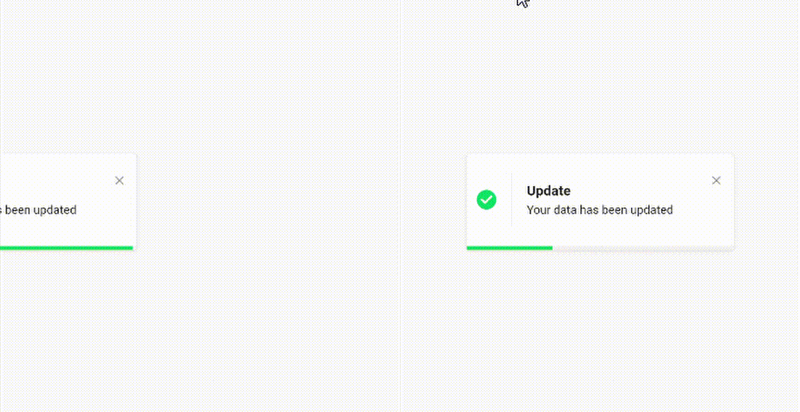
Success theme animation example
ElegantNotification.success(
	title:  Text("Update"),
	description:  Text("Your data has been updated"),
  onDismiss: () {
      print('Message when the notification is dismissed');
  },
  onTap: () {
      print('Message when the notification is pressed');
  },
  closeOnTap: true,
).show(context);
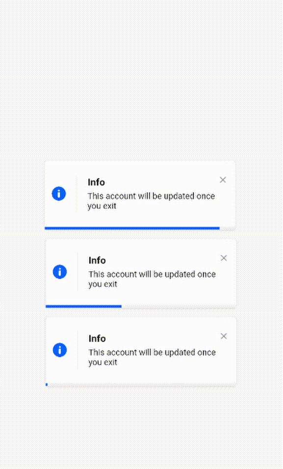
ElegantNotification.info(
	title:  Text("Info"),
	description:  Text("This account will be updated once you exit"),
  icon: Icon(
		Icons.access_alarm,
		color: Colors.orange,
	),
).show(context);
Easiest way to display elegant notification
ElegantNotification(
	description:  Text("Please verifiy your data")
).show(context);
Custom theme animation example
ElegantNotification(
	title:  ("New version"),
	description:  Text("A new version is available to you please update."),
	icon: Icon(
		Icons.access_alarm,
		color: Colors.orange,
	),
	progressIndicatorColor: Colors.orange,
).show(context);
Without title
ElegantNotification.error(
	description:  Text("Please verifiy your data")
).show(context);
With Action
ElegantNotification.info(
	description:  Text('This account will be updated once you exit',),
	action: InkWell(
    onTap: (){
      print('Link pressed')
    }
    child:Text( 'Link',
      style:  TextStyle(
        decoration:  TextDecoration.underline,
        color:  Colors.blue,
      ),
    )
  ),
).show(context);
Using dismissDirection attribute
ElegantNotification.success(
  width: 360,
  position: Alignment.topCenter,
  animation: AnimationType.fromTop,
  title: Text('Update'),
  description: Text('Your data has been updated'),
  onDismiss: () {
    print('Message when the notification is dismissed');
  },
  onNotificationPressed: () {
    print('Message when the notification is pressed');
  },
  isDismissible: true,
  dismissDirection: DismissDirection.up,
).show(context);
Contribution
Of course the project is open source, and you can contribute to it repository link