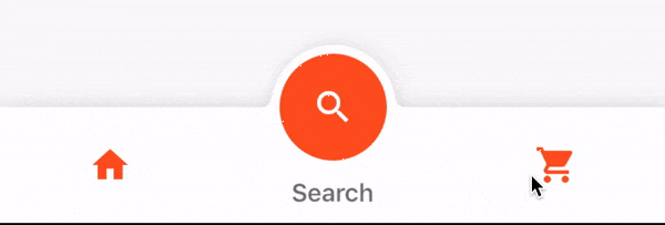
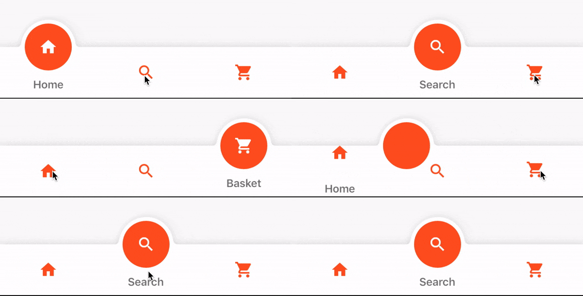
Fancy Bottom Navigation는 부드러운 아이콘 전환과 사용자 정의 가능한 색상이 있는 애니메이션 바텀 네비게이션 바를 제공하는 플러터 패키지입니다. 탭 간 전환 시 동적 시각 피드백을 제공하여 모바일 앱의 사용자 인터페이스를 향상시킵니다. 애니메이션 효과로 아이콘이 우아하게 나타나고 사라지며, 전반적인 사용자 경험을 개선합니다. 개발자는 앱의 디자인 언어에 맞게 외관과 동작을 쉽게 커스터마이징할 수 있습니다. 현대적이고 매력적인 네비게이션 패턴이 필요한 앱에 적합합니다.
사용 사례
탭 기반 탐색을 갖춘 모바일 앱
애니메이션 전환을 통한 UI/UX 향상
하단 탐색 표시 모양 맞춤 설정
시각적으로 매력적인 대시보드 만들기
인터랙티브 앱 인터페이스 설계
주요 기능
애니메이션 아이콘 전환
완전히 사용자 정의 가능한 색상
부드러운 탭 전환 효과
기존 Flutter 프로젝트와의 간편한 통합
사용자 지정 아이콘 및 레이블 스타일링을 지원합니다
적합한 대상
현대적인 탐색을 원하는 플러터 개발자
시각적 매력에 초점을 맞춘 앱
애니메이션 UI 컴포넌트가 필요한 프로젝트
디자인 중심 모바일 애플리케이션
빠른 탐색 향상이 필요한 개발자
고려 사항
제한된 플랫폼별 사용자 정의
복잡한 레이아웃을 위해 추가 스타일링이 필요할 수 있습니다
매우 많은 수의 탭에 최적화되지 않음
오래된 기기에서는 애니메이션 성능이 다를 수 있습니다
상태 관리를 수동으로 처리해야 합니다
원본 README
연결된 소스 저장소의 README 원문 스냅샷입니다. 최신 내용은 저장소에서 확인하세요.
FancyBottomNavigation
Getting Started
Add the plugin (pub coming soon):
dependencies:...fancy_bottom_navigation:^0.3.2
Limitations
For now this is limited to more than 1 tab, and less than 5. So 2-4 tabs.
iconData -> Icon to be used for the tab title -> String to be used for the tab onClick -> Optional function to be used when the circle itself is clicked, on an active tab
Attributes
required
tabs -> List of TabData objects onTabChangedListener -> Function to handle a tap on a tab, receives int position
optional
initialSelection -> Defaults to 0 circleColor -> Defaults to null, derives from Theme activeIconColor -> Defaults to null, derives from Theme inactiveIconColor -> Defaults to null, derives from Theme textColor -> Defaults to null, derives from Theme barBackgroundColor -> Defaults to null, derives from Theme key -> Defaults to null
Theming
The bar will attempt to use your current theme out of the box, however you may want to theme it. Here are the attributes:
Programmatic Selection
To select a tab programmatically you will need to assign a GlobalKey to the widget. When you want to change tabs you will need to access the State using this key, and then call setPage(position).
See example project, main.dart, line 75 for an example.
Showcase
Using this package in a live app, let me know and I'll add you app here.
Inspiration
This package was inspired by a design on dribbble by Manoj Rajput:
https://dribbble.com/shots/5419022-Tab