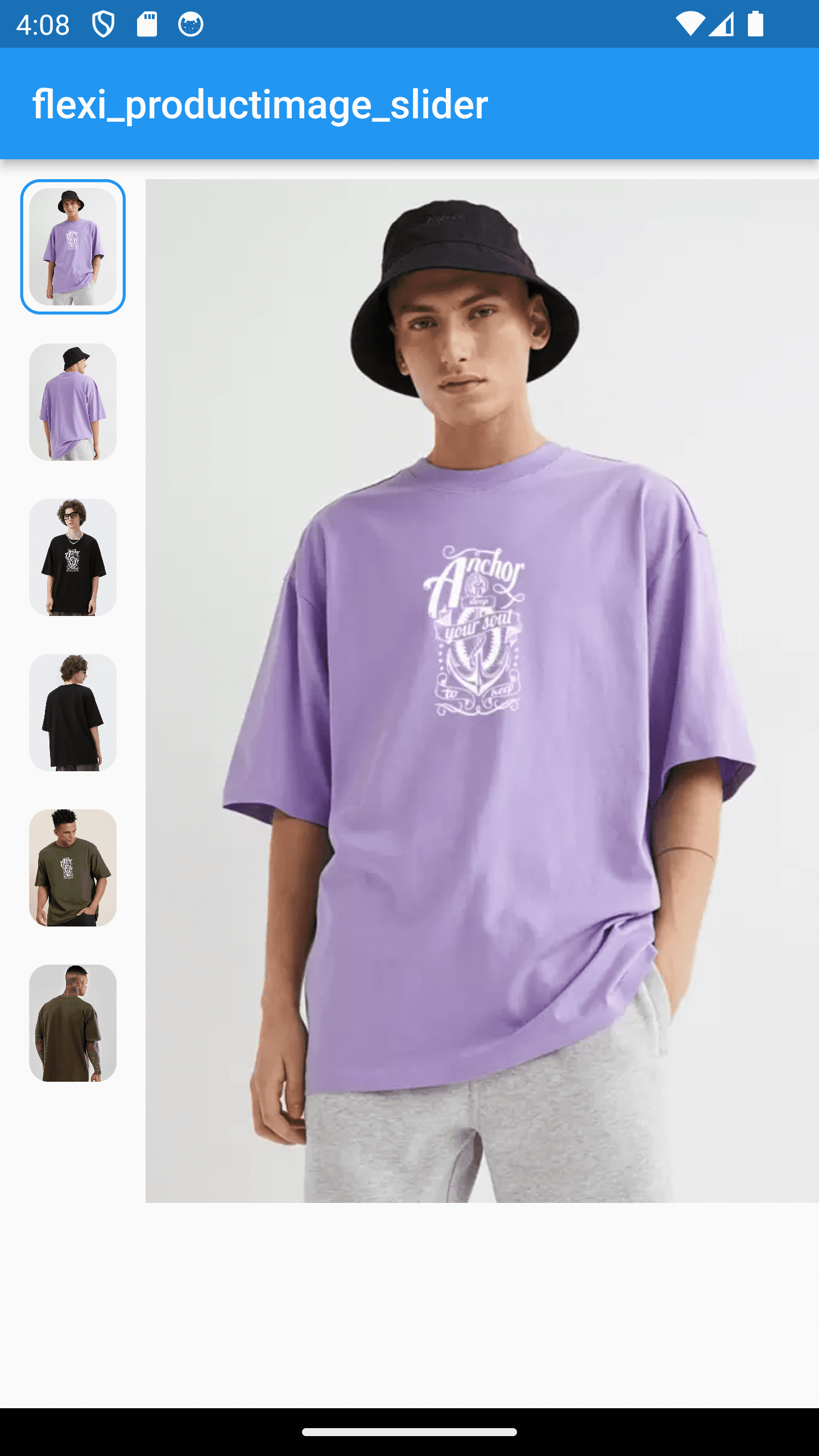
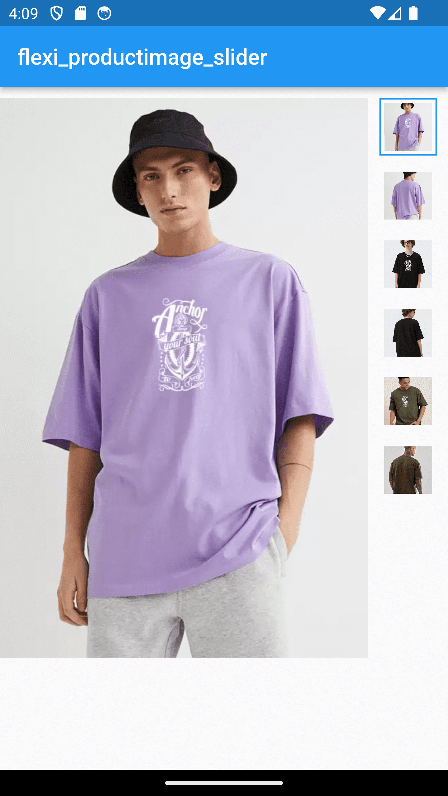
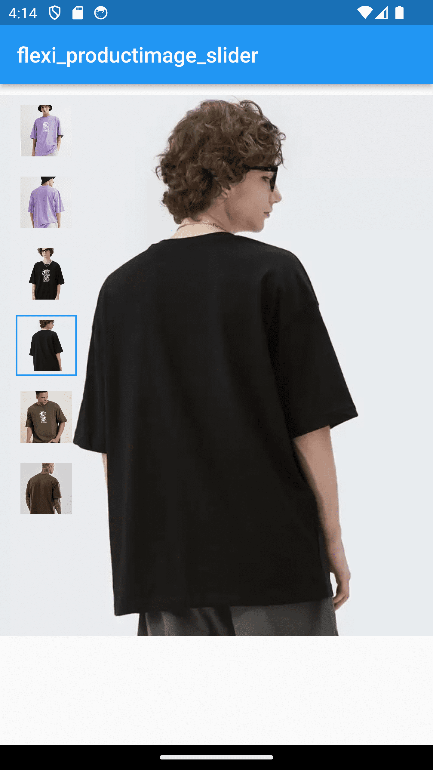
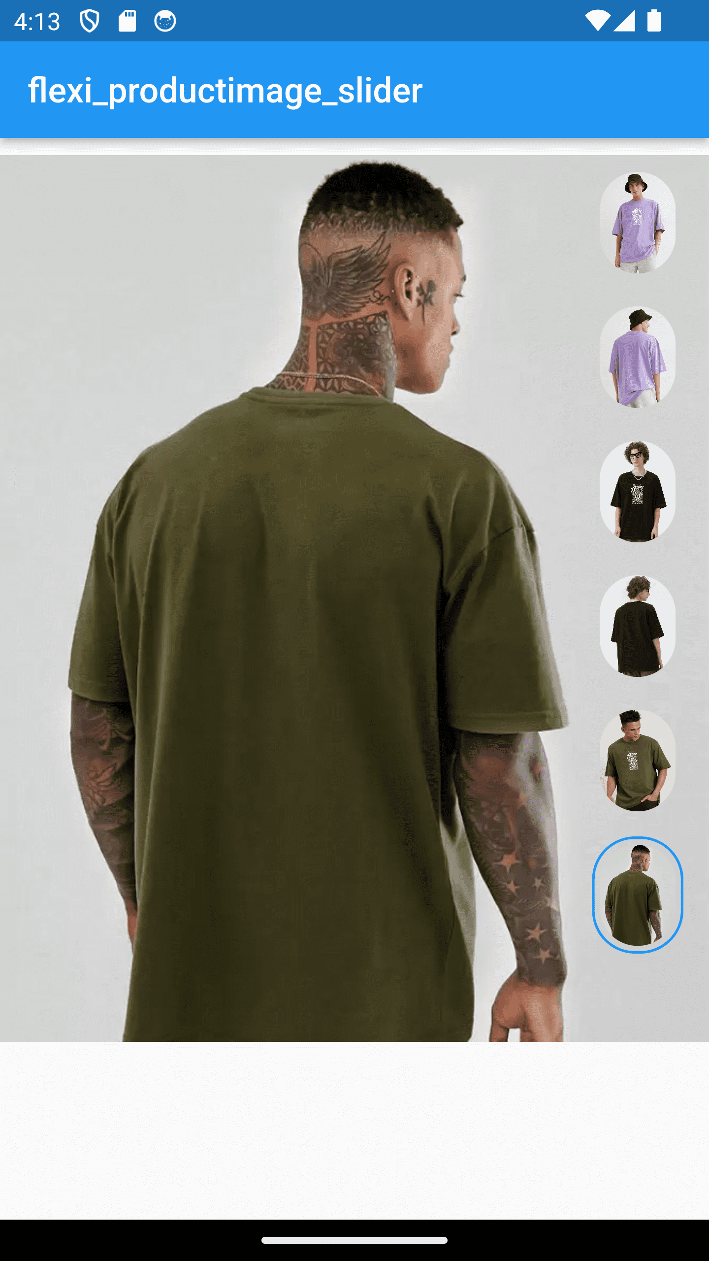
Flexi ProductImage Slider는 부드럽고 사용자 정의 가능한 슬라이더에서 제품 이미지를 표시하도록 설계된 Flutter 패키지입니다. 전자상거래 앱에 이상적이며 Android, iOS, Web, macOS, Windows, Linux 등 다양한 플랫폼을 지원합니다. 반응형 디자인과 직관적인 탐색 기능을 제공하여 제품을 둘러볼 때 사용자 경험을 향상시킵니다. `flutter pub add`를 통해 최소한의 설정으로 개발자는 애플리케이션에 매력적인 이미지 캐러셀을 빠르게 통합할 수 있습니다. 특히 다양한 색상이나 각도와 같은 제품 변형을 보여주는 데 매우 유용합니다.
사용 사례
전자상거래 제품 갤러리
제품 변형 표시
모바일 및 웹 스토어
제품 세부 정보 페이지
인터랙티브 이미지 캐러셀
주요 기능
사용자 정의 가능한 슬라이드 전환
기기 간 반응형 디자인
Flutter와의 간편한 통합
다중 플랫폼 지원
스무스한 터치 기반 탐색
적합한 대상
전자상거래 앱 개발자
제품 중심의 UI 디자이너
크로스플랫폼 모바일 및 웹 프로젝트
경량 이미지 슬라이더를 찾는 개발자
인터랙티브 제품 전시가 필요한 앱
고려 사항
제한된 내장 이미지 편집 도구
기본적으로 자동 재생 없음
고급 스타일링을 위해 수동 구성이 필요합니다
정적 이미지 컬렉션에 가장 적합
외부 이미지 소스에 의존
원본 README
연결된 소스 저장소의 README 원문 스냅샷입니다. 최신 내용은 저장소에서 확인하세요.
flexi_productimage_slider
An image slider to represents your products..:)
Features
Slide your products with thumbnail
set your thumbnail in any shapes, color, corner radius, size , alignment etc. as per your requirements
perform your action on click on image
Installation
In your pubspec.yaml file within your Flutter Project:
dependencies:flexi_productimage_slider:1.1.0
import'package:flexi_productimage_slider/flexi_productimage_slider.dart';
flexiProductimageSlider(
//required fields
arrayImages: const [
"https://i.ibb.co/ZLFHX3F/1.png",
"https://i.ibb.co/JKJvs5S/2.png",
"https://i.ibb.co/LCzV7b3/3.png",
"https://i.ibb.co/L8JHn1L/4.png",
"https://i.ibb.co/7RWNCXH/5.png",
"https://i.ibb.co/bBsh5Pm/6.png",
],
// optional fields//set where you want to set your thumbnail
sliderStyle: SliderStyle.nextToSlider,//.overSlider, .nextToSlider// set you slider height like 1.0,1.5,2.0 etc...
aspectRatio: 0.8,
//set content mode of image
boxFit: BoxFit.cover,
//set this if you want to set any default image index when it loads
selectedImagePosition: 0,
//set your thumbnail alignment
thumbnailAlignment: ThumbnailAlignment.bottom,//.right , .left, .bottom//set how selected thumbnail border displayed
thumbnailBorderType: ThumbnailBorderType.all,//.bottom, .all//set selected thumbnail border width
thumbnailBorderWidth: 1.5,//double value//set thumbnail corner radius
thumbnailBorderRadius: 10,
//set your thumbnail height & width//NOTE : if you set ThumbnailShape.circle then set thumbnail width height same
thumbnailWidth: 50,
thumbnailHeight: 65,
//set color of current image thumbnail border
thumbnailBorderColor: Colors.blue,
//make you action when user click on image
onTap: (index){
print("selected index : $index");
//for zooming effect on click use gallery_zoom_slides//https://pub.dev/packages/gallery_zoom_slidesNavigator.push(context, MaterialPageRoute(builder: (context)=>
galleryZoomSlides(
//required fields
arrayImages: arrayImages,
//Optional fields
zoomTheme: ZoomTheme.theme3,//.theme1, .theme2, .theme3
selectedImagePosition: index,
selectedThumbnailColor: Colors.blue,
)
)
);
},
),
...