패키지, 저장소 및 앱 카테고리 검색

flexible_scrollbar 표지
패키지 상세v0.1.3

flexible_scrollbar

Flutter용 유연한 스크롤바입니다. 이 패키지를 사용하면 다양한 미리 정의된 동작을 가진 사용자 지정 스크롤바를 만들 수 있습니다.

AndroidiOSWebmacOSWindowsLinux
30일 다운로드
1.5천
좋아요
29
Pub 점수
150

패키지 설치

flutter pub add flexible_scrollbar

패키지 개요

공개 정보를 바탕으로 생성한 선택 가이드입니다.

개발자가 사전 정의된 동작을 가진 사용자 지정 스크롤바를 만들 수 있도록 해주는 플러터 패키지입니다. 스타일과 기능에서 유연성을 제공하여 다양한 플랫폼에서 고유한 스크롤바 디자인을 구현할 수 있습니다. 맞춤형 스크롤 경험을 필요로 하는 앱에 적합하며, 안드로이드, iOS, 웹, 맥OS, 윈도우, 리눅스 등 모든 주요 플랫폼을 지원합니다. 스크롤 중 시각적 피드백을 제공함으로써 사용자 상호작용을 향상시키면서 깔끔하고 반응성이 뛰어난 인터페이스를 유지합니다.

사용 사례

  • 웹 애플리케이션에서의 사용자 정의 스크롤바 디자인
  • 모바일 스크롤 가능한 목록에서 UX 향상
  • 데스크톱 앱용 스크롤 인디케이터 맞춤 설정
  • 긴 콘텐츠 화면에서 접근성 향상
  • 플랫폼별 스크롤바 스타일 만들기
  • 스크롤 가능한 위젯에 시각적 피드백 추가

주요 기능

  • 사용자 정의 가능한 스크롤바 모양
  • 사전 정의된 동작 모드
  • 크로스 플랫폼 호환성
  • 사용자 정의 애니메이션 지원
  • ScrollView와의 간편한 통합
  • 기기 간 반응형 디자인

적합한 대상

  • 시각적 커스터마이즈를 원하는 UI 디자이너
  • 스크롤이 많은 인터페이스를 개발하는 개발자
  • 다중 플랫폼을 대상으로 하는 앱
  • 접근성 있는 스크롤이 필요한 프로젝트
  • 사용자 경험의 완성도에 집중하는 팀

고려 사항

  • 최적의 성능을 위해 추가적인 스타일링이 필요할 수 있습니다
  • 행동 사용자 정의는 ScrollController 이해가 필요합니다
  • 스크롤 피드백이 없는 미니멀리스트 디자인에는 적합하지 않습니다
  • 중첩 스크롤 뷰에서의 잠재적 레이아웃 충돌
  • 내장 테마가 네이티브 스크롤바에 비해 제한적임

원본 README

연결된 소스 저장소의 README 원문 스냅샷입니다. 최신 내용은 저장소에서 확인하세요.

A Flexible Scrollbar for Flutter

pub package
A flexible solution for custom scroll bars.


Foreword

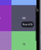
A package has been designed to allow the creation of complex scroll bars. You can customize the scroll thumb, scroll line and add a label, that is positioned by the center of the scroll thumb by default, but you can customize its position as well. As those three things are created by builders called every time the scroll state is changed, you can add custom animations.

How to use

The usage is as simple as a built-in Scrollbar, only you can customize it a lot more.

Install

To install this package simply add the flexible_scrollbar to your dependencies in pubspec.yaml

# pubspec.yaml
dependencies:
  flexible_scrollbar:
import 'package:flexible_scrollbar/flexible_scrollbar.dart';

Basic usage

To get a scrollbar simply wrap a scrollable widget with FlexibleScrollbar and pass a ScrollController to both FlexibleScrollbar and a scrollable widget:

FlexibleScrollbar(
     controller: scrollController,
     child: GridView.builder(
        controller: scrollController,

You will get a defaul scroll thumb and settings:

But it's very simple and we are here to make complex scroll bars so let's see how.

Customization

For the main customization the FlexibleScrollbar widget has three builders: scrollThumbBuilder, scrollLineBuilder and scrollLabelBuilder. Each one of them has a ScrollbarInfo as a parameter and rebuild each time any of the fields of the ScrollbarInfo model has changed.

ScrollbarInfo model has the following properties:

Properties Description
bool isScrolling Changes when the user starts/strops the scroll body scrolling. The isDragging is not affected by it.
bool isDragging Changes when the user starts/strops to drag the scroll thumb. The isScrolling is not affected by it.
double thumbMainAxisSize Contains the calculated depending on the scroll body size thumb length.
double thumbMainAxisOffset Contains the offset in pixels of the scroll thumb from the starting position.
AxisDirection scrollDirection Has the scroll body scroll direction in it (up/down/left/right)

Using those builders you can make custom scrollbars such as the one shown in the example at the beginning. The scroll thumb from the example has been created with the following code:
scrollThumbBuilder: (ScrollbarInfo info) {
     return AnimatedContainer(
       width: info.isDragging
           ? thumbDragWidth
           : thumbWidth,
       height: info.thumbMainAxisSize,
       decoration: BoxDecoration(
         borderRadius: BorderRadius.circular(5),
         color: Colors.black.withOpacity(info.isDragging ? 1 : 0.6),
       ),
       duration: animationDuration,
     );
},
Other parameters

There is some more customization that you can do with the other than builders properties of the FlexibleScrollbar:

Properties Description
bool alwaysVisible Default value is false. If true prevents the scroll thumb from disappearing after the set time.
bool jumpOnScrollLineTapped Default value is true. If false prevents the scroll position change on the scroll line tap.
bool draggable Default value is true. If false prevents user from dragging the scroll thumb.
bool autoPositionLabel Default value is true. If false the label is set to (0, 0) position and can be moved using Positioned widget.
double? scrollLineOffset The offset in pixels of the scroll line from the side defined by the barPosition and the scroll direction.
double? thumbMainAxisMinSize The minimal size of the scroll thumb in case you are using the ScrollbarInfo thumbMainAxisSize and the scroll body is too big.
double? scrollLineCrossAxisSize The cross axis size of the scroll line. Defaults to the scroll thumb size. The scroll thumb cross axis size can not be bigger then this field.
double? scrollLabelOffset The offset in pixels of the label from the side defined by the barPosition and the scroll direction.
Duration? thumbFadeStartDuration Defines the time after which the scroll thumb will start its fade animation.
Duration? thumbFadeDuration The time that takes the scroll thumb to completely fade.
BarPosition barPosition Defines whether the scroll line position at the start or the end of the scroll body cross axis.
ValueChanged<DragStartDetails>? onDragStart This callback is called when the user starts dragging the scroll thumb.
ValueChanged<DragEndDetails>? onDragEnd This callback is called when the user ends dragging the scroll thumb.
ValueChanged<DragUpdateDetails>? onDragUpdate This callback is called during the user's scroll thumb drag process.

License

This package is licensed under the Apache License 2.0 - see the LICENSE file for details.

카테고리

소스 저장소

이 패키지를 사용하는 프로젝트