Flicked Cards는 Flutter용 손가락 제스처 기반으로 사용자 정의 및 확장이 가능한 카드 위젯으로, 상호작용식 카드 뒤집기 및 스와이프 애니메이션을 가능하게 합니다. 부드러운 전환과 반응형 제스처를 갖추고 있어 개발자가 직관적인 터치 인터랙션을 통해 카드를 뒤집거나 제거할 수 있는 매력적인 사용자 인터페이스를 만들 수 있습니다. 이 패키지는 Android, iOS, Web, macOS, Windows, Linux 등 여러 플랫폼을 지원하여 동적 카드 기반 탐색 또는 콘텐츠 표시가 필요한 크로스플랫폼 애플리케이션에 적합합니다.
사용 사례
인터랙티브 카드 슬라이더
스와이프-투-디스미스 인터페이스
제스처 기반 콘텐츠 탐색
대시보드에서 카드 뒤집기 애니메이션
스와이프 가능한 카드를 갖춘 사용자 온보딩 흐름
주요 기능
제스처 기반 카드 상호작용
사용자 정의 가능한 플립 및 스와이프 애니메이션
사용자 정의 동작을 위한 확장 가능한 설계
크로스 플랫폼 호환성
다중 상호작용 상태 지원
사용자 지정 가능한 전환 지속 시간
적합한 대상
인터랙티브 카드 UI를 구축하는 개발자
스와이프 또는 플립 제스처가 필요한 앱
애니메이션 카드 경험을 찾는 디자이너
크로스플랫폼 모바일 및 웹 앱
인터랙티브 레이아웃 프로토타이핑
고려 사항
대규모 카드 목록에 대한 성능 튜닝이 필요할 수 있습니다
사용자 정의에는 더 깊은 다트 지식이 필요할 수 있습니다
다른 패키지에 비해 내장 테마가 제한적입니다
애니메이션 오버헤드로 인해 중간 카드 수에 가장 적합합니다
원본 README
연결된 소스 저장소의 README 원문 스냅샷입니다. 최신 내용은 저장소에서 확인하세요.
flicked_cards
A gesture driven card swipping widget supporting custom animations.
Features
Awesome default animations provided out of the box
Progress through cards swipping both direction or in a single direction
Extensible through custom provided animations
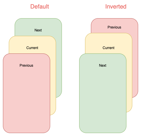
Support piling or popping (depending on animation spec)
Examples
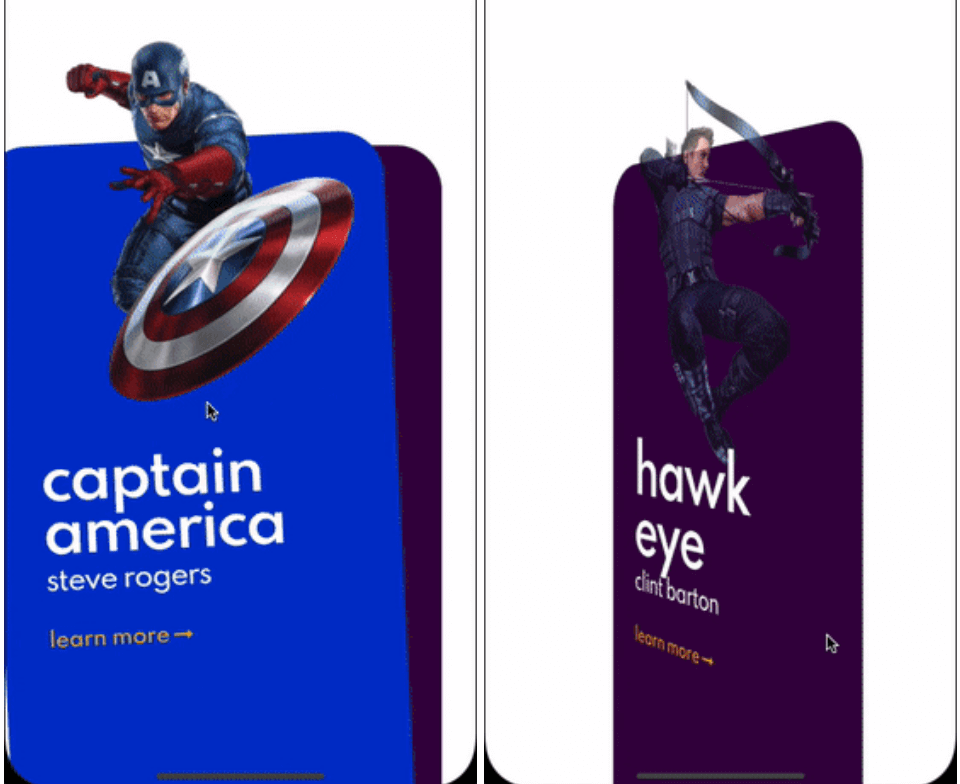
Here are some of the animation provided out of the box, take a look at the example to see all.
Cards used in these examples where taken from Brocodev
flicked_cards provides an easy way to create custom animations but it is required to have a basic understanding
of how cards can be layed out and how to position them depending on the drag progress and some of the properties in AnimationConfig.
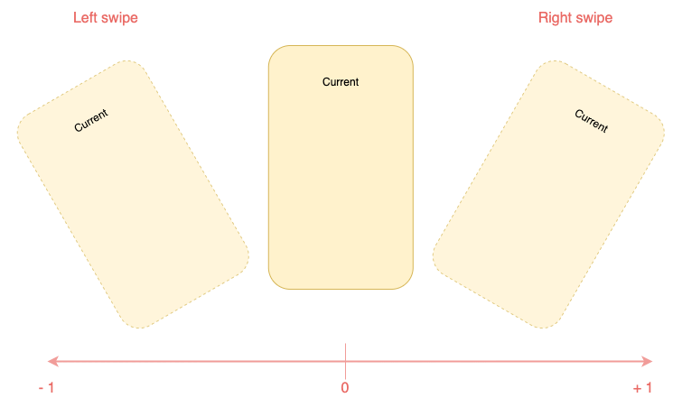
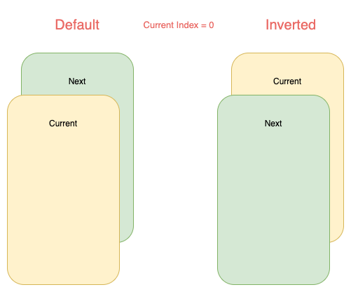
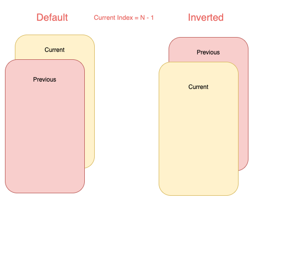
Animations will be provided a progress value in the range (-1, 1) you should try to make you animation symmetric around 0
when posible. Like this:
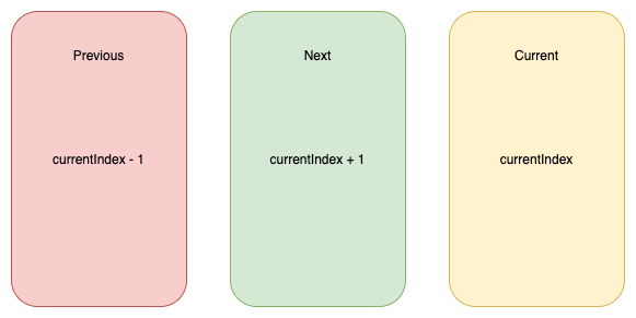
You will have to reason about relative card indices:
Interface for animations
All animations will need to implement CardAnimation which basically
defines:
animation of a particular card depending on swipe progress required
opacity of a particular card depending on swipe progress optional
where to apply transformations on cards (Fractional Offset)