FlipBoard는 플립 애니메이션을 사용하여 애니메이티드 콘텐츠 전환을 가능하게 하는 Flutter 패키지입니다. 각각의 표시 콘텐츠 변경 사항을 부드럽게 애니메이션화하도록 설계된 재사용 가능한 위젯인 FlipFraseBoard, FlipMatrix, FlipClock를 제공합니다. Flutter의 애니메이션 시스템을 기반으로 하며, Android, iOS, Web, macOS, Windows, Linux 등 여러 플랫폼을 지원합니다. 상태 변경 시 시각적 피드백이 사용자 경험을 향상시키므로, 매력적인 UI를 만들기에 이상적입니다.
사용 사례
애니메이션 디지털 시계
동적 텍스트 표시
인터랙티브 데이터 그리드
사용자 인터페이스 전환
게임 스코어 카운터
양식 내 시각적 피드백
주요 기능
부드러운 플립 애니메이션
사전 구축된 전용 보드
크로스 플랫폼 호환성
Flutter와의 간편한 통합
사용자 정의 가능한 플립 방향 및 속도
반응형 콘텐츠 업데이트
적합한 대상
인터랙티브 대시보드를 구축하는 개발자
동적 UI 요소를 찾는 디자이너
시각적 상태 전환을 필요로 하는 앱
교육용 또는 게임 애플리케이션
실시간 데이터 시각화 도구
고려 사항
저사양 기기에서 성능에 영향을 미칠 수 있습니다
플립 효과를 넘어서는 사용자 정의가 제한되어 있음
Flutter 위젯 라이프사이클에 대한 이해가 필요합니다
간단한 정적 콘텐츠에 적합하지 않습니다
애니메이션은 미니멀리즘 디자인에서 방해가 될 수 있습니다
Flutter의 애니메이션 프레임워크 안정성에 의존합니다
원본 README
연결된 소스 저장소의 README 원문 스냅샷입니다. 최신 내용은 저장소에서 확인하세요.
Flip Board
Widgets to build displays that resemble Mechanical Flip Boards.
The basic component is a stateful FlipWidget that renders flip transitions for a stream of items and an itemBuilder.
The package also includes other widgets that compose this basic component in useful Flip Boards:
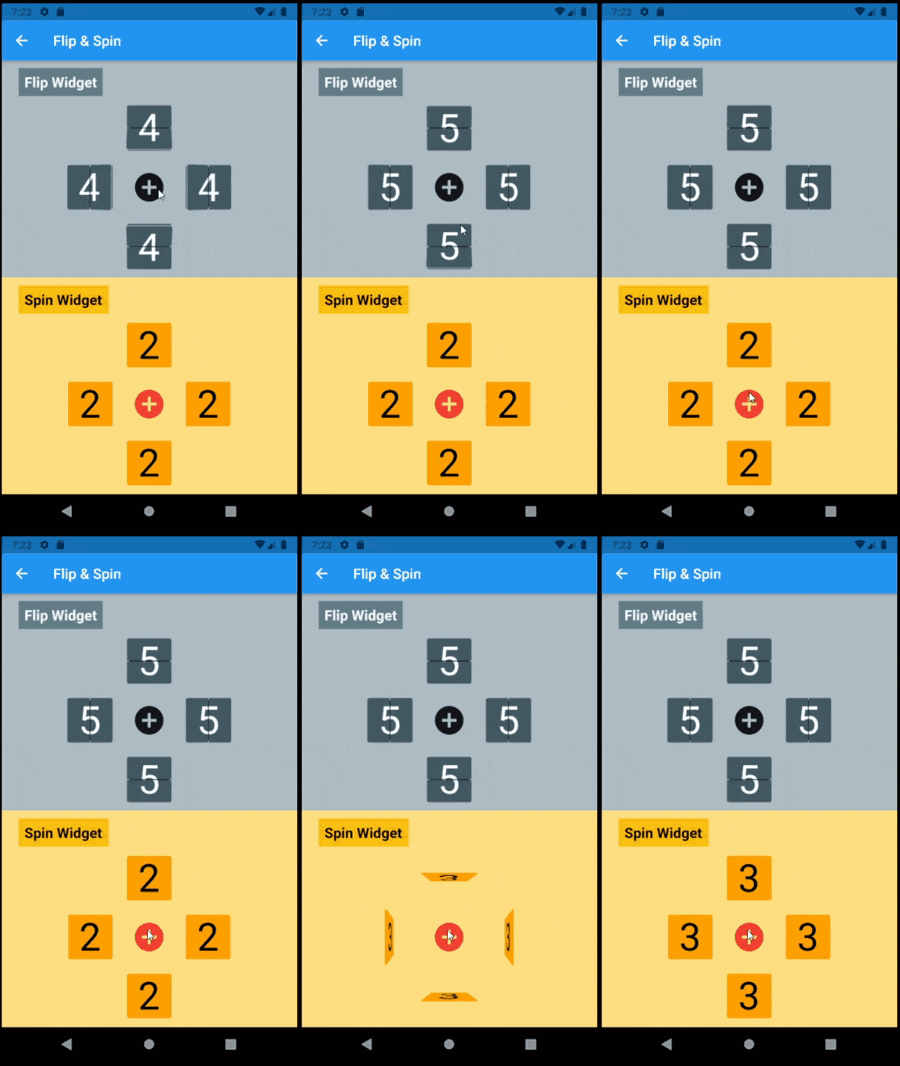
The most distinctive characteristic of a FlipWidget is its flip type to define the type of movement that will animate items rendering, either FlipType.middleFlip or FlipType.spinFlip.
This widget renders flip animations in a configured Axis and AxisDirection, animating the transition to each new item received in the given item stream. It is commonly used to display digits and letters but can actually render any widget you build through the given itemBuilder.
It is constructed with four required parameters (besides many optional parameters):
flipType: either FlipType.middleFlip or FlipType.spinFlip
itemStream: stream of items to be flipped as they are received
itemBuilder: builder to create a widget out of each item
flipDirection: AxisDirection to animate new items flip
Please check the class documentation to see all options.
Middle Flip
When we think of Mechanical Flip Boards as we used to see in airports and sport score boards we think on a Vertical MiddleFlip Widget or, most likely, on a composition (row) of them.
Basic FlipWidgets are usually composed in a layout, this package provides a few configurable compositions of FlipWidgets of the same type and orientation, sometimes varying some elements direction within that axis orientation.
All these composed widgets are described below and explored in the examples folder.
Flip Matrix Board
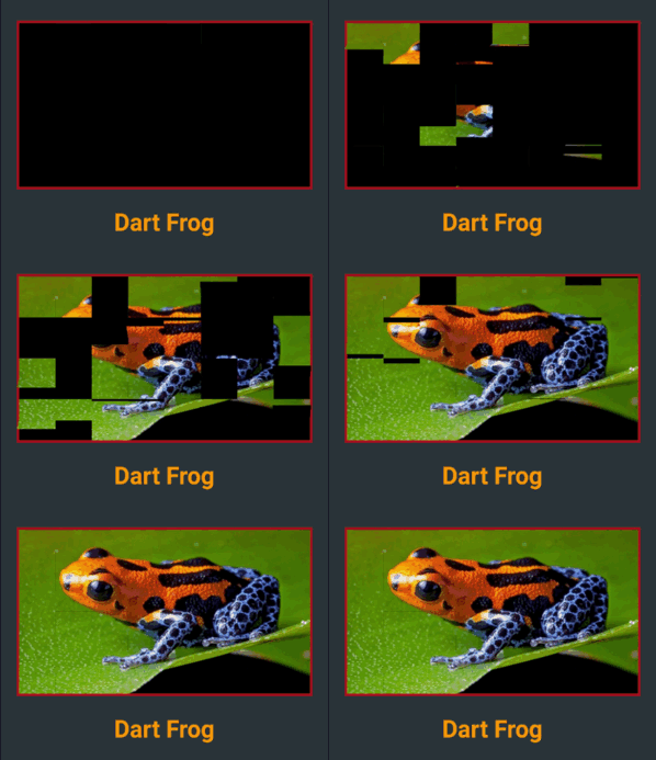
There two classes of FlipMatrixBoard that animate the display in a matrix of FlipWidgets. The first class displays a single child, an image in the given example. The second class animates the display of a stream of items, also given as a stream of images in the example below.
The board is configured with the number of rows and columns, flipping orientation and animation speed and delays parameters.
FlipClock will default to Theme colors but can be further customized through constructor parameters.
The default flip direction is AxisDirection.down and the default animation curve is a custom curve that acceletares like gravity and bounces back at the end (like a mechanical bang).
In the example below some colors are inherited by a parent ThemeData from the amber color scheme. While some colors are defined in the constructor invocation:
This composed widget displays a Frase Board that will animate each letter up to the the given frase letters.
Flip type, initial and end colors, delays and more are all customized at constructor level. Check the class documentation for a run over all configurations.
The provided example looks like this:
This page displays a variety of frase boards, one of them would be constructed like this: