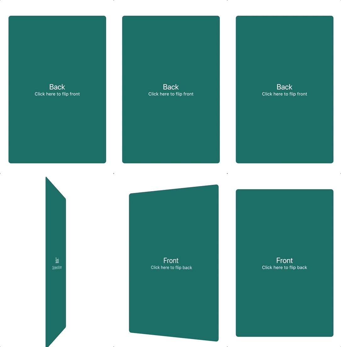
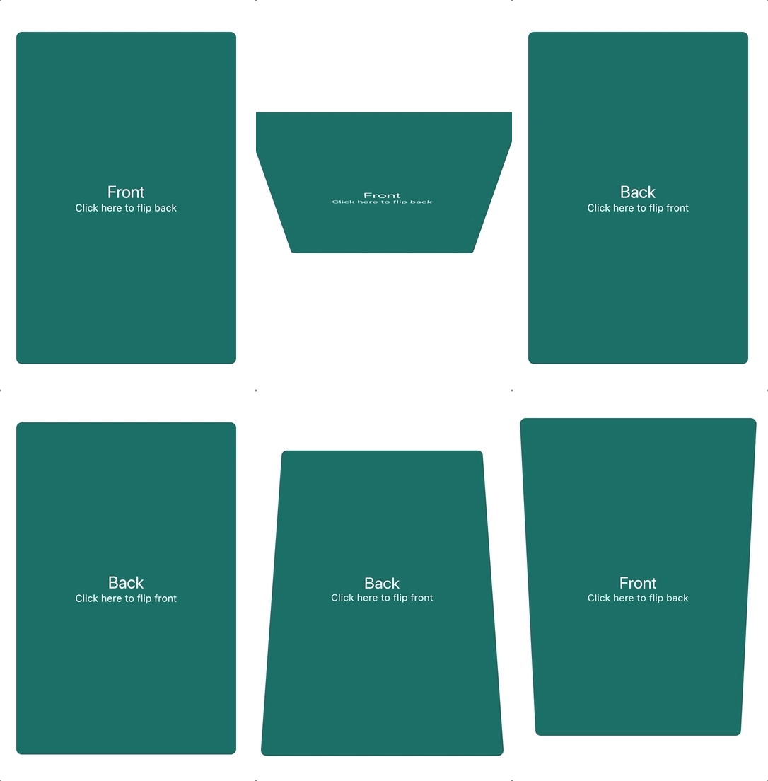
FlipCard는 부드러운 카드 뒤집기 애니메이션을 가능하게 하는 Flutter 패키지로, 제품 정보와 같은 추가 정보를 노출하는 데 이상적입니다. 사용자 정의 가능한 앞면 및 뒷면 위젯을 지원하며, 상호작용 가능한 뒤집기 기능으로 매력적인 사용자 인터페이스에 적합합니다. 이 패키지는 Android, iOS, Web, macOS, Windows, Linux 등 주요 플랫폼에서 작동하여 일관된 동작을 보장합니다. pub add를 통해 간단히 통합할 수 있으며, 복잡성 없이 UI 상호작용을 향상시킵니다.
사용 사례
제품 세부 정보 공개
상호작용 학습 카드
전후 비교
사용자 프로필 전환
게임화된 UI 요소
주요 기능
부드러운 플립 애니메이션
사용자 정의 가능한 앞면 및 뒷면 콘텐츠
크로스 플랫폼 지원
Flutter와의 간편한 통합
제스처 기반의 뒤집기
사용자 지정 가능한 속도 및 방향
적합한 대상
전자상거래 앱
교육 앱
인터랙티브 튜토리얼
대시보드 위젯
UI 프로토타이핑
고려 사항
저사양 기기에서 성능에 영향을 줄 수 있습니다
접근성에 대한 신중한 설계가 필요합니다
2D 전환 효과에 한정
복잡한 전환에 적합하지 않음
애니메이션은 다른 제스처와 충돌할 수 있습니다
원본 README
연결된 소스 저장소의 README 원문 스냅샷입니다. 최신 내용은 저장소에서 확인하세요.
flip_card
A component that provides a flip card animation. It could be used for hiding and showing details of a product.
How to use
Import the package
import'package:flip_card/flip_card.dart';
Default
Create a flip card as shown below. By default the card is touch controlled.
You can turn off touch control by setting flipOnTouch to false.
FlipCard(
  fill: Fill.fillBack, // Fill the back side of the card to make in the same size as the front.
  direction: Axis.horizontal, // default
  initialSide: CardSide.front, // The side to initially display.
  front: Container(
    child: Text('Front'),
  ),
  back: Container(
    child: Text('Back'),
  ),
)
Programmatically
Controller (Recommended)
To control the card programmatically, you can pass a controller
when creating the card.
lateFlipCardController _controller = FlipCardController();
@overrideWidgetbuild(BuildContext context) {
returnFlipCard(
controller: _controller,
front: ...,
back: ...,
);
}
voiddoStuff() {
// Flip the card a bit and back to indicate that it can be flipped (for example on page load)
_controller.hint(
duration: constDuration(milliseconds: 400),
);
// Tilt the card a bit (for example when hovering)
_controller.skew(0.2);
// Flip the card programmatically
_controller.flip();
// Flip the card to front specifically
_controller.flip(CardSide.front);
// Flip the card without animation
_controller.flipWithoutAnimation();
}
Global Key
You can also control the card via a global key as shown below.
You can auto-flip the widget after a certain delay without any external triggering.
FlipCard(
fill: Fill.back, // Fill the back side of the card to make in the same size as the front.
direction: Axis.horizontal, // default
initialSide: CardSide.front, // The side to initially display.
front: Container(
child: Text('Front'),
),
back: Container(
child: Text('Back'),
),
autoFlipDuration: constDuration(seconds: 2), // The flip effect will work automatically after the 2 seconds
)