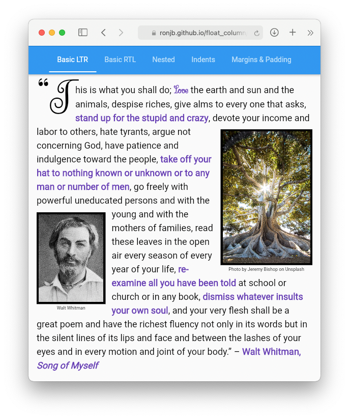
float_column 패키지는 텍스트가 플로팅된 자식 위젯을 둘러싸는 수직 컬럼 레이아웃을 가능하게 하는 Flutter 위젯을 제공합니다. 이는 CSS의 float 동작을 모방합니다. 이미지나 다른 요소 주변에 텍스트가 흐르는 유연한 잡지 스타일 레이아웃을 만들기에 적합합니다. 이 위젯은 Android, iOS, Web, macOS, Windows, Linux 등 여러 플랫폼을 지원하여 크로스플랫폼 앱에 매우 유용합니다. 레이아웃 정밀도와 동적 콘텐츠 흐름을 결합함으로써 UI의 유연성을 강화합니다.
사용 사례
매거진 스타일의 기사 레이아웃
이미지와 텍스트가 있는 제품 목록
부유 요소가 있는 동적 콘텐츠 카드
반응형 웹 레이아웃
소셜 미디어 게시물 표시
주요 기능
플로팅 위젯 주위로 텍스트 감싸기
크로스 플랫폼 호환성
열 기반의 유연한 구조
혼합 위젯 유형을 지원
기존 Flutter 코드와의 간편한 통합
적합한 대상
CSS와 유사한 플로팅 동작이 필요한 UI 디자이너
콘텐츠가 풍부한 앱을 개발하는 개발자
반응형 텍스트 흐름을 필요로 하는 앱
웹 및 모바일 하이브리드 프로젝트
복잡한 레이아웃 시나리오
고려 사항
정밀한 정렬 테스트가 필요할 수 있습니다
많은 플로팅 요소로 인한 성능 영향
중첩 부동 소수점에 대한 제한된 지원
매우 복잡한 그리드 시스템에는 적합하지 않습니다
레이아웃 제약 조건에 대한 이해가 필요합니다
원본 README
연결된 소스 저장소의 README 원문 스냅샷입니다. 최신 내용은 저장소에서 확인하세요.
float_column
A Flutter widget for building a vertical column of widgets and text, where
the text wraps around floated widgets — similar to the CSS float and
clear properties.
Float widgets to the left or right (or start/end for automatic
right-to-left support), with paragraph text wrapping around them.
Float widgets inline from within text using WidgetSpan — the float
anchors to its position in the text.
Clear floats (like CSS clear), with optional minimum spacing.
Margins, padding, and a first-line indent (or hanging indent) on
paragraphs.
Constrain a float's width to a percentage of the column's width.
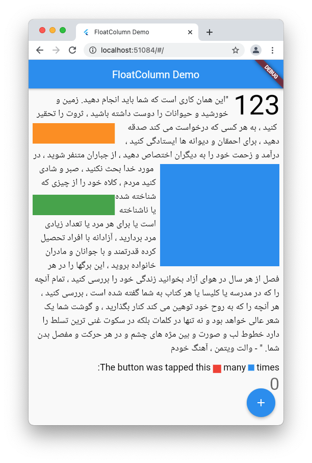
Full right-to-left text direction support.
Justified text (TextAlign.justify) works correctly, including where
text wraps around floats and at a first-line indent.
Works with Flutter text selection.
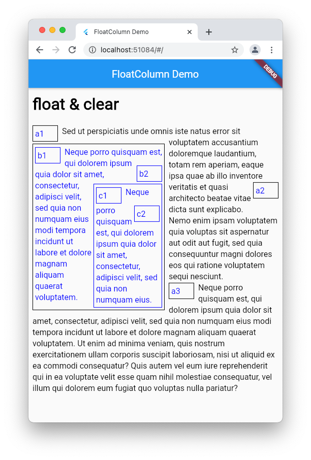
FloatColumn widgets can themselves be floated and nested.
Getting started
Add the dependency to your app's pubspec.yaml file:
dependencies:float_column:^4.1.3
And import it:
import'package:float_column/float_column.dart';
Usage
Basic example
FloatColumn accepts a list of children that can be Widget, Text,
RichText, TextSpan, or WrappableText objects. Wrap any widget that
should float in a Floatable:
FloatColumn(
children: [
constFloatable(
float: FCFloat.start,
padding: EdgeInsetsDirectional.only(end: 8),
child: FlutterLogo(size: 100),
),
constFloatable(
float: FCFloat.end,
clear: FCClear.both,
clearMinSpacing: 20,
padding: EdgeInsetsDirectional.only(start: 8),
child: FlutterLogo(size: 100),
),
WrappableText(
text: constTextSpan(
text: 'This text will wrap around the floated widgets, ''flowing to the right of the first logo, then below it, ''then to the left of the second logo…',
),
),
],
),
Plain Text and TextSpan children work too — they're treated like
WrappableText automatically:
FloatColumn(
children: [
constFloatable(float: FCFloat.start, child: FlutterLogo(size: 80)),
constText('Text children wrap around floated siblings too.'),
],
),
Floated widgets in WidgetSpans
Widgets can also be floated from within the text itself by wrapping them
in a Floatable inside a WidgetSpan. The float is anchored to the line
of text containing the WidgetSpan, and the text wraps around it from
there — handy for figures, pull quotes, or margin notes that should stay
with their place in the text:
FloatColumn(
children: [
WrappableText(
text: constTextSpan(
children: [
TextSpan(text: 'The image below is floated at the point in the ''text where it appears'),
WidgetSpan(
child: Floatable(
float: FCFloat.start,
clear: FCClear.start,
padding: EdgeInsetsDirectional.only(end: 8),
maxWidthPercentage: 0.33,
child: Image(image: AssetImage('assets/fig1.png')),
),
),
TextSpan(text: ', and the rest of the paragraph continues to ''wrap around it…'),
],
),
),
],
),
Drop caps
A classic use case — float the first letter of a paragraph:
FloatColumn(
children: [
WrappableText(
text: constTextSpan(
children: [
WidgetSpan(
child: Floatable(
float: FCFloat.start,
padding: EdgeInsetsDirectional.only(end: 8),
child: Text('T', style: TextStyle(fontSize: 64, height: 1)),
),
),
TextSpan(text: 'he rest of the paragraph wraps around the ''oversized first letter, like a drop cap in a book or ''magazine…'),
],
),
),
],
),
See the example app
for a more polished DropCap widget with font-size-aware measurements.
Clearing floats
Like CSS clear, a child can be pushed below previously floated siblings
with the clear property, using FCClear.left, FCClear.right,
FCClear.start, FCClear.end, or FCClear.both. Floated widgets also
support clearMinSpacing, the minimum vertical space between the cleared
widget and the float above it:
FloatColumn(
children: [
constFloatable(float: FCFloat.start, child: FlutterLogo(size: 100)),
constFloatable(
float: FCFloat.start,
clear: FCClear.start, // Placed below the first logo,
clearMinSpacing: 16, // with at least 16 pixels of spacing.
child: FlutterLogo(size: 100),
),
WrappableText(
text: constTextSpan(text: 'This text wraps around both logos…'),
clear: FCClear.none, // The default — no clearing.
),
],
),
Margins, padding, and indent
WrappableText and Floatable both support margin and padding.
Margins can overlap adjacent content, similar to CSS margin behavior —
vertical margins collapse between non-floated siblings, and a floated
child's margin box is what sibling content wraps around. Padding never
overlaps siblings.
WrappableText also supports a first-line indent — use a positive value
for a normal indent or a negative value for a hanging indent:
WrappableText(
text: constTextSpan(text: 'A paragraph with an indented first line…'),
indent: 32,
margin: constEdgeInsetsDirectional.only(start: 16),
padding: constEdgeInsets.symmetric(vertical: 8),
),
Right-to-left text
FloatColumn respects the ambient Directionality (or an explicit
textDirection), and FCFloat.start/FCFloat.end and
FCClear.start/FCClear.end resolve automatically:
Nesting
FloatColumn widgets can be floated and nested:
Reference
Floatable
Property
Description
float
Which side to float to: none (default), left, right, start, or end.
clear
Place this child below floated siblings: none (default), left, right, start, end, or both.
clearMinSpacing
Minimum vertical spacing below the cleared sibling.
margin
Space around the child that can overlap adjacent content.
padding
Space around the child that never overlaps siblings.
maxWidthPercentage
Maximum width as a fraction of the column's width (defaults to 1.0).