Flutter 패키지로 앱 인터페이스 내에서 떠다니는 자유롭게 드래그할 수 있는 위젯을 만들 수 있게 해줍니다. 이는 사용자가 직관적인 터치 또는 포인터 상호작용을 통해 위젯을 화면 어디든 이동할 수 있도록 합니다. 플로팅 패널, 빠른 접근 도구, 사용자 정의 오버레이와 같은 인터랙티브 UI 요소에 적합합니다. 이 패키지는 Android, iOS, Web, macOS, Windows, Linux 등 모든 주요 플랫폼을 지원하며 기기 간 일관된 동작을 보장합니다.
사용 사례
이동 가능한 부유 패널 만들기
드래그 앤 드롭 빠른 작업 도구 구현
사용자 인터페이스 오버레이의 사용자 정의 설계
인터랙티브 대시보드 컴포넌트 구축
사용자 제어 위젯 위치 지정 활성화
주요 기능
자유형 화면 드래그
크로스 플랫폼 호환성
기존 위젯과의 간단한 통합
부드러운 드래그 애니메이션
다중 플랫폼 지원
적합한 대상
인터랙티브 UI를 구축하는 개발자
이동 가능한 플로팅 요소가 필요한 앱
다중 플랫폼을 대상으로 하는 프로젝트
UX 디자이너가 동적 레이아웃을 프로토타이핑하고 있습니다
고려 사항
경계 제약 조건을 위해 추가 로직이 필요할 수 있습니다
복잡한 중첩 위젯으로 인한 성능 영향
제한된 내장 제스처 사용자 정의
고주파 드래그 시나리오에 최적화되지 않음
드래그 중 위젯 라이프사이클을 신중하게 처리해야 합니다
원본 README
연결된 소스 저장소의 README 원문 스냅샷입니다. 최신 내용은 저장소에서 확인하세요.
Features
Support Android, IOS, Web etc.
This package is used to make a widget movable or draggable around the screen freely;
Works fine for any Widget;
Does not affect the functionality or performance of the particular widget;
Used physics law supported animation to make it more attractive;
Demo
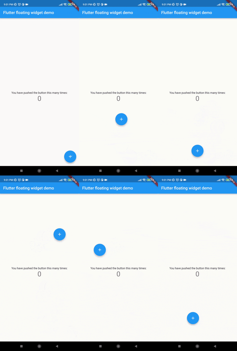
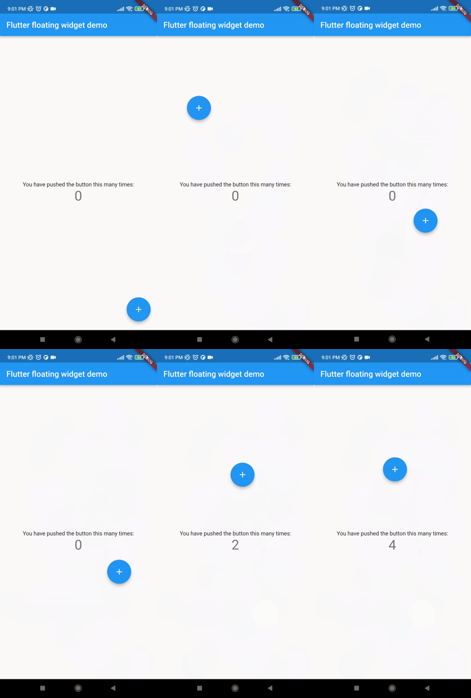
Without auto align
Initially "autoAlign" is false.
autoAlign = false
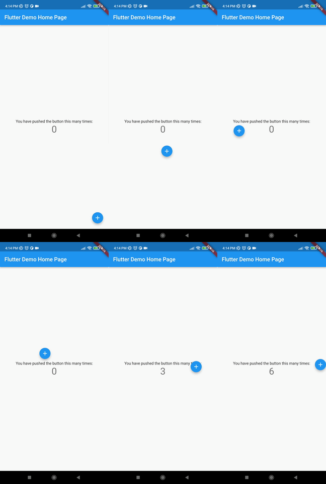
Auto align activated
Add this to your code.
autoAlign = true
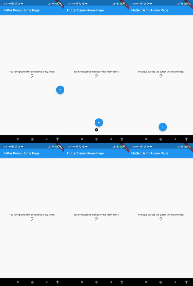
Deletion of the widget
Add this to your code.
deleteWidget: Icon(Icons.cancel),
Getting started
Install
add this in your pubspec.yaml
floating_draggable_widget: ^latest_version
mainScreenWidget is required and it accept any widget. This is actually the base Widget or the parent widget on where the floating widget will be dragged or moved.
floatingWidget is also required and it accept any widget. This is actually the particular widget which will be floated and can be mode or dragged around the screen.
floatingWidgetWidth is also required and it accepts a double value which is the width of the floating widget above mentioned.
floatingWidgetHeight is also required and it accepts a double value which is the height of the floating widget above mentioned.
onDragEvent is a function is not required, which is a event listener of the current position of floating widget, which provides only the x axis as dx and y axis as xy.
autoAlignType is a enum type. which has 3 type. onlyRight, onlyLeft, both. by default it is both. if autoAlign is true then this determines the on which side the floating widget will land after dragging ends.
disableBounceAnimation is a bool type. if autoAlign is true then then setting true to disableBounceAnimation can disable the bounce animation.
dy accepts a double value which is the distance from the top of the screen where floating widget will be positioned initially.
dx accepts a double value which is the distance from the left of the screen where floating widget will be positioned initially.
screenHeight accepts a double value which is the height of the screen initially.
screenWidth accepts a double value which is the width of the screen initially.
speed accepts a double value which is the speed factor of the floating widget after it will be let go. The more speed will be provided the slower the object will move after the user let the widget go freely.
isDraggable accepts a boolean value which determines if the widget is draggable or not.
autoAlign accepts a boolean value which determines if the widget will be auto aligns on the left or right after it is being dragged.
deleteWidget accepts a widget which is used to delete the floating widget.
onDeleteWidget accepts a function which is used to delete the floating widget.
deleteWidgetAlignment accepts an alignment value which is used to align the delete widget.
deleteWidgetAnimationCurve accepts an animation curve value which is used to animate the delete widget.
deleteWidgetAnimationDuration accepts an animation duration value which is used to animate the delete widget
hasDeleteWidgetAnimationDuration accepts an animation duration value which is used to animate the delete widget when it is dragging with the delete widget.
deleteWidgetHeight accepts a double value which is used to set the height of the delete widget.
deleteWidgetWidth accepts a double value which is used to set the width of the delete widget.
isCollidingDeleteWidgetHeight accepts a double value which is used to set the height of the delete widget.
isCollidingDeleteWidgetWidth accepts a double value which is used to set the width of the delete widget.
boxDecoration optionally accepts a box decoration value which is used to set the decoration of the delete widget.
deleteWidgetPadding optionally accepts a padding value which is used to set the padding of the delete widget.