패키지, 저장소 및 앱 카테고리 검색

flutter_advanced_segment 표지
패키지 상세v3.2.0

flutter_advanced_segment

여러 속성을 통해 완전히 맞춤 설정할 수 있는 고급 세그먼트 위젯입니다. 한번 사용해 보시고 즐겨보세요!

AndroidiOSWebmacOSWindowsLinux
30일 다운로드
7.1천
좋아요
118
Pub 점수
150

패키지 설치

flutter pub add flutter_advanced_segment

패키지 개요

공개 정보를 바탕으로 생성한 선택 가이드입니다.

Flutter용으로 매우 사용자 정의가 가능한 세그먼트 위젯으로, 광범위한 스타일 및 구성 옵션을 통해 탭 기반 탐색을 향상시키기 위해 설계되었습니다. Android, iOS, Web, macOS, Windows, Linux 등 주요 플랫폼을 모두 지원합니다. 개발자는 수많은 속성을 통해 세그먼트의 외관과 동작을 맞춤 설정할 수 있어 다양한 UI 디자인에 원활하게 통합할 수 있습니다. 부드러운 전환과 반응형 피드백을 갖춘 직관적이고 상호작용적인 인터페이스를 만들기에 이상적입니다.

사용 사례

  • 사용자 정의 탭 탐색
  • 폼 필드 그룹화
  • 동적 콘텐츠 전환
  • 사용자 선호도 선택기
  • 인터랙티브 대시보드 필터
  • 다중 상태 선택 컨트롤

주요 기능

  • 완전히 사용자 정의 가능한 외관
  • 크로스 플랫폼 호환성
  • 부드러운 전환 애니메이션
  • 광범위한 속성 구성
  • 수평 및 수직 레이아웃 모두 지원
  • 반응형 디자인 적응성

적합한 대상

  • 복잡한 UI를 구축하는 개발자
  • 유연한 탭 컴포넌트가 필요한 디자이너
  • 동적 세그먼트 상호작용을 요구하는 앱
  • 엄격한 UI 일관성 요구가 있는 프로젝트
  • 다중 플랫폼 앱에 플러터를 사용하는 팀

고려 사항

  • 추가적인 스타일링 지식이 필요할 수 있습니다
  • 많은 세그먼트로 인한 성능 영향
  • 제한된 내장 테마
  • 매우 큰 데이터 세트에 최적화되지 않음
  • 신중한 상태 관리가 필요합니다
  • 중첩 구현에서의 잠재적 복잡성

원본 README

연결된 소스 저장소의 README 원문 스냅샷입니다. 최신 내용은 저장소에서 확인하세요.

flutter_advanced_segment

An advanced segment widget, that can be fully customized with bunch of properties, just try it and enjoy!

APP_ICON

Flutter Advanced Segment Flutter Advanced Segment

Examples

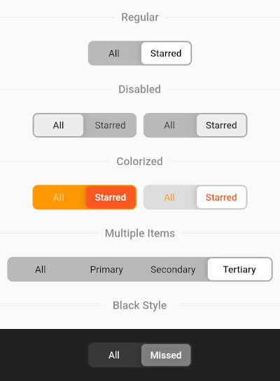
Regular Segment
final _controller = ValueNotifier('all');
//...
AdvancedSegment(
  controller: _controller,
  segments: const {
    'all': 'All',
    'starred': 'Starred',
  },
),
Colorized Segment
AdvancedSegment(
  controller: _controller,
  segments: const {'all': 'All', 'starred': 'Starred'},
  decoration: BoxDecoration(
    color: const Color(0xFFFF6B35),
    borderRadius: BorderRadius.circular(4),
  ),
  sliderColor: const Color(0xFFD63B0E),
  activeStyle: const TextStyle(
    color: Colors.white,
    fontWeight: FontWeight.w600,
  ),
  inactiveStyle: TextStyle(
    color: Colors.white.withValues(alpha: 0.7),
  ),
),
Gradient Decoration
AdvancedSegment(
  controller: _controller,
  segments: const {'all': 'All', 'starred': 'Starred'},
  decoration: BoxDecoration(
    gradient: const LinearGradient(
      colors: [Color(0xFFFF2D55), Color(0xFFFF9500)],
    ),
    borderRadius: BorderRadius.circular(16),
  ),
  sliderColor: Colors.white,
  activeStyle: const TextStyle(
    color: Color(0xFFFF2D55),
    fontWeight: FontWeight.w700,
  ),
  inactiveStyle: TextStyle(
    color: Colors.white.withValues(alpha: 0.85),
  ),
),
Custom Slider Decoration
AdvancedSegment(
  controller: _controller,
  segments: const {'all': 'All', 'starred': 'Starred'},
  decoration: BoxDecoration(
    color: const Color(0xFF2C2C2E),
    borderRadius: BorderRadius.circular(50),
  ),
  sliderDecoration: BoxDecoration(
    color: const Color(0xFFBF5AF2),
    borderRadius: BorderRadius.circular(50),
    border: Border.all(
      color: const Color(0xFFDA8FFF),
      width: 1.5,
    ),
  ),
  activeStyle: const TextStyle(
    color: Colors.white,
    fontWeight: FontWeight.w700,
  ),
  inactiveStyle: TextStyle(
    color: Colors.white.withValues(alpha: 0.5),
  ),
),

AdvancedSegment Parameters

Parameter Description Type Default
controller Controls segments selection ValueNotifier
segments Map of presented segments Map<K, V> required
activeStyle Active segment text style TextStyle fontWeight: FontWeight.w600
inactiveStyle Inactive segment text style TextStyle
decoration Layout decoration (color, border, borderRadius, gradient, etc.) BoxDecoration color: 0x42000000, borderRadius: 8.0
sliderColor Color of the slider thumb Color Colors.white
sliderOffset Gap between slider and layout double 2.0
itemPadding Padding of each item EdgeInsets EdgeInsets.symmetric(h: 15, v: 10)
animationDuration Selection animation duration Duration Duration(milliseconds: 250)
shadow Slider shadow List<BoxShadow> BoxShadow(blurRadius: 8.0)
sliderDecoration Custom slider decoration (overrides sliderColor, borderRadius, shadow) BoxDecoration
enableDrag Whether drag gesture is enabled bool true

카테고리

소스 저장소

이 패키지를 사용하는 프로젝트

아직 데이터가 없습니다.