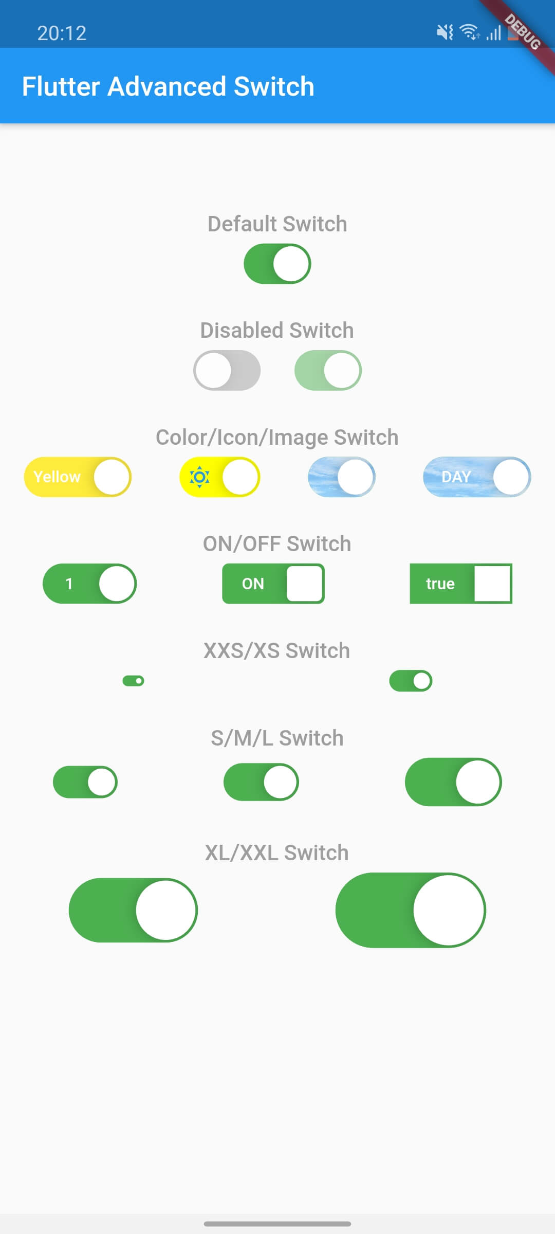
Flutter Advanced Switch는 광범위한 스타일 및 동작 커스터마이징을 위한 풍부한 API를 제공하는 사용자 정의 가능한 스위치 위젯입니다. 개발자는 부드러운 애니메이션, 사용자 지정 트랙 및 탐 디자인, 모든 주요 플랫폼에서 반응형 상호작용을 갖춘 시각적으로 구분되는 스위치를 만들 수 있습니다. 고유한 전환 제어가 필요한 현대적인 UI에 적합하며, 완성도 높고 인터랙티브한 요소로 사용자 경험을 향상시킵니다. 이 패키지는 Android, iOS, Web, macOS, Windows, Linux를 지원하여 크로스플랫폼 일관성을 보장합니다.
사용 사례
사용자 지정 토글 인터페이스
양식에서 사용자 피드백 향상
현대적인 앱 UI 디자인
인터랙티브 설정 패널
크로스 플랫폼 스위치 구성 요소
다시보드에서의 시각적 차별화
주요 기능
높은 사용자 정의 가능한 트랙 및 썸
부드러운 애니메이션 전환
크로스 플랫폼 호환성
풍부한 스타일 옵션
반응형 터치 피드백
사용자 정의 가능한 상태 및 동작
적합한 대상
시각적 유연성을 원하는 UI 디자이너
현대 앱을 개발하는 개발자
일관된 토글 UX가 필요한 팀
복잡한 폼 상호작용을 가진 앱
다중 플랫폼을 대상으로 하는 프로젝트
고려 사항
Flutter 위젯 커스터마이제이션에 대한 이해 필요
패키지 크기가 약간 증가할 수 있습니다
스타일링의 복잡성은 개발 속도에 영향을 줄 수 있습니다
제한된 내장 테마
사용자 정의 없이 간단한 케이스 전환에 적합하지 않음
원본 README
연결된 소스 저장소의 README 원문 스냅샷입니다. 최신 내용은 저장소에서 확인하세요.
flutter_advanced_switch
A highly customizable switch widget for Flutter with support for custom colors, text, icons, images, and more.
Switch Light
Switch Dark
Features
✅ Fully customizable colors, sizes, and shapes
✅ Support for text labels and icons
✅ Background images for active/inactive states
✅ Custom thumb widget support
✅ Smooth animations
✅ Enabled/disabled states
✅ Controller-based or callback-based state management
✅ Customizable thumb padding
✅ Null-safe
Getting Started
In the pubspec.yaml of your flutter project, add the following dependency:
class_MyWidgetStateextendsState<MyWidget> {
final _controller = ValueNotifier<bool>(false);
@overridevoidinitState() {
super.initState();
_controller.addListener(() {
setState(() {
// React to state changesprint('Switch is now: ${_controller.value}');
});
});
}
@overridevoiddispose() {
_controller.dispose();
super.dispose();
}
@overrideWidgetbuild(BuildContext context) {
returnColumn(
children: [
AdvancedSwitch(controller: _controller),
Text('Switch is ${_controller.value ? "ON" : "OFF"}'),
],
);
}
}
Parameters
Parameter
Description
Type
Default
controller
Controls the state of the switch. If provided, the switch will use this controller to manage its state.
ValueNotifier<bool>?
null
activeColor
The background color when the switch is in the active (on) state.
Color
Color(0xFF4CAF50)
inactiveColor
The background color when the switch is in the inactive (off) state.
Color
Color(0xFF9E9E9E)
activeChild
A widget to display on the left side when the switch is active.
Widget?
null
inactiveChild
A widget to display on the right side when the switch is inactive.
Widget?
null
activeImage
An optional background image to display when the switch is active.
ImageProvider?
null
inactiveImage
An optional background image to display when the switch is inactive.
ImageProvider?
null
decoration
The decoration to apply to the switch container. Typically used to set the border radius and shape.
BoxDecoration
BorderRadius.circular(15)
width
The width of the switch.
double
50.0
height
The height of the switch. The thumb size is automatically calculated based on this value.
double
30.0
enabled
Whether the switch is enabled. If false, the switch will be displayed with reduced opacity and will not respond to user interactions.
bool
true
disabledOpacity
The opacity to apply when the switch is disabled.
double
0.5
thumb
A custom widget to use as the thumb (the sliding part of the switch). If null, a default white rounded rectangle with a shadow will be used.
Widget?
null
thumbPadding
The padding around the thumb. This creates space between the thumb and the switch edges.
double
1.0
initialValue
The initial state of the switch when controller is not provided. This value is only used when controller is null.
bool
false
onChanged
Called when the user toggles the switch. The switch will call this callback with the new value. If null and no controller is provided, the switch will be disabled.