Flutter Bootstrap5는 Flutter 애플리케이션에 많은 부트스트랩 5 컴포넌트와 유틸리티를 가져오는 Flutter 패키지입니다. 개발자들이 익숙한 부트스트랩 5 문법과 클래스를 사용하여 반응형이고 모바일 우선 디자인을 구현할 수 있도록 도와줍니다. 이 패키지는 Android, iOS, Web, macOS, Windows, Linux 등 모든 주요 플랫폼을 지원하므로 크로스플랫폼 프로젝트에 이상적입니다. 부트스트랩의 그리드 시스템, 타이포그래피, 버튼, 폼 등을 활용함으로써 개발자는 일관된 스타일을 유지하면서 UI 개발을 가속화할 수 있습니다.
사용 사례
반응형 웹 및 모바일 앱 구축
Bootstrap 패턴을 활용한 빠른 UI 프로토타이핑
크로스 플랫폼 앱 개발
일관된 디자인 시스템 만들기
Flutter에서 부트스트랩 기반 레이아웃 구현
주요 기능
Bootstrap 5 컴포넌트 호환성
반응형 그리드 시스템
모든 대상에 대한 플랫폼 지원
CSS 유사 클래스 기반 스타일링
기존 Flutter 프로젝트와의 간편한 통합
적합한 대상
Bootstrap에 익숙한 개발자
디자인 일관성을 우선시하는 팀
빠른 UI 개발이 필요한 프로젝트
크로스 플랫폼 애플리케이션 빌더
프론트엔드 중심의 플러터 개발자
고려 사항
번들 크기를 증가시킬 수 있습니다
Bootstrap 클래스를 넘어서는 사용자 지정은 제한적입니다
외부 CSS 로직에 의존
완전한 부트스트랩 대체품이 아님
Bootstrap 개념을 이해해야 합니다
원본 README
연결된 소스 저장소의 README 원문 스냅샷입니다. 최신 내용은 저장소에서 확인하세요.
FlutterBootstrap5 🚀
This package is used to support the creation of responsive web applications with Flutter.
It is based on the well-known CSS framework Bootstrap 5 and offers many features that can also be found in Bootstrap.
If you like this package it would be nice if you would give a Like ❤️ and a Star ⭐ to support the project!
If you want to have a quick overview of the most important functions and test them directly, you can do so here
You have various possibilities to customize Flutter Bootstrap5 for your needs.
You can also leave it at the default values to get the default behavior of a Bootstrap5 app.
Currently the following customization options are supported:
BreakPoints
To set your own BreakPoints, you can simply pass the BreakPoints class to the [FlutterBootstrap5] widget.
By default the current BreakPoints of Bootstrap5 CSS are used
Beside the normal BreakPoints you can also define your own BreakPoints for the [FB5Container].
These determine which width a [FB5Container] should have at a certain BreakPoint.
By default the current Container BreakPoints of Bootstrap5 CSS are used
With the parameter defaultFontSize you can specify the default font size to be used for the calculation of "rem" values.
Bootstrap CSS uses rem to calculate margins, paddings and also font size.
Similarly, these values are also calculated in Flutter Bootstrap5 depending on the defaultFontSize.
The default value is 16.0
Typography
Flutter Bootstrap5 uses a font size calculation mechanism based on Bootstrap CSS.
So font sizes change dynamically depending on the screen size.
To customize this behavior you can pass the [FB5Typography] class to FlutterBootstrap5.
Use the theme in your MaterialApp
After configuring [FlutterBootstrap5] to your liking,
you can now pass the theme to your MaterialApp to take full advantage of Flutter Bootstrap 5.
MaterialApp(
title: 'Flutter Bootstrap5 Demo',
theme: BootstrapTheme.of(ctx).toTheme( [PASS YOUR THEME TO OVERRIDE BOOTSTRAP THEME IF YOU WANT TO] ),
home: constHome(),
),
So now let's talk about the features
Currently supported Bootstrap classes
NOTE! Responsive support indicates whether the use of -xs, -sm, -md, -lg, -xl, and-xxl is supported
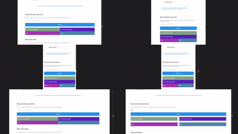
FB5Col are the flutter implementation of the Bootstrap Col. They should be used inside a FB5Row and change their representation according to the classNames.
FB5Grid are used to represent a grid system of your children. They should not contain FB5Cols. FB5Grid automatically adjusts the size of the children so that a row of children always has the same height.
Information about the current screen size and breakpoint is returned by the BootstrapTheme.
For this, nothing more is necessary than to execute the following function.
final screenData = BootstrapTheme.of(context);
It also offers useful functions. For example, the query whether the current breakpoint is larger or smaller than a certain breakpoint.
    final screenData = BootstrapTheme.of(context);
    screenData.currentBreakPoint.isBreakPointOrSmaller(screenData.breakPoints.xl);

    screenData.currentBreakPoint.isBreakPointOrLarger(screenData.breakPoints.xl);
Functions
There are some helper functions to add bootstrap functionality to Flutter widgets:
// e.g. add a 4rem margin-top to a ContainerContainer(
margin: margin(context, 'mt-4'),
);
// e.g. add a 2rem padding to a ContainerContainer(
margin: padding(context, 'p-2'),
);
// add a borderRadius to a ContainerContainer(
decoration: BoxDecoration(
borderRadius: rounded(context), // rounded1 rounded2 rounded3 rounded4 rounded5 roundedPill
),
);
// add a border to a ContainerContainer(
decoration: BoxDecoration(
border: borderPrimary(context), // borderSecondary, borderSuccess, borderDanger, etc...
),
);
// responsiveValue & responsiveValueOrNull// if you need different values for different breakPointsfinal width = responsiveValue<double>(context, defaultValue: 300.0, md: 350.0, xl: 400.0);