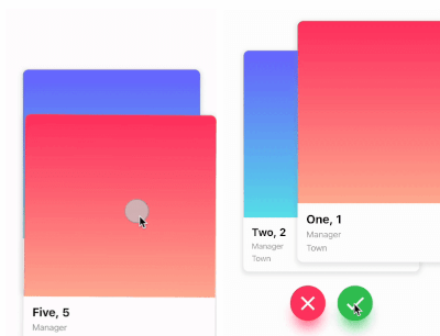
왼쪽, 오른쪽, 위, 아래 제스처를 지원하는 틴더 스타일 카드 스와이프를 가능하게 하는 플러터 패키지입니다. 개발자는 각 스와이프 방향에 대해 사용자 정의 로직을 정의할 수 있어 데이팅 앱, 제품 전시, 콘텐츠 탐색 인터페이스 등에 적합합니다. 이 패키지는 크로스플랫폼으로 안드로이드, iOS, 웹, 맥OS, 윈도우, 리눅스에서 원활하게 작동합니다. 내장된 애니메이션과 제스처 처리를 통해 부드럽고 사용자 정의 가능한 스와이프 경험을 제공합니다.
사용 사례
데이트 앱 인터페이스
제품 또는 항목 탐색
콘텐츠 추천 시스템
인터랙티브 스토리텔링
사용자 선호도 수집
주요 기능
Tinder와 유사한 스와이프 제스처
방향별로 사용자 정의 가능한 스와이프 로직
크로스 플랫폼 호환성
내장 애니메이션
제스처 인식
확장 가능한 위젯 디자인
적합한 대상
스와이프 기반 UI를 구축하는 개발자
카드 스와이프를 통한 사용자 상호작용을 요구하는 앱
직관적인 탐색 패턴이 필요한 프로젝트
인터랙티브 카드 경험 프로토타이핑
고려 사항
스와이프 상태 관리에 주의 깊게 대응해야 합니다
복잡한 레이아웃을 위해 추가 스타일링이 필요할 수 있습니다
대규모 데이터 세트의 성능 영향
카드 기반 상호작용에만 제한됨
수직 스크롤 목록에 최적화되지 않음
원본 README
연결된 소스 저장소의 README 원문 스냅샷입니다. 최신 내용은 저장소에서 확인하세요.
flutter_card_swiper
This is a Flutter package for a Tinder-like card swiper. ✨
It allows you to swipe left, right, up, and down and define your own business logic for each direction.
Very smooth animations supporting Android, iOS, Web & Desktop.
Why?
We built this package because we wanted to:
Have a fully customizable slider
Swipe in any direction
Undo swipes as many times as you want
Choose your own settings such as duration, angle, padding and more
Trigger swipes in any direction with the controller
Add callbacks while swiping, on end, or when the swiper is disabled
Detect the direction (left, right, top, bottom) the card was swiped
Show Cases
Swipe in any direction
Trigger swipes
Unswipe the cards
Fully customizable
Installation
Add this to your package's pubspec.yaml file:
card_swiper:...
OR run
flutterpubaddflutter_card_swiper
in your project's root directory.
Usage
You can place your CardSwiper inside of a Scaffold like we did here. Optional parameters can be defined to enable different features. See the following example:
Index of the first card when the swiper is initialized
false
isDisabled
false
Set to true if swiping should be disabled, has no impact when triggered from the outside
false
isLoop
true
Set to true if the stack should loop
false
maxAngle
30
Maximum angle that the card can reach during swiping
false
allowedSwipeDirection
AllowedSwipeDirection.all
Sets the direction in which the card can be swiped. It can be set to any combination of left, right up or down.
false
numberOfCardsDisplayed
2
Number of cards displayed at the same time
false
onEnd
-
Callback when there are no more cards left to swipe
false
onSwipe
-
Callback when the user swipes a card. If the function returns false, the swipe action is canceled. If it returns true, the swipe action is performed as expected
false
onTapDisabled
-
Callback when a card is tapped and isDisabled is true
false
onUndo
-
Callback when the controller calls undo. If the function returns false, the undo action is canceled. If it returns true, the undo action is performed as expected
A callback containing the horizontal and vertical swipe direction
false
showBackCardOnUndo
-
If true, the previous card will be shown in the background when swiping, and the swipe action will trigger an undo
false
undoSwipeThreshold
50
The horizontal swipe distance threshold, in pixels, after which the back card switches to the previous card. Only active when showBackCardOnUndo is true
false
undoDirection
UndoDirection.left
The direction of the swipe to trigger an undo
false
Controller
The Controller is used to swipe the card from outside of the widget. You can create a controller called CardSwiperController and save the instance for further usage. Please have a closer look at our Example for the usage.