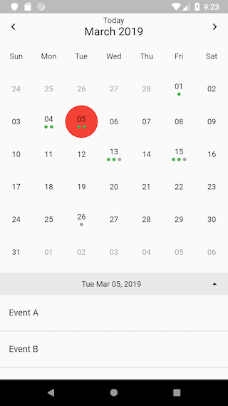
Flutter용 간단하고 깔끔한 캘린더 위젯으로 사용자가 위아래로 스와이프하여 주간 및 월간 보기 사이를 전환할 수 있습니다. 최소한의 인터페이스로 설계되어 날짜 탐색과 시간 기반 작업 관리에 직관적인 방법을 제공합니다. 가벼운 크기로 기존 프로젝트에 쉽게 통합 가능하며, 추가적인 복잡성 없이 보기 간 부드러운 전환을 제공합니다. 사용 가능한 속성을 통해 기본 날짜 선택 및 커스터마이징을 지원합니다.
사용 사례
월간 보기에서 이벤트 표시
주간 보기와 월간 보기 사이 전환
앱에 깔끔한 날짜 선택기 통합하기
스케줄링 및 계획 기능 관리
예약 예약 인터페이스 만들기
주요 기능
주간 및 월간 보기 사이를 전환하려면 스와이프하세요
최소한의 사용자 인터페이스 및 사용자 정의 가능
뷰 전환을 위한 부드러운 애니메이션
날짜 선택을 지원합니다
경량이며 구현이 간편합니다
적합한 대상
간단한 캘린더 필요
작업 및 이벤트 관리 앱
스케줄링 및 기획 도구
직관적인 날짜 탐색이 필요한 앱
깔끔하고 단순한 캘린더를 찾는 개발자
고려 사항
반복 이벤트와 같은 제한된 고급 기능
내장된 이벤트 관리 없음
사용자 정의 스타일링을 위해서는 추가 코드가 필요합니다
복잡한 캘린더 워크플로우에 최적화되지 않음
기본적으로 로컬라이제이션 지원 없음
원본 README
연결된 소스 저장소의 README 원문 스냅샷입니다. 최신 내용은 저장소에서 확인하세요.
flutter_clean_calendar
NOTE:
Due to my current job I'm not able to maintain this project anymore, it's been an exciting journey and thanks to everyone who used it.
You can now use fluter_neat_and_clean_calendar by @rwbr who is actively maintaining his project, his package was forked from this one so be sure everything in here would be supported and more
You can find me on twitter as @elcharliep
Simple flutter calendar based on flutter_calendar package.
Thanks to @AppleEducate for his contributions.
You can pull up and down the calendar to show between weekly/monthly calendar.
It shows the number of events for thats specific date.
It shows the already Done events in other color
Breaking Changes
Introduction of 'CleanCalendarEvent' class. This makes the former syntax of the 'Map' that stores the events incompatible.
Usage
Embed the 'Calendar' widget in a column. Below the calendar (as the second widget in the Column) place a 'ListView.builder' widget for rendereing the list of events.
/// [onDateSelected] is of type [ValueChanged<DateTime>] and it containes the callback function/// extecuted when tapping a date/// [onMonthChanged] is of type [ValueChanged<DateTime>] and it containes the callback function/// extecuted when changing to another month/// [onExpandStateChanged] is of type [ValueChanged<bool>] and it contains a callback function/// executed when the view changes to expanded or to condensed/// [onRangeSelected] contains a callback function of type [ValueChanged], that gets called on changes/// of the range (switch to next or previous week or month)/// [isExpandable] is a [bool]. With this parameter you can control, if the view can expand from week view/// to month view. Default is [false]./// [dayBuilder] can contain a [Widget]. If this property is not null (!= null), this widget will get used to/// render the calenar tiles (so you can customize the view)/// [hideArrows] is a bool. When set to [true] the arrows to navigate to the next or previous week/month in the/// top bar well get suppressed. Default is [false]./// [hideTodayIcon] is a bool. When set to [true] the dispaly of the Today-Icon (button to navigate to today) in the/// top bar well get suppressed. Default is [false]./// [hideBottomBar] at the moment has no function. Default is [false]./// [events] are of type [Map<DateTime, List<CleanCalendarEvent>>]. This data structure containes the events to display/// [selctedColor] this is the color, applied to the circle on the selcted day/// [todayColor] this is the color of the date of today/// [todayButtonText] is a [String]. With this property you can set the caption of the today icon (button to navigate to today)./// If left empty, the calendar will use the string "Today"./// [eventColor] lets you optionally specify the color of the event (dot). If the [CleanCaendarEvents] property color is not set, the/// calendar will use this parameter./// [eventDoneColor] with this property you can define the color of "done" events, that is events in the past./// [initialDate] is of type [DateTime]. It can contain an optional start date. This is the day, that gets initially selected/// by the calendar. The default is to not set this parameter. Then the calendar uses [DateTime.now()]/// [isExpanded] is a bool. If is us set to [true], the calendar gets rendered in month view./// [weekDays] contains a [List<String>] defining the names of the week days, so that it is possible to name them according/// to your current locale./// [locale] is a [String]. This setting gets used to format dates according to the current locale./// [startOnMonday] is a [bool]. This parameter allows the calendar to determine the first day of the week./// [dayOfWeekStyle] is a [TextStyle] for styling the text of the weekday names in the top bar./// [bottomBarTextStyle] is a [TextStyle], that sets the style of the text in the bottom bar./// [bottomBarArrowColor] can set the [Color] of the arrow to expand/compress the calendar in the bottom bar./// [bottomBarColor] sets the [Color] of the bottom bar/// [expandableDateFormat] defines the formatting of the date in the bottom barfinalValueChanged<DateTime> onDateSelected;
finalValueChanged<DateTime> onMonthChanged;
finalValueChanged<bool> onExpandStateChanged;
finalValueChanged onRangeSelected;
finalbool isExpandable;
finalDayBuilder dayBuilder;
finalbool hideArrows;
finalbool hideTodayIcon;
finalMap<DateTime, List<CleanCalendarEvent>> events;
finalColor selectedColor;
finalColor todayColor;
finalString todayButtonText;
finalColor eventColor;
finalColor eventDoneColor;
finalDateTime initialDate;
finalbool isExpanded;
finalList<String> weekDays;
finalString locale;
finalbool startOnMonday;
finalbool hideBottomBar;
finalTextStyle dayOfWeekStyle;
finalTextStyle bottomBarTextStyle;
finalColor bottomBarArrowColor;
finalColor bottomBarColor;
finalString expandableDateFormat;
Sample event data
The syntax of the event map changed due to the introduction of the 'CleanCalendarEvent' class.