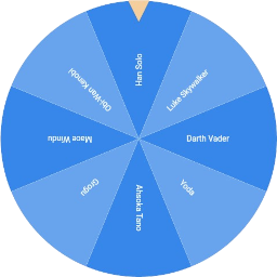
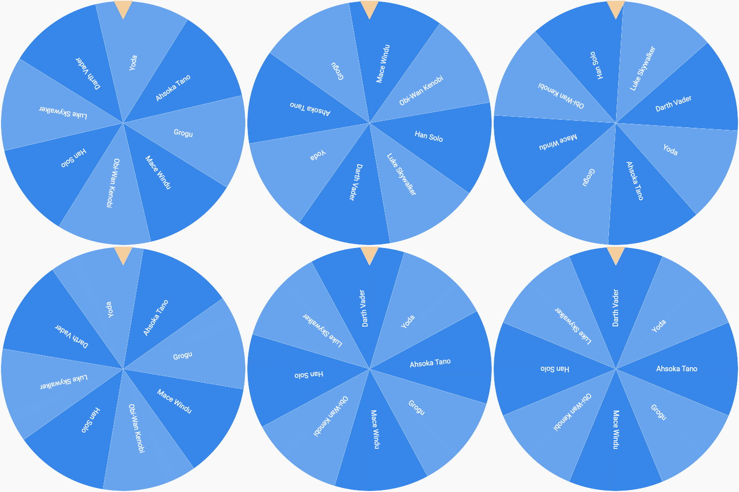
Flutter Fortune Wheel은 Flutter 애플리케이션에서 상호작용 가능한 회전 휠과 운명 바를 생성하기 위한 사용자 정의 가능한 위젯 라이브러리입니다. 개발자가 무작위 선택 과정을 시각화할 수 있게 해주며, 게임, 보상 시스템 또는 추첨 메커니즘에 이상적입니다. 이 패키지는 Android, iOS, Web, macOS, Windows, Linux 등 여러 플랫폼을 지원하여 매우 유연합니다. 부드러운 애니메이션과 pub를 통한 간편한 통합으로 동적인 시각 피드백을 통해 사용자 참여도를 높입니다. 개발자는 세그먼트, 색상 및 회전 행동을 앱 디자인에 맞게 사용자 정의할 수 있습니다.
사용 사례
게임화된 사용자 보상
인터랙티브 추첨
상품 선택 인터페이스
매력적인 온보딩 경험
랜덤 콘텐츠 표시
충성도 프로그램 메커니즘
주요 기능
부드러운 회전 애니메이션
사용자 정의 가능한 휠 세그먼트
다중 플랫폼 지원
pub와의 간편한 통합
회전 지속 시간 및 속도 설정 가능
스핀 완료 이벤트 콜백
적합한 대상
게임 개발자
상호작용을 원하는 앱 디자이너
보상 메커니즘을 갖춘 마케팅 앱
랜덤 퀴즈를 갖춘 교육용 앱
사용자 경험 중심의 모바일 애플리케이션
고려 사항
애니메이션 타이밍을 신중하게 다뤄야 합니다
복잡한 디자인의 경우 성능 최적화가 필요할 수 있습니다
제한된 내장 접근성 기능
고빈도의 빠른 회전을 위한 것이 아님
희소한 상호작용 이벤트에 적합
완전한 기능을 위해 외부 종속성에 의존합니다
원본 README
연결된 소스 저장소의 README 원문 스냅샷입니다. 최신 내용은 저장소에서 확인하세요.
Flutter Fortune Wheel
This Flutter package includes wheel of fortune widgets, which allow you to visualize random selection processes.
They are highly customizable and work across mobile, desktop and the web.
The wheel of fortune is the most iconic visualization.
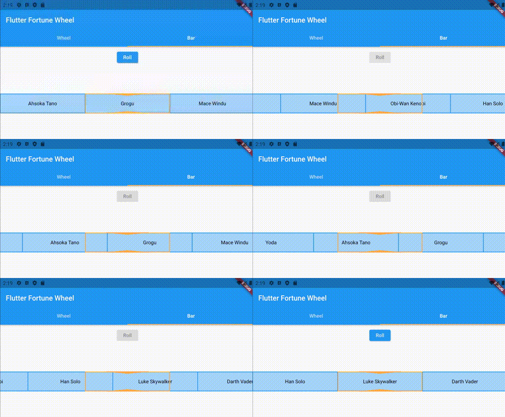
Unfortunately, a circular shape is not the best solution when vertical screen space is scarce. Therefore,
the fortune bar, which is smaller in the vertical direction, is provided as an alternative. See below for an example:
By default, the fortune widgets react to touch and drag input. This behavior can be customized using the physics property, which expects an implementation
of the PanPhysics class.
If you want to disable dragging, simply pass an instance of NoPanPhysics.
FortuneItems can be styled individually using their style property. Styling a FortuneWidget's
items according to a common logic is achieved by passing a StyleStrategy.
By default, the FortuneWheel uses the AlternatingStyleStrategy
and the FortuneBar uses the UniformStyleStrategy.
As with drag behavior, you can pass custom implementations to the styleStrategy property.
// styling FortuneItems individuallyFortuneWheel(
selected: Stream.value(0),
items: [
FortuneItem(
child: Text('A'),
style: FortuneItemStyle(
color: Colors.red, // <-- custom circle slice fill color
borderColor: Colors.green, // <-- custom circle slice stroke color
borderWidth: 3, // <-- custom circle slice stroke width
),
),
FortuneItem(child: Text('B')),
],
)
// common styling for all items of a FortuneWidgetFortuneBar(
// using alternating item styles on a fortune bar
styleStrategy: AlternatingStyleStrategy(),
selected: Stream.value(0),
items: [
FortuneItem(child: Text('Han Solo')),
FortuneItem(child: Text('Yoda')),
FortuneItem(child: Text('Obi-Wan Kenobi')),
],
)
Indicator Styling
The position indicators can be customized by passing a list of FortuneIndicators to FortuneWidget.indicators. By default, the FortuneWheel uses a TriangleIndicator and the FortuneBar uses a RectangleIndicator. You may either pass styled versions of these existing widgets or create your own implementations, since indicators can be any kind of widget. Here is an example of using a customized indicator:
FortuneWheel(
  selected: Stream.value(0),
  indicators: <FortuneIndicator>[
    FortuneIndicator(
      alignment: Alignment.bottomCenter, // <-- changing the position of the indicator
      child: TriangleIndicator(
        color: Colors.green, // <-- changing the color of the indicator
        width: 20.0, // <-- changing the width of the indicator
        height: 20.0, // <-- changing the height of the indicator
        elevation: 0, // <-- changing the elevation of the indicator
      ),
    ),
  ],
  items: [
    FortuneItem(child: Text('A'))
    FortuneItem(child: Text('B')),
  ],
)
Contributions
Contributions are much appreciated.
If you have any ideas for alternative visualizations, feel free to
open a pull request or
raise an issue.
The same holds for any requests regarding existing widgets.