패키지, 저장소 및 앱 카테고리 검색

flutter_pannable_rating_bar 표지
패키지 상세v2.7.2+1

flutter_pannable_rating_bar

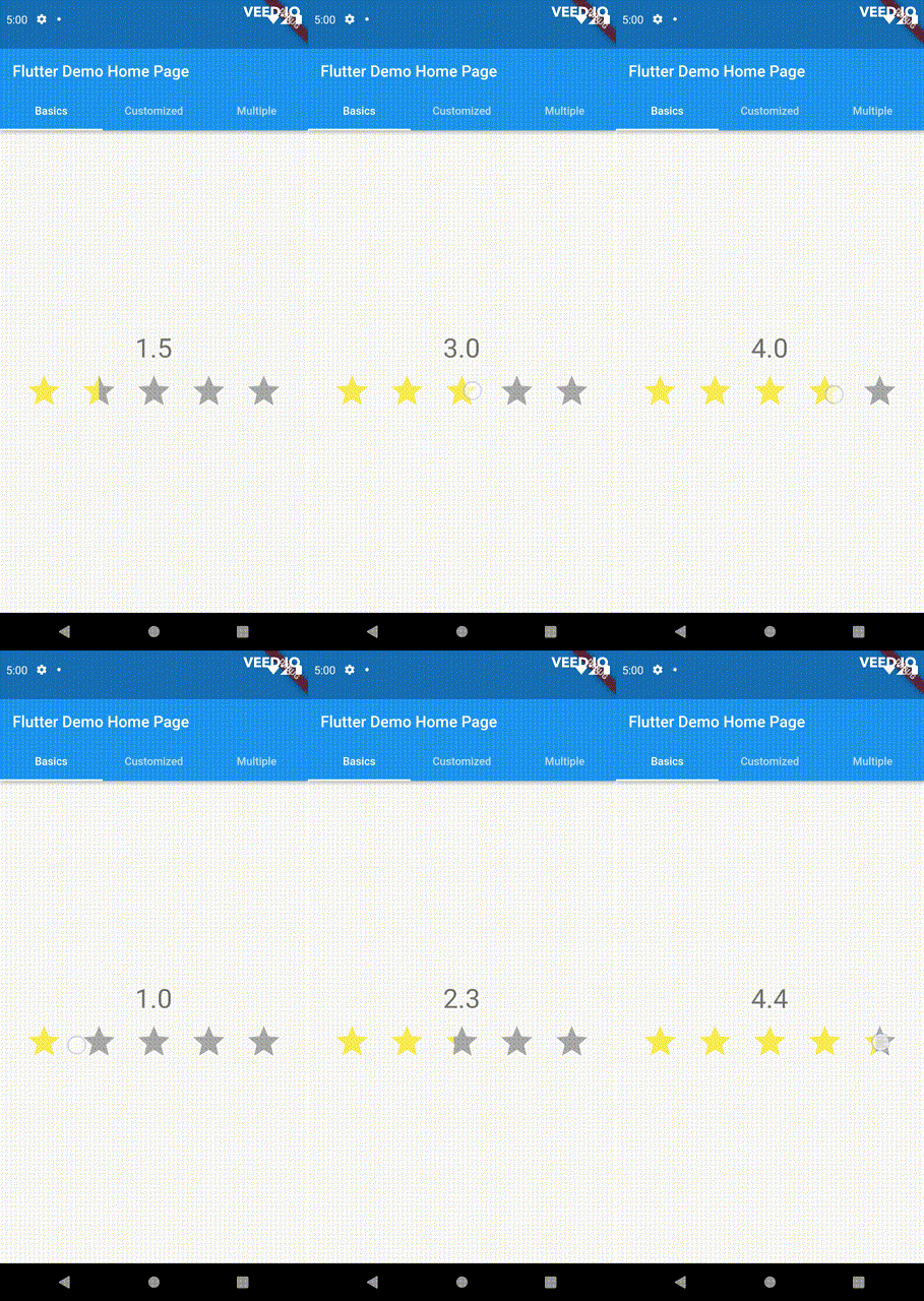
Flutter용 다기능이고 사용자 정의 가능한 평점 바입니다. 이 바는 임의의 분수 값을 선택할 수 있다는 점에서 다른 것들과 차별화됩니다. 드래그, 탭 및 호버 이벤트 모두 지원됩니다.

AndroidiOSWebmacOSWindowsLinux
30일 다운로드
50
좋아요
35
Pub 점수
150

패키지 설치

flutter pub add flutter_pannable_rating_bar

패키지 개요

공개 정보를 바탕으로 생성한 선택 가이드입니다.

Flutter용으로 매우 사용자 정의 가능한 평점 바로, 임의의 분수 평점 값을 선택할 수 있습니다. 전통적인 평점 바와 달리 드래그, 탭, 호버 이벤트를 통해 부드러운 상호작용을 가능하게 하며, 다양한 기기에서 반응성 있고 직관적인 사용자 경험을 제공합니다. 리뷰나 설문 조사와 같이 정밀한 피드백 입력이 필요한 애플리케이션에 이상적입니다. 이 패키지는 Android, iOS, Web, macOS, Windows, Linux 등 모든 주요 플랫폼과 호환됩니다.

사용 사례

  • 사용자 리뷰 및 세부 평가
  • 인터랙티브 설문 인터페이스
  • 앱에서 피드백 수집
  • 실시간 평가 조정
  • 터치 친화적인 UI 컴포넌트

주요 기능

  • 소수점 평가 지원
  • 드래그, 탭 및 호버 상호작용
  • 매우 사용자 정의 가능한 디자인
  • 크로스 플랫폼 호환성
  • 부드러운 애니메이션 전환
  • 사용자 정의 가능한 스텝 크기

적합한 대상

  • 상호작용형 피드백 시스템을 구축하는 개발자
  • 정확한 평가 입력이 필요한 앱
  • 터치 최적화 UI를 원하는 디자이너
  • 다중 플랫폼을 대상으로 하는 프로젝트
  • 동적 평가 컨트롤이 필요한 프로토타입

고려 사항

  • 복잡한 테마에 대해 추가 스타일링이 필요할 수 있습니다
  • 대규모 평가 바 목록에 대한 성능 영향
  • 제스처 충돌을 신중하게 다뤄야 합니다
  • 기본 사용법을 넘어서는 문서가 제한적
  • 매우 높은 빈도의 업데이트에 최적화되지 않음

원본 README

연결된 소스 저장소의 README 원문 스냅샷입니다. 최신 내용은 저장소에서 확인하세요.

pub package

PannableRatingBar

Introducing a new and improved rating bar for Flutter, offering versatility and full customization. Unlike other rating bars, this one allows for any value to be selected, not just full or half ratings when interacted. Tap, drag and hover gestures are seamlessly supported, providing a smooth user experience.

Features

  • Offers fractional values for rating
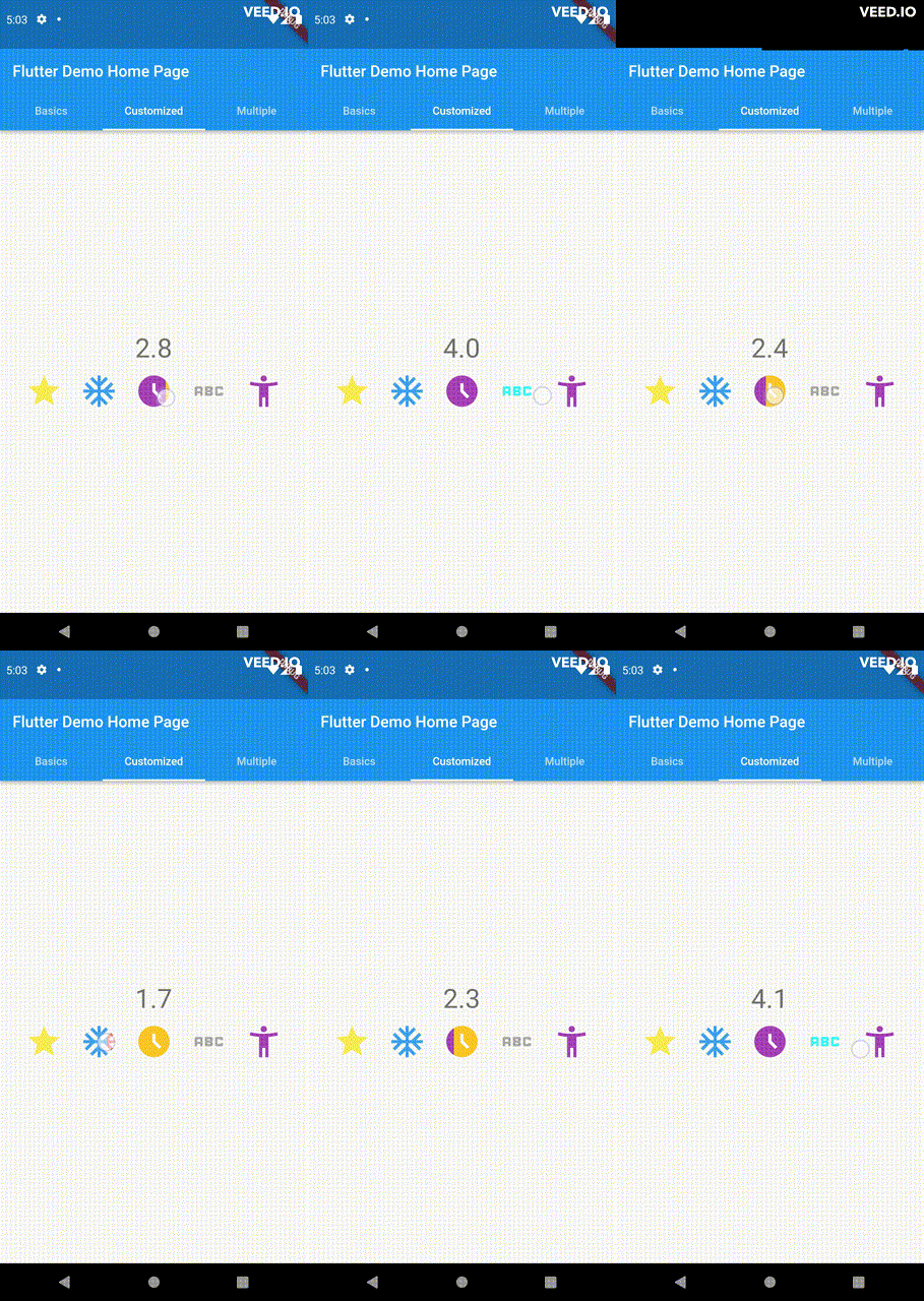
  • High degree of customization for the rating widgets, which can be of different sizes, shapes, and colors.
  • Precise hit testing, as the child widget's render object is utilized to determine the results.
  • Allows for filtering gestures with either tapOnly, dragOnly or tapAndDrag options.
  • Rating reports on cursor hovering supported.
  • Built on Flutter's Wrap widget, offering a variety of supported layouts, including consideration of Wrap properties such as textDirection and verticalDirection when painting the indicators.

Getting started

First import the widget

import 'package:flutter_pannable_rating_bar/flutter_pannable_rating_bar.dart';

Usage

This widget is stateless and highly flexible, allowing you to easily manipulate values and customize the display of the PannableRatingBar. Simply rebuild the widget with the value provided in the onChanged callback or onHover callback and the widget will automatically adjust the rating distribution across each rating widget.

double rating = 0.0;

PannableRatingBar(
  rate: rating,
  items: List.generate(5, (index) =>
    const RatingWidget(
      selectedColor: Colors.yellow,
      unSelectedColor: Colors.grey,
      child: Icon(
        Icons.star,
        size: 48,
      ),
    )),
  onChanged: (value) { // the rating value is updated on tap or drag.
    setState(() {
      rating = value;
    });
  },
)

The widget also supports getting the rate value by hovering with the onHover callback. It works best on devices that support a mouse cursor, including desktop web browsers.

double rating = 0.0;

PannableRatingBar(
  rate: rating,
  items: List.generate(5, (index) =>
    const RatingWidget(
      selectedColor: Colors.yellow,
      unSelectedColor: Colors.grey,
      child: Icon(
        Icons.star,
        size: 48,
      ),
    )),
  onHover: (value) { // the rating value is updated every time the cursor moves over a new item.
    setState(() {
      rating = value;
    });
  },
)

Utilize your own custom widgets as the rating indicators. With complete customization freedom, they don't have to be uniform in size, color, or any other aspect.

double rating = 0.0;

PannableRatingBar(
  rate: rating,
  onChanged: (value) {
    setState(() {
      rating = value;
    });
  },
  items: const [
    RatingWidget(
      selectedColor: Colors.yellow,
      unSelectedColor: Colors.grey,
      child: Icon(
        Icons.star,
        size: 48,
      ),
    ),
    RatingWidget(
      selectedColor: Colors.blue,
      unSelectedColor: Colors.red,
      child: Icon(
        Icons.ac_unit,
        size: 48,
      ),
    ),
    RatingWidget(
      selectedColor: Colors.purple,
      unSelectedColor: Colors.amber,
      child: Icon(
        Icons.access_time_filled,
        size: 48,
      ),
    ),
    RatingWidget(
      selectedColor: Colors.cyanAccent,
      unSelectedColor: Colors.grey,
      child: Icon(
        Icons.abc,
        size: 48,
      ),
    ),
    RatingWidget(
      selectedColor: Colors.tealAccent,
      unSelectedColor: Colors.purple,
      child: Icon(
        Icons.accessibility_new_sharp,
        size: 48,
      ),
    ),
  ],
)
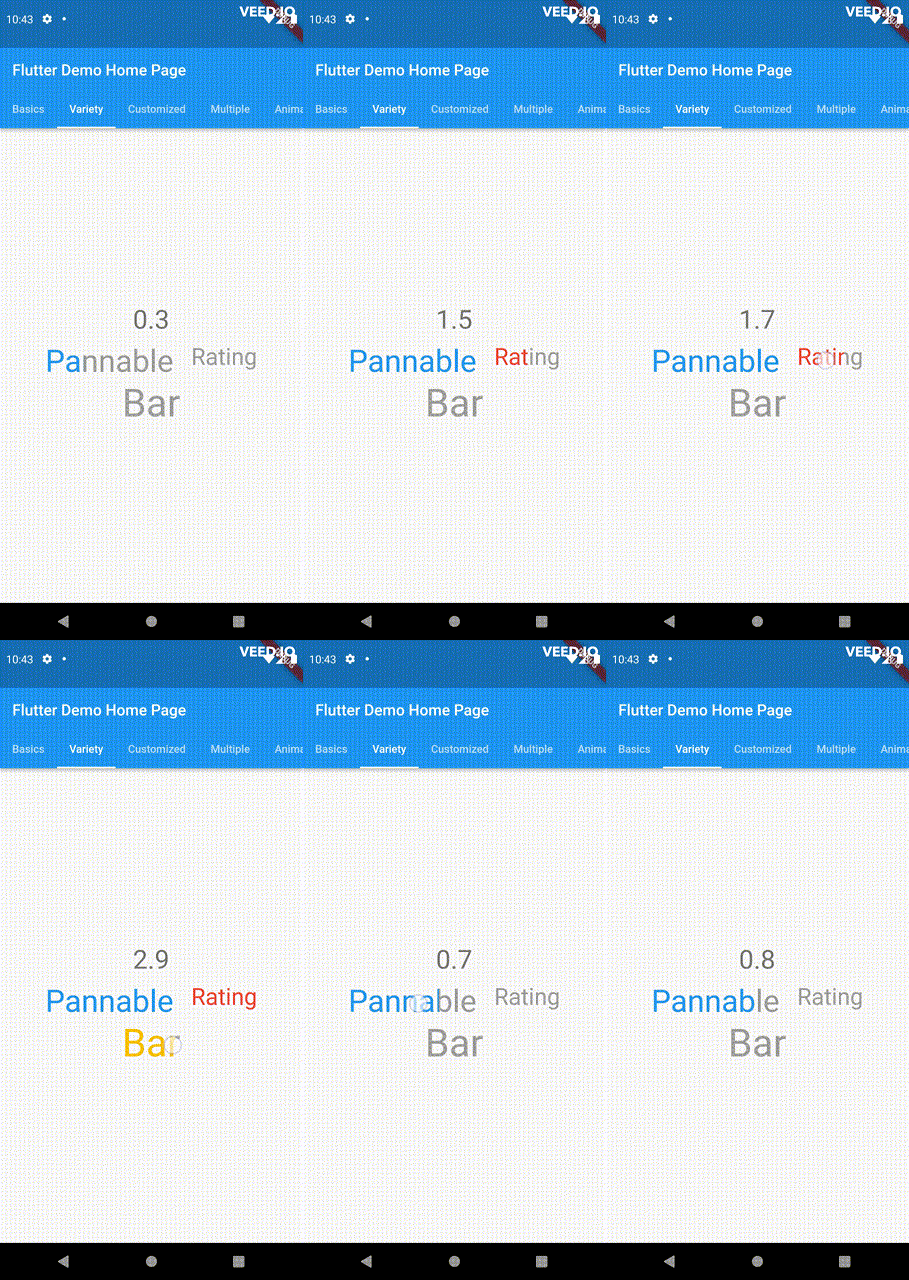
double rating = 0;
PannableRatingBar(
  rate: rating,
  onChanged: (value){
    setState((){
      rating = value;
    });
  },
  spacing: 20,
  items: const [
    RatingWidget(
      selectedColor: Colors.blue,
      child: Text(
        "Pannable",
        style: TextStyle(color: Colors.grey, fontSize: 40),
      ),
    ),
    RatingWidget(
      selectedColor: Colors.red,
      child: Text(
        "Rating",
        style: TextStyle(color: Colors.grey, fontSize: 30),
      ),
    ),
    RatingWidget(
      selectedColor: Colors.amber,
      child: Text(
        "Bar",
        style: TextStyle(color: Colors.grey, fontSize: 50),
      ),
    ),
  ],
),

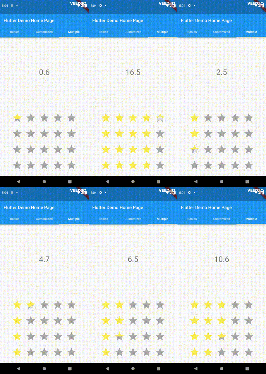
This widget utilizes the layout capabilities of Flutter's built-in Wrap widget, allowing for a wide range of possible layouts to be achieved. The properties of the Wrap widget, such as textDirection and verticalDirection, are also considered when painting the indicators, giving you even greater control over the final look and feel of the rating bar.

double rating = 0.0;

PannableRatingBar.builder(
  rate: rating,
  alignment: WrapAlignment.center,
  spacing: 20,
  runSpacing: 10,
  itemCount: 20,
  direction: Axis.vertical,
  itemBuilder: (context, index) {
    return const RatingWidget(
      selectedColor: Colors.yellow,
      unSelectedColor: Colors.grey,
      child: Icon(
        Icons.star,
        size: 48,
      ),
    );
  },
  onChanged: (value) {
    setState(() {
      rating = value;
    });
  },
)

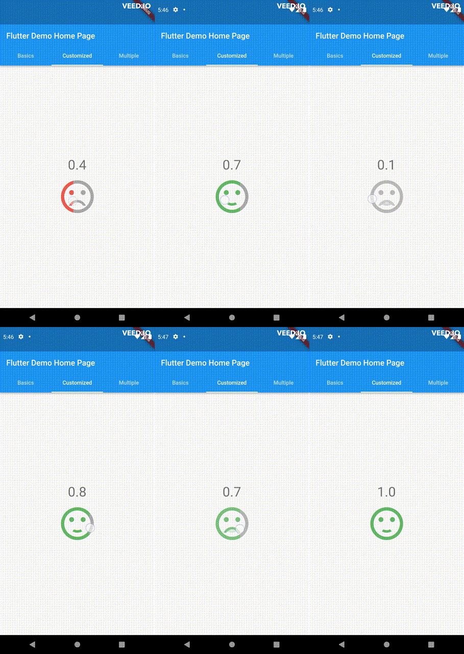
Customize the appearance of the rating indicators based on their values.

double rating = 0;

PannableRatingBar(
    rate: rating,
    spacing: 20,
    onChanged: (value){
      setState((){
        rating = value;
      });
    },
    items: [
      RatingWidget(
        selectedColor: rating <= 0.5 ? Colors.red : Colors.green,
        unSelectedColor: Colors.grey,
        child: AnimatedSwitcher(
          duration: const Duration(milliseconds: 300),
          child: rating <= 0.5
              ? const Icon(
                  Icons.sentiment_very_dissatisfied,
                  key: ValueKey("sad"),
                  size: 100,
                )
              : const Icon(
                  Icons.sentiment_satisfied,
                  key: ValueKey("happy"),
                  size: 100,
                ),
        ),
      ),
    ],
),

For ease of transforming / mutating rating values, the library support using functions to do as such, used as a parameter in PannableRatingBar.

Return null from this will cause the current rating value skipped in all callbacks.

typedef RatingValueTransformer = double? Function(double value);

Some of the pre-built RatingValueTransformers available are:

// Rounding to nearest single fractional digit. This is also the default one that 
// `PannableRatingBar` used.
double singleFractionalValueTransformer(double value);
// Rounding to nearest .5.
double halfFractionalValueTransformer(double value);
// Leave the rating as is.
double rawValueTransformer(double value);

Additional information

For more, checkout and play with the example file. If you have any suggestions for improvement, simply create an issue in the repository!

카테고리

소스 저장소

이 패키지를 사용하는 프로젝트

아직 데이터가 없습니다.