연결된 소스 저장소의 README 원문 스냅샷입니다. 최신 내용은 저장소에서 확인하세요.
Flutter Polls
Customizable Polls for Flutter.
Simple, easy to use and highly customizable.
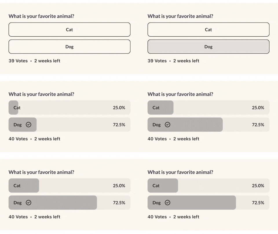
Flutter Polls on pub.dev
Getting Started
In the pubspec.yaml of your flutter project, add the following dependency:
dependencies:
  ...
  flutter_polls: ^0.1.6
Import it:
import 'package:flutter_polls/flutter_polls.dart';
Example
Check out the example project in the example directory here: example on github
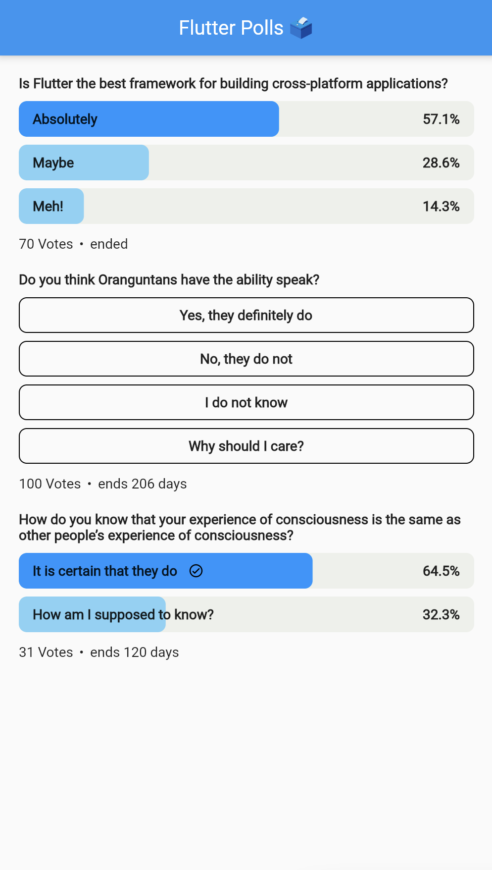
FlutterPolls(
    pollId: '1',
    onVoted: (PollOption pollOption, int newTotalVotes) {
      print('Voted: ${pollOption.id}');
    },
    pollOptionsSplashColor: Colors.white(),
    votedProgressColor: Colors.greyDark().withOpacity(0.3),
    votedBackgroundColor: Colors.grey().withOpacity(0.2),
    votesTextStyle: themeData.textTheme.subtitle1,
    votedPercentageTextStyle:
        themeData.textTheme.headline4?.copyWith(
    color: Colors.black(),
    ),
    votedCheckmark: Icon(
        Icons.circle_check,
        color: AppColors.black(),
        height: 18,
        width: 18,
    ),
    pollTitle: Align(
    alignment: Alignment.centerLeft,
    child: AutoSizeText(
        poll['title'],
        style: TextStyle(
            fontSize: 20,
        ),
    ),
    pollOptions: poll['options'].map(
    (option) {
        return PollOption(
        id: option['id'],
        title: AutoSizeText(
            option['title'],
            style: tTextStyle(
            fontSize: 20,
        ),
        ),
        votes: option['votes'],
        );
    },
    ).toList(),
    metaWidget: Row(
    children: [
        const SizedBox(width: 6),
        AutoSizeText(
        '•',
        style: TextStyle(
            fontSize: 20,
        ),
        ),
        const SizedBox(
        width: 6,
        ),
        AutoSizeText(
        '2 weeks left',
        style: TextStyle(
            fontSize: 20,
        ),
        ),
    ],
    ),
),
Parameters
| Parameter |
Type |
Description |
| pollId |
String |
The poll id. |
| hasVoted |
bool |
Whether the user has voted. |
| userVotedOptionId |
String |
The user voted option id. If the user hasn't voted, this will be null. |
| onVoted |
void Function(PollOption pollOption, int newTotalVotes) |
The callback when the user voted. |
| pollTitle |
Widget |
The poll title. Can be any widget. |
| pollOptions |
List |
The poll options. Each item is a map with the following keys: id, title, votes. |
| heightBetweenTitleAndOptions |
double |
The height between the poll title and the poll options. |
| heightBetweenOptions |
double |
The height between the poll options. |
| votesText |
String |
Votes text. Can be "Votes", "Votos", "Ibo" or whatever language. If not specified, "Votes" is used. |
| votesTextStyle |
TextStyle |
The style of the votes text. |
| metaWidget |
Widget |
The meta widget. Can be any widget. |
| createdBy |
String |
The poll creator. |
| userToVote |
String |
The user to vote. |
| pollStartDate |
DateTime |
The poll start date. |
| pollEnded |
bool |
If the poll is closed. |
| pollOptionsHeight |
double |
The poll options height. |
| pollOptionsWidth |
double |
The poll options width. |
| pollOptionsBorderRadius |
BorderRadius |
The poll options border radius. |
| pollOptionsBorder |
BoxBorder |
The poll options border. |
| pollOptionsFillColor |
Color |
The poll options fill color. |
| pollOptionsSplashColor |
Color |
The poll options splash color. |
| votedPollOptionsRadius |
Radius |
The voted poll options border radius. |
| votedBackgroundColor |
Color |
The voted poll options background color. |
| votedProgressColor |
Color |
The voted poll options progress color. |
| voteInProgressColor |
Color |
The voted poll options background color when user has voted and its still in progress. |
| votedCheckmark |
Widget |
The voted poll options checkmark. |
| votedPercentageTextStyle |
TextStyle |
The voted poll options percentage text style. |
| votedAnimationDuration |
int |
The voted poll options animation duration. |
| loadingWidget |
Widget |
The loading widget when a user votes. Can be any widget. |

