패키지, 저장소 및 앱 카테고리 검색

flutter_scrolling_fab_animated 표지
패키지 상세v0.1.5

flutter_scrolling_fab_animated

스크롤 다운 시 크기가 변경되는 플로팅 버튼을 추가하기 위한 패키지

AndroidiOSWebmacOSWindowsLinux
30일 다운로드
484
좋아요
68
Pub 점수
160

패키지 설치

flutter pub add flutter_scrolling_fab_animated

패키지 개요

공개 정보를 바탕으로 생성한 선택 가이드입니다.

스크롤 이벤트에 반응하여 플로팅 액션 버튼(FAB)을 애니메이션화함으로써 사용자 경험을 향상시키는 플러터 패키지입니다. 사용자가 아래로 스크롤할수록 FAB는 작아지거나 사라지고, 위로 스크롤할 때는 확대되거나 다시 나타납니다. 이 동작은 UI의 정돈을 유지하면서도 주요 작업을 쉽게 접근 가능하게 해줍니다. 이 패키지는 Android, iOS, 웹, macOS, Windows, Linux 등 모든 주요 플랫폼을 지원하며, 일관된 크로스플랫폼 디자인에 이상적입니다.

사용 사례

  • 스크롤 기반의 FAB 애니메이션
  • 동적 FAB을 활용한 모바일 앱 UX 향상
  • 스크롤 시 숨겨진 FAB을 사용하여 깔끔한 인터페이스 만들기
  • 다중 플랫폼 간 일관된 FAB 동작
  • 스크롤 가능한 목록에서 시각적 계층 구조 개선

주요 기능

  • 스크롤 시 자동 FAB 크기 애니메이션
  • 크로스 플랫폼 호환성
  • 기존 스크롤 뷰와의 간단한 통합
  • 사용자 정의 가능한 애니메이션 곡선
  • FAB의 축소 및 확장 모두를 지원

적합한 대상

  • 모바일 및 웹 앱 개발자
  • 인터랙티브 UI에 집중하는 디자이너
  • 긴 스크롤 가능한 콘텐츠를 가진 앱
  • 경량 FAB 개선 기능을 찾는 개발자
  • 플랫폼에 관계없는 컴포넌트가 필요한 프로젝트

고려 사항

  • 최적의 애니메이션 타이밍을 위해 세부 조정이 필요할 수 있습니다
  • 단일 스크롤 화면에 가장 적합
  • 크기와 가시성 외에 사용자 정의가 제한적
  • 복잡한 중첩 스크롤 시나리오에 적합하지 않음
  • 부모 스크롤 가능한 위젯의 동작에 따라 다릅니다

원본 README

연결된 소스 저장소의 README 원문 스냅샷입니다. 최신 내용은 저장소에서 확인하세요.

Flutter Scrolling Fab Animated

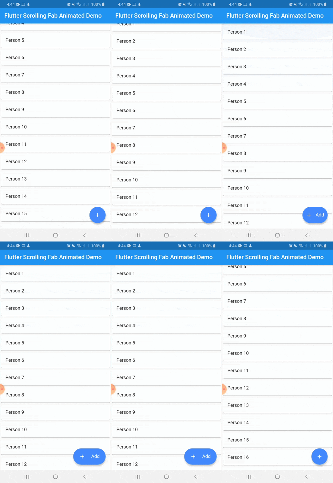
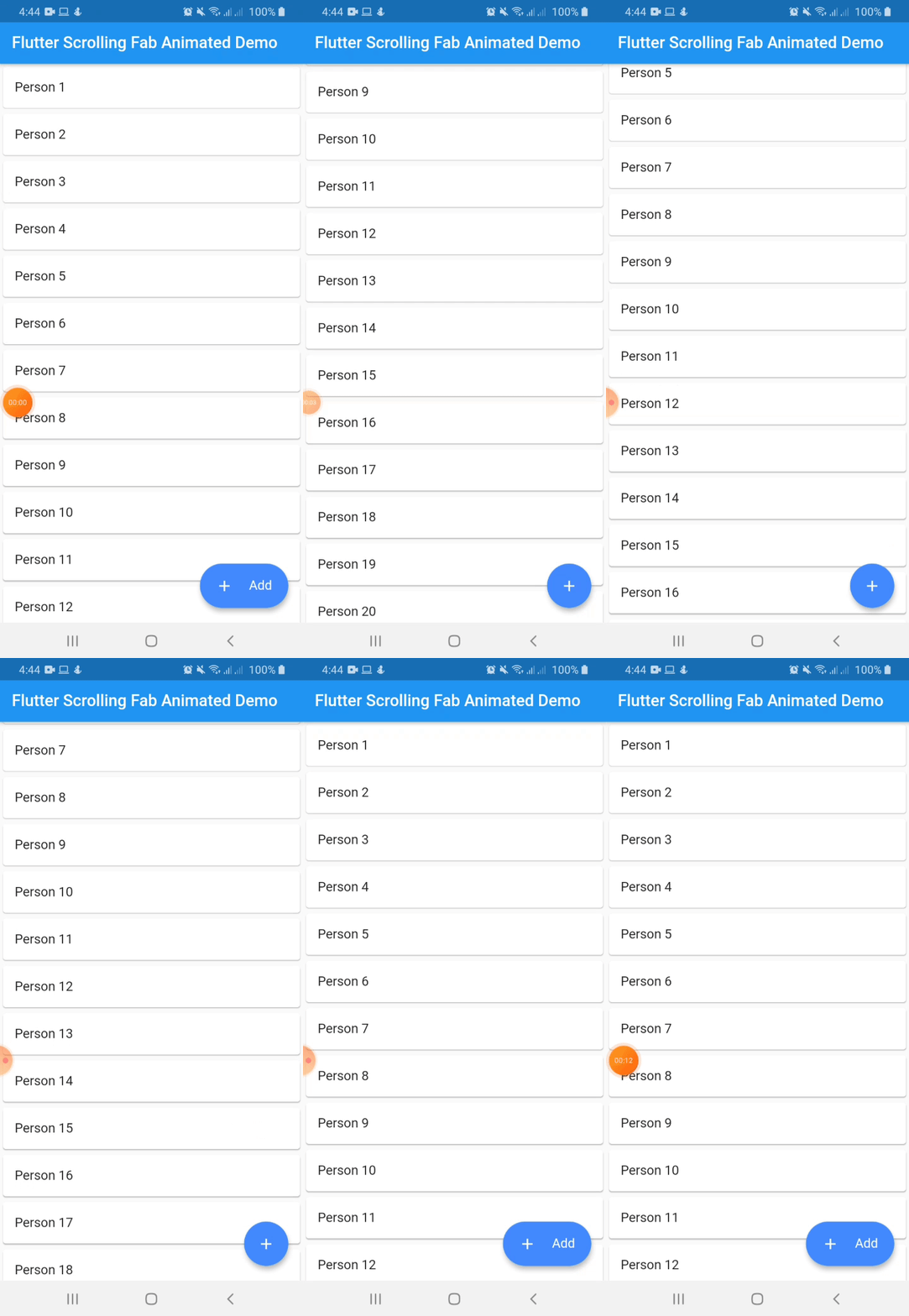
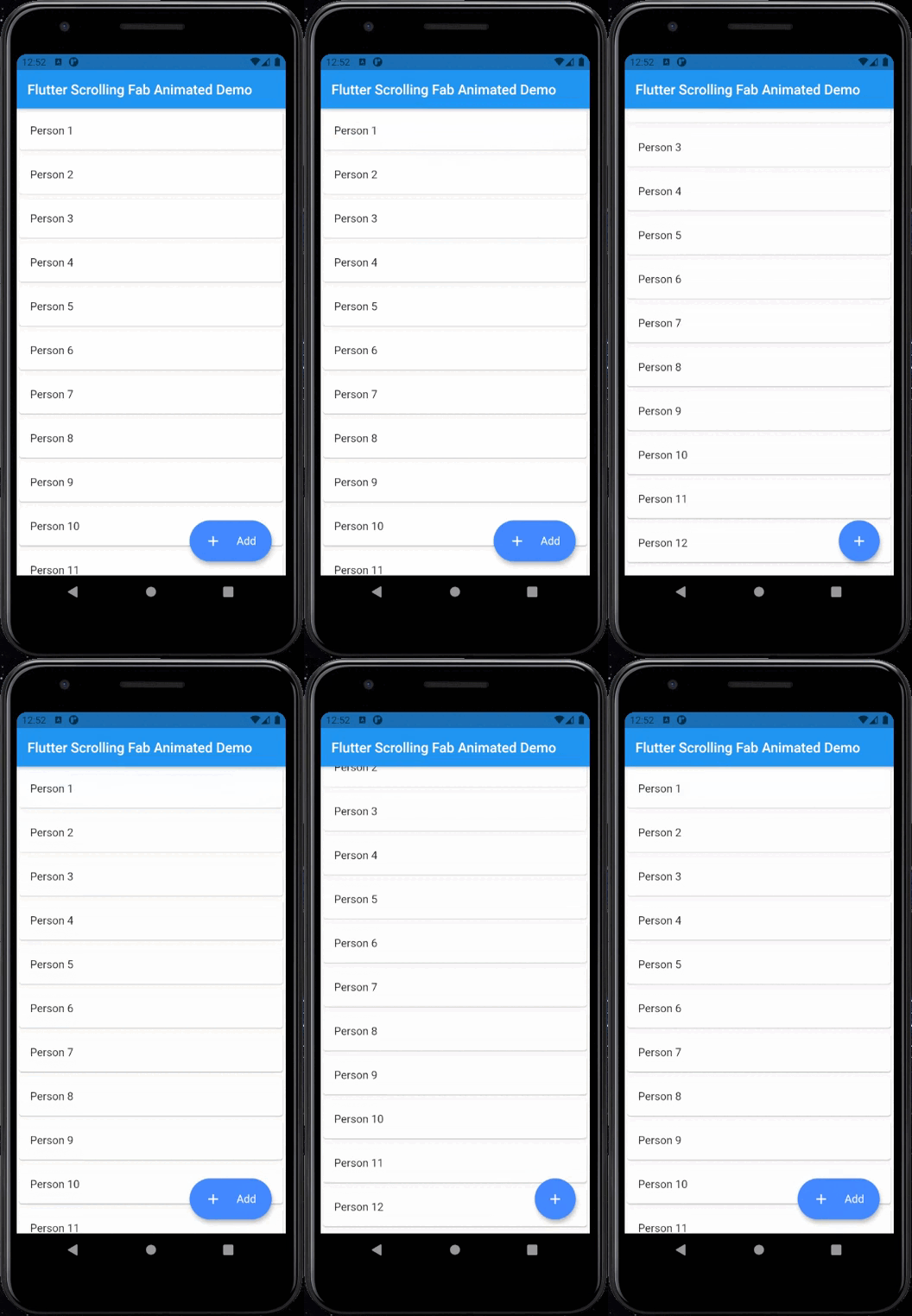
This package is a floating button whose change of size when scroll down and return to its original size when on top again. It's useful with ListView widget and other scrollable widgets.

With animated icon

New Features 💥

  • Adding on long press support
  • Adding ripple effect for the button
  • Removing square shadow around the button when pressing it
  • Added gradient background

Instalation

Include flutter_scrolling_fab_animated in your pubspec.yaml file:

dependencies:
  flutter:
    sdk: flutter
  flutter_scrolling_fab_animated: version

Usage

To use this package, just import it into your file and enjoy it.

import 'package:bottom_sheet_expandable_bar/bottom_sheet_bar_icon.dart';
import 'package:flutter_scrolling_fab_animated/flutter_scrolling_fab_animated.dart';

...

  @override
  Widget build(BuildContext context) {
    return Scaffold(
      appBar: AppBar(
        title: Text('Flutter Scrolling Fab Animated Demo'),
      ),
      body: Container(
        child: new ListView.builder(
          controller: _scrollController,
          itemCount: items.length,
          itemBuilder: (BuildContext ctxt, int index) {
            return new Card(
              child: ListTile(
                title: Text(items[index]),
              )
            );
          }
        ),
      ),
      floatingActionButton: ScrollingFabAnimated(
        icon: Icon(Icons.add, color: Colors.white,),
        text: Text('Add', style: TextStyle(color: Colors.white, fontSize: 16.0),),
        onPress: (){},
        scrollController: _scrollController,
        gradient: const LinearGradient(colors: [Color(0xff0CA2E6),Color(0xff2E3D97),],begin: Alignment.topCenter, end: Alignment.bottomCenter),
        animateIcon: true,
        inverted: false,
        radius: 10.0,
      )
    );
  }

...

Example with a GridView

import 'package:bottom_sheet_expandable_bar/bottom_sheet_bar_icon.dart';
import 'package:flutter_scrolling_fab_animated/flutter_scrolling_fab_animated.dart';

...

  @override
  Widget build(BuildContext context) {
    return Scaffold(
      appBar: AppBar(
        title: Text('Flutter Scrolling Fab Animated Demo'),
      ),
      body: Container(
        child: new GridView.builder(
          gridDelegate: SliverGridDelegateWithFixedCrossAxisCount(crossAxisCount: 2),
          controller: _scrollController,
          itemCount: items.length,
          itemBuilder: (BuildContext ctxt, int index) {
            return new Card(
              child: ListTile(
                title: Center(child: Text(items[index])),
              )
            );
          }),
      ),
      floatingActionButton: ScrollingFabAnimated(
        icon: Icon(Icons.add, color: Colors.white,),
        text: Text('Add', style: TextStyle(color: Colors.white, fontSize: 16.0),),
        onPress: (){},
        scrollController: _scrollController,
        animateIcon: true,
        inverted: false,
        radius: 10.0,
      )
    );
  }

...

Properties
Name Description Required Default
icon Widget to use as button icon True
text Widget to use as button text when button is expanded True
onPress Function to use when press the button True
scrollController ScrollController to use to determine when user is on top or not True
elevation Double value to set the button elevation False 5.0
shadowColor Color value to set the button shadow color False ThemeData.shadowColor
width Double value to set the button width when is expanded False 120.0
height Double value to set the button height False 60.0
duration Value to set the duration for animation False 250 milliseconds
curve Value to set the curve for animation False Curves.easeInOut
limitIndicator Double value to set the boundary value when scroll animation is triggered False 10.0
color Color to set the button background color False Colors.blueAccent
gradient Color to set the button background gradient False null
animateIcon Value to indicate if animate or not the icon False true
inverted Value to inverte the behavior of the animation False false
radius Double value to set the button radius False null

카테고리

소스 저장소

이 패키지를 사용하는 프로젝트

아직 데이터가 없습니다.