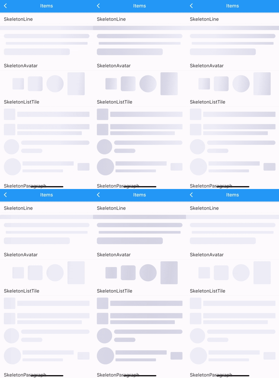
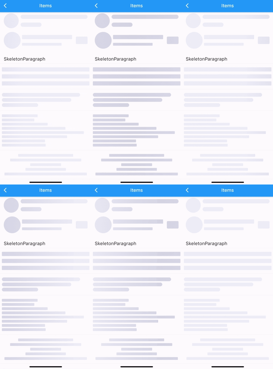
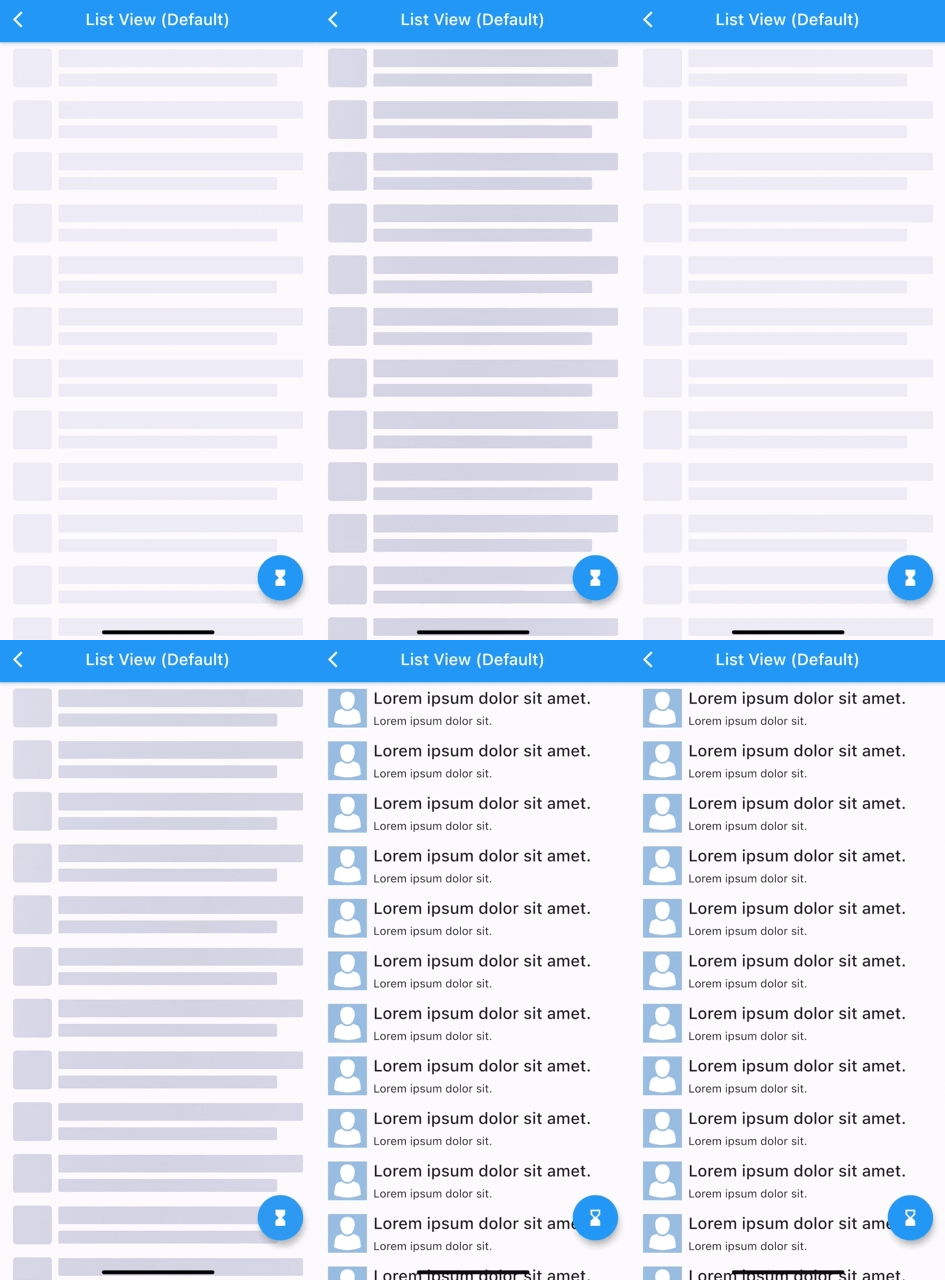
연결된 소스 저장소의 README 원문 스냅샷입니다. 최신 내용은 저장소에서 확인하세요.
Flutter Skeletons
Clone of skeletons
A Flutter package for building custom skeleton widgets to mimic the page's layout while loading.
Installation
flutter pub add flutter_skeleton_ui
Examples
| ListView (Custom) |
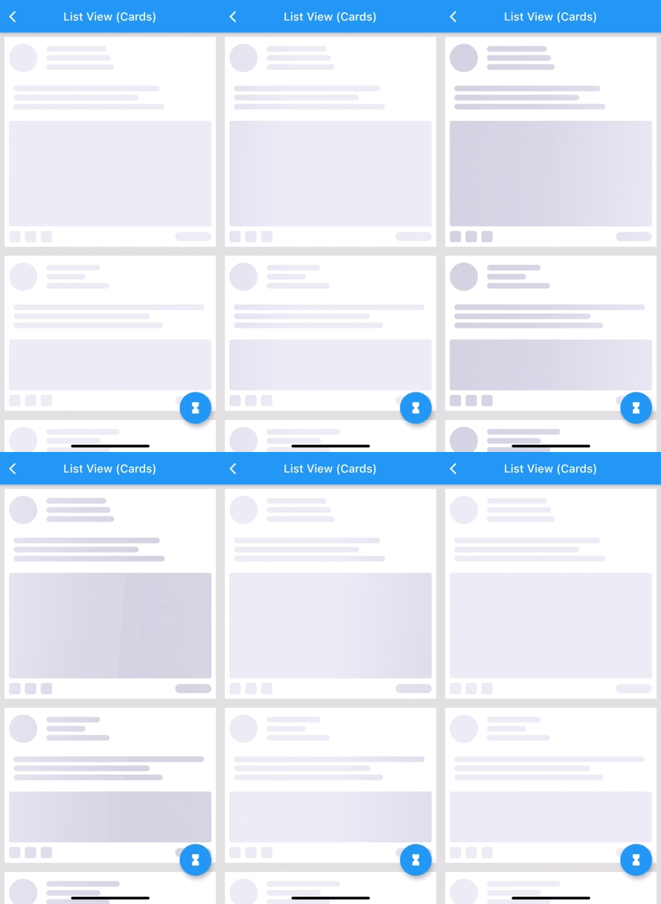
ListView (Complex Cards) |
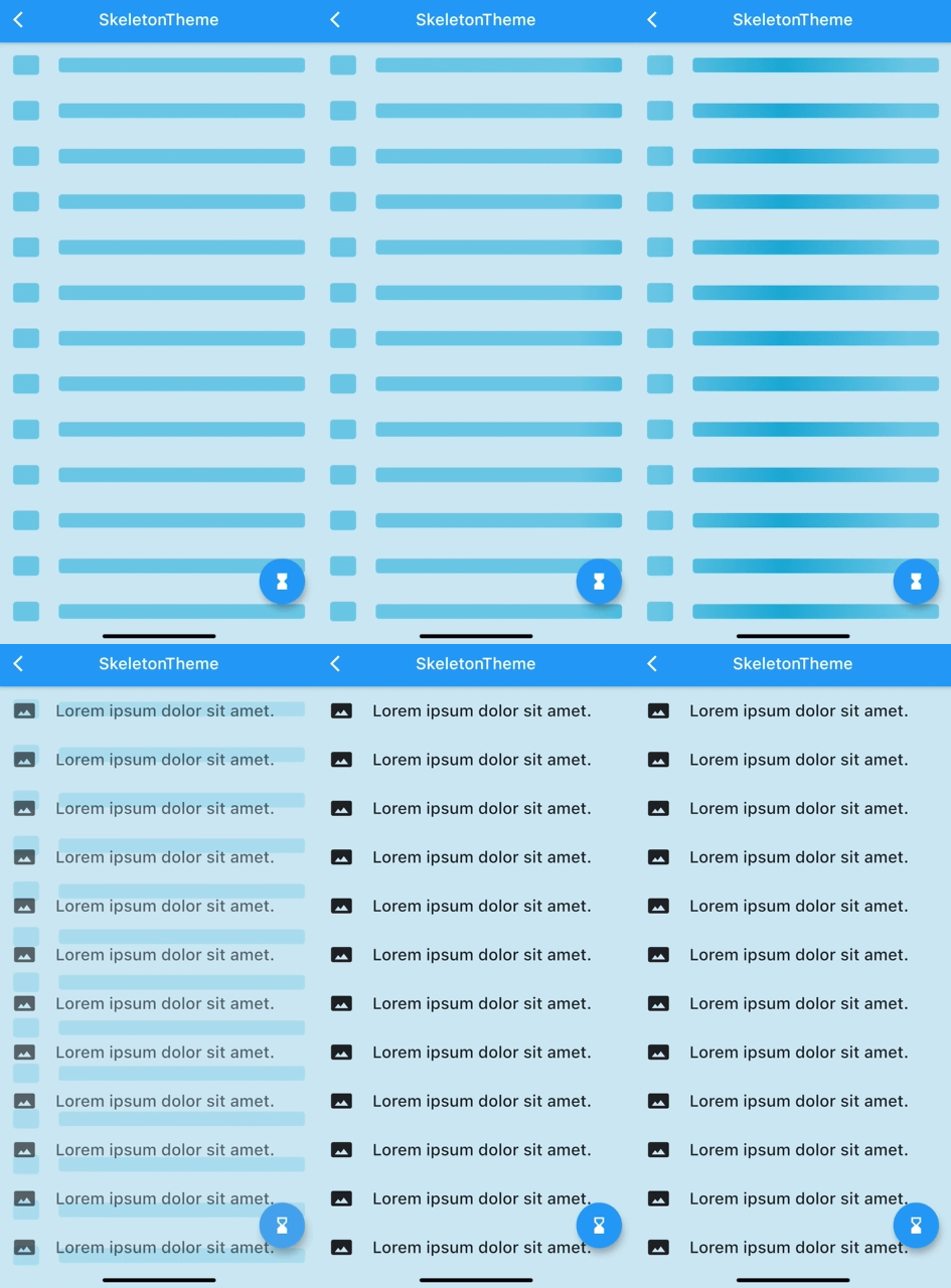
SkeletonTheme |
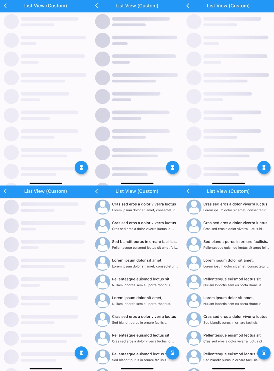 |
 |
 |
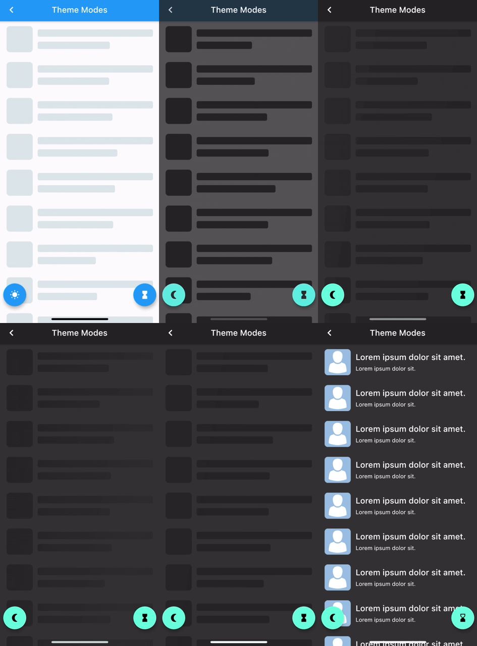
| Light/Dark modes |
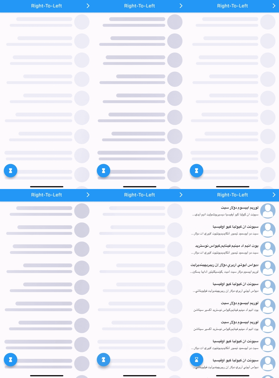
Right-To-Left |
Custom Shimmer |
 |
 |
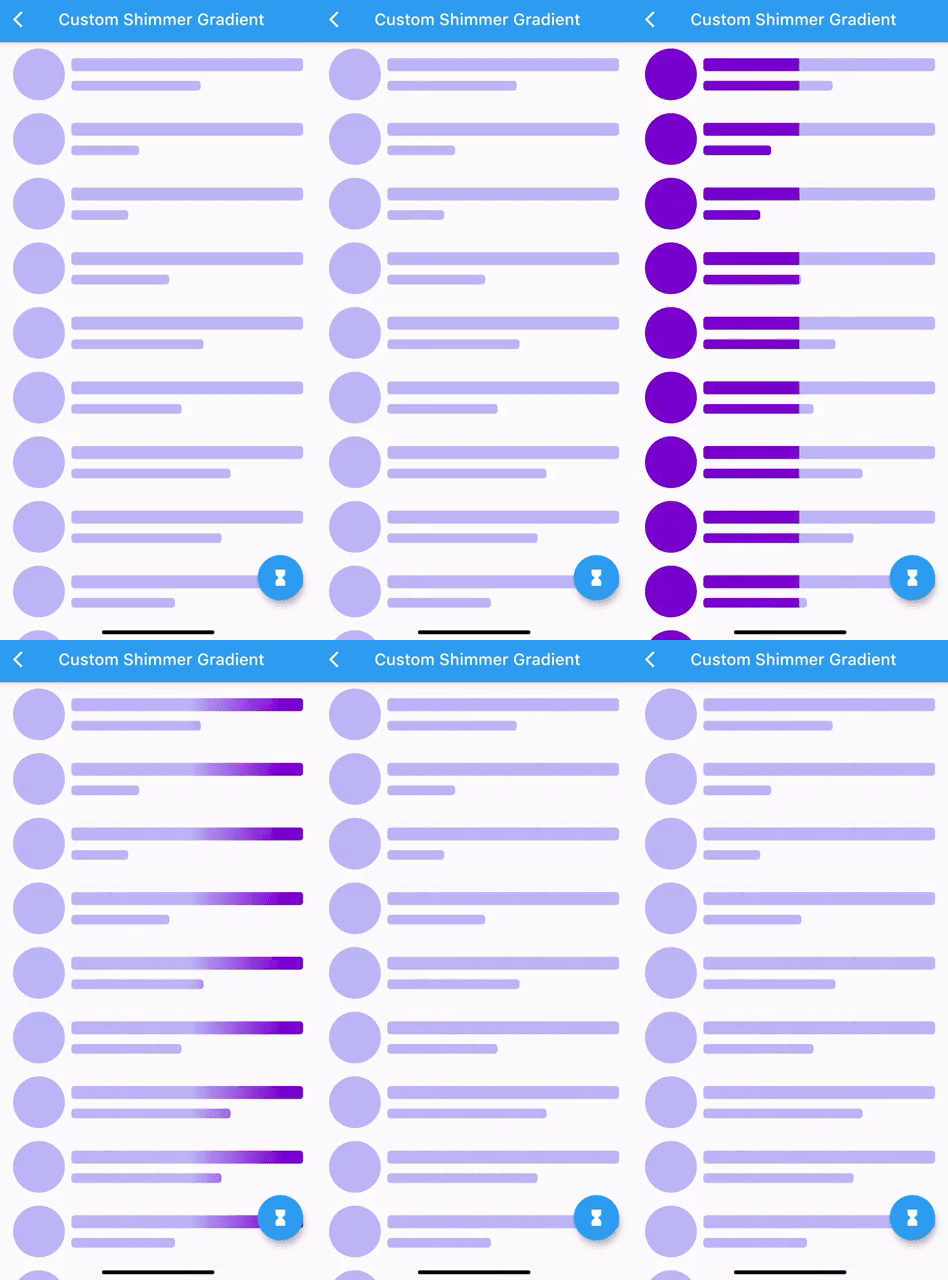 |
All examples can be found here examples.
How To Use
Can be used by encapsulating the child widget in a Skeleton widget:
import 'package:flutter_skeleton_ui/flutter_skeleton_ui.dart';

Skeleton(
        isLoading: _isLoading,
        skeleton: SkeletonListView(),
        child: Container(child: Center(child: Text("Content"))),
      )
or directly:
Container(
    child: _isLoading
    ? SkeletonListView()
    : Container(child: Center(
                       child: Text("Content"))),
)
a SkeletonTheme can be used to set the default configs for all skeleton descendants in the tree.
SkeletonTheme(
shimmerGradient: LinearGradient(
colors: [
Color(0xFFD8E3E7),
Color(0xFFC8D5DA),
Color(0xFFD8E3E7),
],
stops: [
0.1,
0.5,
0.9,
],
),
darkShimmerGradient: LinearGradient(
colors: [
Color(0xFF222222),
Color(0xFF242424),
Color(0xFF2B2B2B),
Color(0xFF242424),
Color(0xFF222222),
],
stops: [
0.0,
0.2,
0.5,
0.8,
1,
],
begin: Alignment(-2.4, -0.2),
end: Alignment(2.4, 0.2),
tileMode: TileMode.clamp,
),
child: MateriaApp(
...
),
),
More Customization:
| ListView (Complex Cards) |
|
for more complex shapes you can build your skeleton inside a SkeletonItem widget:
ListView.builder(
  physics: NeverScrollableScrollPhysics(),
  itemCount: 5,
  itemBuilder: (context, index) => Padding(
    padding: const EdgeInsets.all(8.0),
    child: Container(
      padding: const EdgeInsets.all(8.0),
      decoration: BoxDecoration(color: Colors.white),
      child: SkeletonItem(
          child: Column(
        children: [
          Row(
            children: [
              SkeletonAvatar(
                style: SkeletonAvatarStyle(
                    shape: BoxShape.circle, width: 50, height: 50),
              ),
              SizedBox(width: 8),
              Expanded(
                child: SkeletonParagraph(
                  style: SkeletonParagraphStyle(
                      lines: 3,
                      spacing: 6,
                      lineStyle: SkeletonLineStyle(
                        randomLength: true,
                        height: 10,
                        borderRadius: BorderRadius.circular(8),
                        minLength: MediaQuery.of(context).size.width / 6,
                        maxLength: MediaQuery.of(context).size.width / 3,
                      )),
                ),
              )
            ],
          ),
          SizedBox(height: 12),
          SkeletonParagraph(
            style: SkeletonParagraphStyle(
                lines: 3,
                spacing: 6,
                lineStyle: SkeletonLineStyle(
                  randomLength: true,
                  height: 10,
                  borderRadius: BorderRadius.circular(8),
                  minLength: MediaQuery.of(context).size.width / 2,
                )),
          ),
          SizedBox(height: 12),
          SkeletonAvatar(
            style: SkeletonAvatarStyle(
              width: double.infinity,
              minHeight: MediaQuery.of(context).size.height / 8,
              maxHeight: MediaQuery.of(context).size.height / 3,
            ),
          ),
          SizedBox(height: 8),
          Row(
            mainAxisAlignment: MainAxisAlignment.spaceBetween,
            children: [
              Row(
                children: [
                  SkeletonAvatar(
                      style: SkeletonAvatarStyle(width: 20, height: 20)),
                  SizedBox(width: 8),
                  SkeletonAvatar(
                      style: SkeletonAvatarStyle(width: 20, height: 20)),
                  SizedBox(width: 8),
                  SkeletonAvatar(
                      style: SkeletonAvatarStyle(width: 20, height: 20)),
                ],
              ),
              SkeletonLine(
                style: SkeletonLineStyle(
                    height: 16,
                    width: 64,
                    borderRadius: BorderRadius.circular(8)),
              )
            ],
          )
        ],
      )),
    ),
  ),
);
Issues and feedback
For issues, please report here. Contributions are welcome.