패키지, 저장소 및 앱 카테고리 검색

flutter_slider_drawer 표지
패키지 상세v3.0.2

flutter_slider_drawer

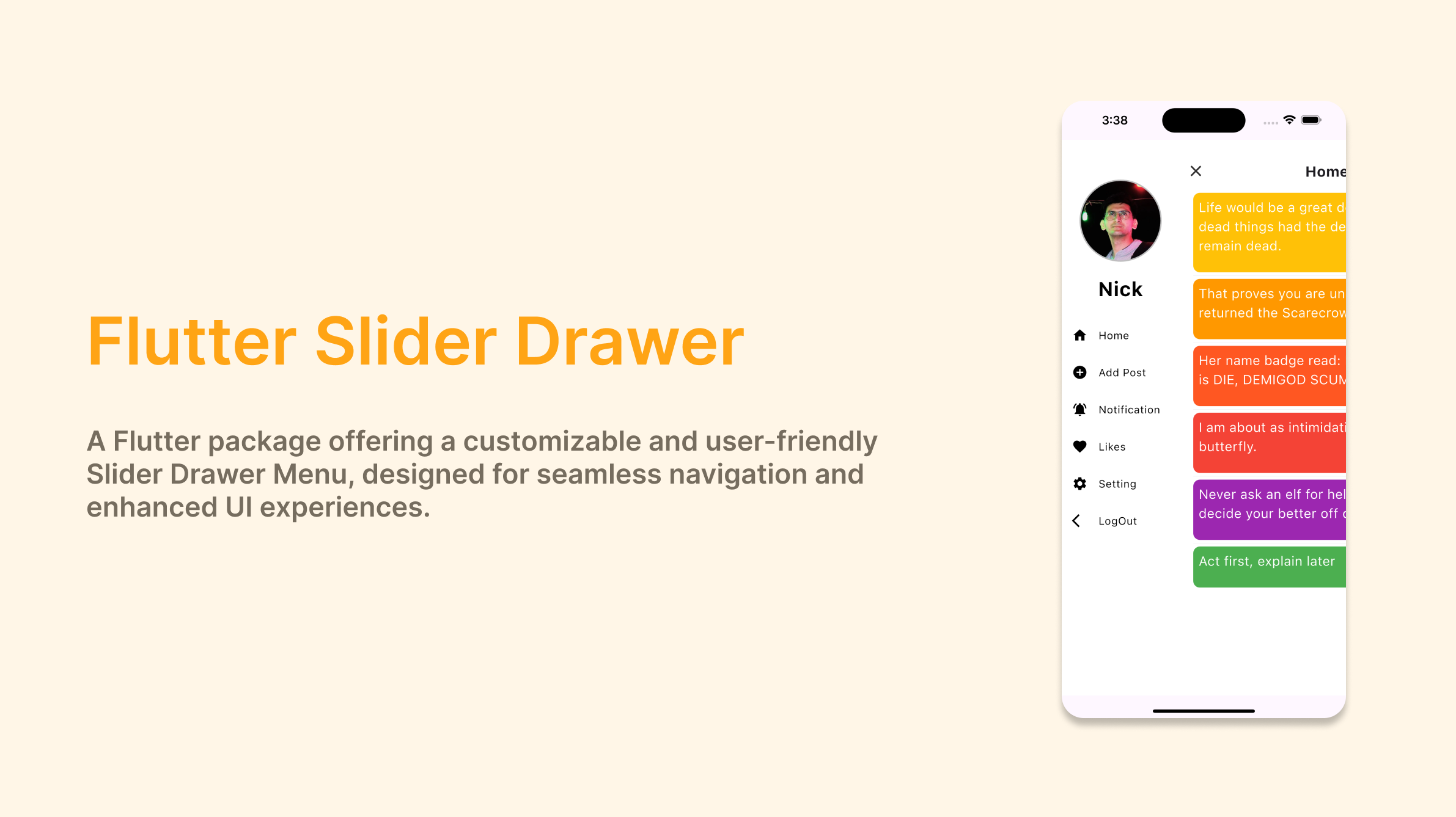
슬라이더 드로어 메뉴의 사용자 정의 구현을 포함한 Flutter 패키지

AndroidiOSWebmacOSWindowsLinux
30일 다운로드
7.9천
좋아요
597
Pub 점수
160

패키지 설치

flutter pub add flutter_slider_drawer

패키지 개요

공개 정보를 바탕으로 생성한 선택 가이드입니다.

독특하고 부드러운 슬라이딩 애니메이션을 제공하는 사용자 정의 가능한 슬라이딩 드로어 메뉴를 제공하는 플러터 패키지입니다. 모바일 및 웹 애플리케이션에서 직관적인 탐색을 위해 설계되었으며, 표준 네비게이션 드로어의 현대적인 대안을 제공합니다. Android, iOS, Web, macOS, Windows, Linux 등 여러 플랫폼을 지원하여 장치 간 일관된 동작을 보장합니다. 가벼운 구현과 pub를 통한 간편한 통합으로 개발자는 앱에 인터랙티브한 사이드 메뉴를 빠르게 추가할 수 있습니다. 스와이프 제스처, 애니메이션 속도, 스타일링 등의 커스터마이징 옵션이 있습니다. 세련되고 제스처 기반의 탐색 경험을 필요로 하는 앱에 적합합니다.

사용 사례

  • 모바일 앱 탐색
  • 웹 대시보드 사이드바
  • 제스처 기반 메뉴 상호작용
  • 크로스 플랫폼 UI 일관성
  • 사용자 정의 가능한 슬라이드 인 메뉴

주요 기능

  • 부드러운 슬라이딩 애니메이션
  • 제스처 지원
  • 크로스 플랫폼 호환성
  • 사용자 정의 가능한 외관
  • 간편한 퍼블리싱 통합

적합한 대상

  • 현대적인 탐색을 찾는 개발자
  • 스와이프 가능한 사이드 패널이 필요한 앱
  • 다중 플랫폼을 대상으로 하는 프로젝트
  • UI 중심의 플러터 애플리케이션
  • 애니메이션 드로어를 원하는 디자이너

고려 사항

  • 드로워 스타일 레이아웃에 제한됨
  • 중첩된 탐색을 수동으로 처리해야 합니다
  • 추가 상태 관리가 필요할 수 있습니다
  • 복잡한 다단계 메뉴에는 적합하지 않습니다
  • 애니메이션 성능은 장치 기능에 따라 달라집니다

원본 README

연결된 소스 저장소의 README 원문 스냅샷입니다. 최신 내용은 저장소에서 확인하세요.

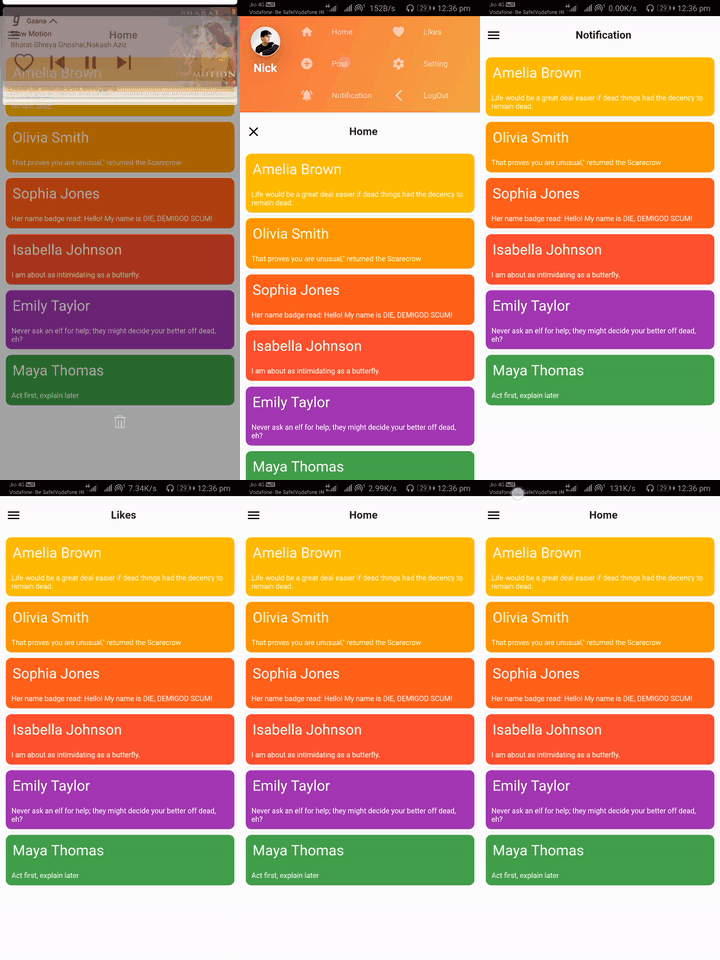
slider_document

Flutter Slider Drawer

pub package pub package

A Flutter package with custom implementation of the Slider Drawer Menu

To start using this package, add flutter_slider_drawer dependency to your pubspec.yaml

dependencies:
  flutter_slider_drawer: '<latest_release>'

Features

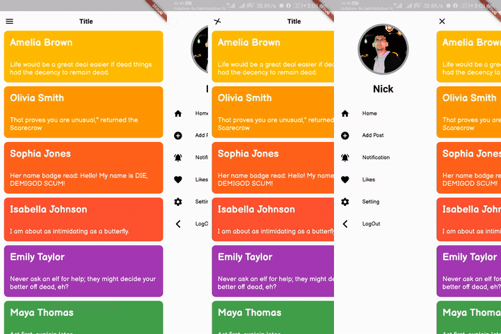
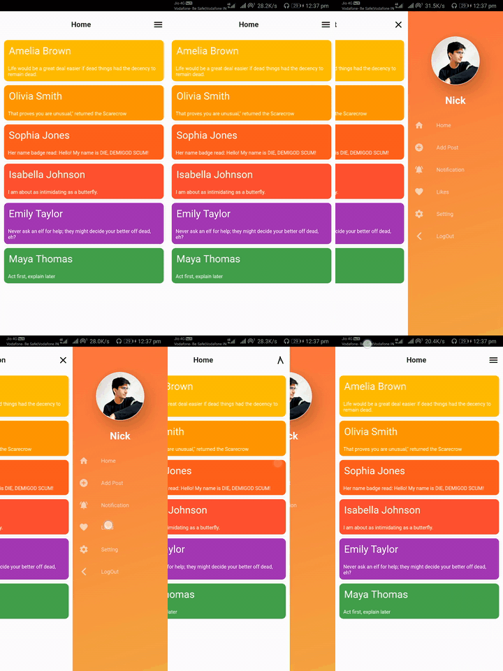
  • Slider with custom animation time
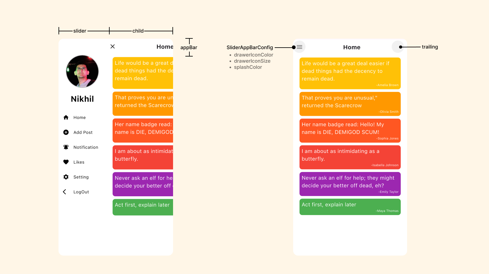
  • Provide Basic Appbar with customization of color and title
  • Dynamic slider open and close offset
  • Provide drawer icon animation
  • Provide shadow of Main screen with customization of shadow colors,blurRadius and spreadRadius
  • Provide RTL(RightToLeft),LTR(LeftToRight) and TTB(TopToBottom) slider open selection
  • Provide Custom Appbar support and you can also use plugin appBar with use of SliderAppBar widget
  • If you are using CupertinoApp then pass isCupertino: true

Code

  Widget build(BuildContext context) {
    return Scaffold(
      body: SliderDrawer(
        key: _sliderDrawerKey,
        appBar: SliderAppBar(
          config: SliderAppBarConfig(
            title: Text(
              title,
              textAlign: TextAlign.center,
              style: const TextStyle(
                fontSize: 22,
                fontWeight: FontWeight.w700,
              ),
            ),
          ),
        ),
        sliderOpenSize: 179,
        slider: Container(color: Colors.red),
        child: Container(color: Colors.amber),
      ),
    );
  }


slider_document


Slider open

SliderOpen.LEFT_TO_RIGHT SliderOpen.RIGHT_TO_LEFT SliderOpen.TOP_TO_BOTTOM
slider_left slider_right slider_top

Controlling the drawer
class _MyAppState extends State<MyApp> {
   GlobalKey<SliderDrawerState> _sliderDrawerKey =
      GlobalKey<SliderDrawerState>();

  @override
  Widget build(BuildContext context) {
    return Scaffold(
      body: SliderDrawer(
        key: _sliderDrawerKey,
        appBar: SliderAppBar(
          config: SliderAppBarConfig(
            title: Text(
              title,
              textAlign: TextAlign.center,
              style: const TextStyle(
                fontSize: 22,
                fontWeight: FontWeight.w700,
              ),
            ),
          ),
        ),
        sliderOpenSize: 179,
        slider: Container(color: Colors.red),
        child: Container(color: Colors.amber),
      ),
    );
  }
}
      
  • Using the below methods to control drawer .
 _sliderDrawerKey.currentState.closeDrawer();
 _sliderDrawerKey.currentState.openDrawer();
 _sliderDrawerKey.currentState.toggle();
 _sliderDrawerKey.currentState.isDrawerOpen();

  • Use below variable if you want to control animation.

__sliderDrawerKey.currentState.animationController

Contribute to Development

Your contribution will help improve the plugin

Buy Me A Coffee

License

BSD 2-Clause License

카테고리

소스 저장소

이 패키지를 사용하는 프로젝트