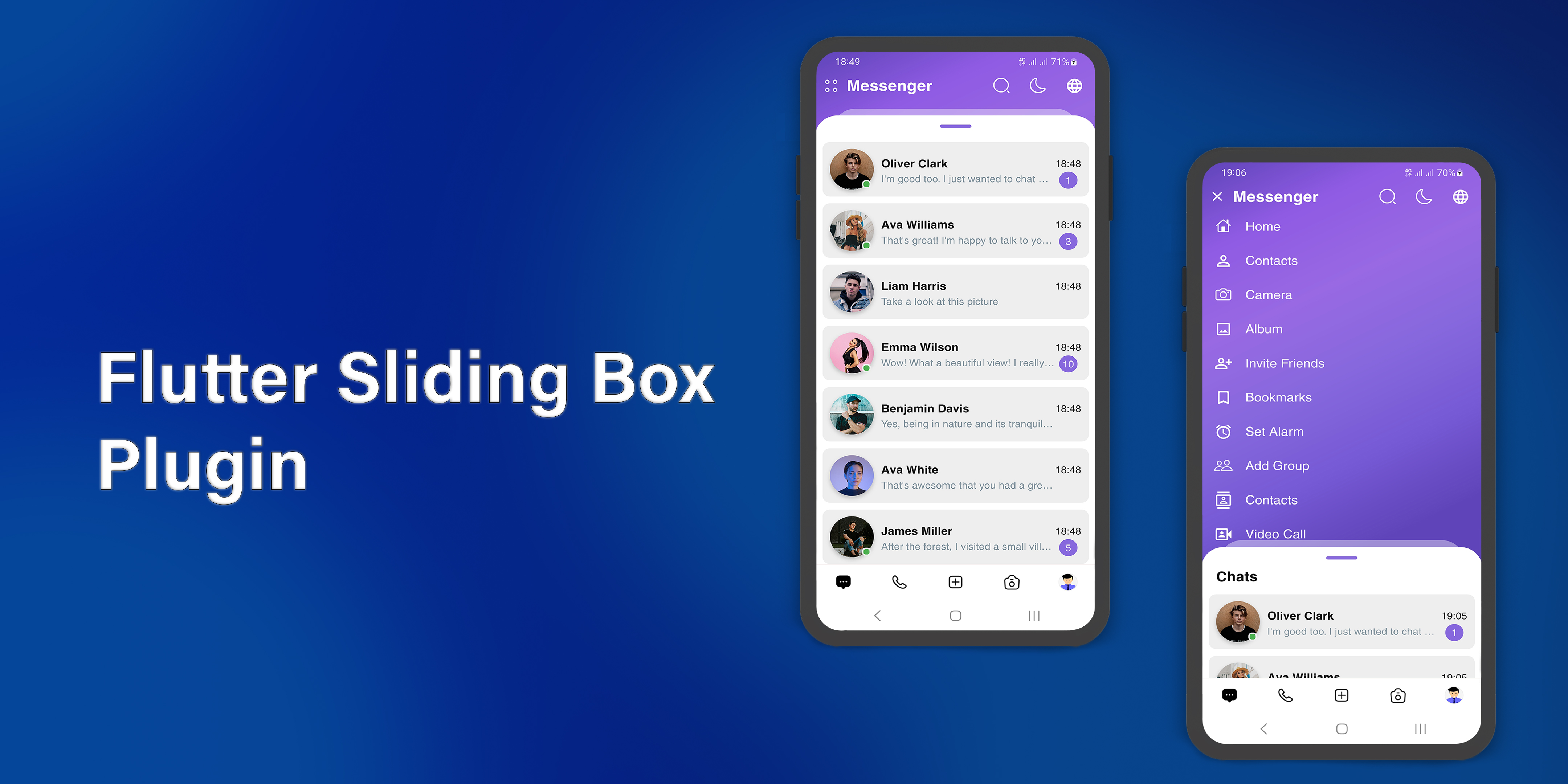
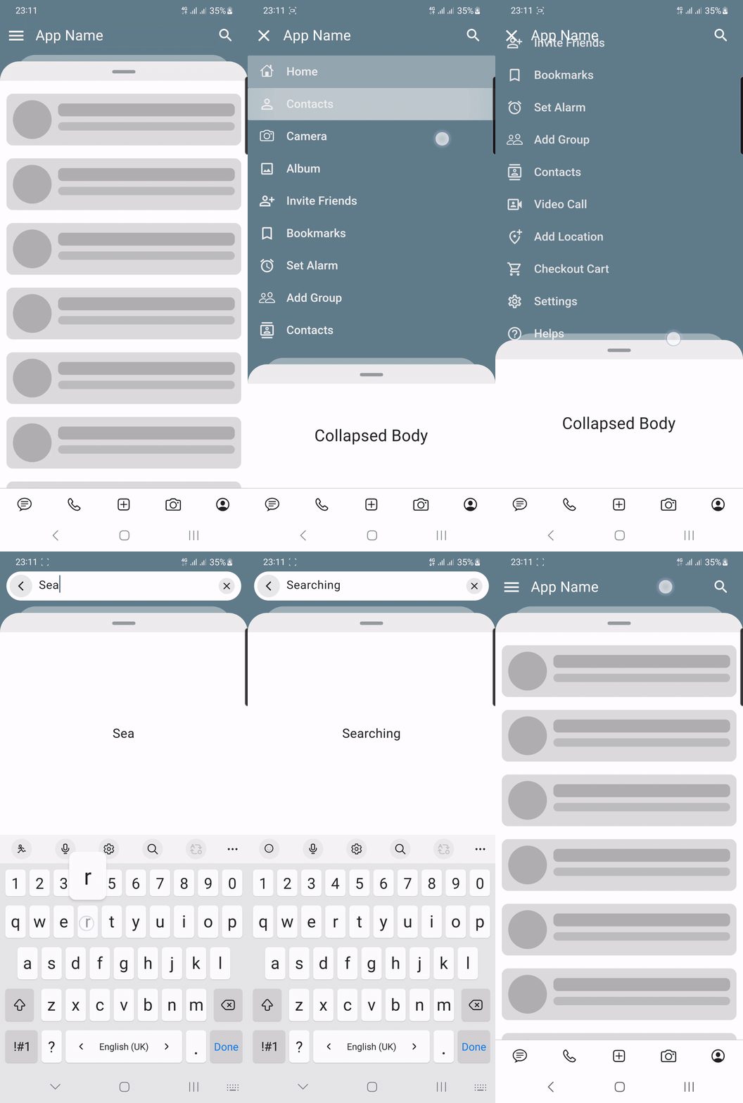
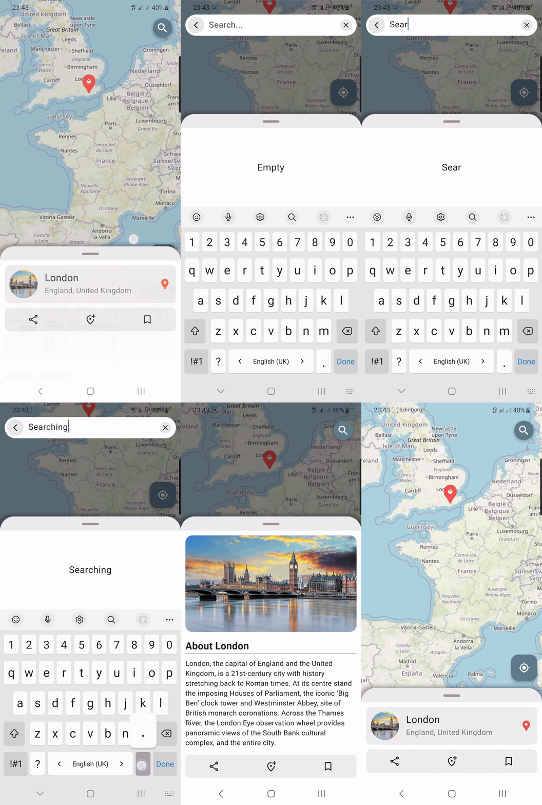
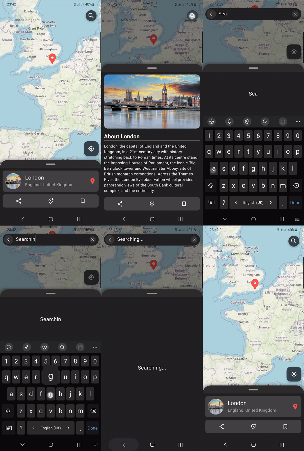
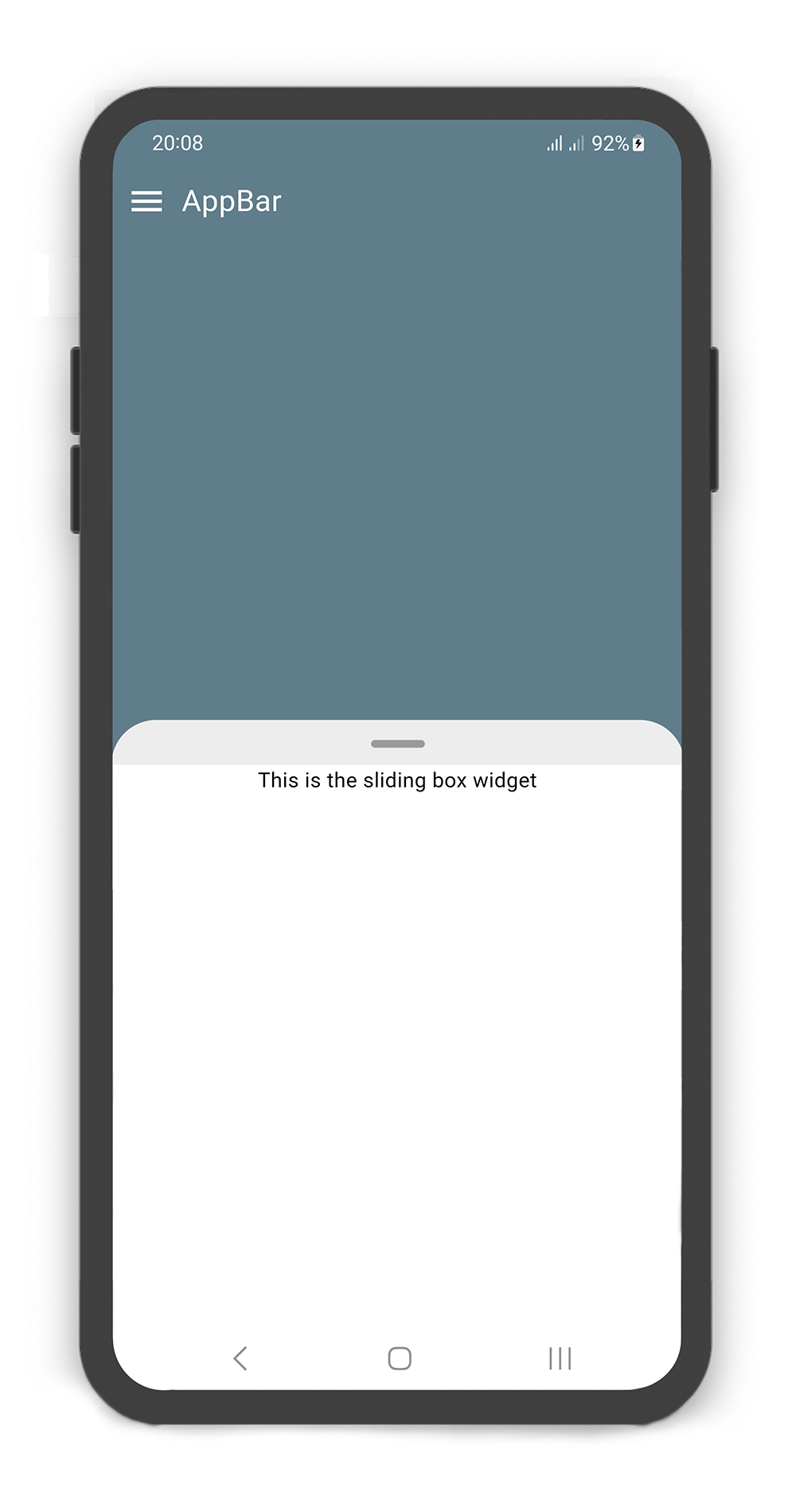
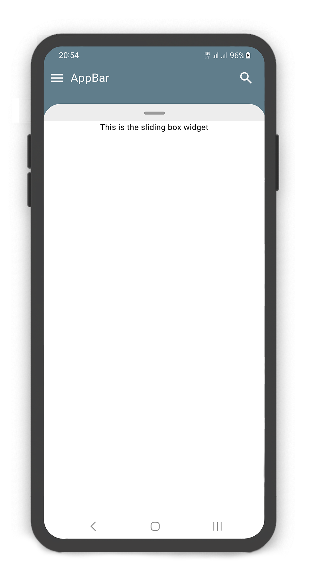
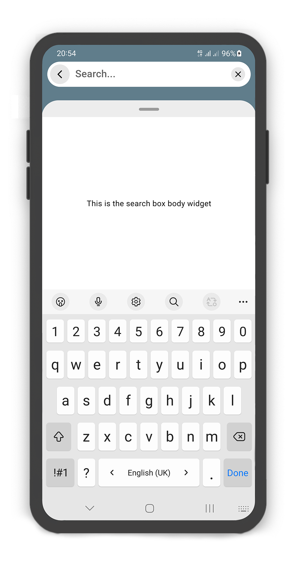
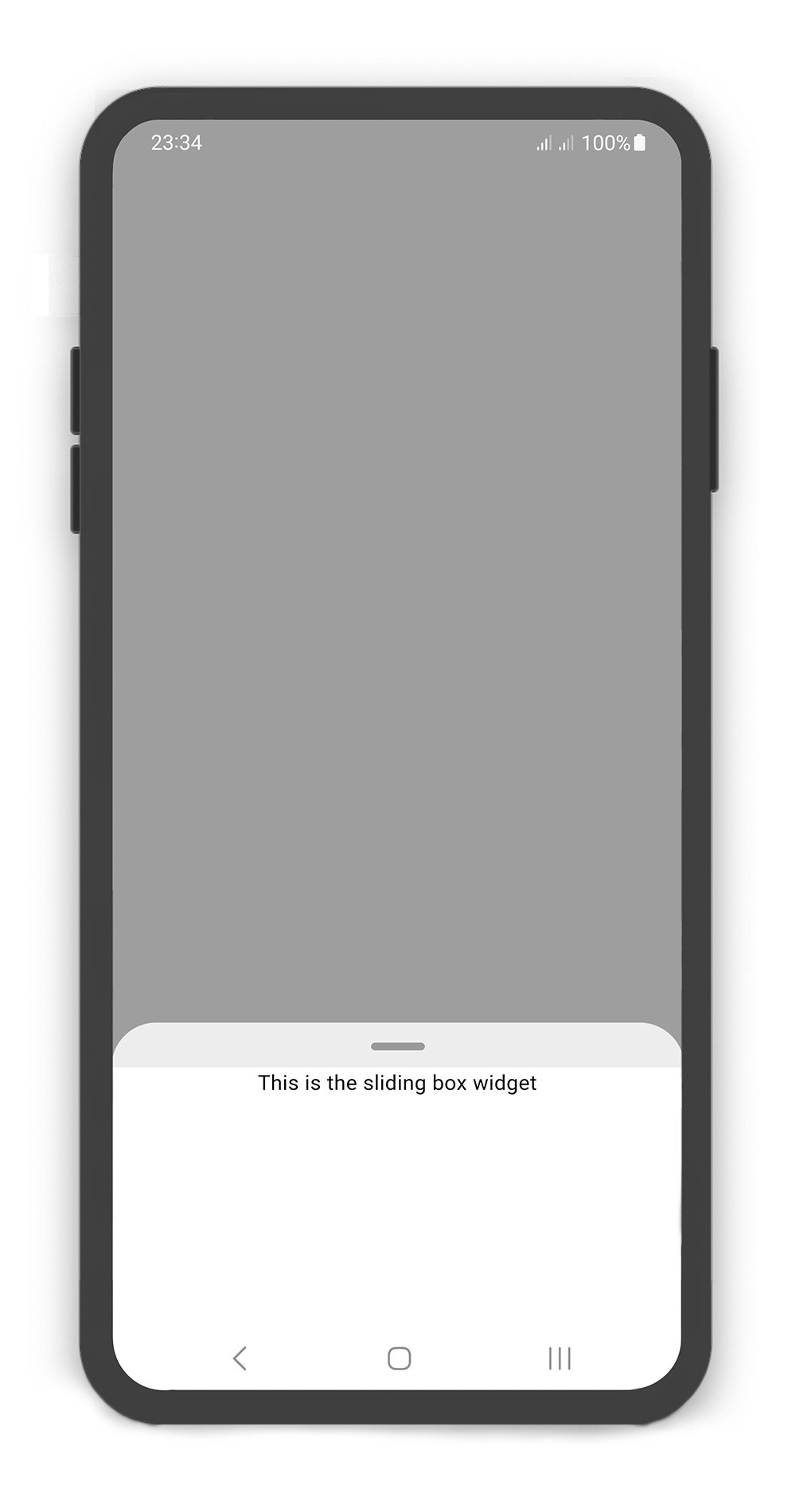
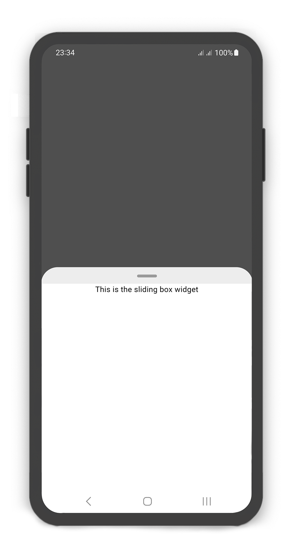
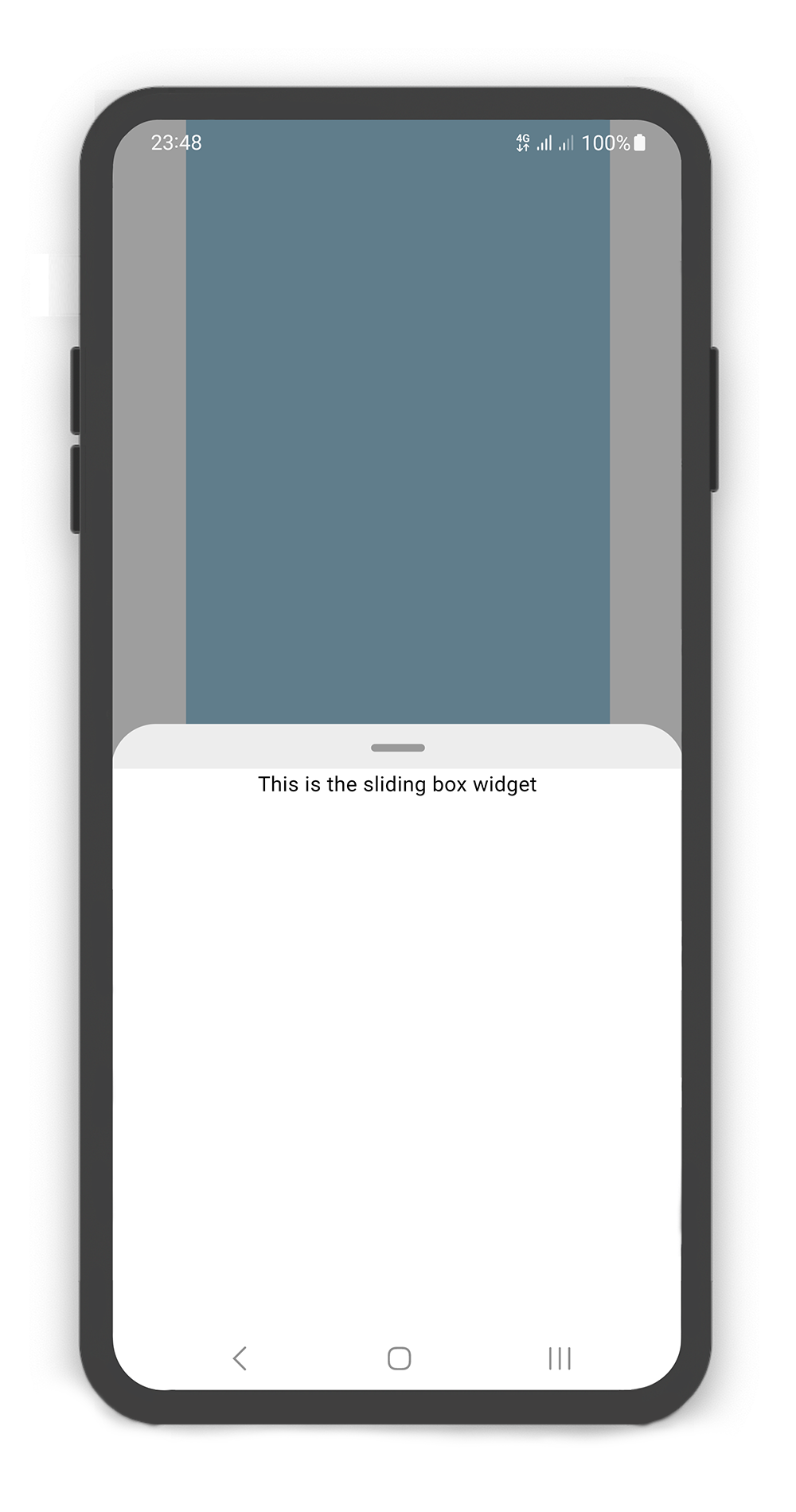
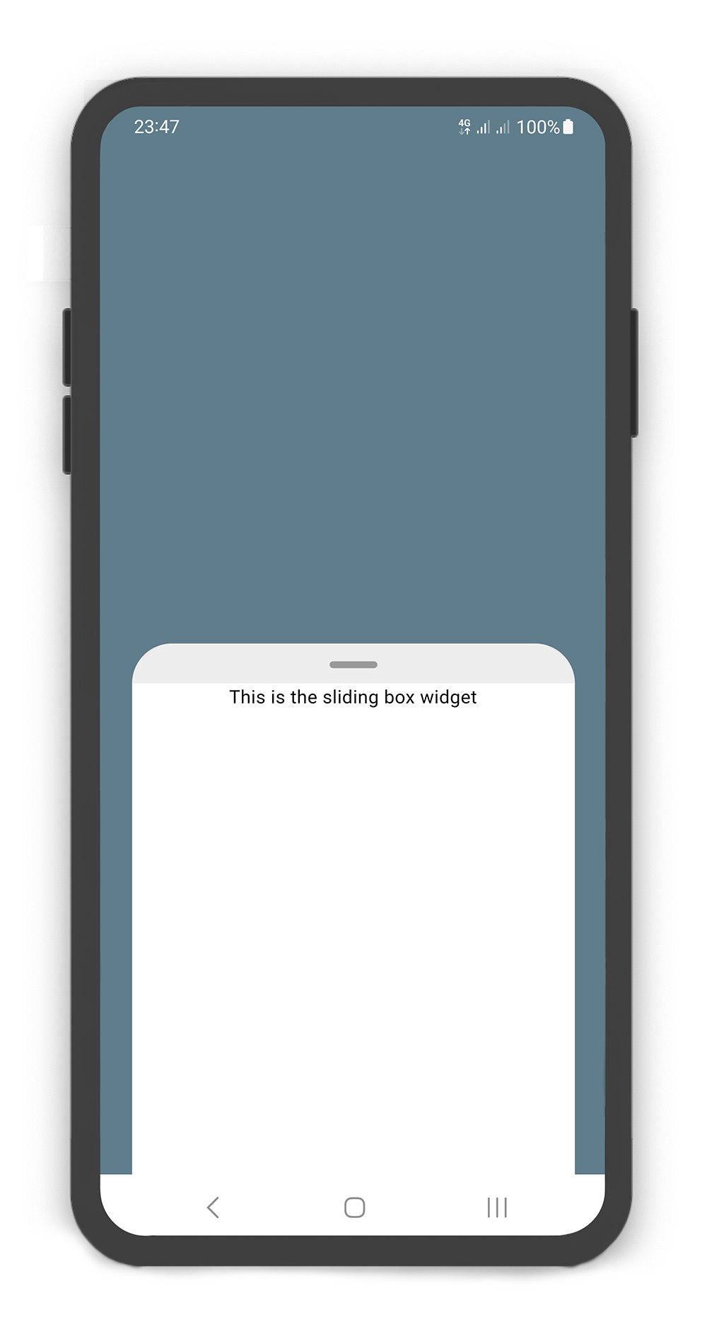
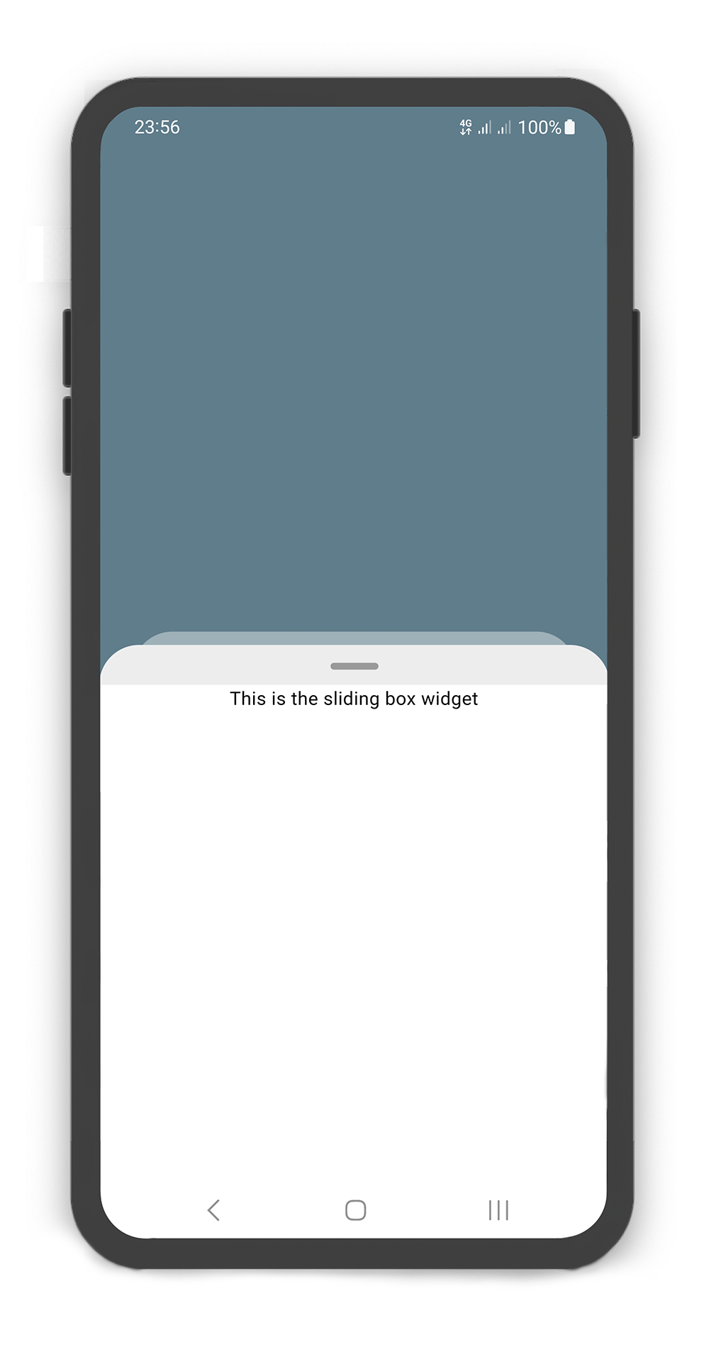
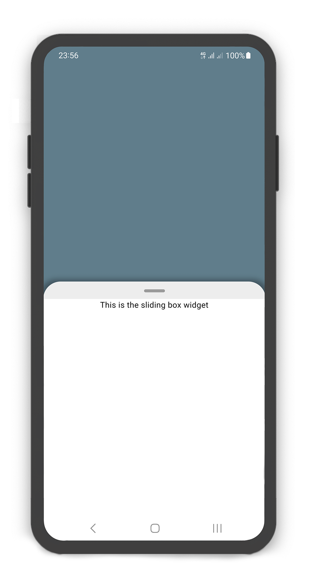
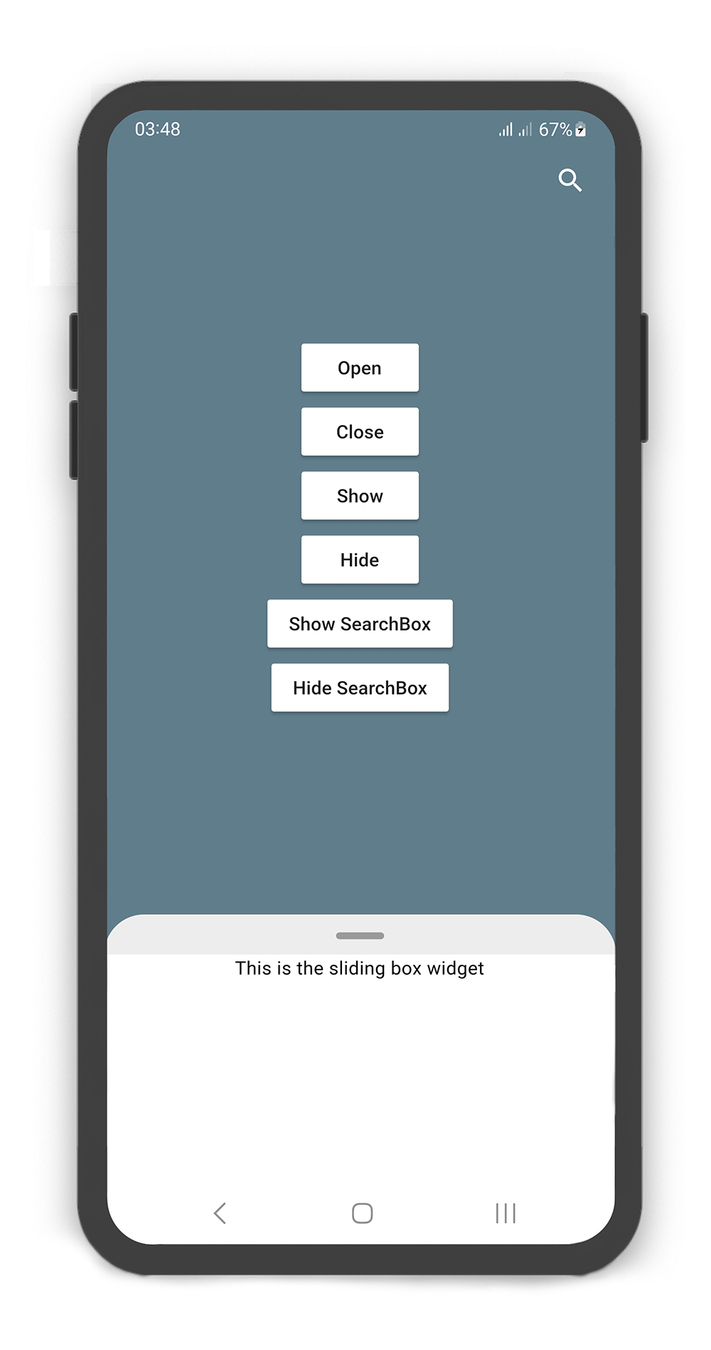
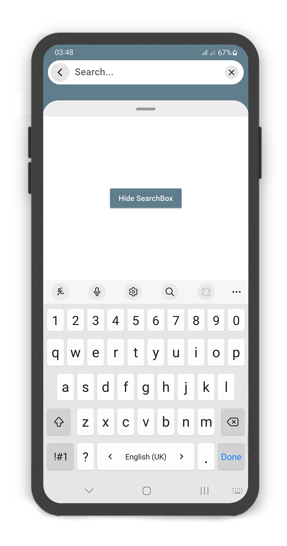
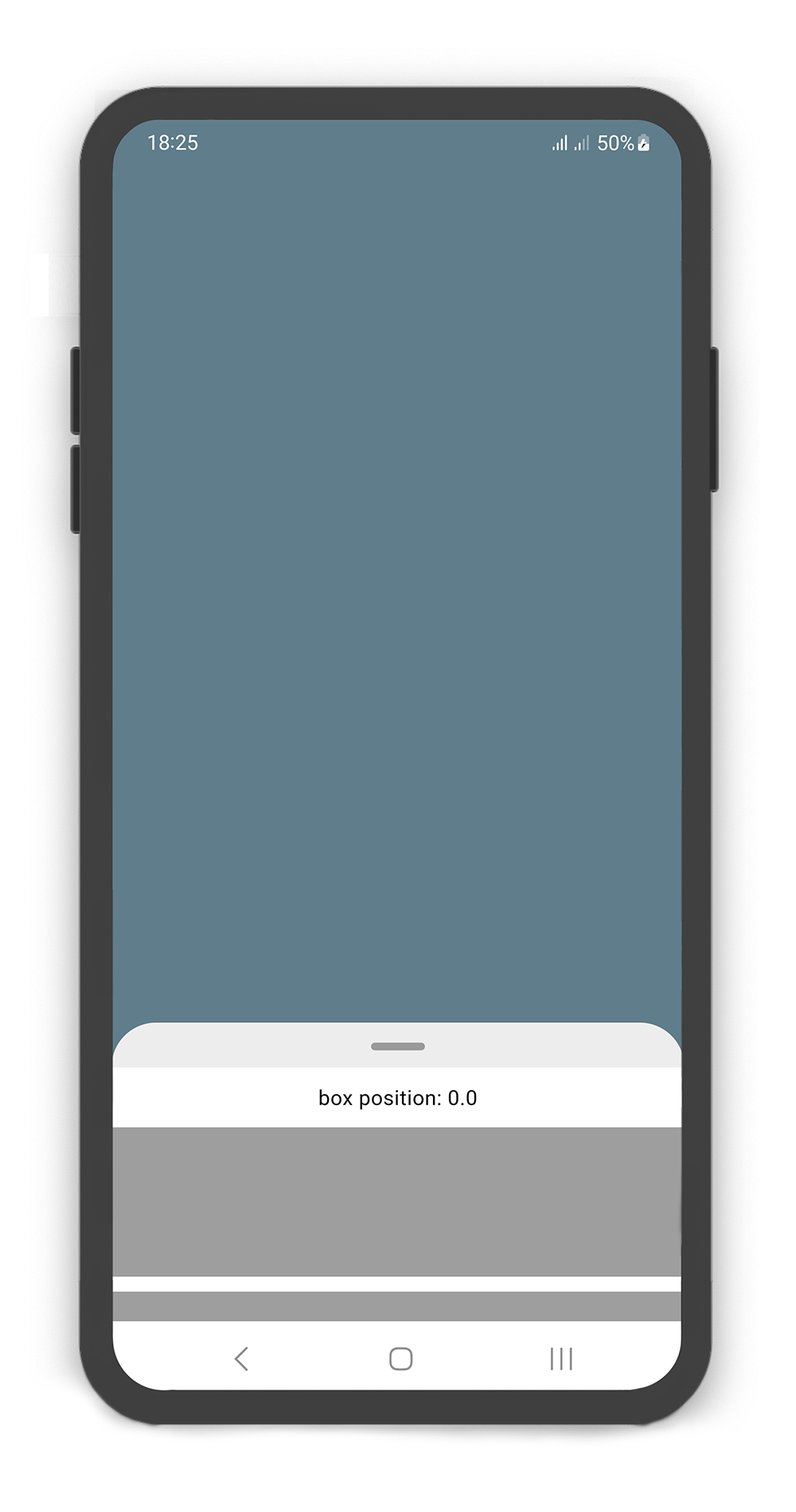
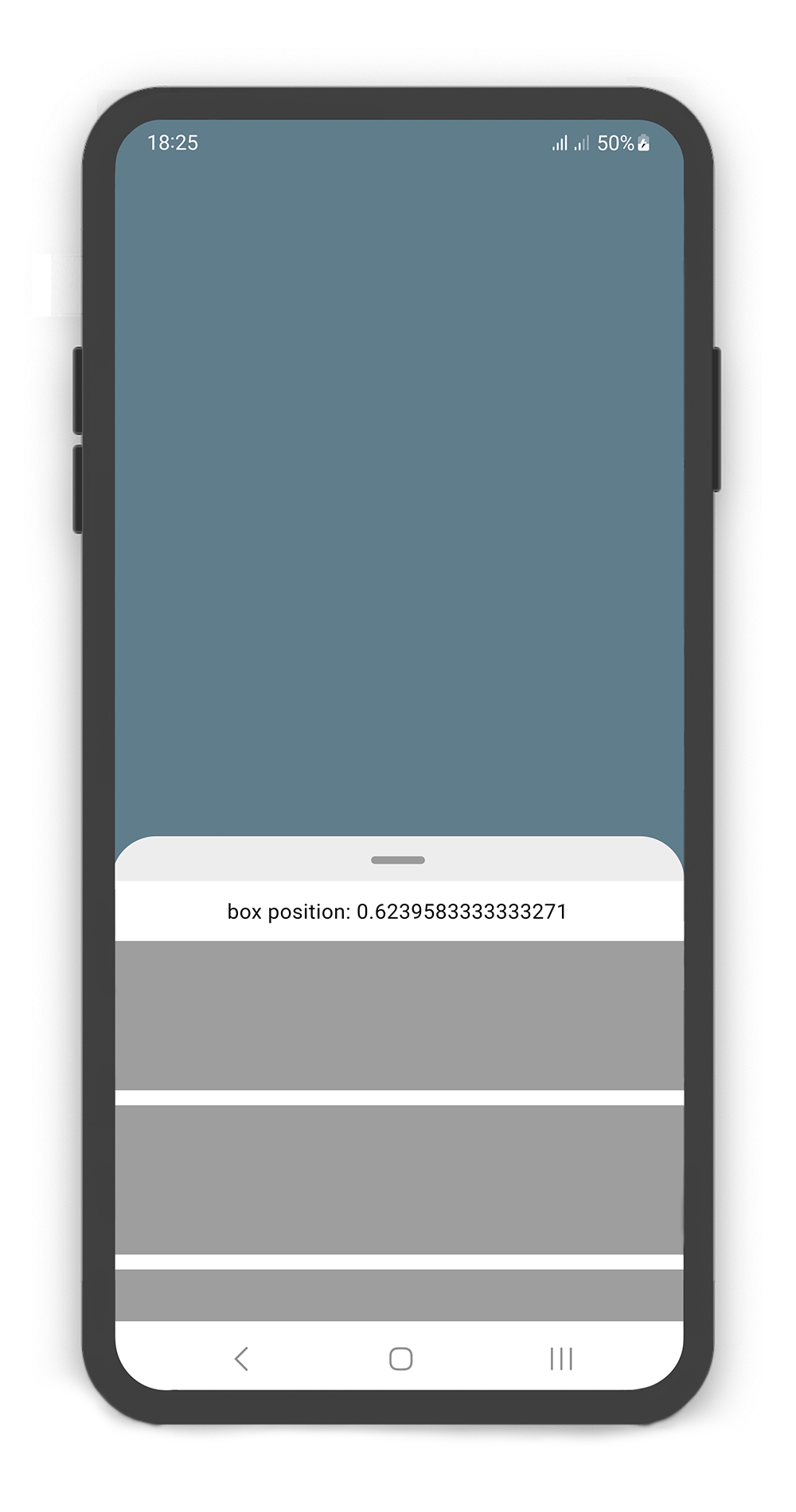
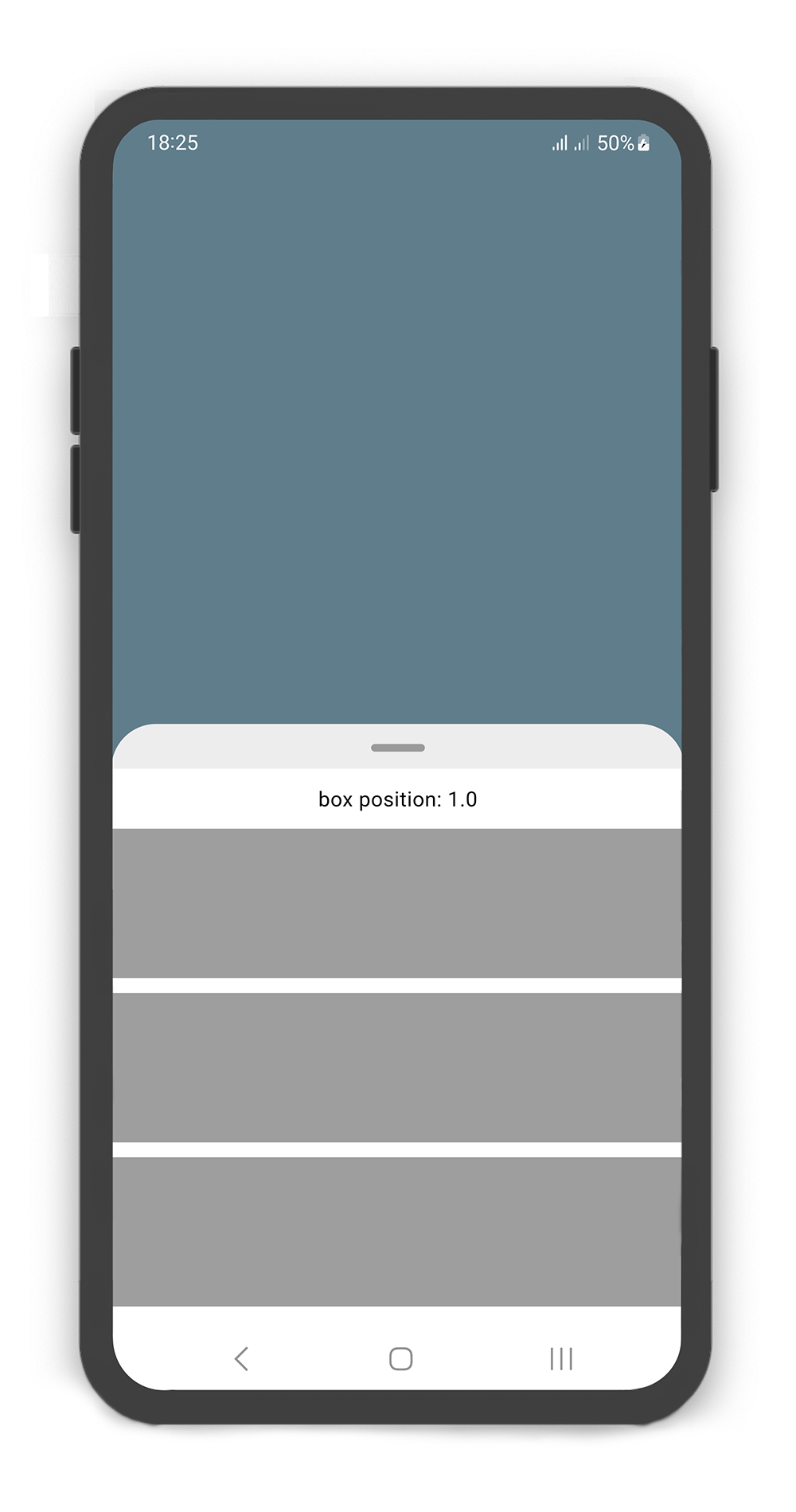
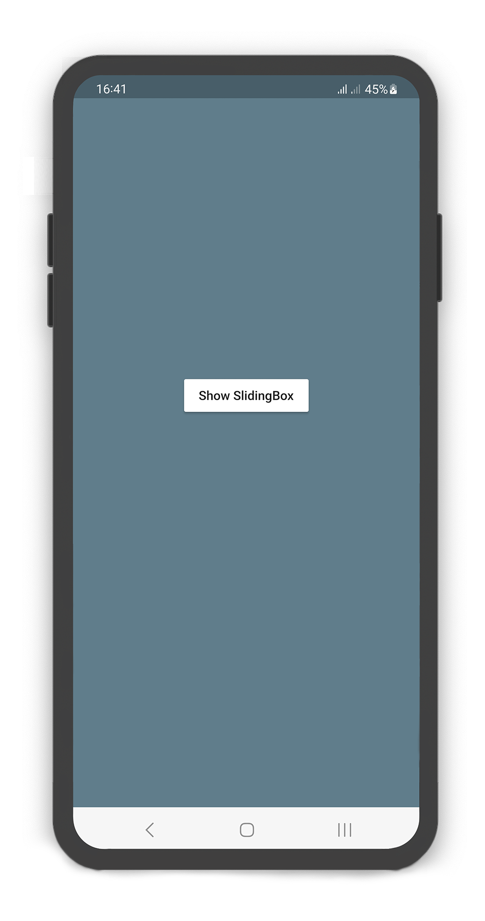
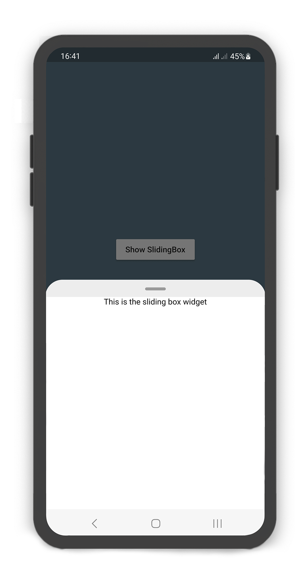
Flutter Sliding Box는 하단 시트와 유사한 슬라이딩 패널을 모든 플랫폼에서 구현하는 것을 간편하게 만드는 드래그 가능한 위젯입니다. Android, iOS, Web, macOS, Windows, Linux에 대해 일관되고 반응성 있는 인터페이스를 제공합니다. 이 패키지는 부드러운 수직 또는 수평 슬라이드 제스처를 가능하게 하여 메뉴, 폼, 상세 보기와 같은 접을 수 있는 콘텐츠 영역에 이상적입니다. Flutter의 유연성을 활용해 플랫폼별 코드 없이 네이티브처럼 동작하며, 가벼운 설계로 기존 프로젝트에 쉽게 통합할 수 있습니다.
사용 사례
접을 수 있는 바닥 시트 구현
인터랙티브 폼 드로어 만들기
동적 콘텐츠 패널 구축
모바일 우선 네비게이션 드로어 설계
제스처 기반 UI 컴포넌트 활성화
주요 기능
크로스 플랫폼 호환성
드래그 가능한 슬라이딩 동작
사용자 정의 가능한 애니메이션 곡선
다중 방향 지원
내장된 제스처 인식
경량이며 통합이 쉬움
적합한 대상
다중 플랫폼 앱을 개발하는 개발자
인터랙티브 패널이 필요한 UI 디자이너
제스처 기반 탐색이 필요한 앱
접을 수 있는 콘텐츠 영역을 가진 프로젝트
일관된 바텀 시트 경험을 원하는 팀
고려 사항
복잡한 레이아웃을 위해 추가 스타일링이 필요할 수 있습니다
성능은 패널 콘텐츠의 복잡성에 따라 달라집니다
고급 애니메이션에 대한 맞춤 설정 제한
간단에서 중간 복잡도의 슬라이딩 인터페이스에 적합
매우 동적 또는 중첩된 슬라이딩 구조에 대해 권장되지 않습니다
원본 README
연결된 소스 저장소의 README 원문 스냅샷입니다. 최신 내용은 저장소에서 확인하세요.
SlidingBox for Flutter
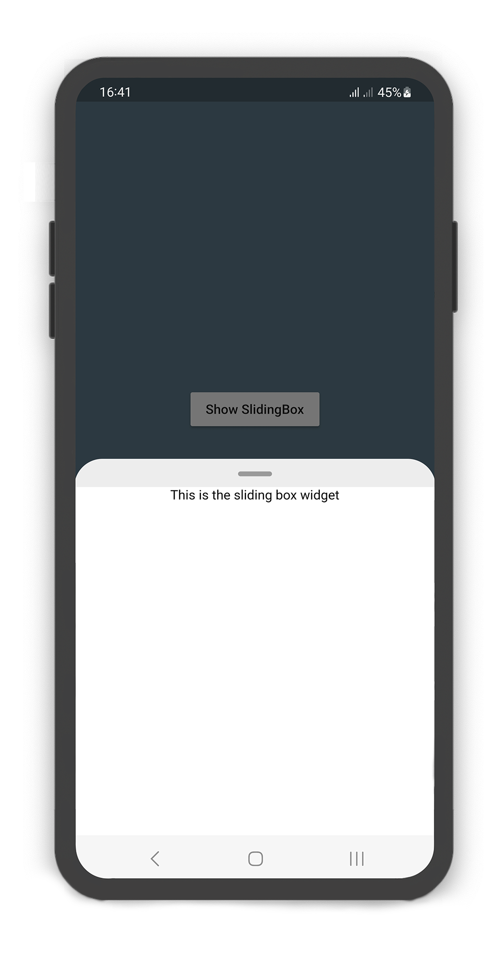
A draggable flutter widget (like bottom sheet panel) that makes it easier to use a SlidingBox for all platform.
Boxes can be customized with your content and placed in your app.
To see example of the following SlidingBox on a device or simulator:
There are several options that allow for more control:
Properties
Data Type
Description
body
Widget
A widget that slides from minHeight to maxHeight and is placed on the backdrop.
bodyBuilder
Widget
Provides a ScrollController to attach to a scrollable widget in the box and current box position. If body and bodyBuilder are both non-null, body will be used.
controller
BoxController
It can be used to control the state of sliding box and search box.
collapsed
bool
If set to true, the state of the box is collapsed.
collapsedBody
Widget
The Widget displayed overtop the box when collapsed. This fades out as the sliding box is opened.
width
double
width of the sliding box.
minHeight
double
The height of the sliding box when fully collapsed.
maxHeight
double
The height of the sliding box when fully opened.
color
Color
color to fill the background of the sliding box.
borderRadius
BorderRadius
The corners of the sliding box are rounded by this.
style
BoxStyle
The styles of the sliding box that includes shadow and sheet and none.
physics
ScrollPhysics
Gets a ScrollPhysic, the physics determines how the scroll view continues to animate after the user stops dragging the scroll view.
draggable
bool
Allows toggling of draggability of the sliding box. If set to false, the sliding box cannot be dragged up or down.
draggableIcon
IconData
A Icon Widget that is placed in top of the box. Gets a IconData.
draggableIconColor
Color
The color of the draggableIcon.
draggableIconVisible
bool
If set to false, the draggableIcon hides. Use controller to open and close sliding box by taps.
draggableIconBackColor
Color
The color to fill the background of the draggableIcon icon. The position of the icon is top of the box.
onBoxSlide
ValueChanged<double>
This callback is called when the sliding box slides around with position of the box. The position is a double value between 0.0 and 1.0, where 0.0 is fully collapsed and 1.0 is fully opened.
onBoxOpen
VoidCallback
This callback is called when the sliding box is fully opened.
onBoxClose
VoidCallback
This callback is called when the sliding box is fully closed.
onBoxShow
VoidCallback
This callback is called when the sliding box is visible.
onBoxHide
VoidCallback
This callback is called when the sliding box is invisible.
onSearchBoxShow
VoidCallback
This callback is called when the search box is visible.
onSearchBoxHide
VoidCallback
This callback is called when the search box is invisible.
animationCurve
Curve
animationCurve defines the easier behavior of the box animation.
animationDuration
Duration
animationDuration defines the time for the box animation to complete.
backdrop
Backdrop
A Widget that is placed behind of the box, filled with the Backdrop.
Backdrop Usage
Using the Backdrop
Manually change the Backdrop properties.
Properties
Data Type
Description
color
Color
color to fill the background of the backdrop.
width
double
width of the backdrop body.
fading
bool
If set to true, the backdrop body fades out when the sliding box opened.
moving
bool
If set to true, the backdrop body moving up when the sliding box opened.
overlay
bool
If set to true, a dark layer displayed above of the backdrop and behind of the sliding box when is opened.
overlayOpacity
double
Amount of dark overlay layer. a double value between 0.0 and 1.0.
backgroundGradient
Gradient
The gradient color to fill the background of the backdrop. if color and backgroundGradient are both non-null, color will be used.
body
Widget
A Widget that is placed in the backdrop and behind of the sliding box.
It can be used to control the state of search box text field. Gets a TextEditingController.
leading
Icon
A Icon Widget that is placed in left of the search box text field.
color
Color
color to fill the background of the SearchBox.
inputDecoration
InputDecoration
decoration to show around the search box text field.
borderRadius
BorderRadius
The corners of the search box are rounded by this.
style
TextStyle
style for text of the SearchBox.
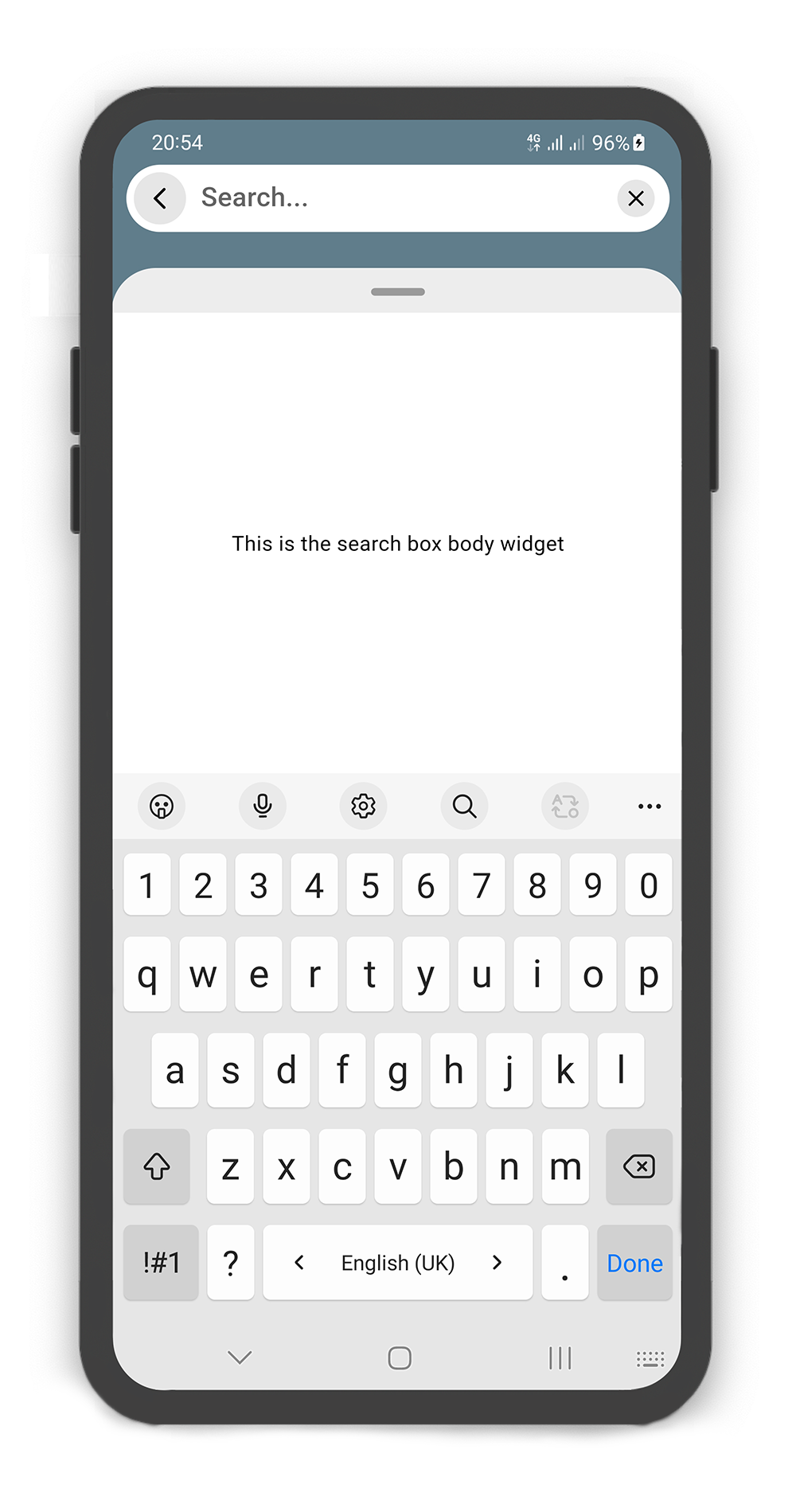
body
Widget
A Widget that is placed in the sliding box (in search mode displays the search result).
draggableBody
bool
In search mode, allows toggling of draggability of the sliding box. If set to false, the sliding box cannot be dragged up or down when search box visible. If set to true, search box invisible when dragging.
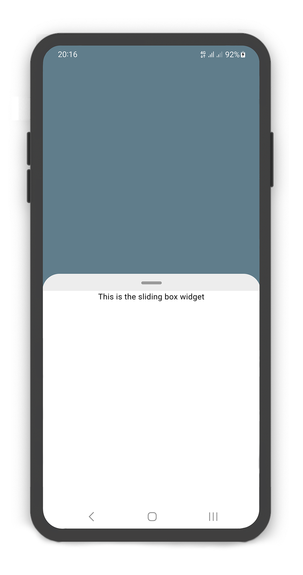
SlidingBox backdrop includes overlay: true
Customize overlayOpacity (a value between 0.0 and 1.0), default value is 0.5
@overrideWidgetbuild(BuildContext context) {
returnScaffold(
body: SlidingBox(
minHeight: 200,
maxHeight: 400,
style: BoxStyle.sheet, /// or BoxStyle.shadow (default is 'none')
body: Center(
child: Text("This is the sliding box widget",
style: TextStyle(color: Colors.black),),
),
backdrop: Backdrop(
color: Colors.blueGrey,
),
),
);
}
Box Controller
Using the BoxController
Manually change the SearchBox state. For better performance, use a BoxController as controller (recommended).
Properties
Data Type
Description
isAttached
bool
Determine if the boxController is attached to an instance of the SlidingBox (this property must be true before any other BoxController functions can be used).
isBoxOpen
bool
Returns whether or not the box is open.
isBoxClosed
bool
Returns whether or not the box is close.
isBoxVisible
bool
Returns whether or not the box is visible.
isSearchBoxVisible
bool
Returns whether or not the search box is visible.
getPosition
bool
Returns box position (a value between 0.0 and 1.0).
minHeight
double
Returns box minHeight.
maxHeight
double
Returns box maxHeight.
boxWidth
double
Returns box width.
backdropWidth
double
Returns backdrop width.
Methods
Return Type
Description
openBox()
Future<void>
Opens the sliding box with animation (i.e. to the maxHeight).
closeBox()
Future<void>
Closes the sliding box with animation (i.e. to the minHeight).
showBox()
Future<void>
Shows the sliding box (i.e. is visible).
hideBox()
Future<void>
Hides the sliding box (i.e. is invisible).
showSearchBox()
Future<void>
Shows the search box (i.e. is visible).
hideSearchBox()
Future<void>
Hides the search box (i.e. is invisible).
setPosition()
Future<void>
Sets the sliding box position with animation (a value between 0.0 and 1.0).