연결된 소스 저장소의 README 원문 스냅샷입니다. 최신 내용은 저장소에서 확인하세요.
flutter_tags


Create beautiful tags quickly and easily.
Installing
Add this to your package's pubspec.yaml file:
dependencies:
  flutter_tags: "^0.4.9+1"
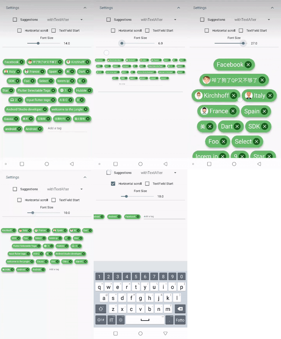
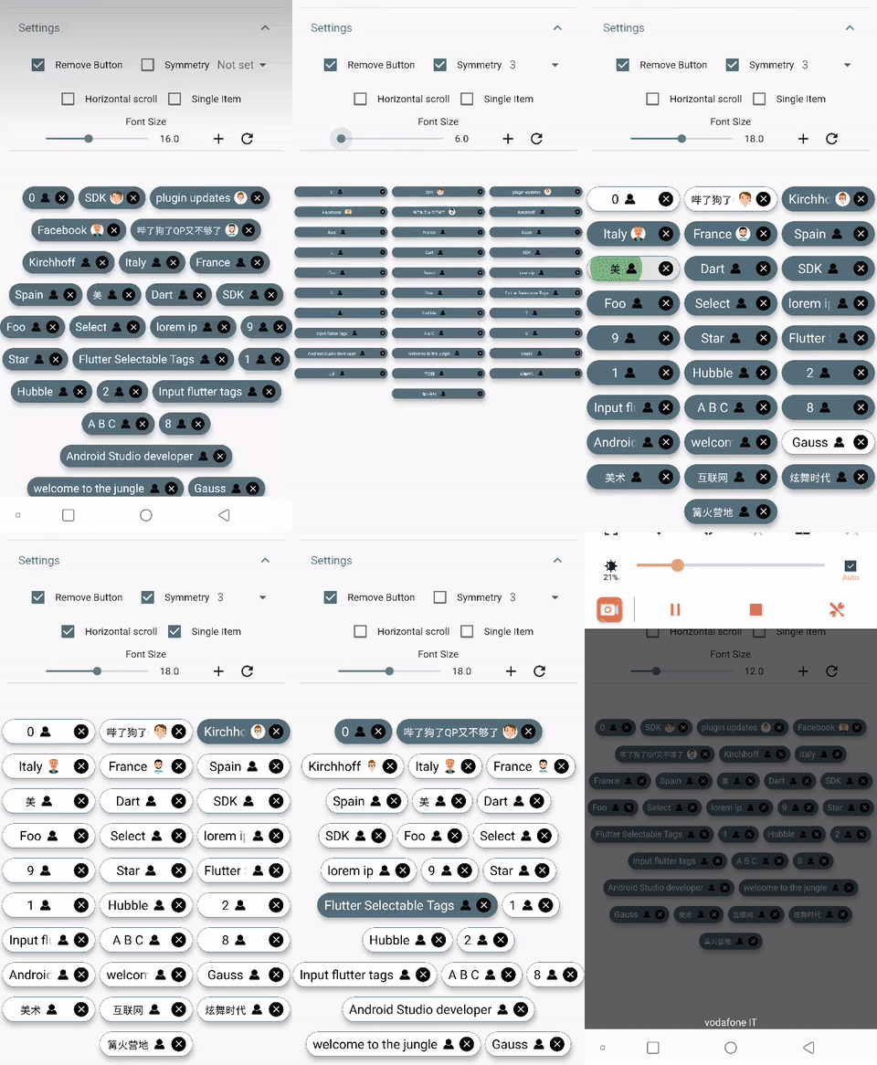
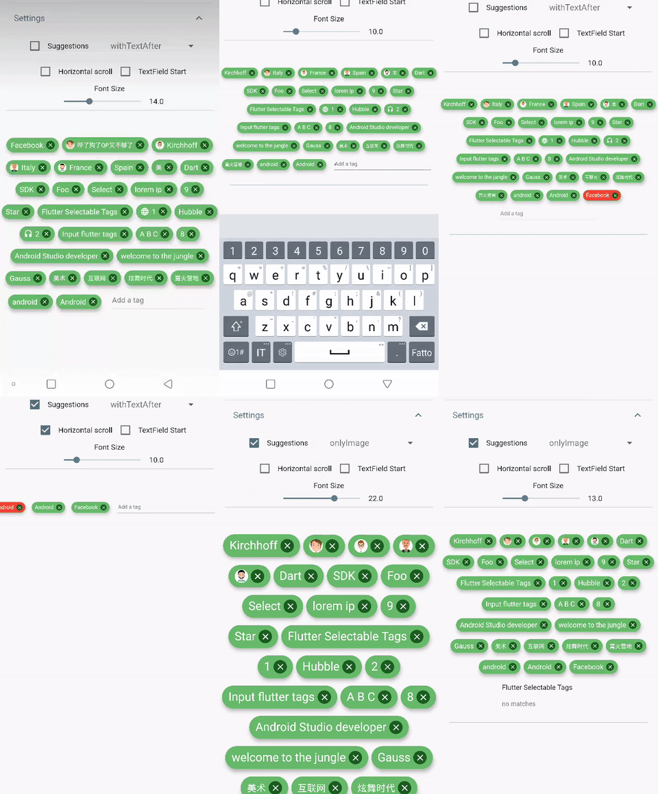
DEMO
Simple usage
import 'package:flutter_tags/flutter_tags.dart';
.
.
.
List _items;
double _fontSize = 14;
@override
void initState(){
super.initState();
Model().getItems().then((items){
_items = items;
});
}
@override
Widget build(BuildContext context) {
return Tags(
key:_tagStateKey,
textField: TagsTextField(
textStyle: TextStyle(fontSize: _fontSize),
constraintSuggestion: true, suggestions: [],
onSubmitted: (String str) {
setState(() {
_items.add(str);
});
},
),
itemCount: _items.length,
itemBuilder: (int index){
final item = _items[index];
return ItemTags(
key: Key(index.toString()),
index: index,
title: item.title,
active: item.active,
customData: item.customData,
textStyle: TextStyle( fontSize: _fontSize, ),
combine: ItemTagsCombine.withTextBefore,
image: ItemTagsImage(
image: AssetImage("img.jpg")
),
icon: ItemTagsIcon(
icon: Icons.add,
),
removeButton: ItemTagsRemoveButton(
onRemoved: (){
setState(() {
_items.removeAt(index);
});
return true;
},
),
onPressed: (item) => print(item),
onLongPressed: (item) => print(item),
);
},
);
}
final GlobalKey<TagsState> _tagStateKey = GlobalKey<TagsState>();
_getAllItem(){
List<Item> lst = _tagStateKey.currentState?.getAllItem;
if(lst!=null)
lst.where((a) => a.active==true).forEach( ( a) => print(a.title));
}
Wrapped widget example
You are free to wrap ItemTags () inside another widget
Tags(
      itemCount: items.length,
      itemBuilder: (int index){
          return Tooltip(
          message: item.title,
          child:ItemTags(
            title:item.title,
          )
          );
      },
    );
Tags() parameters
| PropName |
Description |
default value |
columns |
Possibility to set number of columns when necessary |
null |
itemCount |
Tag number to display |
required |
symmetry |
Ability to view and scroll tags horizontally |
false |
horizontalScroll |
Offset drawer width |
0.4 |
heightHorizontalScroll |
height for HorizontalScroll to set to display tags correctly |
60 |
spacing |
Horizontal space between the tags |
6 |
runSpacing |
Vertical space between the tags |
14 |
alignment |
Horizontal WrapAlignment |
WrapAlignment.center |
runAlignment |
Vertical WrapAlignment |
WrapAlignment.center |
direction |
Direction of the ItemTags |
Axis.horizontal |
verticalDirection |
Iterate Item from the lower to the upper direction or vice versa |
VerticalDirection.down |
textDirection |
Text direction of the ItemTags |
TextDirection.ltr |
itemBuilder |
tag generator |
|
textField |
add textField |
TagsTextFiled() |
ItemTags() parameters
index - requiredtitle - requiredtextScaleFactor - custom textScaleFactoractive - bool value (default true)pressEnabled - active onPress tag ( default true)customData - Possibility to add any custom value in customData field, you can retrieve this later. A good example: store an id from Firestore document.textStyle - textStyle()alignment - MainAxisAlignment ( default MainAxisAlignment.center)combine - * ability to combine text, icons, images in different ways ( default ItemTagsCombine.imageOrIconOrText)*icon - ItemTagsIcon()image - ItemTagsImage()removeButton - ItemTagsRemoveButton()borderRadius - BorderRadiusborder - custom border-sidepadding - default EdgeInsets.symmetric(horizontal: 7, vertical: 5)elevation - default 5singleItem - default falsetextOverflow - default TextOverflow.fadetextColor - default Colors.blacktextActiveColor - default Colors.whitecolor - default Colors.whiteactiveColor - default Colors.blueGreyhighlightColor -splashColor -colorShowDuplicate - default Colors.redonPressed - callbackonLongPressed - callbackonRemoved - callback
Donate
It takes time to carry on this project. If you found it useful or learned something from the source code please consider the idea of donating 5, 20, 50 € or whatever you can to support the project.
Issues
If you encounter problems, open an issue. Pull request are also welcome.