패키지, 저장소 및 앱 카테고리 검색

flutter_tree_pro 표지
패키지 상세v0.0.15

flutter_tree_pro

Flutter 트리 선택 위젯입니다. 트리 노드를 선택하는 데 사용할 수 있습니다. RTL도 지원합니다.

AndroidiOSWebmacOSWindowsLinux
30일 다운로드
140
좋아요
28
Pub 점수
150

패키지 설치

flutter pub add flutter_tree_pro

패키지 개요

공개 정보를 바탕으로 생성한 선택 가이드입니다.

Flutter Tree Pro는 Flutter용 사용자 정의 가능한 트리 선택 위젯으로, 사용자가 계층적 데이터 구조를 쉽게 탐색하고 선택할 수 있도록 도와줍니다. 오른쪽에서 왼쪽으로의 레이아웃(RTL)을 지원하여 다국어 애플리케이션에 적합합니다. 이 패키지는 Android, iOS, Web, macOS, Windows, Linux 플랫폼과 원활하게 통합됩니다. 직관적인 사용자 인터랙션을 위해 설계되어 파일 탐색기, 조직도, 카테고리 선택기와 같은 복잡한 트리 기반 인터페이스를 개발자가 쉽게 만들 수 있습니다. 가벼우면서도 유연한 아키텍처로 대규모 데이터셋에서도 부드러운 성능을 보장합니다.

사용 사례

  • 파일 탐색기 인터페이스
  • 조직도 표시
  • 카테고리 필터링 시스템
  • 계층적 데이터 선택
  • 설정 탐색 메뉴

주요 기능

  • RTL 지원
  • 크로스 플랫폼 호환성
  • 사용자 정의 가능한 노드 스타일
  • 대규모 트리에 대한 효율적인 렌더링
  • 다중 선택 기능

적합한 대상

  • 계층적 UI를 구축하는 개발자
  • 트리 기반 탐색이 필요한 앱
  • 국제화된 애플리케이션
  • 복잡한 데이터 구조 시각화
  • 공유 코드베이스를 가진 웹 및 모바일 앱

고려 사항

  • 복잡한 테마를 위해 사용자 정의 스타일링이 필요할 수 있습니다
  • 매우 깊은 트리 구조로 인한 성능 영향
  • 제한된 내장 애니메이션
  • 상태 관리를 수동으로 처리해야 합니다
  • 실시간 공동 편집을 위한 최적화되지 않음

원본 README

연결된 소스 저장소의 README 원문 스냅샷입니다. 최신 내용은 저장소에서 확인하세요.

flutter_tree_pro

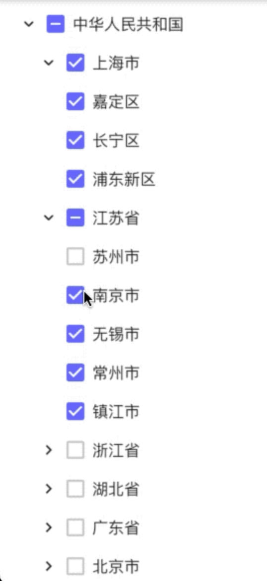
A Flutter tree-select widget with checkbox selection, single-select mode, RTL support, and leaf-node drag-and-drop.

Demo

flutter_tree demo

Features

  • Build tree data from flat list (DataType.DataList) or nested map (DataType.DataMap)
  • Multi-select with parent/child check-state synchronization
  • Single-select mode with initial selected node
  • Expand/collapse nodes
  • RTL layout support
  • Custom tree connector line style (TreeLineStyle)
  • Drag-and-drop for leaf nodes
    • Drop on a non-leaf node: dragged leaf becomes a child of that node
    • Drop on a leaf node: dragged leaf is inserted after target leaf as a sibling

Installation

Add dependency to your pubspec.yaml:

dependencies:
  flutter_tree_pro: ^0.0.16

Then run:

flutter pub get

Quick Start (DataList)

import 'package:flutter/material.dart';
import 'package:flutter_tree_pro/flutter_tree_pro.dart';

class TreeDemo extends StatefulWidget {
  const TreeDemo({super.key});

  @override
  State<TreeDemo> createState() => _TreeDemoState();
}

class _TreeDemoState extends State<TreeDemo> {
  final List<Map<String, dynamic>> listData = [
    {'id': 1001, 'parentId': 0, 'value': 'USA'},
    {'id': 1002, 'parentId': 1001, 'value': 'California'},
    {'id': 1003, 'parentId': 1002, 'value': 'San Francisco'},
    {'id': 1004, 'parentId': 1001, 'value': 'New York'},
  ];

  final List<Map<String, dynamic>> initialListData = [
    {'id': 1003, 'parentId': 1002, 'value': 'San Francisco'},
  ];

  List<Map<String, dynamic>> checked = [];

  @override
  Widget build(BuildContext context) {
    return Scaffold(
      appBar: AppBar(title: const Text('flutter_tree_pro')),
      body: FlutterTreePro(
        listData: listData,
        initialListData: initialListData,
        isExpanded: true,
        isRTL: false,
        isSingleSelect: false,
        config: const Config(
          dataType: DataType.DataList,
          id: 'id',
          parentId: 'parentId',
          label: 'value',
          children: 'children',
          lineStyle: TreeLineStyle(
            color: Color(0xFFE0E0E0),
            width: 1.0,
            indent: 28,
            showVerticalLine: true,
            showHorizontalLine: true,
          ),
        ),
        onChecked: (items) {
          setState(() {
            checked = items;
          });
        },
      ),
    );
  }
}

Data Source Modes

DataType.DataList

Use flat list data with id + parentId and pass it through listData.

Required fields in each item (or mapped by Config):

  • id
  • parentId
  • label (for display text)
DataType.DataMap

Use nested tree data with children and pass it through treeData.

If treeData is empty and initialTreeData is provided, initialTreeData will be used as fallback root data.

API

FlutterTreePro parameters
Parameter Type Default Description
treeData List<Map<String, dynamic>> const [] Tree source for DataMap mode
listData List<Map<String, dynamic>> const [] Flat source for DataList mode
initialTreeData Map<String, dynamic> const {} Fallback root tree node when treeData is empty
initialListData List<Map<String, dynamic>> const [] Initial checked items in multi-select mode
config Config const Config() Field mapping and tree style config
onChecked Function(List<Map<String, dynamic>>) required Selection callback
isExpanded bool false Expand all nodes initially
isRTL bool false Enable right-to-left layout
isSingleSelect bool false Enable single-select mode
initialSelectValue int 0 Initial selected node ID in single-select mode
Config
Field Type Default Description
dataType DataType DataType.DataMap Data mode
id String 'id' Node ID key
parentId String 'parentId' Parent ID key
label String 'label' Display text key
value String 'value' Reserved compatibility field
children String 'children' Children key
lineStyle TreeLineStyle const TreeLineStyle() Connector line style
TreeLineStyle
Field Type Default Description
color Color Color(0xFFD9D9D9) Line color
width double 1.0 Line width
indent double 24.0 Per-level indentation
showVerticalLine bool true Show vertical connectors
showHorizontalLine bool true Show horizontal connectors

Drag-and-Drop Rules

  • Only leaf nodes can be dragged.
  • A node cannot be dropped onto itself.
  • A node cannot be dropped directly onto its current parent.
  • Drop on a leaf node inserts after that target leaf, keeping the same parent level.
  • Drop on a non-leaf node appends as the target node's child.

Notes

  • In multi-select mode, onChecked returns checked leaf nodes after internal filtering/deduplication.
  • In single-select mode, onChecked returns at most one selected node.
  • Config.value is reserved for compatibility and is not used by current select-state logic.

Example Project

See /example for a runnable demo:

cd example
flutter pub get
flutter run

License

MIT

카테고리

소스 저장소

이 패키지를 사용하는 프로젝트

아직 데이터가 없습니다.