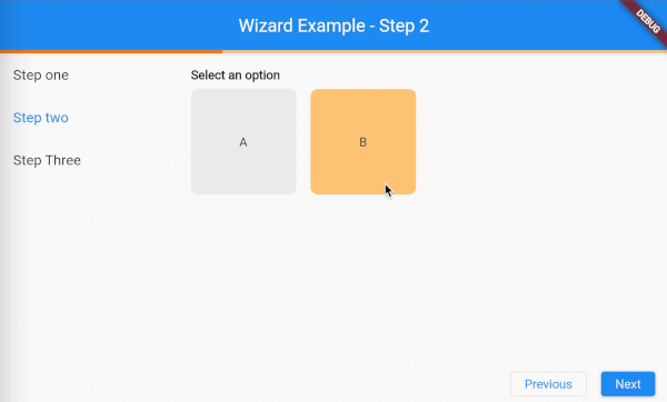
flutter_wizard는 개발자가 외관과 동작을 완전히 제어할 수 있도록 설계된 유연한 Flutter 라이브러리입니다. 다단계 프로세스를 사용자에게 안내하는 구조적인 접근 방식을 제공하며, 온보딩 흐름, 폼 제출 또는 설정 워즈드에 이상적입니다. 직관적인 API와 모든 주요 플랫폼 지원을 통해 기존 앱에 원활하게 통합할 수 있습니다. 이 패키지는 사용자 정의를 강조하여 워즈드의 UI 및 네비게이션 로직의 모든 측면을 맞춤화할 수 있게 해줍니다.
To start you've to wrap all of your wizard components with the DefaultWizardController which could receive a couple of arguments.
stepController (required) A list of WizardStepControllers, more details will be described in one of the following chapters.
IMPORTANT:The order of the stepControllers reflects to the order of the steps as displayed in the Wizard widget.
initialIndex The initial of the initial step to display.
onStepChanged A callback that gets triggered when the step changes.
onControllerCreated A callback that gets triggered when the [WizardController] is created.
child (required) The child widget of the DefaultWizardController. This widget (or one of its children) should contain all the widgets that need to interact with the Wizard widget. The reason for this is that all widgets under the DefaultWizardController are able to get the WizardController by calling the WizardController.of(context) or the provided extension context.wizardController.
In this example above the ProgressIndicator, Wizard, and ActionBar all have access to the WizardController because they are wrapped inside of the DefaultWizardController.
Step state management
As described in the last chapter you can provide the DefaultWizardController with stepControllers. This argument expects a list of WizardStepControllers. These step controllers need to be provided a step state. This step state could be a bloc, cubit, provider, notifier, etc. The only thing you are required to do is mixin the WizardStep into your statemanaged object.
When mixin the WizardStep your statemanaged object will be extended with the following properties and methods.
wizardController A property that contains the WizardController.
onControllerReceived A callback that gets fired when the wizardController property has been set. This callback will receive the WizardController as an argument.
onShowing A callback that triggeres when the step has started showing.
onShowingCompleted A callback that triggeres when the step has completed showing.
onHiding A callback that triggers when the step has started hiding.
onHidingCompleted A callback that triggers when the step has completed hiding.
Provider example:
classStepOneProviderwithWizardStep{
StepOneProvider();
final _description = BehaviorSubject<String>.seeded('');
final descriptionFocusNode = FocusNode();
final descriptionTextController = TextEditingController();
Stringget description {
return _description.value;
}
@overrideFuture<void> onShowing() async {
if (_description.value.isEmpty) {
descriptionFocusNode.requestFocus();
}
}
@overrideFuture<void> onHiding() async {
if (descriptionFocusNode.hasFocus) {
descriptionFocusNode.unfocus();
}
}
voidupdateDescription(String description) {
_description.add(description);
}
voiddispose() {
descriptionTextController.dispose();
}
}
Determine the widgets to show for each step
Now with the DefaultWizardController setup it's time to setup the widgets to show for eacht step.
We are going to need to Wizard widget for this. This widget contains only one arguments.
stepBuilder The builder method to build the steps corresponding widget. The builder method provides you with a BuildContext and a wizard step state. The wizard step state is the object in which you've mixed the WizardStep. This could be your bloc, cubit, provider, notifier, etc. Then based on the class type of the state you can determine the widget to show and pass the state into this widget to display the state to the user.
Now let me explain to you how you could make your own custom widgets and how you could make them interact with the Wizard widget.
So you could create your own widget the same way like you create every other widget. Then in your widget you can get the WizardController by calling the WizardController.of(context) or the provided extension context.wizardController.
With the WizardController you can interact with the Wizard widget. The WizardController contains the following properties and methods to control the widget or receive information about its state.
eventStream Streams the events that happen on the WizardController. The events have a
base type of WizardEvent and can be casted to the specific event type.
The events are:
WizardEnableGoBackEvent: Triggered when enableGoBack is called.
WizardEnableGoNextEvent: Triggered when enableGoNext is called.
WizardDisableGoBackEvent: Triggered when disableGoBack is called.
WizardDisableGoNextEvent: Triggered when disableGoNext is called.
WizardGoNextEvent: Triggered when goNext is called.
WizardGoBackEvent: Triggered when goBack is called.
WizardGoToEvent: Triggered when goTo is called.
WizardForcedGoBackToEvent: Triggered when disableGoNext is called with an
index lower as the current index.
stepControllers A list of the WizardStepControllers.
stepCount The step count.
isFirstStep Indicates whether a specific int index is the first.
isLastStep Indicates whether a specific int index is the last.
indexStream The step index as stream.
index The step index.
getStepIndex A method that returns the index for the provided WizardStep step.
getIsGoBackEnabledStream Indicates weather the go back action is enabled as a stream.
getIsGoBackEnabled Indicates weather the go back action is enabled as a stream.
enableGoBack A method to enable the go back button for a specific int index.
disableGoBack A method to disable the go back button for a specific int index.
getIsGoEnabledStream Indicates weather the go back action is enabled as a stream.
getIsGoBackEnabled Indicates weather the go back action is enabled as a stream.
enableGoNext A method to enable the go next button for a specific int index.
disableGoNext A method to disable the go next button for a specific int index. When disabling an index that is lower then the current index the Wizard will automatically animate back to the provided index.
getIsAnimateToEnabledStream Indicates weather the animate to action is enabled for a specific int index as a stream.
getIsAnimateToEnabled Indicates weather the animate to action is enabled for a specific int index.
In some cases it can be helpful to see the events that are being triggered on the wizard. To get insights in these events you could add the WizardEventListener to your widget tree.
IMPORTANT NOTE: The WizardEventListener depends on the WizardController so it needs to added underneath the DefaultWizardController widget.
The arguments:
child The child widget
listener A callback that listens to the WizardEvent events from the WizardController. The events are:
WizardEnableGoBackEvent: Triggered when enableGoBack is called.
WizardEnableGoNextEvent: Triggered when enableGoNext is called.
WizardDisableGoBackEvent: Triggered when disableGoBack is called.
WizardDisableGoNextEvent: Triggered when disableGoNext is called.
WizardGoNextEvent: Triggered when goNext is called.
WizardGoBackEvent: Triggered when goBack is called.
WizardGoToEvent: Triggered when goTo is called.
WizardForcedGoBackToEvent: Triggered when disableGoNext is called with an
index lower as the current index.
Example:
WizardEventListener(
listener: (context, event) {
if (event isWizardForcedGoBackToEvent) {
ScaffoldMessenger.of(context).showSnackBar(SnackBar(
content: Text(
'Step ${event.toIndex + 2} got disabled so the wizard is moving back to step ${event.toIndex + 1}.',
),
dismissDirection: DismissDirection.horizontal,
));
}
},
),