패키지, 저장소 및 앱 카테고리 검색

google_nav_bar 표지
패키지 상세v5.0.7

google_nav_bar

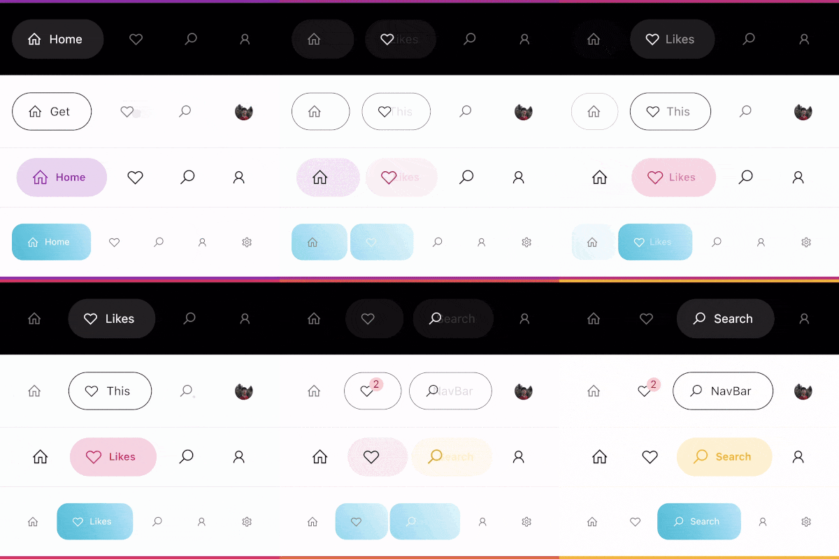
현대적인 구글 스타일의 네비게이션 바로, 하단 네비게이션 바 또는 탭바로 사용할 수 있으며, 디자인은 Dribbble의 Cuberto의 UI/UX를 엄격히 따릅니다.

AndroidiOSWebmacOSWindowsLinux
30일 다운로드
3.4만
좋아요
1.7천
Pub 점수
140

패키지 설치

flutter pub add google_nav_bar

패키지 개요

공개 정보를 바탕으로 생성한 선택 가이드입니다.

Google의 디자인 언어와 Dribbble의 Cuberto UI/UX 개념을 영감으로 삼은 현대적이고 시각적으로 매력적인 네비게이션 바입니다. 부드러운 애니메이션, 사용자 정의 가능한 색상, 반응형 레이아웃을 갖춘 하단 네비게이션 바 또는 탭 바로 작동합니다. Flutter 전용으로 제작되었으며 Android, iOS, Web, macOS, Windows, Linux 등 여러 플랫폼을 지원합니다. 깔끔한 미학과 직관적인 사용자 상호작용에 중점을 두어, 완성도 있는 네비게이션 경험을 필요로 하는 앱에 이상적입니다.

사용 사례

  • 모바일 앱 하단 탐색
  • 웹 애플리케이션 탭 인터페이스
  • 크로스 플랫폼 플러터 앱
  • 현대적인 UI 디자인 구현
  • 사용자 정의 가능한 탐색 막대

주요 기능

  • 구글 영감을 받은 디자인
  • 부드러운 애니메이션
  • 다중 플랫폼 지원
  • 사용자 지정 가능한 색상 및 아이콘
  • 반응형 레이아웃
  • Flutter와의 간편한 통합

적합한 대상

  • 마테리얼 디자인 미학을 찾는 개발자
  • 우아한 하단 탐색이 필요한 앱
  • 디자인 중심의 플러터 프로젝트
  • UI/UX 애호가
  • 빠른 프로토타이핑

고려 사항

  • 내비게이션 사용 사례에 한정
  • 수동 아이콘 관리가 필요합니다
  • 복잡한 레이아웃을 위해 추가 스타일링이 필요할 수 있습니다
  • 상위 수준의 탐색 막대에 적합하지 않습니다
  • 외부 디자인 일관성에 따라 달라짐

원본 README

연결된 소스 저장소의 README 원문 스냅샷입니다. 최신 내용은 저장소에서 확인하세요.

google_nav_bar


A modern google style nav bar for flutter.

google_nav_bar

GoogleNavBar is a Flutter widget designed by Aurelien Salomon and developed by sooxt98.

Getting Started

Add this to your package's pubspec.yaml file:

...
dependencies:
  google_nav_bar: ^5.0.7
  

Now in your Dart code, you can use:

import 'package:google_nav_bar/google_nav_bar.dart';

Usage

Style your tab globally with GNav's attribute, if you wish to style tab separately, use GButton's attribute

GNav(
  rippleColor: Colors.grey[800], // tab button ripple color when pressed
  hoverColor: Colors.grey[700], // tab button hover color
  haptic: true, // haptic feedback
  tabBorderRadius: 15, 
  tabActiveBorder: Border.all(color: Colors.black, width: 1), // tab button border
  tabBorder: Border.all(color: Colors.grey, width: 1), // tab button border
  tabShadow: [BoxShadow(color: Colors.grey.withOpacity(0.5), blurRadius: 8)], // tab button shadow
  curve: Curves.easeOutExpo, // tab animation curves
  duration: Duration(milliseconds: 900), // tab animation duration
  gap: 8, // the tab button gap between icon and text 
  color: Colors.grey[800], // unselected icon color
  activeColor: Colors.purple, // selected icon and text color
  iconSize: 24, // tab button icon size
  tabBackgroundColor: Colors.purple.withOpacity(0.1), // selected tab background color
  padding: EdgeInsets.symmetric(horizontal: 20, vertical: 5), // navigation bar padding
  tabs: [
    GButton(
      icon: LineIcons.home,
      text: 'Home',
    ),
    GButton(
      icon: LineIcons.heart_o,
      text: 'Likes',
    ),
    GButton(
      icon: LineIcons.search,
      text: 'Search',
    ),
    GButton(
      icon: LineIcons.user,
      text: 'Profile',
    )
  ]
)

View the example folder

There are 4 different use case included in the /example directory, go try it out!

카테고리

소스 저장소

이 패키지를 사용하는 프로젝트