패키지, 저장소 및 앱 카테고리 검색

gradient_borders 표지
패키지 상세v1.0.4

gradient_borders

입력 및 컨테이너용 그라데이션 테두리. 기본 플러터 위젯(예: 컨테이너 및 입력 장식)과 통합된 경계 패키지. 사용이 간편하고 플랫폼에 독립적입니다.

AndroidiOSWebmacOSWindowsLinux
30일 다운로드
19.3만
좋아요
333
Pub 점수
160

패키지 설치

flutter pub add gradient_borders

패키지 개요

공개 정보를 바탕으로 생성한 선택 가이드입니다.

컨테이너와 입력 필드에 그라데이션 테두리를 추가하는 플러터 패키지로 부드러운 색상 전환을 통해 시각적 매력을 높입니다. 모든 주요 플랫폼(안드로이드, iOS, 웹, 맥OS, 윈도우, 리눅스)에서의 간편함과 호환성을 고려해 설계되었습니다. Container 및 InputDecoration와 같은 표준 플러터 위젯과 쉽게 통합되며, 최소한의 설정만으로 사용 가능합니다. 복잡성 없이 사용자 경험을 개선하는 현대적인 UI 디자인에 적합합니다.

사용 사례

  • 폼 입력에 세련된 테두리 추가하기
  • 카드 또는 컨테이너 시각 효과 향상
  • 앱에서 현대적인 UI 요소 만들기
  • 그라디언트를 사용한 반응형 레이아웃 설계
  • 버튼 또는 필드 테두리 맞춤 설정
  • 최소한의 코드로 앱 미적 요소 향상

주요 기능

  • Container 및 InputDecoration와의 간편한 통합
  • 부드러운 그라데이션 전환을 지원합니다
  • 크로스 플랫폼 호환성
  • 필수 구성 최소화
  • 기존의 Flutter 위젯과 호환됨
  • 추가 종속성 필요 없음

적합한 대상

  • 시각적 향상을 원하는 UI 디자이너
  • 현대의 모바일 또는 웹 앱을 개발하는 개발자
  • 우아한 테두리 효과가 필요한 프로젝트
  • 사용자 인터페이스 다듬기에 집중한 앱
  • Flutter 장식 옵션을 탐색하는 초보자
  • 플랫폼에 관계없이 스타일링을 원하는 팀

고려 사항

  • 많은 그라디언트 테두리가 있는 저사양 기기에서 성능에 영향을 줄 수 있습니다
  • 그라데이션 방향과 색상 외에 맞춤 설정이 제한적입니다
  • 복잡한 테두리 패턴에 적합하지 않음
  • 가독성을 위해 대비를 신중히 고려해야 합니다
  • 시각적 혼잡을 피하기 위해 적절히 사용하는 것이 좋습니다
  • 일관성을 위해 Flutter의 렌더링 파이프라인에 의존합니다

원본 README

연결된 소스 저장소의 README 원문 스냅샷입니다. 최신 내용은 저장소에서 확인하세요.

Gradient borders

style: very good analysis

Various borders that use gradient instead of boring plain colors.

Usage

Box borders:

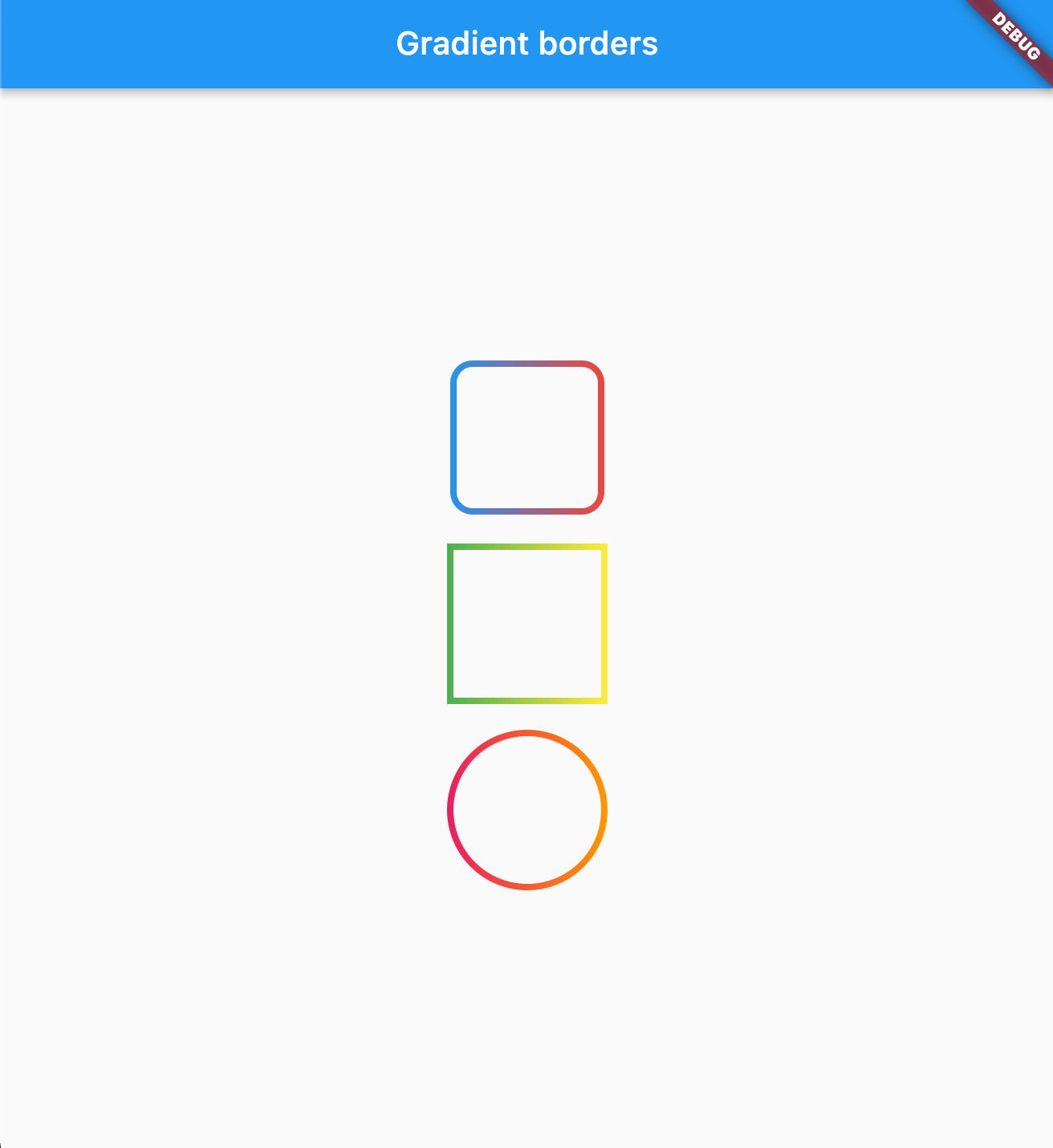
Change your container borders to use fancy gradients:

Container(
  width: 100,
  height: 100,
  decoration: BoxDecoration(
    border: const GradientBoxBorder(
      gradient: LinearGradient(colors: [Colors.blue, Colors.red]),
      width: 4,
    ),
    borderRadius: BorderRadius.circular(16)
  ),
),

Works with both: border radius, and with BoxShape.circle

Parameters
Parameter Type Default Description
gradient Gradient required The gradient to use for the border color.
width double 1.0 The width of the border.
strokeAlign double BorderSide.strokeAlignInside The alignment of the stroke relative to the border edge. Use BorderSide.strokeAlignInside (-1), BorderSide.strokeAlignCenter (0), or BorderSide.strokeAlignOutside (1).

image

Input borders

You can use GradientOutlineInputBorder as a part of your input decoration:

TextField(
  decoration: InputDecoration(
    border: GradientOutlineInputBorder(
      gradient: LinearGradient(colors: [Colors.red, Colors.blue]),
      width: 2,
    ),
    focusedBorder: GradientOutlineInputBorder(
     gradient: LinearGradient(colors: [Colors.yellow, Colors.green]),
      width: 2
    ),
    label: Text("Example"),
  ),
),
Parameters
Parameter Type Default Description
gradient Gradient required The gradient to use for the border color.
width double 1.0 The width of the border.
gapPadding double 4.0 Horizontal padding around the label cutout in the border.
borderRadius BorderRadius BorderRadius.all(Radius.circular(4)) The border radius of the rounded corners.
borderAlignment OutlineBorderAlignment OutlineBorderAlignment.onEdge Controls where the stroke is drawn relative to the widget edge. onEdge draws the border centered on the widget boundary; inside draws it fully inside.

image

You can also use GradientUnderlineInputBorder as part of your input decoration:

TextField(
  decoration: InputDecoration(
    border: GradientOutlineInputBorder(
      gradient: LinearGradient(colors: [Colors.red, Colors.blue]),
      width: 2,
    ),
    focusedBorder: GradientUnderlineInputBorder(
     gradient: LinearGradient(colors: [Colors.yellow, Colors.green]),
      width: 2
    ),
    label: Text("Example"),
  ),
),
Sponsored by

The Code Brothers

카테고리

소스 저장소

이 패키지를 사용하는 프로젝트