패키지, 저장소 및 앱 카테고리 검색

gradient_widgets 표지
패키지 상세v0.6.0

gradient_widgets

아름다운 그라데이션으로 둘러싸인 최소한의 플러터 위젯 세트입니다.

30일 다운로드
617
좋아요
89
Pub 점수
60

패키지 설치

flutter pub add gradient_widgets

패키지 개요

공개 정보를 바탕으로 생성한 선택 가이드입니다.

GradientWidgets는 아름다운 그라데이션으로 강화된 최소한의 위젯 세트를 제공하는 가벼운 Flutter 패키지입니다. 개발자들이 배경, 텍스트 및 기타 UI 요소에 그라데이션 효과를 간단하고 직관적인 API로 쉽게 적용할 수 있도록 도와줍니다. 복잡한 설정 없이 앱에 시각적 매력을 더하기에 적합하며, 부드러운 그라데이션 전환을 지원하고 기존의 Flutter 프로젝트에 원활하게 통합됩니다. 이 패키지는 단순성과 성능에 중점을 두어 현대적이고 시각적으로 매력적인 인터페이스에 이상적입니다.

사용 사례

  • 컨테이너에 그라디언트 배경 추가
  • 그라디언트 색상으로 텍스트 강화
  • 애니메이션 그라디언트 효과 만들기
  • 현대적인 앱 UI 설계
  • 최소한의 코드로 시각적 매력 향상
  • 버튼 및 카드 외관 맞춤 설정

주요 기능

  • 간단한 그라데이션 위젯 API
  • 배경 및 텍스트 그라디언트 지원
  • 최소 성능 오버헤드
  • Flutter와의 간편한 통합
  • 정돈되고 읽기 쉬운 코드베이스
  • 외부 종속성 없음

적합한 대상

  • 시각적 완성도를 추구하는 UI 디자이너
  • 현대의 모바일 앱을 개발하는 개발자
  • 미묘한 그라데이션 효과가 필요한 프로젝트
  • 시각적으로 풍부한 인터페이스 프로토타이핑
  • 미적 디자인에 중점을 둔 앱

고려 사항

  • 기본 그라디언트 기능에 국한됨
  • 내장 애니메이션 컨트롤 없음
  • 복잡한 색상 효과에 적합하지 않습니다
  • 그라디언트 방향과 색상을 수동으로 처리해야 합니다
  • 정적 또는 간단한 동적 그라디언트에 가장 적합

원본 README

연결된 소스 저장소의 README 원문 스냅샷입니다. 최신 내용은 저장소에서 확인하세요.

Pub

Gradient Widgets

Gradient Widgets

As of ^0.5.0, shadowColor is available for gradient buttons and cards

A minimal set of Flutter widgets encased with beautiful gradients.

You can use them when your UI needs user attention/focus, , e.g., login or send actions, or important shopping item title (see Gradient Screens to get the idea 😉)

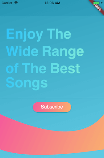
☑️ GradientText

☑️ GradientCard

☑️ GradientButton

☑️ CircularGradientButton + Shadow Color

☑️ GradientProgressIndicator

☑️ CircularGradientProgressIndicator

◻️ GradientAppBar

Installation

In your pubspec.yaml root add:

dependencies:
  gradient_widgets: ^0.6.0

then,

import 'package:gradient_widgets/gradient_widgets.dart';

Usage

Card + Gradient
GradientCard(
    gradient: Gradients.tameer,
    shadowColor: Gradients.tameer.colors.last.withOpacity(0.25),
    elevation: 8,
);

most parameters are the same as the Card.

Progress Indicator + Gradient
Gradient Widgets

must be gradient.colors.length = 2

indeterminate

GradientProgressIndicator(gradient: Gradients.rainbowBlue,);

determinate

GradientProgressIndicator(
  gradient: Gradients.rainbowBlue,
  value: 0.65,
);
Circular Progress Indicator + Gradient
Circular Gradient Progress Widgets

must be gradient.colors.length = 2

indeterminate

GradientCircularProgressIndicator(
  gradient: Gradients.aliHussien,
);

determinate

GradientCircularProgressIndicator(
  gradient: Gradients.aliHussien,
  radius: 100,
);
Normal Button + Gradient
GradientButton(
  child: Text('Gradient'),
  callback: () {},
  gradient: Gradients.backToFuture,
  shadowColor: Gradients.backToFuture.colors.last.withOpacity(0.25),
),

most parameters are the same as any *Button.

Circular Button + Gradient
CircularGradientButton(
  child: Icon(Icons.gradient),
  callback: (){},
  gradient: Gradients.rainbowBlue,
  shadowColor: Gradients.rainbowBlue.colors.last.withOpacity(0.5),
),

most parameters are the same as FloatingActionButton.

Text + Gradient
GradientText(
  'Hello',
  shaderRect: Rect.fromLTWH(0.0, 0.0, 50.0, 50.0),
  gradient: Gradients.hotLinear,
  style: TextStyle(fontSize: 40.0,),
),

all parameters are the same as the Text.


Getting Started

For help getting started with Flutter, view our online documentation.

For help on editing package code, view the documentation.

카테고리

소스 저장소

이 패키지를 사용하는 프로젝트