패키지, 저장소 및 앱 카테고리 검색

group_button 표지
패키지 상세v5.3.4

group_button

Flutter 사용자 정의 위젯으로 버튼 그룹을 만듭니다. 라디오 및 체크박스 버튼이 포함되어 있습니다.

AndroidiOSWebmacOSWindowsLinux
30일 다운로드
26.9만
좋아요
622
Pub 점수
160

패키지 설치

flutter pub add group_button

패키지 개요

공개 정보를 바탕으로 생성한 선택 가이드입니다.

라디오 및 체크박스 스타일을 모두 지원하는 그룹 버튼 생성을 가능하게 하는 플러터 커스텀 위젯입니다. 상호 배타적이거나 다중 선택 옵션을 깔끔하고 재사용 가능한 형식으로 구현하는 것을 단순화합니다. 양식, 필터 및 설정 인터페이스와 같이 사용자가 세트에서 하나 이상의 옵션을 선택해야 할 때 이상적입니다. 이 패키지는 모든 주요 플랫폼과 호환되며 기존 플러터 프로젝트에 원활하게 통합됩니다.

사용 사례

  • 그룹화된 선택이 있는 폼 입력
  • UI의 필터 옵션
  • 사용자 선호 설정
  • 다중 선택 또는 단일 선택 버튼 그룹
  • 동적 폼 빌더

주요 기능

  • 라디오 및 체크박스 버튼 유형을 지원합니다
  • Flutter와의 간편한 통합
  • 크로스 플랫폼 호환성
  • 사용자 지정 스타일
  • 그룹 선택을 위한 내장 상태 관리
  • 모든 기기용 반응형 디자인

적합한 대상

  • 인터랙티브 폼을 개발하는 개발자
  • 그룹화된 버튼 컴포넌트가 필요한 UI 디자이너
  • 필터 또는 선호도 선택이 필요한 앱
  • 다중 플랫폼을 대상으로 하는 프로젝트

고려 사항

  • 선택 콜백을 수동으로 처리해야 합니다
  • 제한된 내장 검증
  • 스타일링에는 추가적인 사용자 정의가 필요할 수 있습니다
  • 추가 로직 없이 복잡한 동적 그룹에는 적합하지 않음

원본 README

연결된 소스 저장소의 README 원문 스냅샷입니다. 최신 내용은 저장소에서 확인하세요.

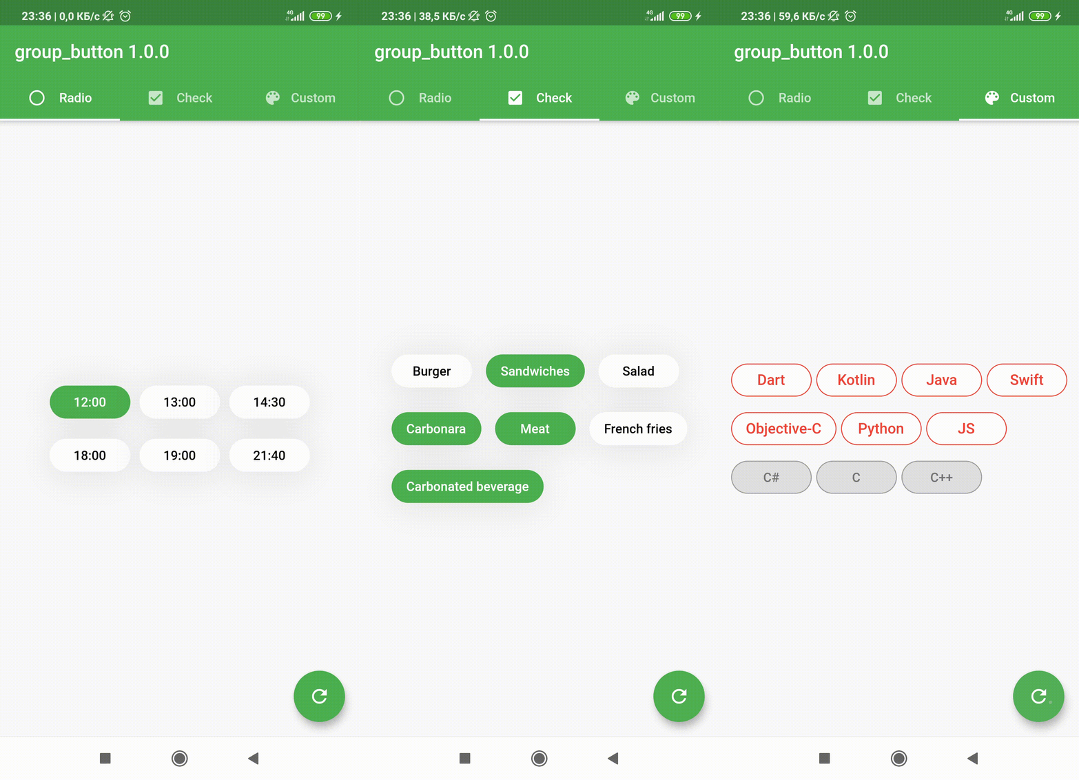
Flutter widget to create a group of buttons fast 🚀

Included Radio and CheckBox buttons models with custom groping types 🤤
Show some ❤️ and star the repo to support the project!

Pub License: MIT Repository views Pub

Pub likes Pub popularity Pub points


GroupButtonController GroupButtonBuilder GroupButtonOptions

Getting Started

Follow these steps to use this package

Add dependency
dependencies:
  group_button: ^5.4.0
Add import package
import 'package:group_button/group_button.dart';
Easy to use

Simple example of use GroupButton
Put this code in your project at an screen and learn how it works 😊

GroupButton(
    isRadio: false,
    onSelected: (index, isSelected) => print('$index button is selected'),
    buttons: ["12:00", "13:00", "14:30", "18:00", "19:00", "21:40"],
)
Controller

Starting from version 4.1.0
You can control your Group Button using the controller

final controller = GroupButtonController();

Column(
  children: [
    GroupButton.checkbox(
      controller: controller,
      buttons: ['12:00', '13:00', '14:00'],
      onSelected: (i, selected) => debugPrint('Button #$i $selected'),
    ),
    TextButton(
      onPressed: () => controller.selectIndex(1),
      child: const Text('Select 1 button'),
    )
  ],
),
Generic button value

In new 5.0.0 version you can set custom buttons value type
It can be int, DateTime, double or YourCustomClass
Button text will be result of .toString() model method in common button display case

GroupButton<DateTime>(
  buttons: [DateTime(2022, 4, 9), DateTime(2022, 4, 10)],
)
Button builders

Also you can use generic button values with cutsom buttonBuilder
In order to turn values into any widget

GroupButton<DateTime>(
  buttons: [DateTime(2022, 4, 9), DateTime(2022, 4, 10)],
  buttonBuilder: (selected, date, context) {
    return Text('${date.year}-${date.month}-${date.day}');
  },
),

In this package, there are four different possibilities for customizing your buttons through builders

  • 1 buttonBuilder It will build a fully custom button based on the value parameter
  • 2 buttonIndexedBuilder same as buttonBuilder. But based on button index.
  • 3 buttonTextBuilder It will replace the text of your button, which is constructed based on the style parameters passed in GroupButtonOptions. The appearance of the button remains the same, but the text is changed. Based on button value.
  • 4 buttonIndexedTextBuilder same as buttonTextBuilder. But based on button index.
Fully Customize

In order to customize your buttons inside GroupButton you can use GroupButtonOptions

GroupButtonOptions(
  selectedShadow: const [],
  selectedTextStyle: TextStyle(
    fontSize: 20,
    color: Colors.pink[900],
  ),
  selectedColor: Colors.pink[100],
  unselectedShadow: const [],
  unselectedColor: Colors.amber[100],
  unselectedTextStyle: TextStyle(
    fontSize: 20,
    color: Colors.amber[900],
  ),
  selectedBorderColor: Colors.pink[900],
  unselectedBorderColor: Colors.amber[900],
  borderRadius: BorderRadius.circular(100),
  spacing: 10,
  runSpacing: 10,
  groupingType: GroupingType.wrap,
  direction: Axis.horizontal,
  buttonHeight: 60,
  buttonWidth: 60,
  mainGroupAlignment: MainGroupAlignment.start,
  crossGroupAlignment: CrossGroupAlignment.start,
  groupRunAlignment: GroupRunAlignment.start,
  textAlign: TextAlign.center,
  textPadding: EdgeInsets.zero,
  alignment: Alignment.center,
  elevation: 0,
),

Examples

You can check more examples of using this package here


Thanks to all contributors of this package


For help getting started with 😍 Flutter, view online documentation, which offers tutorials, samples, guidance on mobile development, and a full API reference.

카테고리

소스 저장소

이 패키지를 사용하는 프로젝트