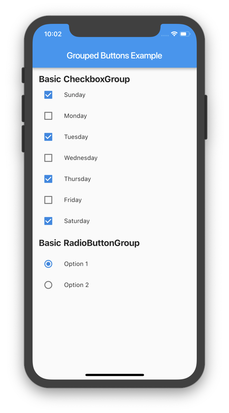
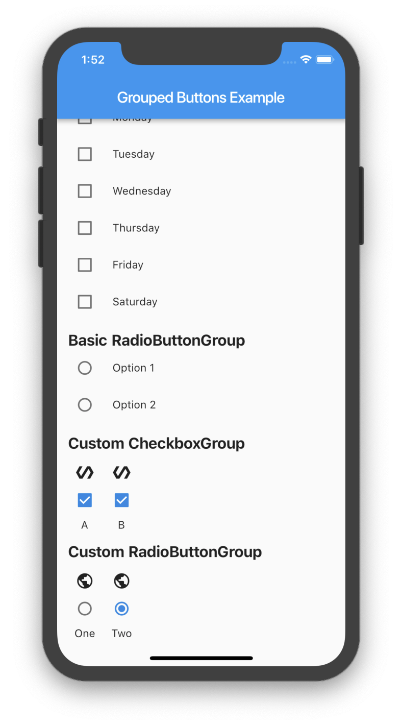
그룹화된 체크박스와 라디오 버튼의 생성 및 관리를 단순화하는 가벼운 플러터 패키지입니다. 일관된 스타일과 상태 관리로 다중 선택 옵션을 처리하는 깔끔하고 재사용 가능한 방법을 제공합니다. 사용자가 미리 정의된 목록에서 하나 이상의 항목을 선택해야 하는 폼이나 설정에 적합합니다. 이 패키지는 일반적인 패턴을 추상화함으로써 빌더 코드를 줄이고 개발자 생산성을 향상시킵니다.
사용 사례
다중 선택 옵션을 가진 폼 입력
사용자 선호 설정
설문조사 또는 퀴즈 인터페이스
동적 옵션 선택
그룹에 대한 간편한 상태 처리
전환 가능한 옵션을 위한 일관된 UI
주요 기능
체크박스와 라디오 버튼 그룹화를 쉽게
내장 상태 관리
사용자 정의 가능한 외관
최소한의 보일러플레이트
단일 및 다중 선택을 모두 지원합니다
깔끔하고 읽기 쉬운 API
적합한 대상
옵션 그룹을 사용하여 폼을 구축하는 개발자
일관된 토글 컴포넌트를 찾는 UI 디자이너
간단하지만 확장 가능한 선택 위젯이 필요한 프로젝트
코드 유지보수를 우선시하는 팀
Flutter 초보자가 폼 처리를 배운다
고려 사항
체크박스 및 라디오 버튼 유형으로 제한됨
내장된 검증 없음
중첩 그룹을 지원하지 않습니다
복잡한 디자인을 위해 수동 스타일링이 필요합니다
선택을 넘어서는 고급 폼 로직에는 적합하지 않습니다
원본 README
연결된 소스 저장소의 README 원문 스냅샷입니다. 최신 내용은 저장소에서 확인하세요.
grouped_buttons
A set of Flutter widgets that makes grouping Checkboxes and Radio Buttons much easier!
There are several options that allow for more control.
Custom CheckboxGroup
Properties
Description
activeColor
The color to use when a Checkbox is checked.
checkColor
The color to use for the check icon when a Checkbox is checked.
checked
Specifies which boxes to be automatically checked. Every element must match a label. This is useful for clearing all selections (set it to []). If this is non-null, then the user must handle updating this list; otherwise, the state of the CheckboxGroup won't change.
disabled
Specifies which boxes should be disabled. If this is non-null, no boxes will be disabled. The strings passed to this must match the labels.
itemBuilder
Called when needed to build a CheckboxGroup element.
labels
(required) A list of strings that describes each Checkbox. Each label must be distinct.
labelStyle
The style to use for the labels.
margin
Empty space surrounding the CheckboxGroup.
onChange
Called when the value of the CheckboxGroup changes.
onSelected
Called when the user makes a selection.
orientation
Specifies the orientation to display elements. Either GroupedButtonsOrientation.HORIZONTAL or GroupedButtonsOrientation.VERTICAL.
padding
Empty space in which to inset the CheckboxGroup.
tristate
If true the checkbox's value can be true, false, or null.
Specifies which buttons should be disabled. If this is non-null, no buttons will be disabled. The strings passed to this must match the labels.
itemBuilder
Called when needed to build a RadioButtonGroup element.
labels
(required) A list of strings that describes each Radio button. Each label must be distinct.
labelStyle
The style to use for the labels.
margin
Empty space surrounding the RadioButtonGroup.
onChange
Called when the value of the RadioButtonGroup changes.
onSelected
Called when the user makes a selection.
orientation
Specifies the orientation to display elements. Either GroupedButtonsOrientation.HORIZONTAL or GroupedButtonsOrientation.VERTICAL.
padding
Empty space in which to inset the RadioButtonGroup.
picked
Specifies which Radio button to automatically pick. Every element must match a label. This is useful for clearing what is picked (set it to ""). If this is non-null, then the user must handle updating this; otherwise, the state of the RadioButtonGroup won't change.