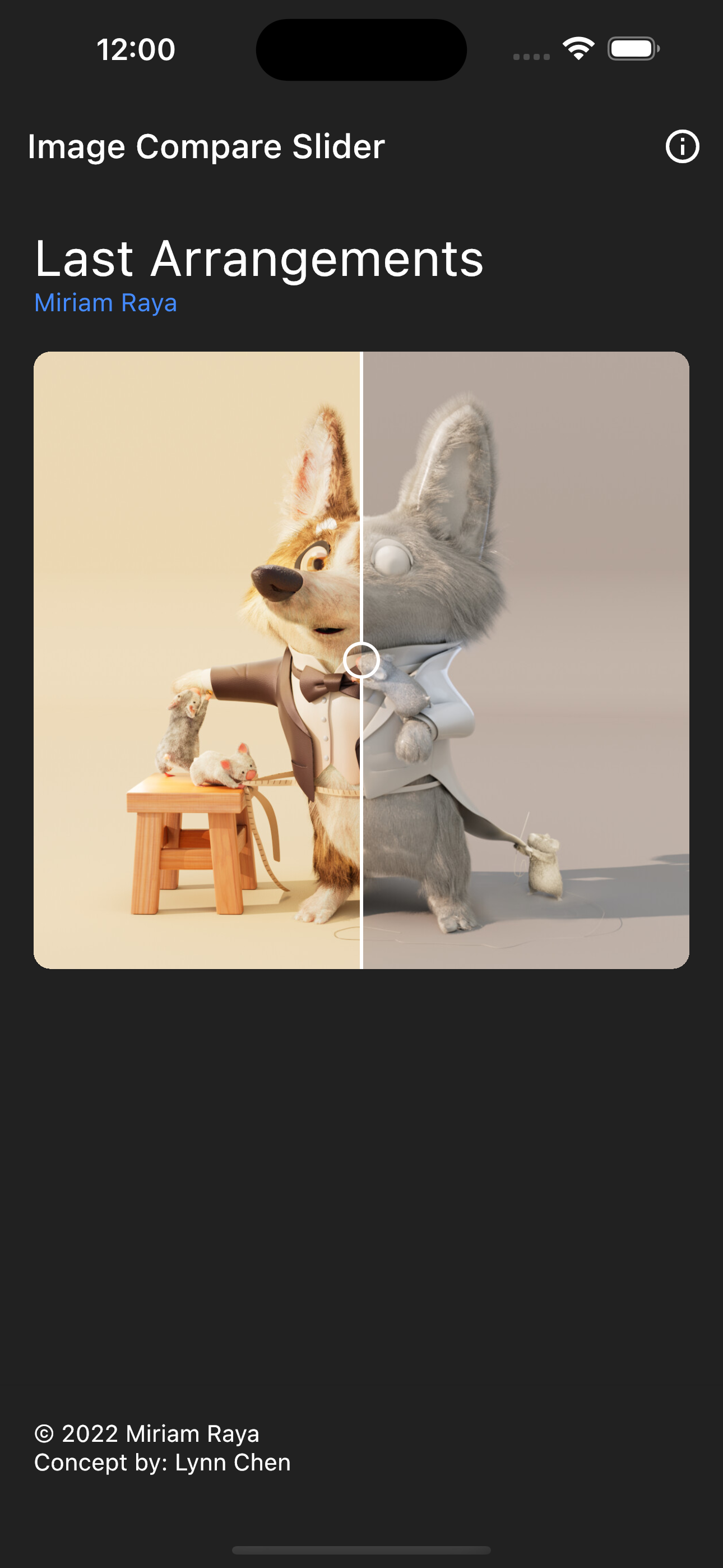
image_compare_slider 패키지는 드래그 가능한 슬라이더 핸들을 사용하여 이미지를 부드럽게 양옆으로 비교할 수 있게 해줍니다. 사용자가 핸들을 스ไล드하면서 하나의 이미지를 점차적으로 노출시킬 수 있어, 전후 시각화에 이상적입니다. 핸들 모양, 슬라이더 위치, 애니메이션 속도 등 다양한 옵션을 통해 완전히 맞춤설정 가능하며, Android, iOS, Web, macOS, Windows, Linux 등 주요 플랫폼을 모두 지원합니다. 가볍고 설정이 간단해 Flutter 앱에 쉽게 통합할 수 있습니다.
사용 사례
전후 사진 비교
제품 기능 시연
시각 디자인 검토
교육 이미지 분석
사용자 인터페이스 테스트
주요 기능
드래그 가능한 슬라이더 핸들
사용자 정의 가능한 핸들 및 트랙
부드러운 전환 애니메이션
크로스 플랫폼 지원
Flutter와의 간편한 통합
사용자 정의 가능한 초기 위치
적합한 대상
시각적 비교 도구가 필요한 앱 개발자
디자이너가 이미지 변경 사항을 전시하고 있습니다
교육 앱 제작자
전자상거래 제품 미리보기
인터랙티브 UI 컴포넌트
고려 사항
최상의 결과를 얻으려면 크기가 동일한 두 장의 이미지가 필요합니다
큰 이미지에서는 성능이 달라질 수 있습니다
수평 슬라이딩 레이아웃으로 제한
사용자 정의 스타일은 Flutter 위젯에 대한 이해가 필요합니다
복잡한 레이아웃에서는 추가 패딩 또는 제약 조건이 필요할 수 있습니다
원본 README
연결된 소스 저장소의 README 원문 스냅샷입니다. 최신 내용은 저장소에서 확인하세요.
Image Compare Slider
Inspired by react-compare-slider, this package allows you to easily compare two images with a slider — with zoom & pan, rotation (with lock), custom handles and size matching.
PR's are welcome!
Installation 💻
❗ In order to start using Image Compare you must have the Dart SDK installed on your machine.
Drives position, zoom, pan and rotation programmatically
handleBuilder
HandleBuilder?
Builds a fully custom, draggable handle widget
onlyHandleDraggable
bool
Restrict slider movement to dragging the handle
fit
BoxFit
How both images are inscribed into their box (default BoxFit.contain)
aspectRatio
double?
Force both images into the same box to match different sizes
zoomable
bool
Enable pinch / double-tap zoom on both images
pannable
bool
Enable drag-to-pan on both images
enableGestureRotation
bool
Enable two-finger rotation gestures
doubleTapToZoom
bool
Toggle zoom on double-tap (default true)
minScale / maxScale
double
Zoom bounds (default 1.0 / 5.0)
doubleTapScale
double
Zoom factor applied on double-tap (default 2.5)
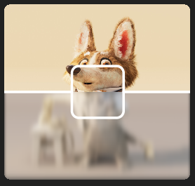
If you want to add some effects you can use the itemOneBuilder and itemTwoBuilder parameters to wrap the images with a ColorFilter or ImageFilter, or any other widget you want.
For example, to add a ImageFilter with a blur effect:
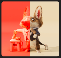
You can also pass any custom properties to the Image for itemOne and itemTwo, and most of the Image properties will be applied to the ImageCompareSlider widget.
For example, adding a colorBlendMode with a color to itemOne:
Control how the divider line is stroked with dividerLineStyle. Pick a preset
or build a fully custom dash pattern. This only affects the painted line, not
the handle.
// Solid (the default).ImageCompareSlider(
itemOne: constImage.asset('...'),
itemTwo: constImage.asset('...'),
dividerLineStyle: constDividerLineStyle.solid(),
);
// Dashed — dashes of `dashLength` separated by `gapLength` (logical pixels).ImageCompareSlider(
itemOne: constImage.asset('...'),
itemTwo: constImage.asset('...'),
dividerLineStyle: DividerLineStyle.dashed(dashLength: 10, gapLength: 6),
);
// Dotted — round dots whose diameter equals `dividerWidth`.ImageCompareSlider(
itemOne: constImage.asset('...'),
itemTwo: constImage.asset('...'),
dividerWidth: 4,
dividerLineStyle: DividerLineStyle.dotted(gapLength: 8),
);
// Fully custom — a repeating list of alternating on/off lengths, starting// with an "on" (drawn) segment. Here: long dash, gap, short dash, gap.ImageCompareSlider(
itemOne: constImage.asset('...'),
itemTwo: constImage.asset('...'),
dividerLineStyle: constDividerLineStyle(
pattern: <double>[12, 4, 4, 4],
strokeCap: StrokeCap.round,
),
);
Enable zoomable and/or pannable to pinch-zoom and drag both images at once
while keeping them perfectly aligned. Double-tap toggles zoom. Dragging the
handle still moves the slider, even while zoomed in.
Pass an ImageCompareSliderController to rotate either image in either
direction. Turn on lockRotation to rotate both images together in the same
cycle. The controller also exposes zoom, pan, position and a reset().
final controller = ImageCompareSliderController();
ImageCompareSlider(
controller: controller,
itemOne: constImage.asset('...'),
itemTwo: constImage.asset('...'),
);
// Rotate the left image a quarter turn clockwise.
controller.rotateOne(ImageCompareSliderController.quarterTurn);
// Rotate the right image counter-clockwise.
controller.rotateTwo(-ImageCompareSliderController.quarterTurn);
// Lock so both rotate together.
controller.lockRotation = true;
// Snap the second image to the first's angle.
controller.matchRotation();
// Reset zoom/pan/rotation.
controller.reset();
Remember to dispose() controllers you create yourself.
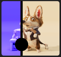
Custom handle ✋
Replace the painted handle with any widget via handleBuilder. It is centered
on the handle anchor and stays draggable. The divider line is still drawn.
If your images have different sizes or aspect ratios, set an aspectRatio and
a fit (e.g. BoxFit.cover) so both are forced into the same box and line up.
Releases are driven by the changelog using cider.
During development, record changes under the ## Unreleased section of
CHANGELOG.md (manually, or with dart run cider log added "...").
When ready, run the helper script. It bumps the version, promotes the
Unreleased section to the new version, commits and creates the v<version>
tag:
dart run tool/release.dart            # patch release (default)
dart run tool/release.dart minor      # or: major | patch | build | breaking | none
dart run tool/release.dart minor --push   # cut and push in one step
By default it does not push. Push the tag to publish:
git push --follow-tags
You can also run the Release: … entries in the VS Code Run & Debug panel.
Pushing a version tag triggers .github/workflows/publish.yaml, which publishes
to pub.dev (via GitHub OIDC, no secrets) and creates a GitHub release with notes
from the matching CHANGELOG.md section.
One-time setup: on pub.dev go to the package admin page → Automated
publishing → enable GitHub Actions publishing for
cgutierr-zgz/image_compare_slider with the tag pattern v{{version}}.