패키지, 저장소 및 앱 카테고리 검색

kf_drawer 표지
패키지 상세v2.1.0

kf_drawer

사이드 메뉴(Drawer)

AndroidiOSWebmacOSWindowsLinux
30일 다운로드
817
좋아요
144
Pub 점수
160

패키지 설치

flutter pub add kf_drawer

패키지 개요

공개 정보를 바탕으로 생성한 선택 가이드입니다.

kf_drawer는 여러 플랫폼에서 애플리케이션용 사용자 정의 가능한 사이드 메뉴(Drawer)를 제공하는 Flutter 패키지입니다. 너비, 애니메이션, 항목 스타일링과 같은 다양한 커스터마이징 옵션을 지원하는 깔끔하고 가벼운 네비게이션 구현을 제공합니다. 사용이 간편하도록 설계되어 Android, iOS, Web, macOS, Windows, Linux의 Flutter 앱에 원활하게 통합됩니다. 일관되고 반응성이 뛰어난 네비게이션 드로어 경험을 필요로 하는 앱에 적합합니다.

사용 사례

  • 모바일 앱 탐색
  • 웹 대시보드 사이드바
  • 데스크톱 애플리케이션 메뉴
  • 크로스 플랫폼 탐색
  • 사용자 지정 가능한 서랍 레이아웃

주요 기능

  • 크로스 플랫폼 호환성
  • 사용자 정의 가능한 서랍 너비
  • 부드러운 애니메이션
  • 간편한 통합
  • 사용자 정의 위젯 지원

적합한 대상

  • 다중 플랫폼 앱을 개발하는 개발자
  • 일관된 탐색이 필요한 팀
  • 복잡한 사이드바 요구사항을 가진 앱
  • 사용자 인터페이스 중심 프로젝트
  • 빠른 프로토타이핑

고려 사항

  • 제한된 내장 테마
  • 고급 디자인을 위해서는 수동 스타일링이 필요합니다
  • 내장된 다크 모드 지원 없음
  • Flutter의 Drawer API에 의존합니다
  • 추가 상태 관리가 필요할 수 있습니다

원본 README

연결된 소스 저장소의 README 원문 스냅샷입니다. 최신 내용은 저장소에서 확인하세요.

KFDrawer

pub package CI

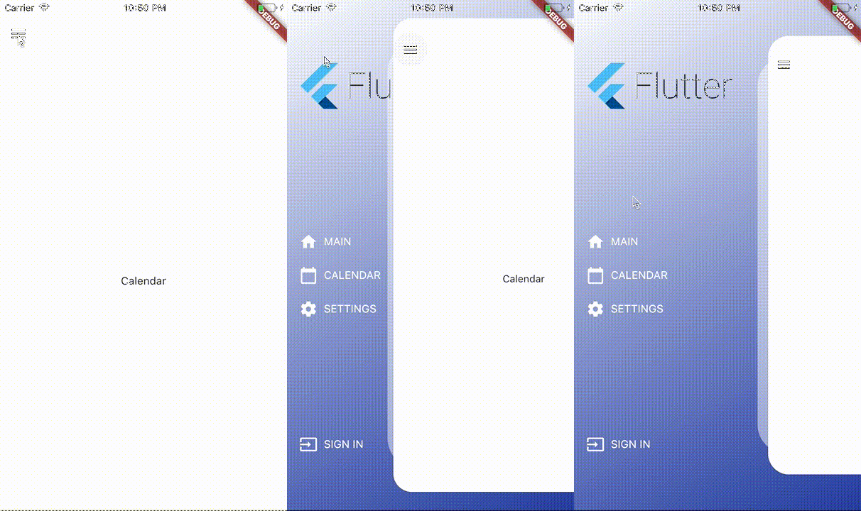
A dependency-free animated side drawer for Flutter. KFDrawer supports controller and context-based control, gestures, pinned or centered menus, page history, right-side drawers, and RTL layouts on every Flutter platform.

KFDrawer demo

Install

dependencies:
  kf_drawer: ^2.1.0

KFDrawer 2.1 supports Dart 3 and Flutter 3.10 or newer. The package is tested against both its compatibility floor and the current Flutter stable release.

Quick start

Create a controller, give each page item a widget, and place KFDrawer in your Scaffold body:

late final KFDrawerController drawerController;

@override
void initState() {
  super.initState();
  drawerController = KFDrawerController(
    initialPage: const HomePage(),
    items: <KFDrawerItem>[
      KFDrawerItem.withPage(
        alias: 'home',
        icon: const Icon(Icons.home, color: Colors.white),
        text: const Text('HOME', style: TextStyle(color: Colors.white)),
        page: const HomePage(),
      ),
      KFDrawerItem.withPage(
        alias: 'settings',
        icon: const Icon(Icons.settings, color: Colors.white),
        text: const Text('SETTINGS', style: TextStyle(color: Colors.white)),
        page: const SettingsPage(),
      ),
    ],
  );
}

@override
Widget build(BuildContext context) {
  return Scaffold(
    body: KFDrawer(
      controller: drawerController,
      decoration: const BoxDecoration(
        gradient: LinearGradient(
          colors: <Color>[Colors.white, Color(0xFF2C48AB)],
        ),
      ),
    ),
  );
}

@override
void dispose() {
  drawerController.dispose();
  super.dispose();
}

The page widgets do not need to extend a KFDrawer-specific base class. Open or close the nearest drawer directly from a descendant page:

IconButton(
  tooltip: 'Open navigation menu',
  icon: const Icon(Icons.menu),
  onPressed: () => KFDrawer.of(context)?.toggle(),
)

The controller callbacks remain available for existing integrations:

drawerController.open?.call();
drawerController.close?.call();
drawerController.toggle?.call();

Custom content without a controller

Use content when your application manages navigation elsewhere, such as with a bottom navigation bar:

KFDrawer(
  content: Scaffold(
    body: pages[currentIndex],
    bottomNavigationBar: BottomNavigationBar(
      currentIndex: currentIndex,
      onTap: onBottomNavigationTap,
      items: const <BottomNavigationBarItem>[
        BottomNavigationBarItem(icon: Icon(Icons.home), label: 'Home'),
        BottomNavigationBarItem(icon: Icon(Icons.person), label: 'Profile'),
      ],
    ),
  ),
  items: <KFDrawerItem>[
    KFDrawerItem(
      text: const Text('Open profile'),
      onPressed: openProfile,
    ),
  ],
)

Menu layout

By default, header, items, and footer use the original scrollable layout. Two opt-in properties cover fixed-footer and centered-menu use cases:

KFDrawer(
  controller: drawerController,
  header: const MyDrawerHeader(),
  footer: const MyDrawerFooter(),
  footerPinned: true,
  centerScrollableItems: true,
)
  • footerPinned keeps the footer outside the scrolling item list.
  • centerScrollableItems centers a shrink-wrapped item list between a fixed header and footer.
  • scrollable: false retains the non-scrolling centered column layout.

Right-side and RTL drawers

KFDrawerDirection is logical, so start automatically follows the ambient text direction:

// Left in LTR, right in RTL (default).
KFDrawer(direction: KFDrawerDirection.start)

// Right in LTR, left in RTL.
KFDrawer(direction: KFDrawerDirection.end)

Translation, edge dragging, content tap regions, shadow offset, icon padding, and menu alignment all follow the resolved side.

Dynamic items

Controller changes rebuild the drawer automatically:

drawerController.items = <KFDrawerItem>[...newItems];
drawerController.addItem(newItem);
drawerController.removeItem(oldItem);
drawerController.clearItems();

// If you mutate drawerController.items directly:
drawerController.items.add(newItem);
drawerController.refreshItems();

drawerController.selectItem('settings');

Optional page history and Back handling

KFDrawer swaps page widgets; it does not push Navigator routes. Enable the lightweight controller history only if this is the behavior your app needs:

final drawerController = KFDrawerController(
  initialPage: const HomePage(),
  maintainPageHistory: true,
);

AnimatedBuilder(
  animation: drawerController,
  builder: (context, child) {
    return PopScope<Object?>(
      canPop: !drawerController.canGoBack,
      onPopInvokedWithResult: (didPop, result) {
        if (!didPop) drawerController.goBack();
      },
      child: child,
    );
  },
  child: KFDrawer(controller: drawerController),
)

Use replacePage to change the current page without adding a history entry and clearHistory after a navigation reset.

Page item callbacks

When an item has both page and onPressed, KFDrawer now performs both actions: it selects the page, optionally closes the drawer, and invokes the callback.

KFDrawerItem.withPage(
  page: const ProfilePage(),
  text: const Text('PROFILE'),
  onPressed: logProfileSelection,
  closeOnTap: true,
)

Use an item without page when the callback should fully own navigation.

Useful options

Property Default Purpose
drawerWidth 0.66 Revealed fraction of available width
minScale 0.86 Content scale while open
borderRadius 32 Open content corner radius
shadowColor translucent white Decorative layer color; use transparent to hide it
disableContentTap true Absorb content interaction and close it on tap
dragEnabled true Enable pointer dragging
edgeDragWidth 8 Edge gesture activation width
animationDuration 280 ms Programmatic animation duration
slideCurve easeInOutCubic Translation curve
scaleCurve easeInOutBack Scale curve
onDrawerChanged null Observe open-state targets
semanticLabel localized drawer label Accessibility label

See the runnable example for a complete integration.

Support

If KFDrawer saves you time, you can support its ongoing maintenance on Buy Me a Coffee.

License

KFDrawer is released under the MIT License.

카테고리

소스 저장소

이 패키지를 사용하는 프로젝트