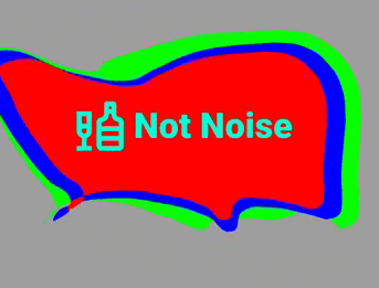
연결된 소스 저장소의 README 원문 스냅샷입니다. 최신 내용은 저장소에서 확인하세요.
liquid_container
Demo
Liquid button container. The physics of the Hover effect is not indistinguishable from a drop of water
Video of the application
Features
easy to use
has many parameters for fine tuning
fully native dart
Getting started
Add this to your pubspec.yaml
dependencies:
  liquid_container: ^1.0.4
Get the package from Pub:
flutter packages get
Import it in your file
import 'package:liquid_container/liquid_container.dart' ;
Usage
final optionsParam = Options (
layers: [
LayerModel (
points: [],
viscosity: 0.9 ,
touchForce: 30 ,
forceLimit: 15 ,
color: const Color (0xFF00FF00 ),
),
LayerModel (
points: [],
viscosity: 0.9 ,
touchForce: 50 ,
forceLimit: 10 ,
color: const Color (0xFFFF0000 ),
),
],
gap: 30 ,
noise: 30 ,
forceFactorBuild: 10 ,
forceFactorOnTap: 150 ,
);
Add BoxDecoration to customize the container shape (optional)
BoxDecoration _borderForm () {
return const BoxDecoration (
borderRadius: BorderRadius .only (
topLeft: Radius .circular (40 ),
topRight: Radius .circular (80 ),
bottomLeft: Radius .circular (150 ),
bottomRight: Radius .circular (20 ),
));
}
Use the pretty hover button
Widget _buildLiquidButton () {
return LiquidContainer (
onTap: () {
},
optionsParam: optionsParam,
boxDecorationLabel: _borderForm (),
child: _buildSomeChild (),
);
}
Full example
import 'package:flutter/material.dart' ;
void main () {
runApp (const LiquidApp ());
}
class LiquidApp extends StatelessWidget static const title = 'Liquid Container' ;
const LiquidApp ({
super . key,
});
@override
Widget build (BuildContext context) {
return MaterialApp (
title: title,
home: Scaffold (
appBar: AppBar (
title: const Text (title),
),
body: Container (
color: Colors .grey,
child: ListView (
children: const [
BigNoiseLiquidWidget (),
SizedBox (height: 300 ),
],
),
),
),
);
}
}
class BigNoiseLiquidWidget extends StatefulWidget const BigNoiseLiquidWidget ({super .key});
@override
_BigNoiseLiquidWidgetState createState () => _BigNoiseLiquidWidgetState ();
}
class _BigNoiseLiquidWidgetState extends State <BigNoiseLiquidWidget > static const _label = 'Big Noise' ;
final optionsParam = Options (
layers: [
LayerModel (
points: [],
viscosity: 0.9 ,
touchForce: 30 ,
forceLimit: 15 ,
color: const Color (0xFF00FF00 ),
),
LayerModel (
points: [],
viscosity: 0.9 ,
touchForce: 50 ,
forceLimit: 10 ,
color: const Color (0xFF0000FF ),
),
LayerModel (
points: [],
viscosity: 0.9 ,
touchForce: 50 ,
forceLimit: 10 ,
color: const Color (0xFFFF0000 ),
),
],
gap: 30 ,
noise: 30 ,
forceFactorBuild: 10 ,
forceFactorOnTap: 150 ,
scaleOptionLayer: [1 , 0.9 , 0.8 ],
);
@override
Widget build (BuildContext context) {
return Container (
height: 200 ,
margin: const EdgeInsets .only (left: 10 , right: 30 , top: 100 ),
child: LiquidContainer (
onTap: _onTapToLiquidButton,
optionsParam: optionsParam,
boxDecorationLabel: _borderForm (),
child: _buildForegroundChild (),
),
);
}
BoxDecoration _borderForm () {
return const BoxDecoration (
borderRadius: BorderRadius .only (
topLeft: Radius .circular (40 ),
topRight: Radius .circular (80 ),
bottomLeft: Radius .circular (150 ),
bottomRight: Radius .circular (20 ),
));
}
void _onTapToLiquidButton () {
ScaffoldMessenger .of (context).showSnackBar (
SnackBar (
content: Padding (
padding: const EdgeInsets .symmetric (horizontal: 5 , vertical: 20 ),
child: Row (
mainAxisAlignment: MainAxisAlignment .spaceBetween,
children: [
const Text (
_label,
style: TextStyle (
fontSize: 20 ,
fontWeight: FontWeight .w900,
color: Color (0xFF00FFD5 ),
),
),
IconButton (
onPressed: ScaffoldMessenger .of (context).clearSnackBars,
icon: const Icon (
Icons .close,
size: 30 ,
color: Colors .redAccent,
),
),
],
),
),
),
);
}
Row _buildForegroundChild () {
return Row (
mainAxisAlignment: MainAxisAlignment .center,
children: const <Widget >[
Icon (
Icons .liquor_outlined,
color: Color (0xFF00FFD5 ),
size: 60 ,
),
SizedBox (width: 5 ),
Text (
_label,
style: TextStyle (
fontSize: 36 ,
fontWeight: FontWeight .w900,
color: Color (0xFF00FFD5 ),
),
),
],
);
}
}
Author
Okladnoj