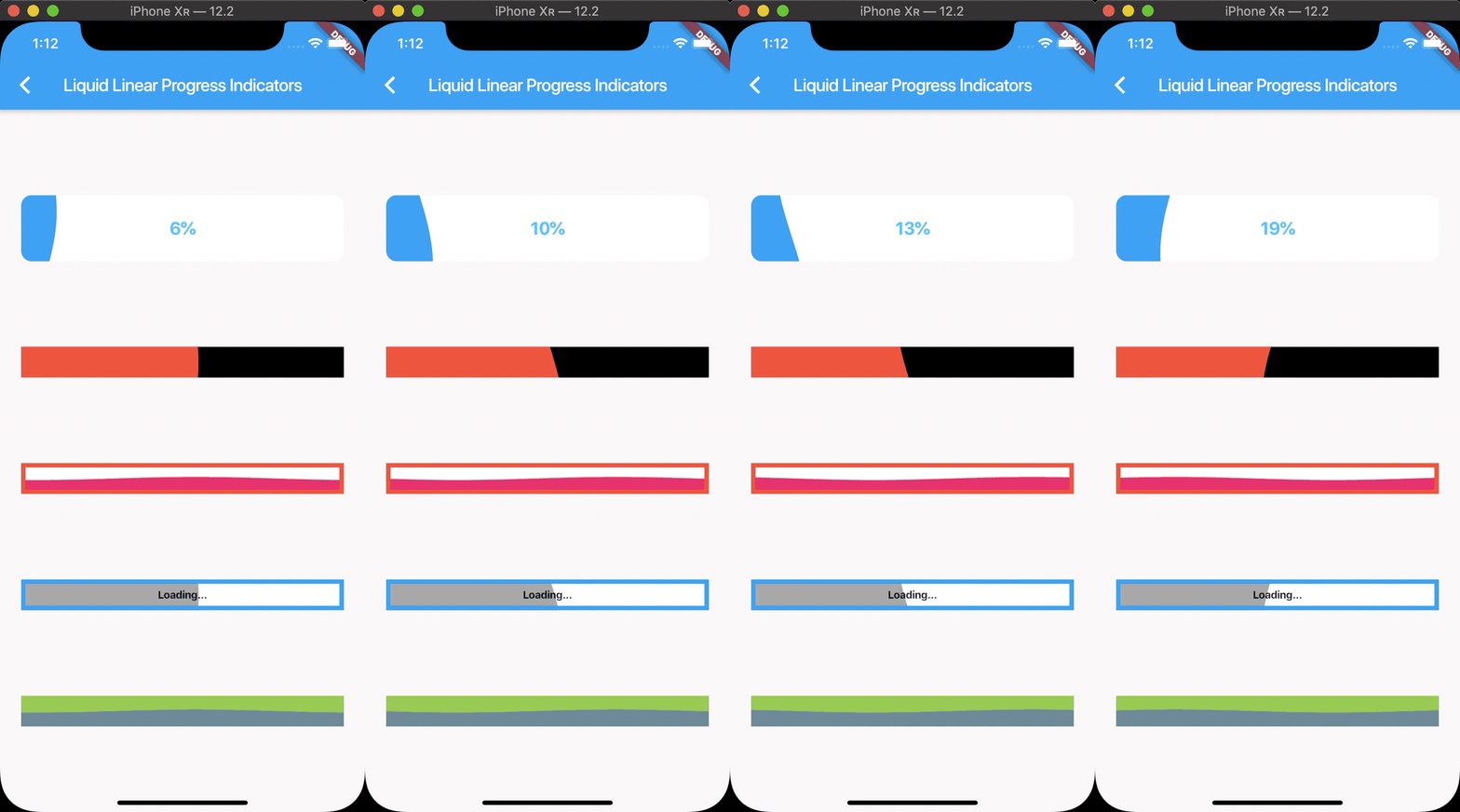
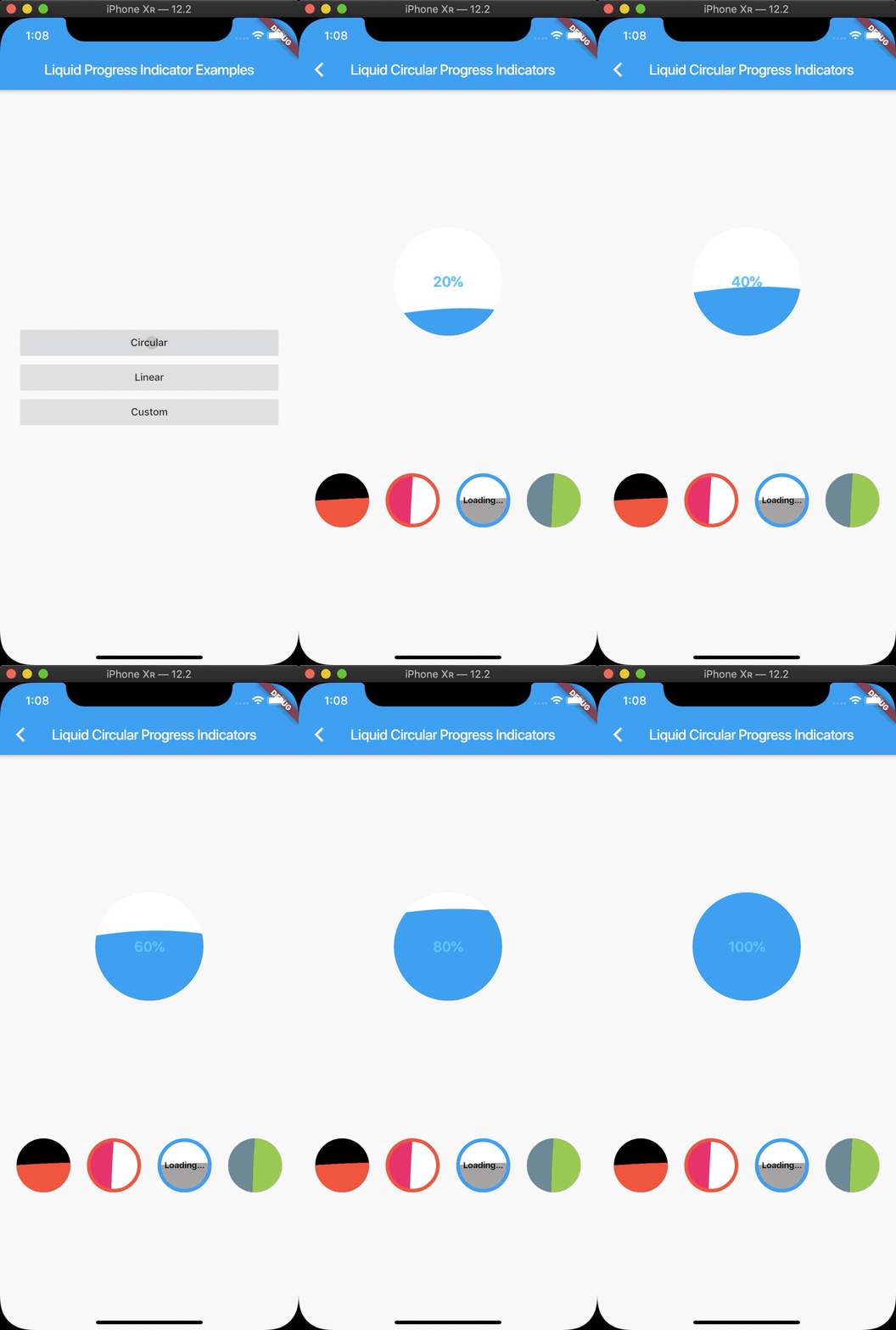
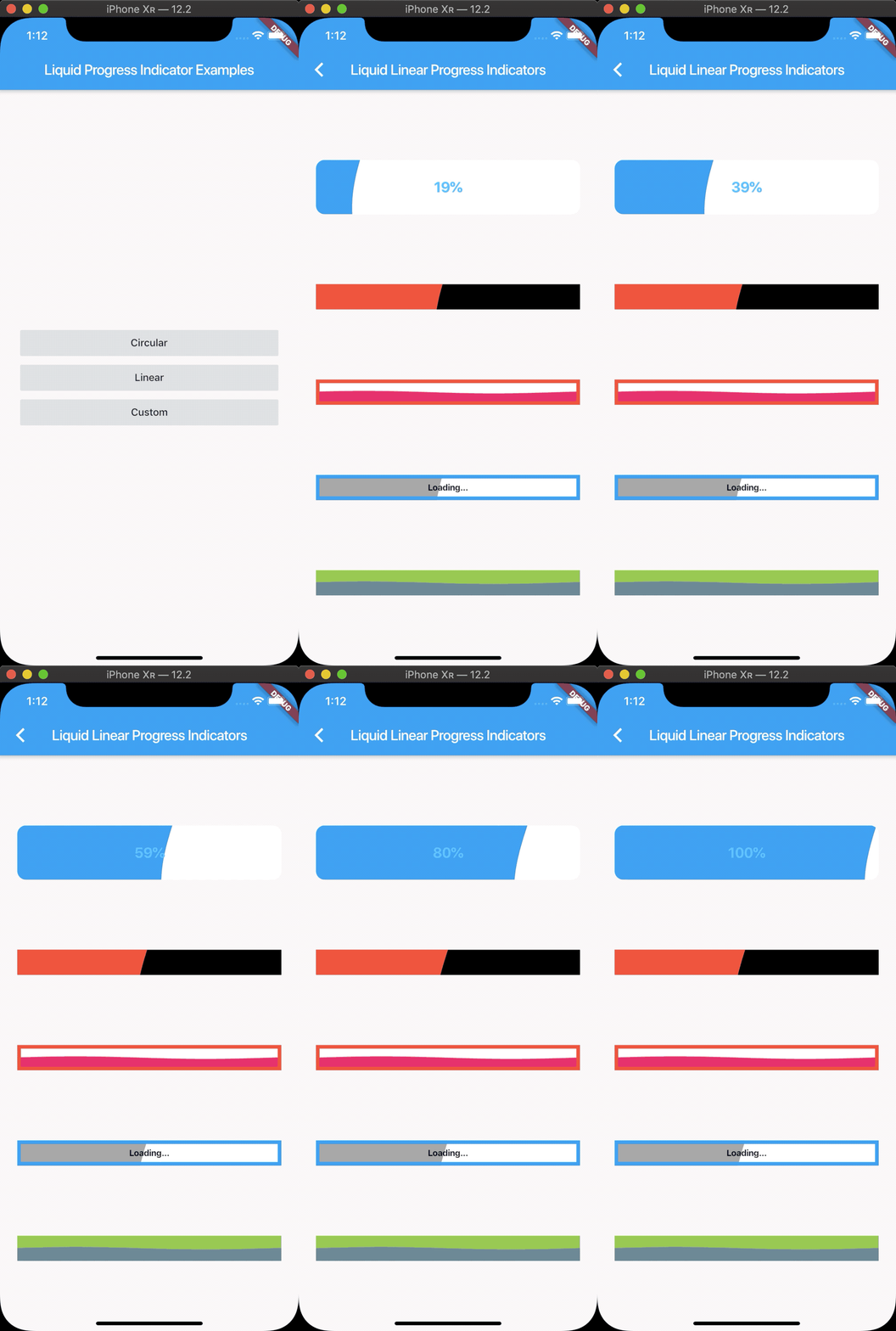
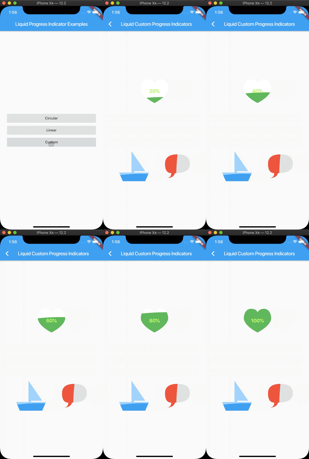
Flutter에서 시각적으로 매력적인 진행률 표시기로, 액체처럼 흐르는 효과를 모방하여 내장된 ProgressIndicator와 유사한 부드럽고 흐르는 애니메이션을 제공합니다. 동적이고 유연한 시각적 요소를 통해 로딩 상태 및 진행 추적에 적합한 사용자 경험을 향상시킵니다. 가볍고 쉽게 통합할 수 있으며, 색상, 크기, 애니메이션 속도를 사용자 정의할 수 있습니다. 시각적 피드백이 중요한 현대적이고 매력적인 UI에 이상적입니다.
사용 사례
로딩 화면
양식 내 진행률 추적
인터랙티브 앱 온보딩
게임 로딩 애니메이션
데이터 가져오기 중 시각 피드백
주요 기능
액체 같은 흐르는 애니메이션
사용자 지정 가능한 색상 및 크기
부드럽고 반응성 있는 전환
Flutter와의 간편한 통합
선형 및 원형 스타일 둘 다 지원
적합한 대상
현대적인 앱 인터페이스
디자인 중심 애플리케이션
사용자 참여도 향상
유연한 움직임을 필요로 하는 애니메이션
시각적 완성도를 추구하는 개발자
고려 사항
저사양 기기에서 성능에 영향을 줄 수 있습니다
기본 스타일링을 넘어서는 사용자 정의가 제한적입니다
고주기 업데이트에 적합하지 않음
전체 테마와의 일관성을 고려한 신중한 디자인 조정이 필요합니다
애니메이션은 최소한의 사용자 인터페이스에서 방해가 될 수 있습니다
원본 README
연결된 소스 저장소의 README 원문 스냅샷입니다. 최신 내용은 저장소에서 확인하세요.
liquid_progress_indicator
Liquid progress indicator for Flutter.
Features
Liquid circular progress indicator.
Liquid linear progress indicator.
Liquid custom progress indicator.
Works similarly to Flutters own ProgressIndicator.
LiquidCircularProgressIndicator(
  value: 0.25, // Defaults to 0.5.
  valueColor: AlwaysStoppedAnimation(Colors.pink), // Defaults to the current Theme's accentColor.
  backgroundColor: Colors.white, // Defaults to the current Theme's backgroundColor.
  borderColor: Colors.red,
  borderWidth: 5.0,
  direction: Axis.horizontal, // The direction the liquid moves (Axis.vertical = bottom to top, Axis.horizontal = left to right). Defaults to Axis.vertical.
  center: Text("Loading..."),
);
LiquidLinearProgressIndicator
LiquidLinearProgressIndicator(
  value: 0.25, // Defaults to 0.5.
  valueColor: AlwaysStoppedAnimation(Colors.pink), // Defaults to the current Theme's accentColor.
  backgroundColor: Colors.white, // Defaults to the current Theme's backgroundColor.
  borderColor: Colors.red,
  borderWidth: 5.0,
  borderRadius: 12.0,
  direction: Axis.vertical, // The direction the liquid moves (Axis.vertical = bottom to top, Axis.horizontal = left to right). Defaults to Axis.horizontal.
  center: Text("Loading..."),
);
LiquidCustomProgressIndicator
LiquidCustomProgressIndicator(
  value: 0.2 // Defaults to 0.5.
  valueColor: AlwaysStoppedAnimation(Colors.pink), // Defaults to the current Theme's accentColor.
  backgroundColor: Colors.white, // Defaults to the current Theme's backgroundColor.
  direction: Axis.vertical, // The direction the liquid moves (Axis.vertical = bottom to top, Axis.horizontal = left to right).
  shapePath: _buildBoatPath(), // A Path object used to draw the shape of the progress indicator. The size of the progress indicator is created from the bounds of this path.
)