패키지, 저장소 및 앱 카테고리 검색

list_tile_switch 표지
패키지 상세v1.0.0

list_tile_switch

간단하면서도 우아한 위젯은 Material ListTile과 사용자 정의 및 원본 Material 및 Cupertino 스위치 구현을 결합합니다.

AndroidiOSWebmacOSWindowsLinux
30일 다운로드
458
좋아요
75
Pub 점수
150

패키지 설치

flutter pub add list_tile_switch

패키지 개요

공개 정보를 바탕으로 생성한 선택 가이드입니다.

Material Design ListTile를 사용자 정의 가능한 네이티브 스타일 스위치와 원활하게 통합하는 플러터 패키지입니다. Material 및 쿠퍼티오 스타일 모두 지원합니다. 일관된 크로스플랫폼 레이아웃을 갖춘 토글 가능한 리스트 아이템을 만들 수 있는 깔끔하고 우아한 솔루션을 제공합니다. 가볍고 사용하기 쉬운 컴포넌트로서 기능성과 미적 매력을 결합하여 사용자 경험을 향상시킵니다. 설정 또는 선호도 화면에서 자주 사용되는 스위치에 이상적입니다.

사용 사례

  • 설정 UI
  • 선호도 패널
  • 토글 가능한 목록 항목
  • 사용자 프로필 구성
  • 폼 컨트롤

주요 기능

  • 사용자 정의 가능한 Material 및 Cupertino 스위치
  • 원활한 ListTile 통합
  • 크로스 플랫폼 일관성
  • 경량이며 성능이 뛰어남
  • 구현하기 쉬움
  • 스타일링 유연성

적합한 대상

  • 설정 화면을 개발하는 개발자
  • 네이티브 스타일의 토글을 찾는 디자이너
  • 크로스 플랫폼 전환 컴포넌트가 필요한 앱
  • UI 다듬기에 중점을 둔 프로젝트

고려 사항

  • Flutter 3.0 이상이 필요합니다
  • 스위치 전용 기능에 한정
  • 표준 전환 외에 내장 애니메이션이 없습니다
  • 복잡한 레이아웃의 경우 추가 스타일링이 필요할 수 있습니다

원본 README

연결된 소스 저장소의 README 원문 스냅샷입니다. 최신 내용은 저장소에서 확인하세요.

ListTileSwitch

Build Status Codemagic build status Coverage Status

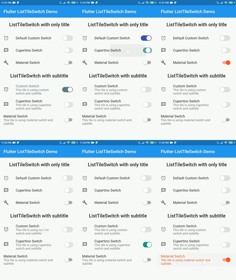
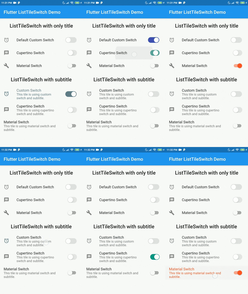
ListTileSwitch is a simple widget that combines ListTile with a switch. Offering 3 types of switch widgets:

  1. Switch: Material Switch from Material library on Flutter SDK.
  2. CupertinoSwitch: CupertinoSwitch from Cupertino library on Flutter SDK.
  3. A custom switch.

Demo

Tested on Android and Web but not iOS. Theoritacially it should work on iOS devices too, since this package contains nothing but pure Dart and Flutter components.

Installation

Add dependency for package on your pubspec.yaml:

dependencies:
    list_tile_switch: <latest>

Usage

Use it as a regular ListTile widget with a bonus: the trailing widget is a switch. Covering all aspects of the ListTile and adding more with a custom switch.

Parameter Definition
double switchScale Adjusting the scale of the switch widget.
Color switchActiveColor The color of the switch when the switch is active.
bool toggleSelectedOnValueChange Deciding whether to color the ListTile when switch value is true, the selected color will be the switchActiveColor.
Color switchInactiveColor Color when the switch is inactive.
SwitchType switchType Indicating the type of switch to be displayed.
bool value Current state of the switch value.
onChanged(bool) Toggle callback for the widget.
Widget leading, Widget title, Widget subtitle, Widget isThreeLine, EdgeInsetsGeometry contentPadding, VoidCallback onLongPress, VisualDensity visualDesnsity, bool dense, bool enabled, FocusNode focusNode, bool autoFocus, bool selected, Color focusColor, Color hoverColor, MouseCursor mouseCursor Referring to the original implementation of ListTile from Flutter SDK, all of the values are mapped directly to the ListTile widget internally.

Example

import 'package:flutter/material.dart';  
import 'package:list_tile_switch/list_tile_switch.dart';  
  
void main() {  
  runApp(MyApp());  
}  
  
class MyApp extends StatelessWidget {  
  @override  
  Widget build(BuildContext context) {  
  return MaterialApp(  
  title: 'Flutter ListTileSwitch Demo',  
  debugShowCheckedModeBanner: false,  
  theme: ThemeData(  
  primarySwatch: Colors.blue,  
  visualDensity: VisualDensity.adaptivePlatformDensity,  
 ),  home: ListTileSwitchExample(title: 'Flutter ListTileSwitch Demo'),  
 ); }}  
  
class ListTileSwitchExample extends StatefulWidget {  
  ListTileSwitchExample({Key key, this.title}) : super(key: key);  
  final String title;  
  @override  
  _ListTileSwitchExampleState createState() => _ListTileSwitchExampleState();  
}  
  
class _ListTileSwitchExampleState extends State<ListTileSwitchExample> {  
  bool _value = false;  
  @override  
  Widget build(BuildContext context) {  
    return Scaffold(  
	  appBar: AppBar(  
		title: Text(widget.title),  
	  ),
	  body: ListTileSwitch(  
	    value: _value,  
		leading: Icon(Icons.access_alarms),  
		onChanged: (value) {  
		  setState(() {  
			_value = value;  
		  });
		},
		visualDensity: VisualDensity.comfortable,
		switchType: SwitchType.cupertino,
		switchActiveColor: Colors.indigo,  
		title: Text('Default Custom Switch'),  
	 ),
   );
}}

Todo

The list of additional features that are considered to be implemented in the future.

  • [ ] Creating more tests
  • [ ] Add interactivity to custom switch widget
  • [ ] Make custom switch more configurable
    • [ ] Configurable thumb shape
    • [ ] Configurable track shape
    • [ ] Scaling animation on value change

Contribution

Contributions are accepted via pull requests. For more information about how to contribute to this package, please check the contribution guide.

License

This project is licensed under the MIT license, additional knowledge about the license can be found here.

카테고리

소스 저장소

이 패키지를 사용하는 프로젝트

아직 데이터가 없습니다.