패키지, 저장소 및 앱 카테고리 검색

material_dialogs 표지
패키지 상세v1.1.5

material_dialogs

Flutter 패키지는 앱에서 애니메이션 효과가 있는 간단하고 세련된 Material 대화 상자를 만들 수 있도록 도와줍니다.

AndroidiOSWebmacOSWindowsLinux
30일 다운로드
4.1천
좋아요
360
Pub 점수
155

패키지 설치

flutter pub add material_dialogs

패키지 개요

공개 정보를 바탕으로 생성한 선택 가이드입니다.

Material Dialogs는 애니메이션 효과가 있으며 스타일리시하고 사용자 정의 가능한 마테리얼 디자인 대화 상자를 쉽게 만들 수 있도록 설계된 Flutter 패키지입니다. 모든 플랫폼에서 마테리얼 가이드라인에 부합하는 현대적인 대화 상자 인터페이스를 구축하기 위한 사용하기 쉬운 API를 제공합니다. 경고, 확인 및 사용자 지정 대화 상자와 같은 다양한 대화 상자 유형을 지원하며 부드러운 애니메이션과 반응형 레이아웃을 갖추고 있습니다. 안드로이드, iOS, 웹, macOS, Windows, 리눅스용 앱에서 시각적으로 매력적인 팝업을 통해 사용자 상호작용을 향상시키기에 이상적입니다.

사용 사례

  • 경고 및 확인 표시
  • 사용자 정의 모달 대화 상자 만들기
  • 애니메이션을 통한 사용자 피드백 향상
  • 온보딩 또는 튜토리얼 프롬프트 구현
  • 인터랙티브 바텀 시트 추가
  • Material Design를 활용한 UI 일관성 향상

주요 기능

  • 애니메이션 전환
  • 사용자 지정 테마
  • 크로스 플랫폼 지원
  • 간단한 API
  • 내장 대화 상자 유형
  • 반응형 디자인

적합한 대상

  • 빠른 대화 구현을 원하는 개발자
  • 일관된 Material Design이 필요한 앱
  • 다중 플랫폼 대상 프로젝트
  • 사용자 인터페이스 중심 애플리케이션
  • 개발자 경험을 우선시하는 팀
  • 프로토타이핑 및 빠른 개발

고려 사항

  • 마테리얼 디자인 미학에 국한
  • 비 매터리얼 테마에 대해 추가 스타일링이 필요할 수 있습니다
  • Flutter의 Material 라이브러리에 의존합니다
  • 복잡한 사용자 정의 모달에 적합하지 않습니다
  • Flutter의 기본 테마 시스템과 함께 사용하는 것이 가장 좋습니다
  • Flutter의 위젯 트리에 대한 이해가 필요합니다

원본 README

연결된 소스 저장소의 README 원문 스냅샷입니다. 최신 내용은 저장소에서 확인하세요.

Flutter Material Dialogs

pub

Flutter Material Dialogs 📱

A Flutter library aims to help you create 💪🏻animated, 😃 simple, 😎 stylish Material Dialogs in your app.

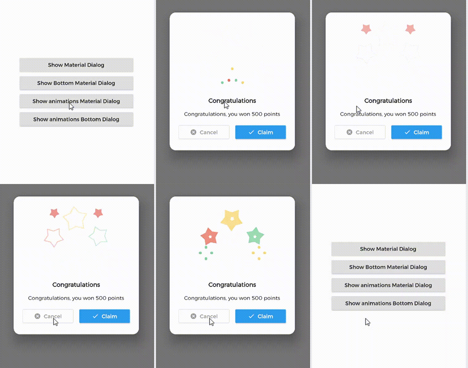
1. Material Dialog 2. Animations Material Dialog 3. Bottom Material Dialog 4. Animations Bottom Dialog

Table of Contents:

Introduction

MaterialDialog This Plugin will be useful to create simple, animated, and beautiful dialogs in your next Flutter app. This library implements Airbnb's Lottie library to render After Effects animation in app.

Types of Dialog

MaterialDialog library provides two types of dialog i.e.

1. Material Dialog 2. Bottom Sheet Material Dialog
A normal material dialog which can have one or two buttons. A Bottom Sheet material dialog which can have one or two buttons, is showed from bottom of device.

Implementation

Implementation of Material Dialog library is so easy. You can check /example directory for demo. Let's have look talk in details about it.

install
i. pubspec

In pubspec.yaml

dependencies:
  material_dialogs: _latest_version

Now in your Dart code, you can use:

import 'package:material_dialogs/material_dialogs.dart';

Details see pub.dev.

Create Dialog

As there are two types of dialogs in library. Material Dialogs are instantiated as follows.

i. Material Dialog

Dialogs class will be used to create your dialog, below is an example to show your dialog in the app.

Dialogs.materialDialog(
          msg: 'Are you sure ? you can\'t undo this',
          title: "Delete",
          color: Colors.white,
          context: context,
          actions: [
            IconsOutlineButton(
              onPressed: () {},
              text: 'Cancel',
              iconData: Icons.cancel_outlined,
              textStyle: TextStyle(color: Colors.grey),
              iconColor: Colors.grey,
            ),
            IconsButton(
              onPressed: () {},
              text: 'Delete',
              iconData: Icons.delete,
              color: Colors.red,
              textStyle: TextStyle(color: Colors.white),
              iconColor: Colors.white,
            ),
          ])

IconsOutlineButton and IconsButton are both buttons widgets provided by the plugin to make things easier for you read more, you can use any other buttons if you want.

ii. Bottom Sheet Material Dialog

Dialogs class will be used to create your dialog, use bottomMaterialDialog. Below is an example to show your dialog in the app.

Dialogs.bottomMaterialDialog(
          msg: 'Are you sure? you can\'t undo this action',
          title: 'Delete',
          context: context,
          actions: [
            IconsOutlineButton(
              onPressed: () {},
              text: 'Cancel',
              iconData: Icons.cancel_outlined,
              textStyle: TextStyle(color: Colors.grey),
              iconColor: Colors.grey,
            ),
            IconsButton(
              onPressed: () {},
              text: 'Delete',
              iconData: Icons.delete,
              color: Colors.red,
              textStyle: TextStyle(color: Colors.white),
              iconColor: Colors.white,
            ),
          ]),

Show Animations

Animations in this library are implemented using Lottie animation library. You can get free animations files here.

*.json file downloaded from LottieFiles should be placed in flutter project.

For example, here cong_example.json animation file is used in the assets folder to show congratulations animation in the example app.

In code, set lottieBuilder arg in Widget to set Animation to the dialog.

Dialogs.materialDialog(
          color: Colors.white,
          msg: 'Congratulations, you won 500 points',
          title: 'Congratulations',
          lottieBuilder: Lottie.asset(
          'assets/cong_example.json',
          fit: BoxFit.contain,
          ),
          context: context,
          actions: [
            IconsButton(
              onPressed: () {},
              text: 'Claim',
              iconData: Icons.done,
              color: Colors.blue,
              textStyle: TextStyle(color: Colors.white),
              iconColor: Colors.white,
            ),
          ]),

Icons buttons

The plugin provide you some out of the box customized buttons to help you creating your dialog.

IconsOutlineButton

This widget helps you create an outline button easily

    IconsOutlineButton(
      onPressed: () {},
      text: 'Cancel',
      iconData: Icons.cancel_outlined,
      textStyle: TextStyle(color: Colors.grey),
      iconColor: Colors.grey,
    ),
IconsButton

This widget helps you create a material button with icons in few lines of code

    IconsButton(
      onPressed: () {},
      text: 'Delete',
      iconData: Icons.delete,
      color: Colors.red,
      textStyle: TextStyle(color: Colors.white),
      iconColor: Colors.white,
    ),
CustomView

You can add your own Widget inside the dialog by using the customView attribute and CustomViewPosition to place it wherever you want.

Possible values
BEFORE_ANIMATION
BEFORE_TITLE (Default)
BEFORE_MESSAGE
BEFORE_ACTION
AFTER_ACTION
Dialogs.materialDialog(
          color: Colors.white,
          msg: 'Congratulations, you won 500 points',
          title: 'Congratulations',
          lottieBuilder: Lottie.asset(
          'assets/cong_example.json',
          fit: BoxFit.contain,
          ),
          customView: MySuperWidget(),
          customViewPosition: CustomViewPosition.BEFORE_ACTION,
          context: context,
          actions: [
            IconsButton(
              onPressed: () {},
              text: 'Claim',
              iconData: Icons.done,
              color: Colors.blue,
              textStyle: TextStyle(color: Colors.white),
              iconColor: Colors.white,
            ),
          ]),

Limitations

it's better to make your animation to have the same background color as your dialog's background color, please use lottie editor to remove the background layer of your animation or make it same as your dialog background color before using it in the plugin.

Contribute

Let's develop with collaborations. We would love to have contributions by raising issues and opening PRs. Filing an issue before PR is must.

Credits

This library is built using following open-source libraries.

License

Project is published under the Apache 2.0 license. Feel free to clone and modify repo as you want, but don't forget to add reference to authors :)

카테고리

의존성

의존성 목록 1 개

소스 저장소

이 패키지를 사용하는 프로젝트

아직 데이터가 없습니다.