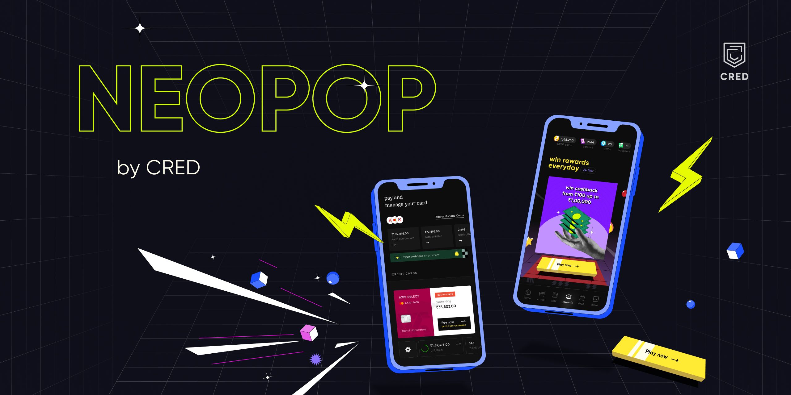
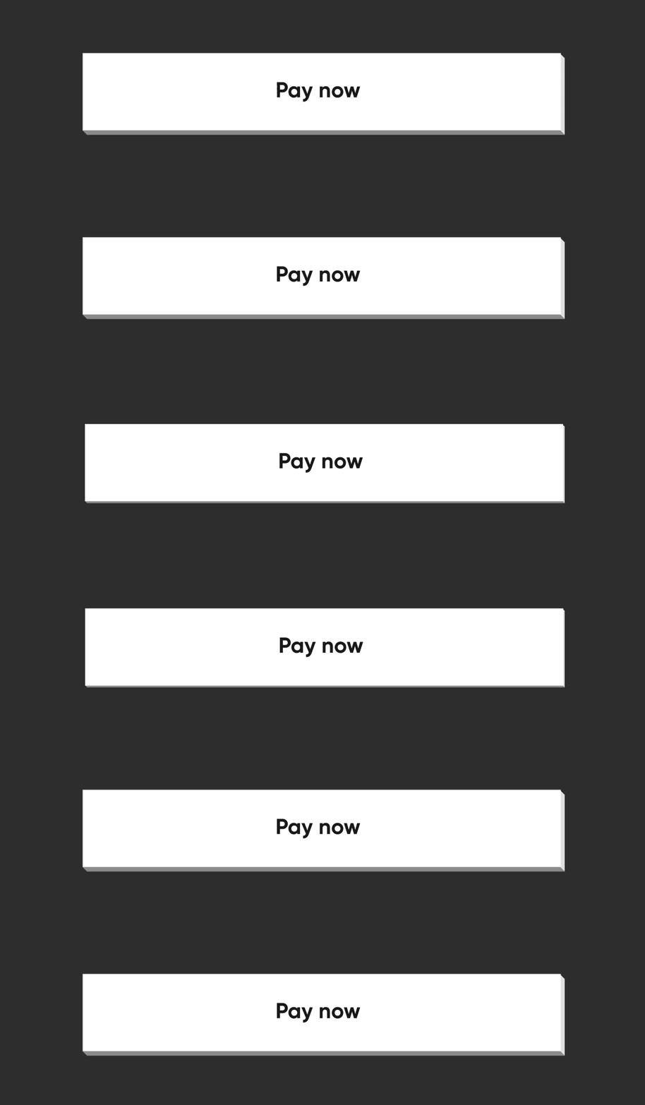
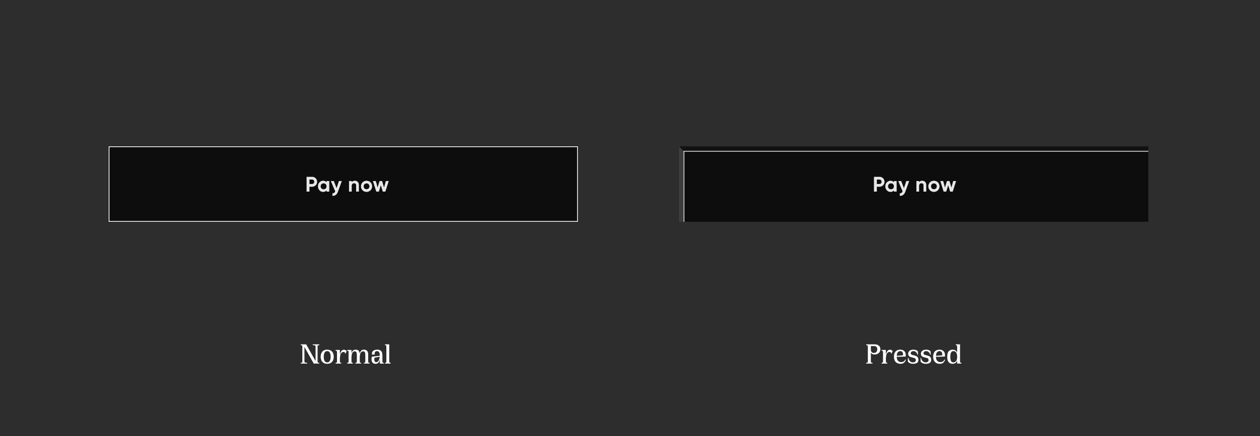
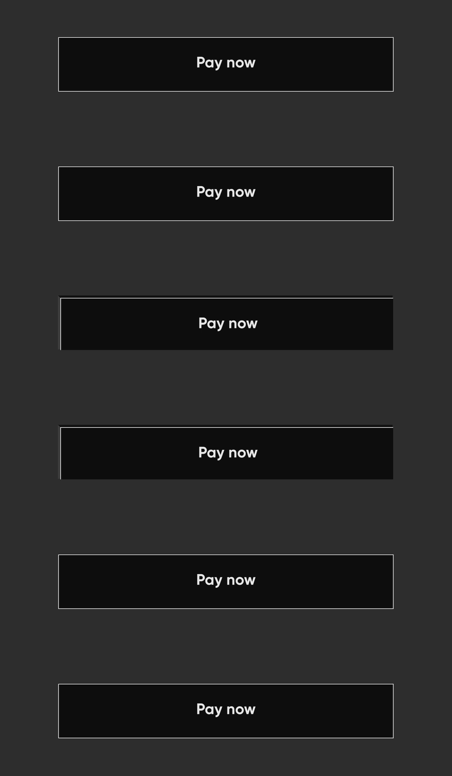
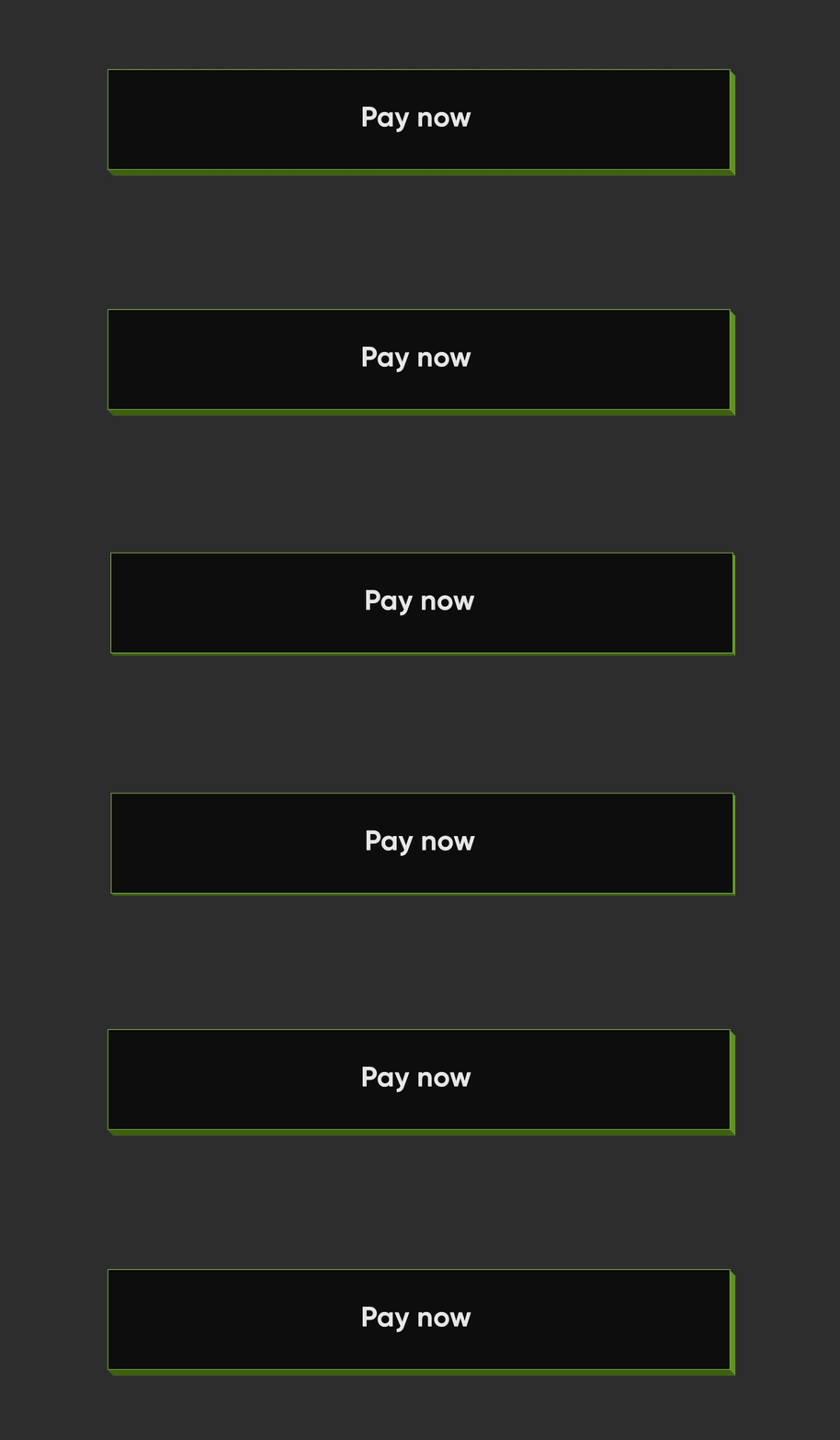
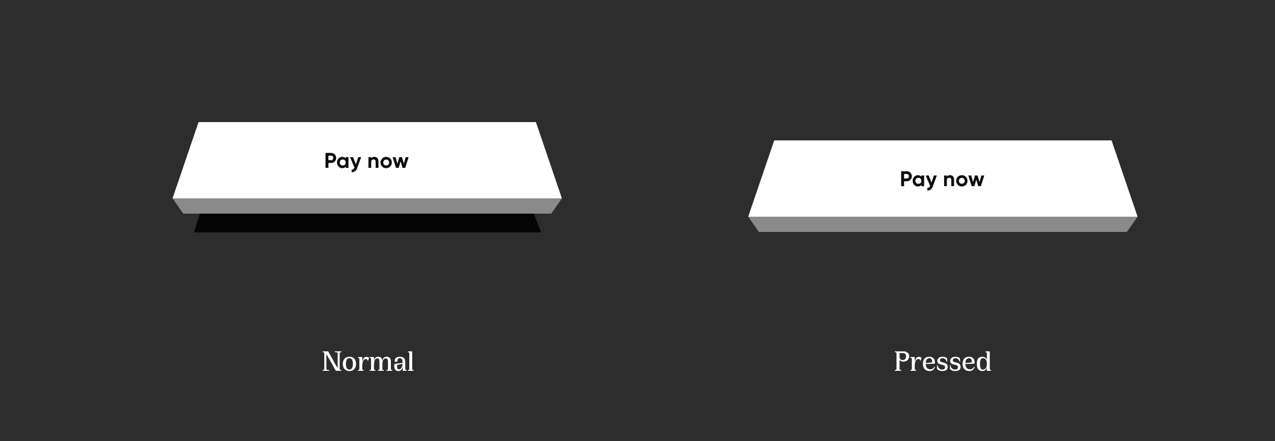
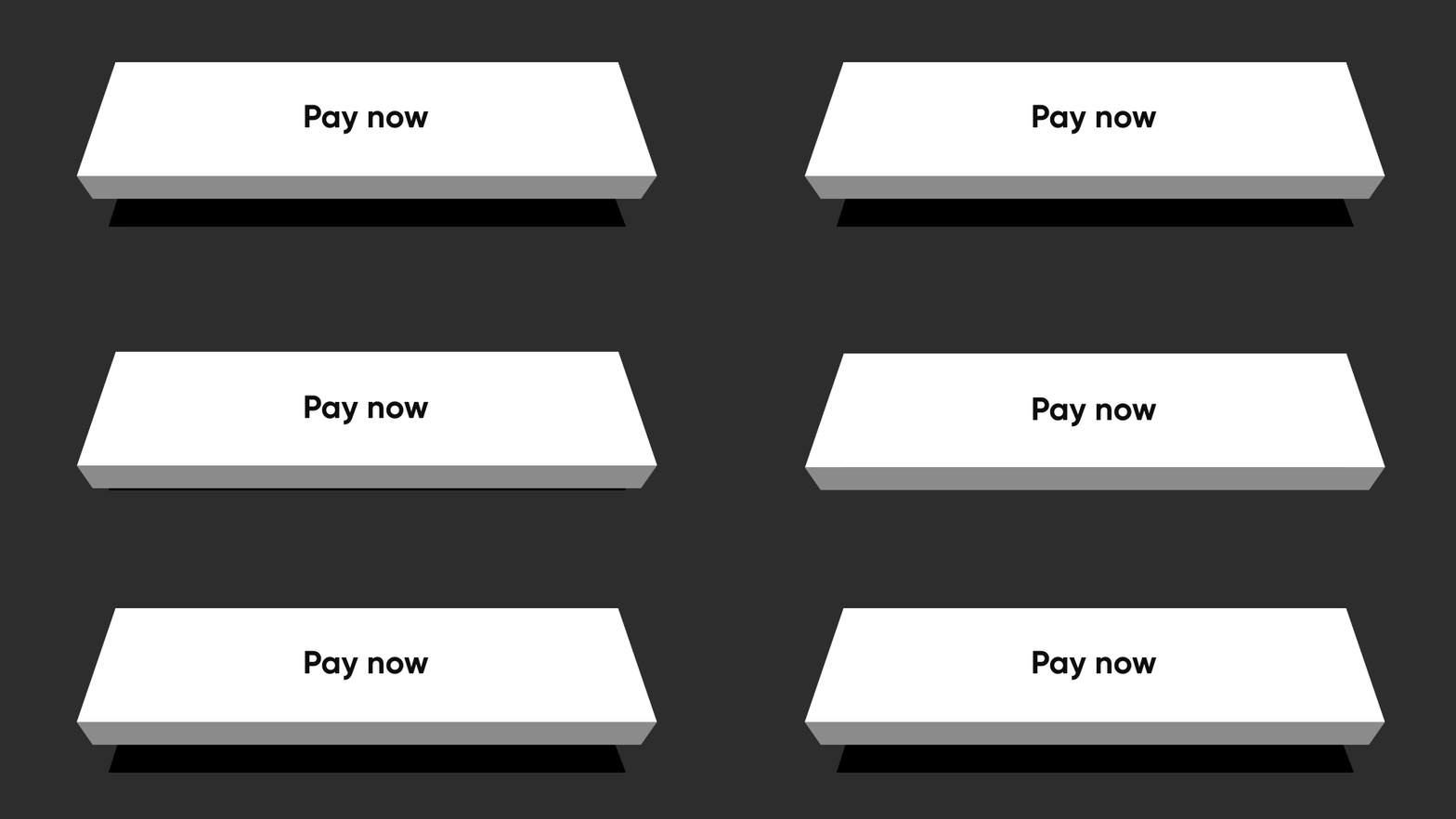
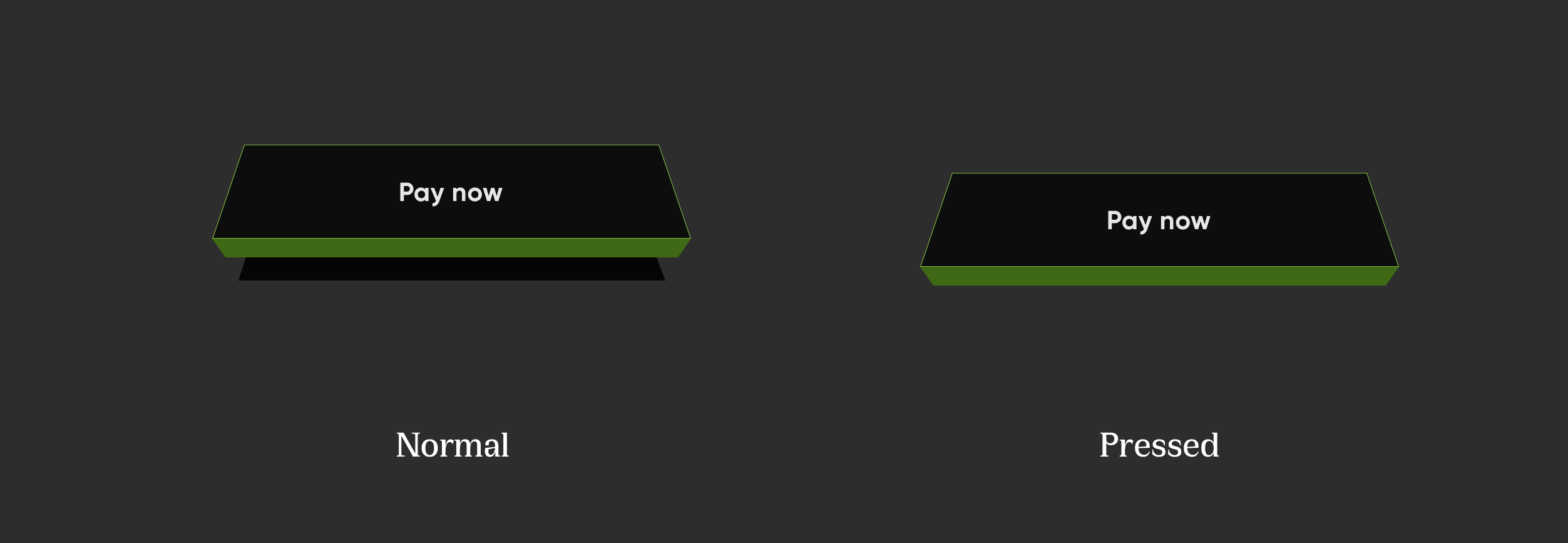
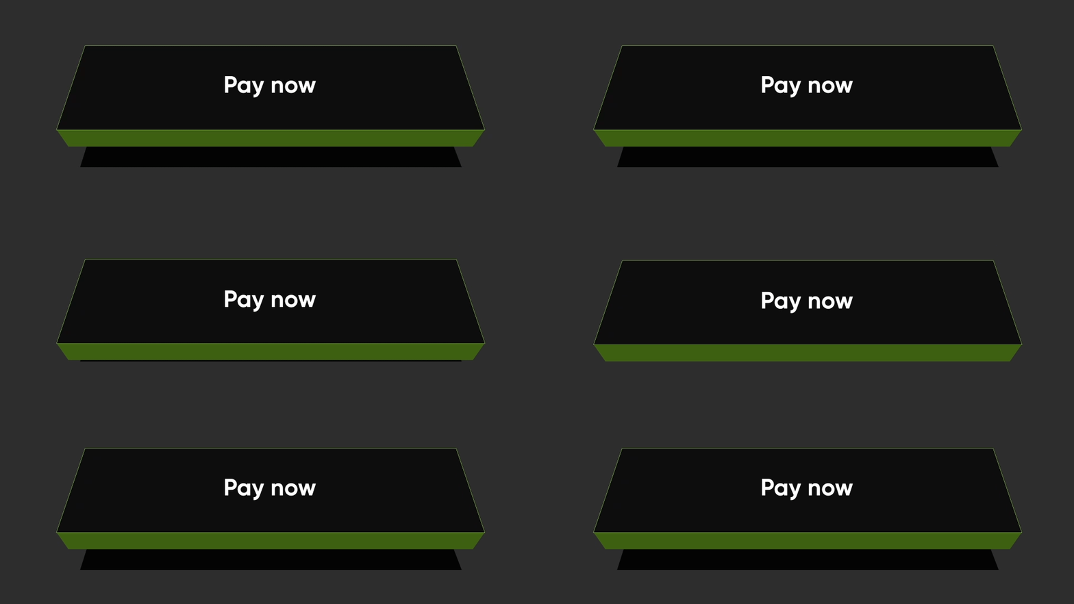
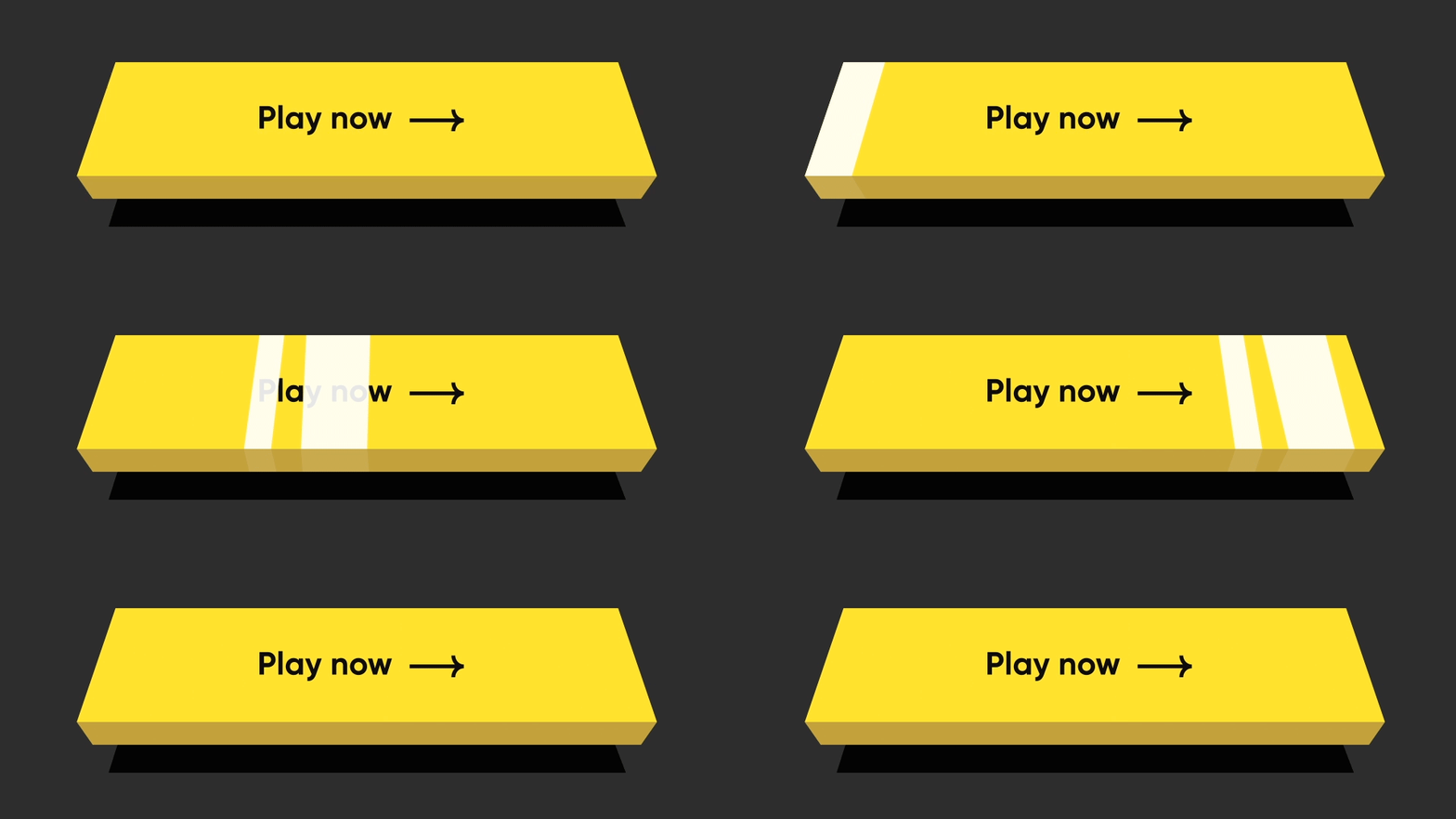
NeoPop은 CRED.club에서 개발한 Flutter 패키지로, 현대적인 UI를 구축하기 위한 사용자 정의가 가능하고 시각적으로 매력적인 컴포넌트를 제공합니다. 이는 버튼과 프로그레스 인디케이터와 같은 애니메이션 효과와 상호작용 기능을 간편하게 통합할 수 있도록 하며, 세련되고 현대적인 디자인 언어를 채택하고 있습니다. 이 라이브러리는 미세한 애니메이션과 반응형 피드백을 통해 사용자 경험을 향상시키도록 설계되어 있으며, 완성도 있고 역동적인 인터페이스를 목표로 하는 앱에 이상적입니다. NeoPop은 Android, iOS, Web, macOS, Windows, Linux 등 여러 플랫폼을 지원하여 다양한 장치에서 일관된 성능을 보장합니다.
사용 사례
모바일 앱에서 애니메이션 버튼 만들기
인터랙티브 진행률 표시기 구현
현대적인 시각 효과로 UI 개선
매력적인 온보딩 화면 만들기
고정밀 프로토타입 설계
폼에 마이크로 인터랙션 추가하기
주요 기능
사전 구축된 사용자 지정 가능한 NeoPop 컴포넌트
부드러운 애니메이션 및 햅틱 피드백
크로스 플랫폼 호환성
pub add를 통한 간편한 통합
경량이고 성능이 뛰어남
다크 모드 지원
적합한 대상
현대적인 컴포넌트를 찾는 UI 디자이너
인터랙티브한 Flutter 앱을 개발하는 개발자
사용자 참여도에 집중하는 팀
완성도 높은 MVP를 만드는 스타트업
크로스 플랫폼 프로젝트를 진행하는 프론트엔드 엔지니어
고려 사항
복잡한 테마에 맞추기 위해 추가적인 스타일링이 필요할 수 있습니다
기본 사용법 외에 문서가 제한적
현대적인 미적 목표를 가진 앱에 가장 적합
최소한의 또는 전통적인 UI 디자인에 적합하지 않음
애니메이션 과도 사용 시 성능에 미치는 영향
원본 README
연결된 소스 저장소의 README 원문 스냅샷입니다. 최신 내용은 저장소에서 확인하세요.
NeoPOP
NeoPOP is CRED's inbuilt library for using NeoPOP components in your app.
What really is NeoPOP?
NeoPOP was created with one simple goal; to create the next generation of a beautiful, affirmative design system. NeoPOP stays true to everything that design at CRED stands for.
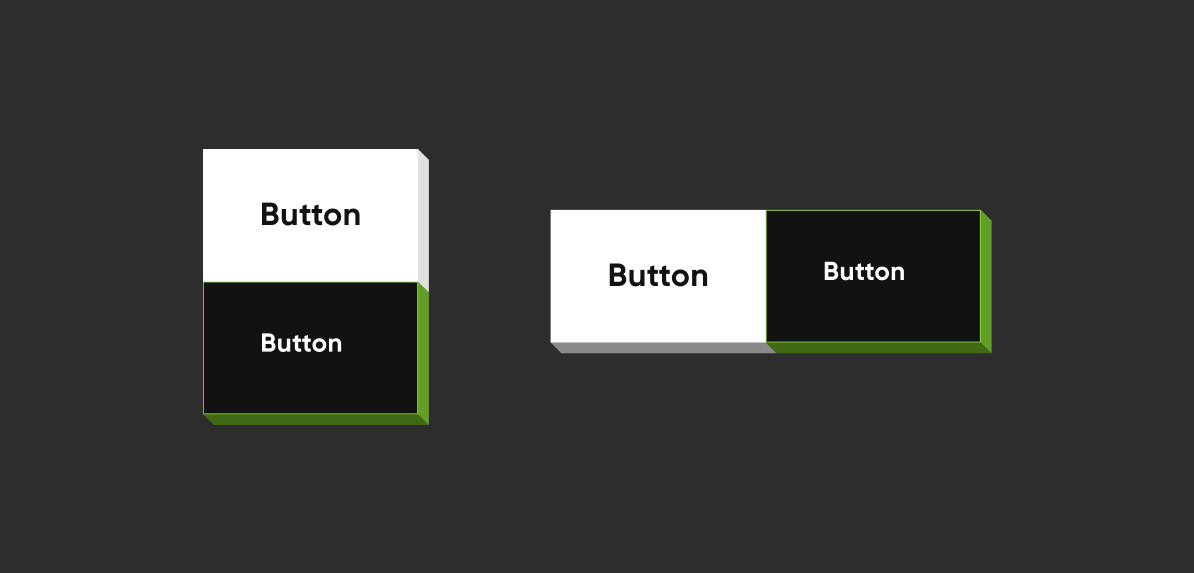
By specifying the buttonPosition as Position.center, NeoPOP will compute right and bottom surface's color according to color.
Top and left surface's color is computed w.r.t parentColor and grandparentColor
The decoration to paint the button. The color and decoration arguments cannot both be supplied, since it would potentially result in the decoration drawing over the background color. To supply a decoration with a color, use decoration.
buttonDepth
double?
The depth of the tilted button. default: 8.0
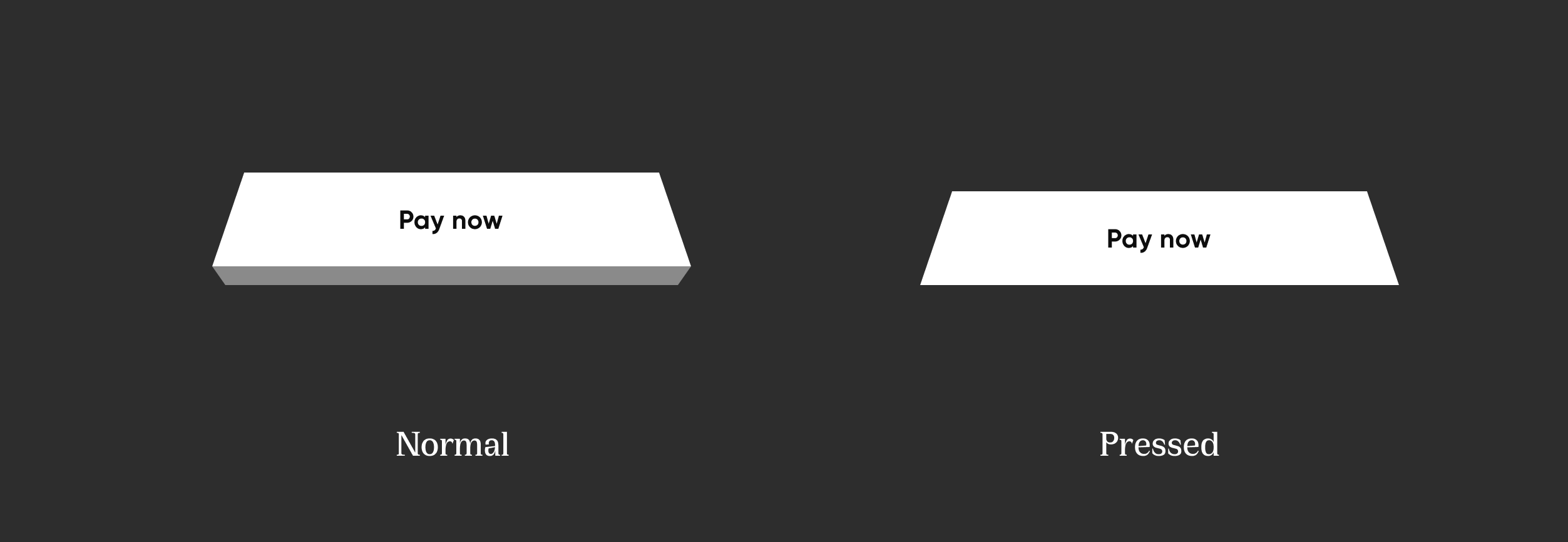
onTapUp
VoidCallback?
A callback triggered when a pointer that will trigger a tap with button has stopped contacting the screen
onTapDown
VoidCallback?
A callback triggered when a pointer that might cause a tap with button has contacted the screen
shadowDistance
double?
The maximum distance from the button at which the shadow is painted. default: 20
yPosFactor
double?
Factor that defines the floating positions of buttons and shadow along vertical-axis. default: 5
isFloating
bool
Whether the button is floating. default: false
floatingDuration
Duration?
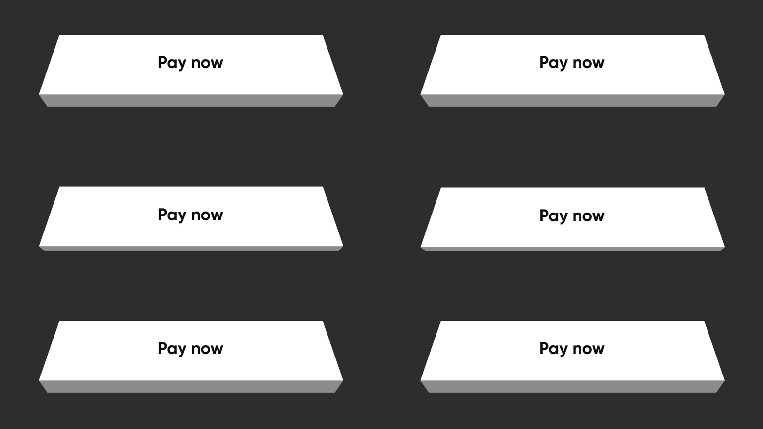
The duration of the floating animation. One floating cycle i.e to-and-fro movement of the button and shadow accounts for two floating durations. default: Duration(milliseconds: 1500)
floatingDelay
Duration?
The delay between two floating cycles. default: Duration(milliseconds: 750)
tapDuration
Duration?
The duration of the animation when button is pressed or released. default: Duration(milliseconds: 100)
enabled
bool
Whether the button is enabled. default: true
Contributing
Pull requests are welcome! We'd love help improving this library. Feel free to browse through open issues to look for things that need work. If you have a feature request or bug, please open a new issue so we can track it.
License
Copyright2022DreamplugTechnologiesPrivateLimited.
Licensed under the ApacheLicense, Version2.0 (the "License");
you may not use this file except in compliance with the License.
You may obtain a copy of the License at
http://www.apache.org/licenses/LICENSE-2.0 Unlessrequired by applicable law or agreed to in writing, software
distributed under the Licenseis distributed on an "AS IS" BASIS,
WITHOUT WARRANTIES OR CONDITIONS OF ANY KIND, either express or implied.
See the Licensefor the specific language governing permissions and
limitations under the License.