패키지, 저장소 및 앱 카테고리 검색

number_paginator 표지
패키지 상세v1.1.2

number_paginator

페이지 간 전환을 위한 Flutter 페이지네이터 위젯입니다.

AndroidiOSWebmacOSWindowsLinux
30일 다운로드
1만
좋아요
108
Pub 점수
160

패키지 설치

flutter pub add number_paginator

패키지 개요

공개 정보를 바탕으로 생성한 선택 가이드입니다.

숫자 버튼을 사용하여 페이지 간 이동을 위한 간단하고 사용자 정의 가능한 페이지네이터를 제공하는 플러터 위젯입니다. 리스트 뷰나 페이징 콘텐츠에서 깔끔하고 직관적인 페이지 탐색을 위해 설계되었으며, 모바일, 웹, 데스크톱 등 다양한 플랫폼을 지원합니다. 사용자는 시각적 피드백과 함께 특정 페이지로 직접 이동할 수 있어 데이터 집약형 애플리케이션에서 사용성 향상에 기여합니다. 기존 플러터 프로젝트에 최소한의 설정으로 원활하게 통합할 수 있습니다.

사용 사례

  • 목록에서 대규모 데이터셋 탐색하기
  • 대시보드에서 페이지 컨트롤 구현
  • 데이터 테이블에서 사용자 경험 향상
  • 이미지 갤러리에서 페이지네이션 지원
  • 반응형 웹 및 모바일 인터페이스 만들기

주요 기능

  • 번호 매겨진 페이지 버튼
  • 사용자 정의 스타일링
  • 크로스 플랫폼 호환성
  • ListView와의 간단한 통합
  • 내장된 접근성 지원
  • 부드러운 전환 애니메이션

적합한 대상

  • 페이지 기반 UI를 개발하는 개발자
  • 광범위한 콘텐츠 로딩을 가진 앱
  • 직관적인 탐색이 필요한 프로젝트
  • 플랫폼 일관성을 우선시하는 팀
  • 경량 페이지네이션 솔루션을 찾는 사용자

고려 사항

  • 동적 데이터에 대해 사용자 정의 로직이 필요할 수 있습니다
  • 매우 큰 페이지 수에 최적화되지 않음
  • 제한된 내장 오류 처리
  • 자동 페이지 로딩 메커니즘 없음
  • 데이터 업데이트를 위해 외부 상태 관리에 의존합니다

원본 README

연결된 소스 저장소의 README 원문 스냅샷입니다. 최신 내용은 저장소에서 확인하세요.

Number Paginator

pub.dev analysis demo

A Flutter paginator widget for switching between page numbers.

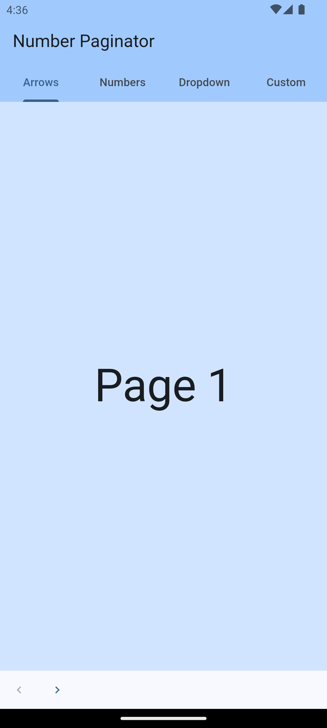
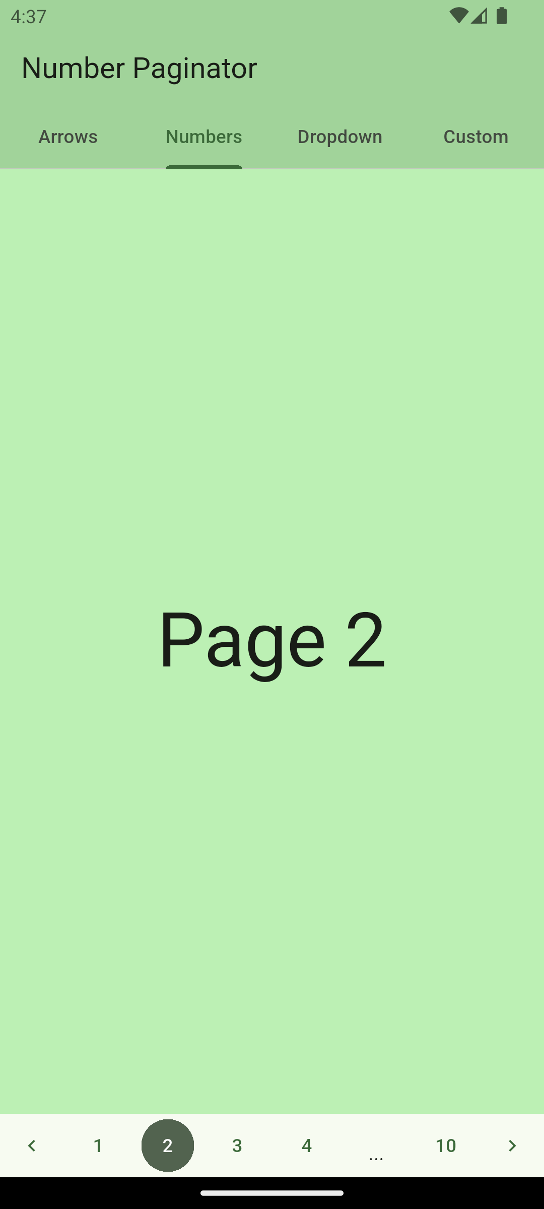
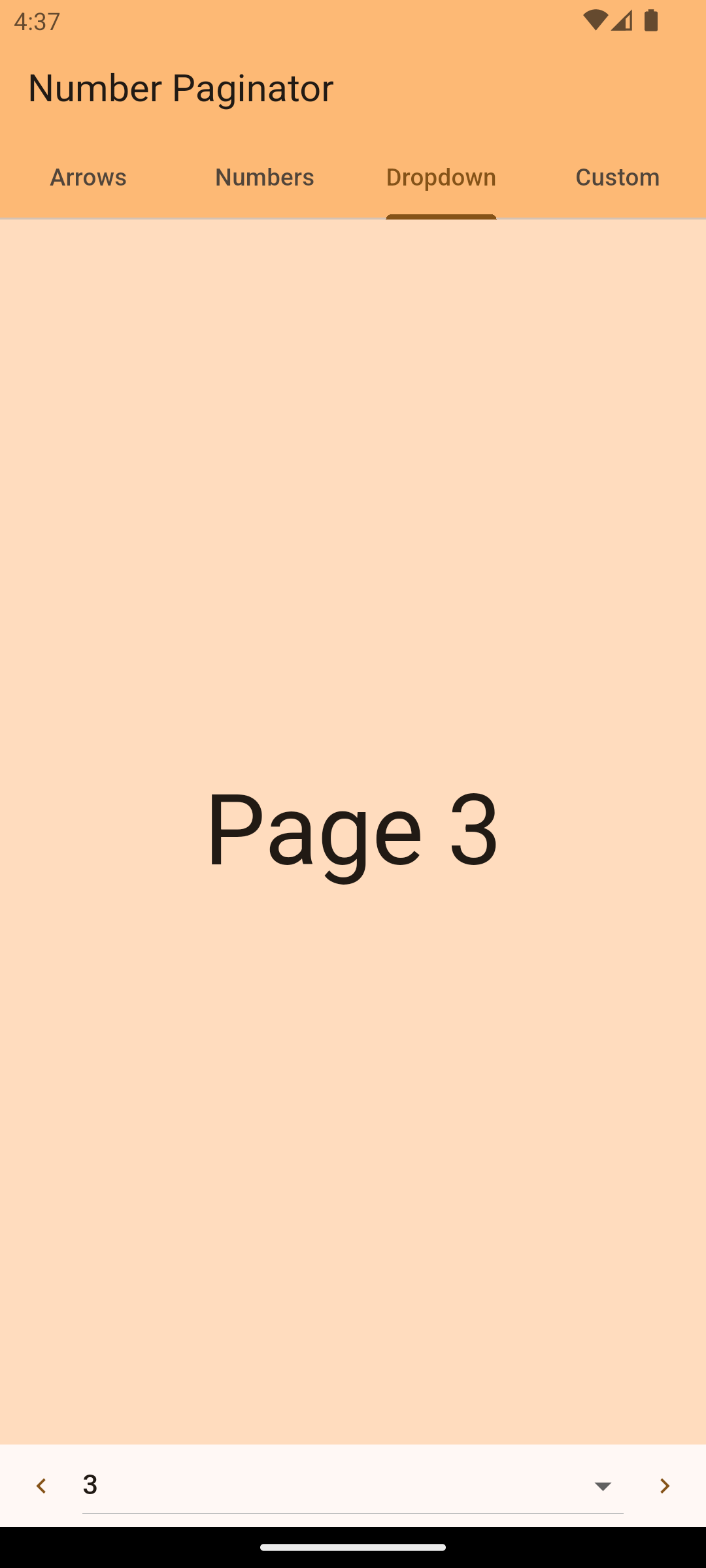
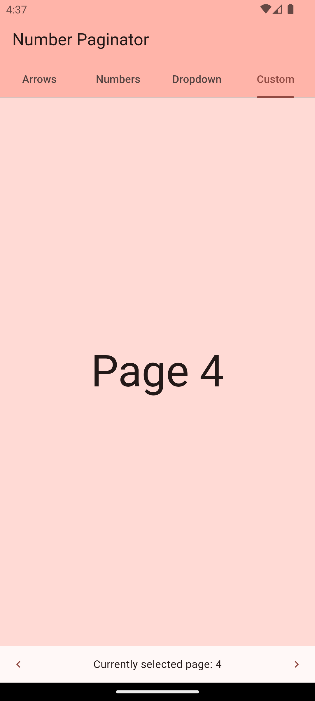
screenshot1 screenshot2 screenshot3 screenshot3 → Check web demo

Getting Started

The number_paginator package allows you to implement pagination with page numbers very easily. If you have content that is split up into several pages, number_paginator can be used to let the user switch between these page numbers. The package automatically handles the case where page numbers don't fit on one screen and replaces some of them with three dots.

Usage - Version 1.0.0 or newer

NumberPaginator only requires the number of pages (numberPages) to be set. All the rest is handled by the widget automatically. Normally, one also wants to react to page changes using the onPageChange callback. By default, NumberPaginator displays just page numbers, without arrow buttons for "previous" or "next" (unlike in the versions previous to 1.0.0).

NumberPaginator(
  numberPages: 10,
  onPageChange: (int index) {
    // handle page change...
  },
)

simple usage screenshot

With arrow buttons

From version 1.0.0 on, the back/next buttons are not shown by default. You can manually add PrevButton and NextButton widgets, which come included with the package. This gives more freedom compared to the versions before 1.0.0, and lets you customize the layout as you need.

NumberPaginator(
  numberPages: 10,
  onPageChange: (int index) {
    // handle page change...
  },
  child: const SizedBox(
    height: 48,
    child: Row(
      children: [
        PrevButton(),
        Expanded(
          child: NumberContent(),
        ),
        NextButton(),
      ],
    ),
  ),
)
With Controller

NumerPaginatorController allows you to control the NumberPaginator from the outside, e.g. with an external button anywhere in your app.

// instantiate the controller in your state
final NumberPaginatorController _controller = NumberPaginatorController();

...
/// use it within NumberPaginator
NumberPaginator(
  controller: _controller,
  // by default, the paginator shows numbers as center content
  numberPages: 10,
  onPageChange: (int index) {
    // handle page change...
  },
)
...
// Use the controller, e.g. within a button, to trigger a page change
floatingActionButton: FloatingActionButton(
  onPressed: () => _controller.next(),
  child: const Icon(Icons.navigate_next),
)

Be aware that the page indices are zero-based! I.e. using _controller.navigateToPage(0); will navigate to page "1".

Customize

NumberPaginator version 1.0.0 and later provides more flexibility when it comes to customization.

Button look and feel
// define variables in your widget state
final int _numPages = 10;
final NumberPaginatorController _controller = NumberPaginatorController();

// use in the build method
NumberPaginator(
  controller: _controller,
  numberPages: _numPages,
  onPageChange: (int index) {
    setState(() {
      _currentPage = index;
    });
  },
  child: SizedBox(
    height: 64,
    child: Padding(
      padding: const EdgeInsets.all(4.0),
      child: NumberContent(
        buttonBuilder: (context, index, isSelected) => _CustomButton(
          onTap: () => _controller.navigateToPage(index),
          text: '${index + 1}',
          isSelected: isSelected,
        ),
      ),
    ),
  ),
)

// define any custom button widget that you like
class _CustomButton extends StatelessWidget {
  final VoidCallback onTap;
  final String text;
  final bool isSelected;

  const _CustomButton({
    required this.onTap,
    required this.text,
    this.isSelected = false,
  });

  @override
  Widget build(BuildContext context) {
    return AspectRatio(
      aspectRatio: 1,
      child: Padding(
        padding: const EdgeInsets.all(4.0),
        child: ElevatedButton(
          child: Text(text),
          onPressed: onTap,
          style: ElevatedButton.styleFrom(
            backgroundColor: isSelected ? Colors.blue : Colors.grey,
            foregroundColor: Colors.white,
            shape: RoundedRectangleBorder(borderRadius: BorderRadius.circular(4.0)),
            padding: EdgeInsets.zero,
          ),
        ),
      ),
    );
  }
}

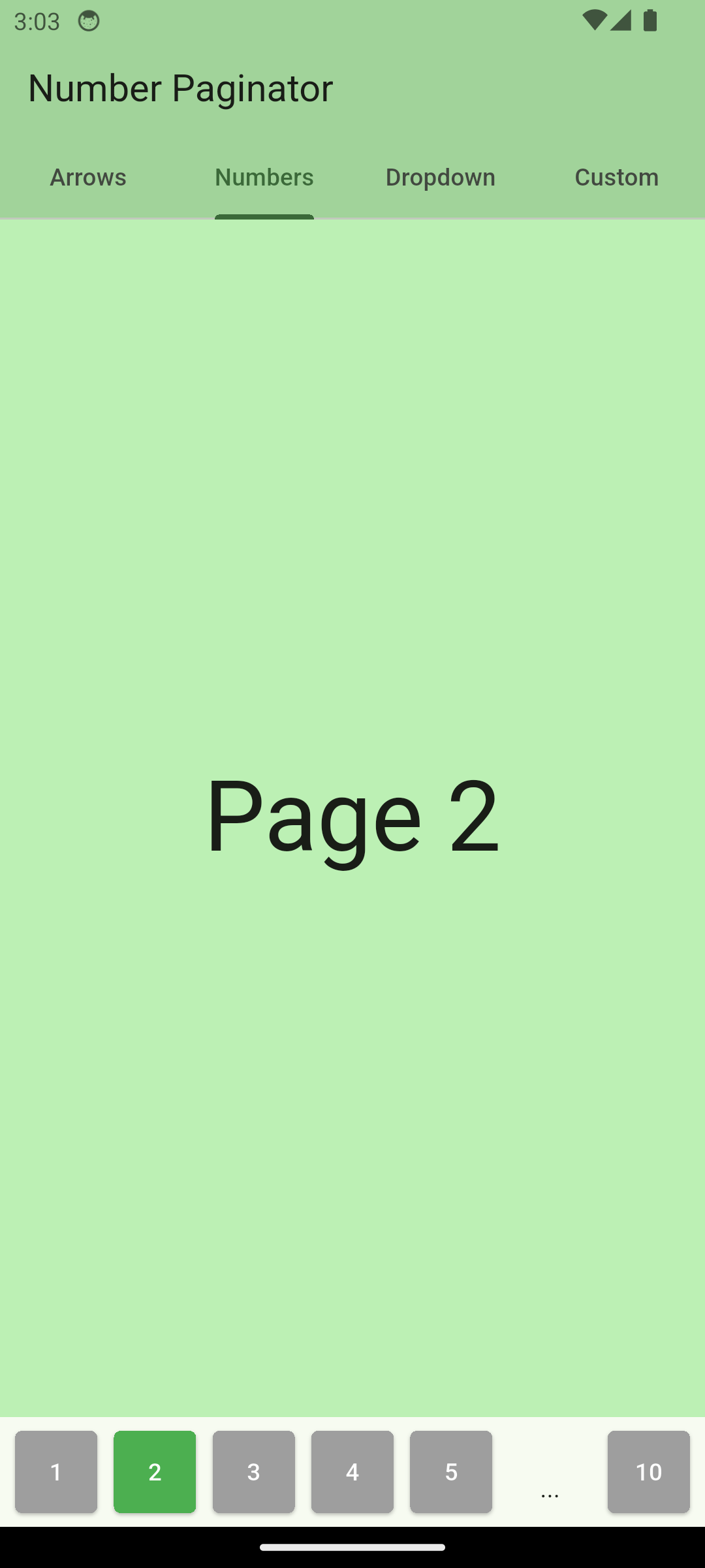
custom buttons

Content variations

NumberPaginator allows for customization of how a user can navigate between pages. It provides three different modes and an additional possibility of complete customization o the content using a builder.

Numbers (default)

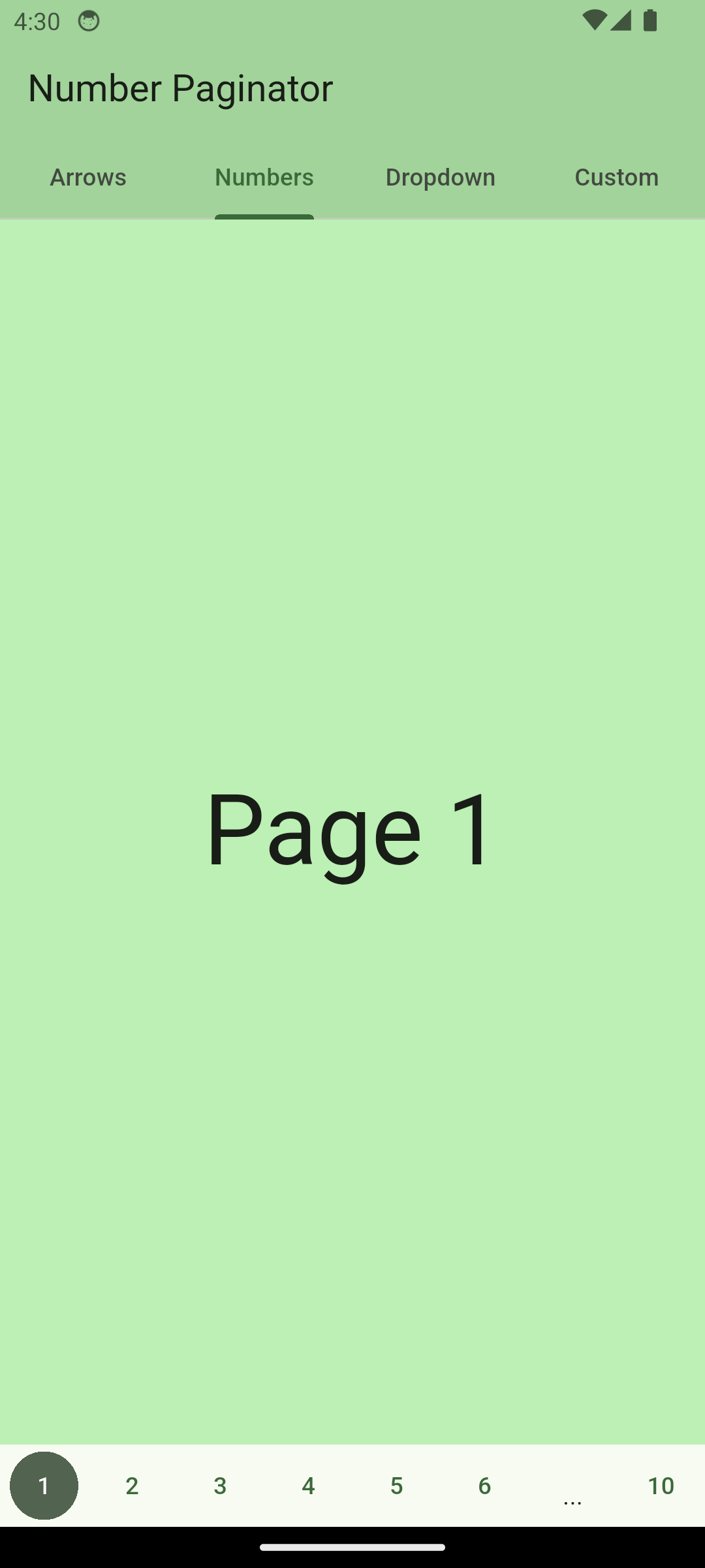
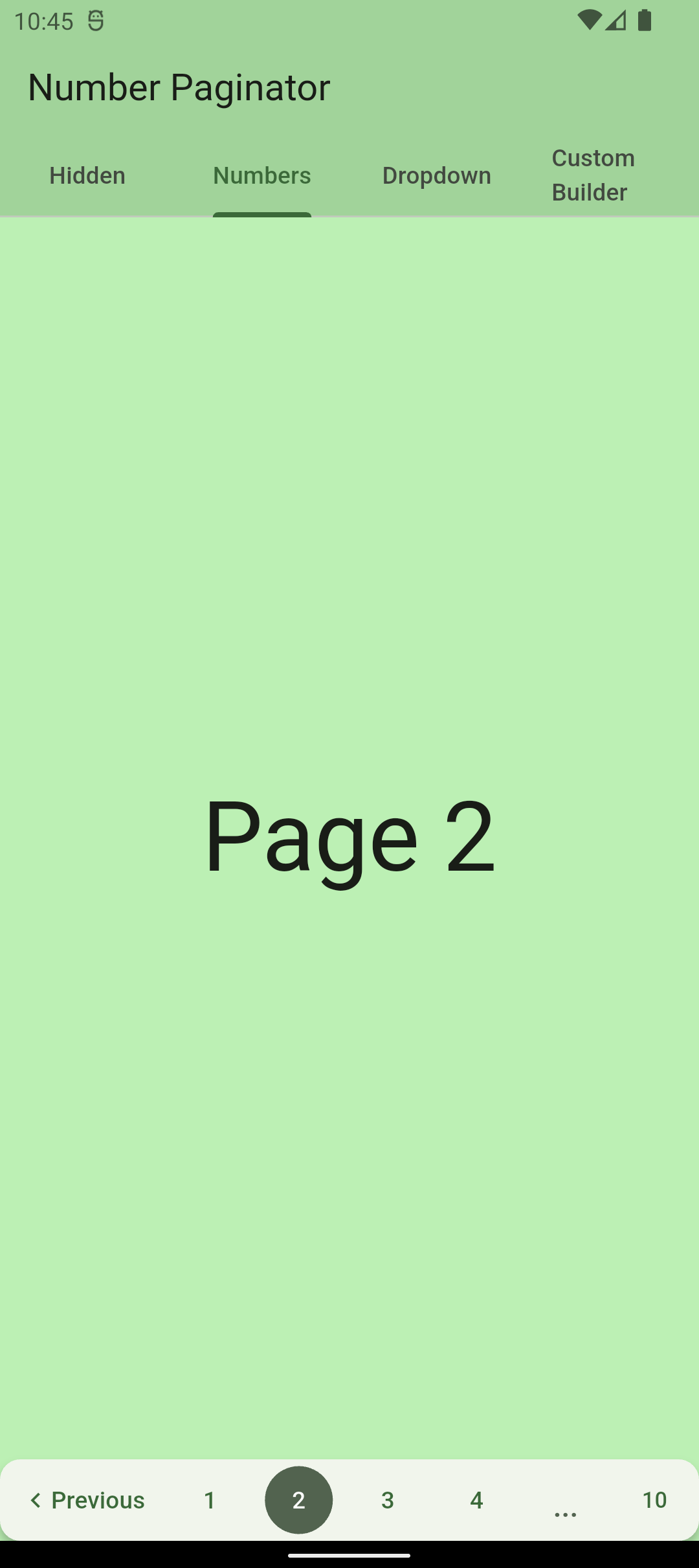
The paginator shows numbers for switching to any page number that is visible. If the pages don't fit on the screen, some of them are replaced with three dots.

NumberPaginator(
  ...
  child: const SizedBox(
    height: 48,
    child: Row(
      children: [
        PrevButton(),
        Expanded(
          child: NumberContent(),
        ),
        NextButton(),
      ],
    ),
  ),
)

screenshot with page numbers

Scrollable Numbers

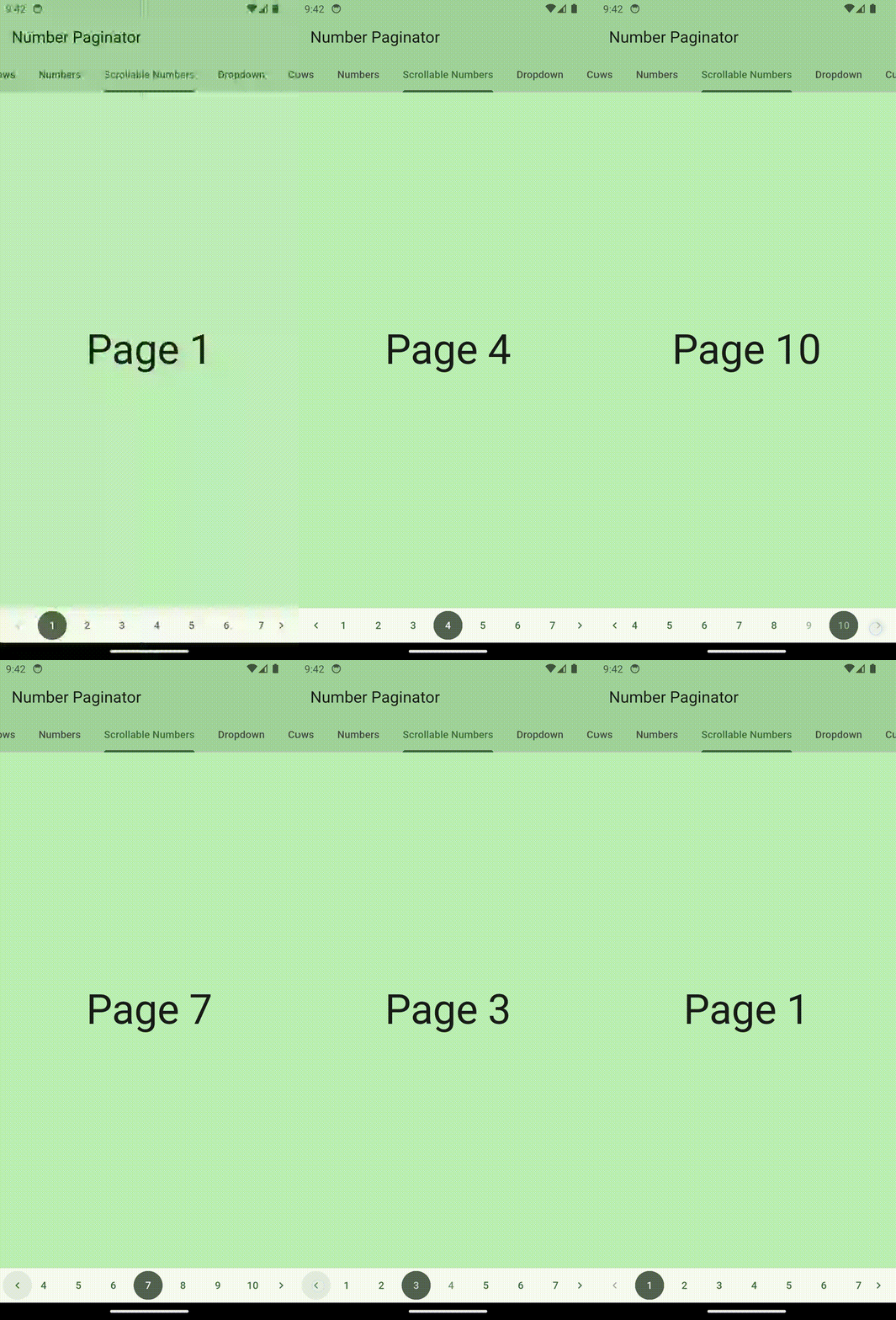
The page numbers can also be made scrollable. Just use ScrollableNumberContent for that.

NumberPaginator(
  ...
  child: const SizedBox(
    height: 48,
    child: Row(
      children: [
        PrevButton(),
        Flexible(child: ScrollableNumberContent()),
        NextButton(),
      ],
    ),
  ),
)

gif with scrollable page numbers

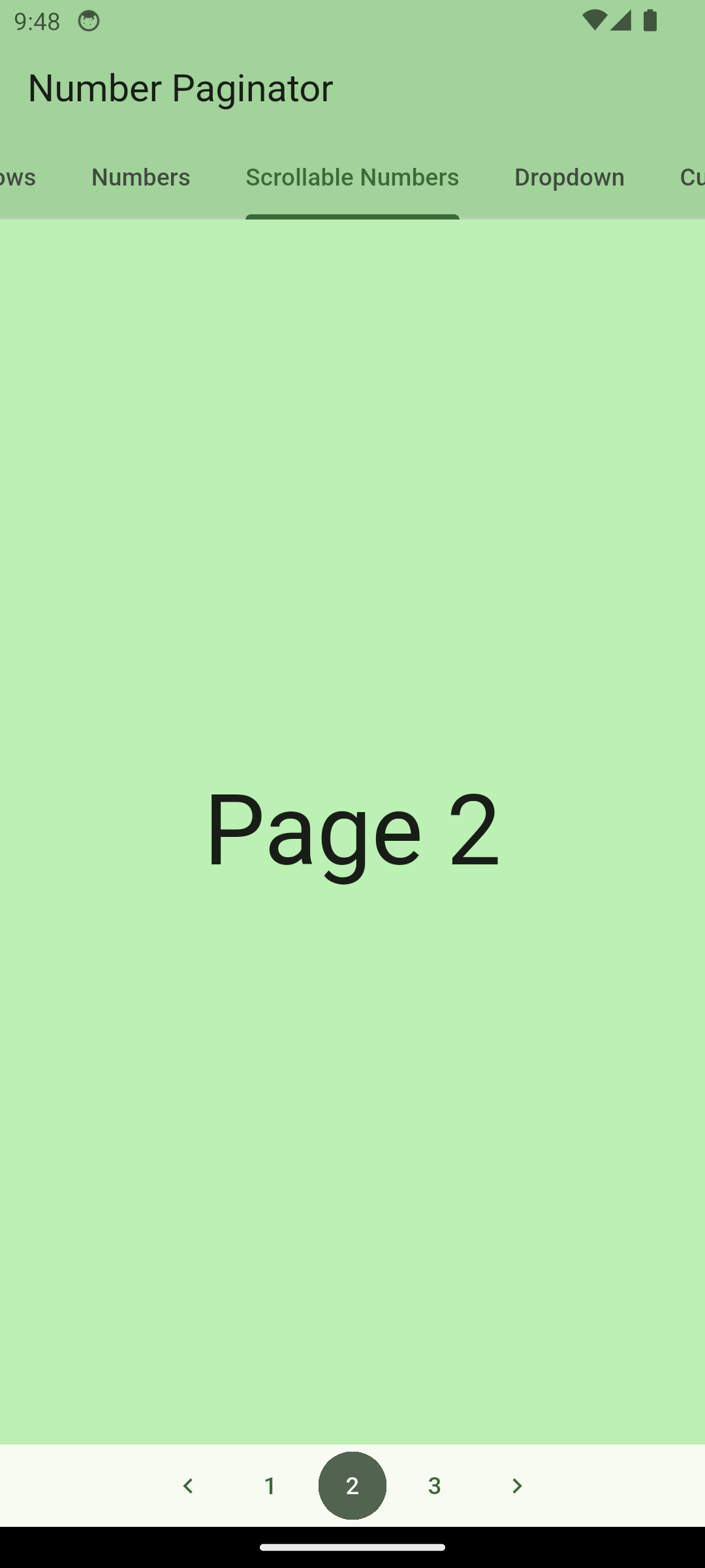
If you want the buttons to be centered, you can set shrinkWrap: true for ScrollableNumberContent like so:

ScrollableNumberContent(shrinkWrap: true)

centered scrollable page numbers

Dropdown

The paginator shows a dropdown (material widget) for choosing which page to show, along with the prev/next buttons.

NumberPaginator(
  ...
  child: const SizedBox(
    height: 48,
    child: Row(
      children: [
        PrevButton(),
        Expanded(
          child: DropDownContent(),
        ),
        NextButton(),
      ],
    ),
  ),
)

screenshot with dropdown

CustomContent (for passing any content)

Using the builder property, you can pass any content that you want that should be displayed as a central part of the paginator. For example, you can pass a custom text:

NumberPaginator(
  ...
  child: SizedBox(
    height: 48.0,
    child: Row(
      children: [
        const PrevButton(),
        Expanded(
          child: CustomContent(
            builder: (context, currentPage) => Center(
              child: Text("Currently selected page: ${currentPage + 1}"),
            ),
          ),
        ),
        const NextButton(),
      ],
    ),
  ),
)

screenshot with usage of builder

Complete example

A complete example of a simple page widget with number pagination.

import 'package:flutter/material.dart';
import 'package:number_paginator/number_paginator.dart';

class NumbersPage extends StatefulWidget {
  const NumbersPage({Key? key}) : super(key: key);

  @override
  _NumbersPageState createState() => _NumbersPageState();
}

class _NumbersPageState extends State<NumbersPage> {
  final int _numPages = 10;
  int _currentPage = 0;

  @override
  Widget build(BuildContext context) {
    var pages = List.generate(
      _numPages,
      (index) => Center(
        child: Text(
          "Page ${index + 1}",
          style: Theme.of(context).textTheme.displayLarge,
        ),
      ),
    );

    return Scaffold(
      backgroundColor: Theme.of(context).colorScheme.primaryContainer,
      body: pages[_currentPage],
      bottomNavigationBar: Material(
        child: NumberPaginator(
          numberPages: _numPages,
          onPageChange: (int index) {
            setState(() {
              _currentPage = index;
            });
          },
          child: const SizedBox(
            height: 48,
            child: Row(
              children: [
                PrevButton(),
                Expanded(
                  child: NumberContent(),
                ),
                NextButton(),
              ],
            ),
          ),
        ),
      ),
    );
  }
}

Usage - Version 0.4.4 or older

Show usage instructions

NumberPaginator only requires the number of pages (numberPages) to be set. All the rest is handled by the widget automatically. Normally, one also wants to react to page changes using the onPageChange callback. By default, NumberPaginator displays page numbers as central content of the paginator.

NumberPaginator(
  numberPages: 10,
  onPageChange: (int index) {

    // handle page change...
  },
)
With Controller

NumerPaginatorController allows you to control the NumberPaginator from the outside, e.g. with an external button anywhere in your app.

// instantiate the controller in your state
final NumberPaginatorController _controller = NumberPaginatorController();

...
/// use it within NumberPaginator
NumberPaginator(
  controller: _controller,
  // by default, the paginator shows numbers as center content
  numberPages: _numPages,
  onPageChange: (int index) {
    setState(() {
      _currentPage = index;
    });
  },
)

...
// Use the controller, e.g. within a button, to trigger a page change
floatingActionButton: FloatingActionButton(
  onPressed: () => _controller.next(),
  child: const Icon(Icons.navigate_next),
)

Customize

NumberPaginator allows for several customizations.

Button look and feel
NumberPaginator(
  // by default, the paginator shows numbers as center content
  numberPages: 10,
  onPageChange: (int index) {
    setState(() {
      _currentPage = index; // _currentPage is a variable within State of StatefulWidget
    });
  },
  // initially selected index
  initialPage: 4,
  config: NumberPaginatorUIConfig(
    // default height is 48
    height: 64,
    buttonShape: BeveledRectangleBorder(
      borderRadius: BorderRadius.circular(8),
    ),
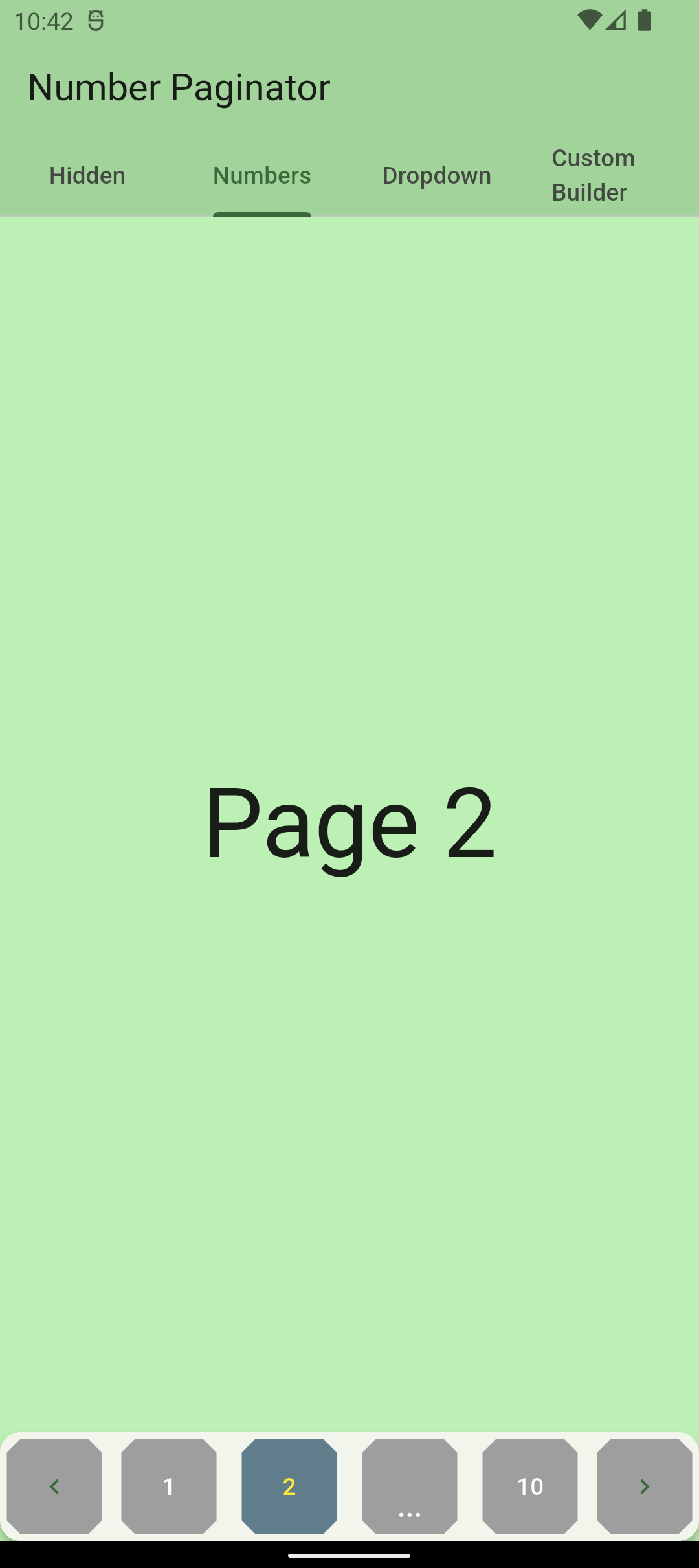
    buttonSelectedForegroundColor: Colors.yellow,
    buttonUnselectedForegroundColor: Colors.white,
    buttonUnselectedBackgroundColor: Colors.grey,
    buttonSelectedBackgroundColor: Colors.blueGrey,
  ),
)

custom buttons

Visibility/customisation of prev/next buttons
NumberPaginator(
  // by default, the paginator shows numbers as center content
  numberPages: 10,
  onPageChange: (int index) {
    setState(() {
      _currentPage = index; // _currentPage is a variable within State of StatefulWidget
    });
  },
  // show/hide the prev/next buttons
  showPrevButton: true,
  showNextButton: false,  // defaults to true
  // custom content of the prev/next buttons, maintains their behavior 
  nextButtonContent: Icon(Icons.arrow_right_alt),
  // custom prev/next buttons using builder (ignored if showPrevButton/showNextButton is false)
  prevButtonBuilder: (context) => TextButton(
    onPressed: _controller.currentPage > 0 ? () => _controller.prev() : null,  // _controller must be passed to NumberPaginator
    child: const Row(
      children: [
        Icon(Icons.chevron_left),
        Text("Previous"),
      ],
    ),
  ),
)

prev/next button customisation

Content variations

NumberPaginator allows for customization of how a user can navigate between pages. It provides three different modes and an additional possibility of complete customization o the content using a builder.

Hidden (only arrows are visible)

The user only sees arrows to switch to the previous/next page.

NumberPaginator(
  numberPages: _numPages,
  // shows only default arrows, no center content of paginator
  config:
      const NumberPaginatorUIConfig(mode: ContentDisplayMode.hidden),
  onPageChange: (int index) {
    setState(() {
      _currentPage = index;
    });
  },
)

screenshot for hidden

Numbers (default)

The paginator shows numbers for switching to any page number that is visible.

NumberPaginator(
  // by default, the paginator shows numbers as center content
  numberPages: _numPages,
  onPageChange: (int index) {
    setState(() {
      _currentPage = index;
    });
  },
)

screenshot with page numbers

Dropdown

The paginator shows a dropdown (material widget) for choosing which page to show, along with the prev/next buttons.

NumberPaginator(
  numberPages: _numPages,
  // shows a dropdown as the center paginator content
  config: const NumberPaginatorUIConfig(
      mode: ContentDisplayMode.dropdown),
  onPageChange: (int index) {
    setState(() {
      _currentPage = index;
    });
  },
)

screenshot with dropdown

Builder (for passing any content)

Using the contentBuilder property, you can pass any content that you want that should be displayed as a central part of the paginator. For example, you can pass a custom text:

NumberPaginator(
  numberPages: _numPages,
  contentBuilder: (index) => Expanded(
    child: Center(
      child: Text("Currently selected page: ${index + 1}"),
    ),
  ),
  onPageChange: (int index) {
    setState(() {
      _currentPage = index;
    });
  },
)

screenshot with usage of builder

Complete example

A complete example of a simple page widget with number pagination.

import 'package:flutter/material.dart';
import 'package:number_paginator/number_paginator.dart';

class NumbersPage extends StatefulWidget {
  const NumbersPage({Key? key}) : super(key: key);

  @override
  _NumbersPageState createState() => _NumbersPageState();
}

class _NumbersPageState extends State<NumbersPage> {
  final int _numPages = 10;
  int _currentPage = 0;

  @override
  Widget build(BuildContext context) {
    var pages = List.generate(
      _numPages,
      (index) => Center(
        child: Text(
          "Page ${index + 1}",
          style: Theme.of(context).textTheme.headline1,
        ),
      ),
    );

    return Scaffold(
      body: pages[_currentPage],
      // card for elevation
      bottomNavigationBar: Card(
        margin: EdgeInsets.zero,
        elevation: 4,
        child: NumberPaginator(
          // by default, the paginator shows numbers as center content
          numberPages: _numPages,
          onPageChange: (int index) {
            setState(() {
              _currentPage = index;
            });
          },
        ),
      ),
    );
  }
}

Coming soon...

  • Animations

Contribute

If you have any ideas for extending this package or have found a bug, please contribute!

  1. You'll need a GitHub account.
  2. Fork the number_paginator repository.
  3. Work on your feature/bug.
  4. Create a pull request.
  5. Star this project. ⭐
  6. Become a hero!! 🎉

카테고리

소스 저장소

이 패키지를 사용하는 프로젝트