패키지, 저장소 및 앱 카테고리 검색

outline_gradient_button 표지
패키지 상세v2.0.1+1

outline_gradient_button

OutlineGradientButton 패키지는 그라데이션 외곽선이 있는 버튼을 만들기 위해 개발되었습니다.

AndroidiOSWebmacOSWindowsLinux
30일 다운로드
22
좋아요
97
Pub 점수
150

패키지 설치

flutter pub add outline_gradient_button

패키지 개요

공개 정보를 바탕으로 생성한 선택 가이드입니다.

outline_gradient_button 패키지는 플러터 애플리케이션에서 그라데이션 외곽선을 가진 시각적으로 매력적인 버튼을 생성할 수 있도록 해줍니다. 표준 버튼 위젯을 확장하여 사용자 정의 가능한 그라데이션 테두리를 추가함으로써 현대적이고 동적인 UI 디자인을 가능하게 합니다. 기능성을 희생하지 않고도 세련되고 눈에 띄는 인터페이스를 원하는 앱에 이상적입니다. 이 패키지는 Android, iOS, 웹, macOS, Windows, Linux 등 모든 주요 플랫폼을 지원하며, 다양한 장치 간 일관된 외관을 보장합니다. pub add를 통해 최소한의 설정만으로 기존 프로젝트에 쉽게 통합할 수 있습니다.

사용 사례

  • 스타일리시한 UI 요소 만들기
  • 앱 시각적 매력 향상
  • 인터랙티브 액션 버튼 설계
  • 현대적인 모바일 및 웹 인터페이스 구축
  • 폼 버튼에 그라디언트 효과 추가

주요 기능

  • 그라디언트 외곽 스타일
  • 크로스 플랫폼 호환성
  • Flutter와의 간편한 통합
  • 사용자 정의 가능한 테두리 색상 및 두께
  • 다양한 버튼 유형(ElevatedButton, TextButton 등)을 지원합니다
  • 경량이고 성능이 뛰어남

적합한 대상

  • 시각적 매력이 필요한 UI 디자이너
  • 현대적인 Flutter 앱을 개발하는 개발자
  • 기울기 기반 상호작용 요소를 필요로 하는 프로젝트
  • 다중 플랫폼을 대상으로 하는 앱
  • 프로토타이핑 및 생산 준비 완료 인터페이스

고려 사항

  • 복잡한 그라디언트를 위해 추가 스타일링이 필요할 수 있습니다
  • 윤곽 효과에 한정됨, 채우기 그라데이션은 지원되지 않음
  • 대량의 버튼에 대한 성능 영향
  • 가시성을 위해 대조적인 배경 색상과 함께 사용하는 것이 가장 좋습니다

원본 README

연결된 소스 저장소의 README 원문 스냅샷입니다. 최신 내용은 저장소에서 확인하세요.

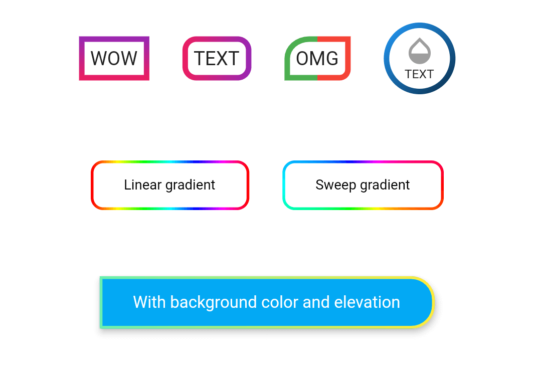
wow

Example

Take a look at the provided example for how to use the OutlineGradientButton.

How to use

demo_button1

OutlineGradientButton(
  child: Text('WOW'),
  gradient: LinearGradient(
    colors: [Colors.purple, Colors.pink],
    begin: Alignment.topCenter,
    end: Alignment.bottomCenter,
  ),
  strokeWidth: 4,
),

demo_button2

OutlineGradientButton(
  child: Text('TEXT'),
  gradient: LinearGradient(colors: [Colors.pink, Colors.purple]),
  strokeWidth: 4,
  radius: Radius.circular(8),
),

demo_button3

OutlineGradientButton(
  child: Text('OMG'),
  gradient: LinearGradient(
    stops: [0, 0.5, 0.5, 1],
    colors: [Colors.green, Colors.green, Colors.red, Colors.red],
  ),
  strokeWidth: 4,
  corners: Corners(topLeft: Radius.elliptical(16, 14), bottomRight: Radius.circular(6)),
),

demo_button4

OutlineGradientButton(
  child: SizedBox(
    width: 52,
    height: 52,
    child: Column(
      mainAxisSize: MainAxisSize.min,
      mainAxisAlignment: MainAxisAlignment.center,
      children: <Widget>[
        Icon(Icons.opacity, color: Colors.grey, size: 24),
        Text('TEXT', style: TextStyle(fontSize: 9)),
      ],
    ),
  ),
  gradient: LinearGradient(
    colors: [Colors.blue, Colors.black],
    begin: Alignment(-1, -1),
    end: Alignment(2, 2),
  ),
  strokeWidth: 4,
  padding: EdgeInsets.zero,
  radius: Radius.circular(26),
),

demo_button5

OutlineGradientButton(
  child: Text('Linear gradient', style: TextStyle(color: Colors.black, fontSize: 10)),
  gradient: LinearGradient(
    colors: List.generate(360, (h) => HSLColor.fromAHSL(1, h.toDouble(), 1, 0.5).toColor()),
  ),
  strokeWidth: 2,
  padding: EdgeInsets.symmetric(horizontal: 24, vertical: 12),
  radius: Radius.circular(8),
),

demo_button6

OutlineGradientButton(
  child: Text('Sweep gradient', style: TextStyle(color: Colors.black, fontSize: 10)),
  gradient: SweepGradient(
    colors: List.generate(360, (h) => HSLColor.fromAHSL(1, h.toDouble(), 1, 0.5).toColor()),
  ),
  strokeWidth: 2,
  padding: EdgeInsets.symmetric(horizontal: 24, vertical: 12),
  radius: Radius.circular(8),
),

demo_button7

OutlineGradientButton(
  child: Text('With background color and elevation', style: TextStyle(color: Colors.white, fontSize: 12)),
  gradient: LinearGradient(colors: [Colors.greenAccent, Colors.yellow]),
  strokeWidth: 2,
  padding: EdgeInsets.symmetric(horizontal: 24, vertical: 12),
  corners: Corners(topRight: Radius.circular(16), bottomRight: Radius.circular(16)),
  backgroundColor: Colors.lightBlue,
  elevation: 4,
  inkWell: true,
  onTap: () => showSnack('onTap'),
  onDoubleTap: () => showSnack('onDoubleTap'),
  onLongPress: () => showSnack('onLongPress'),
),

카테고리

소스 저장소

이 패키지를 사용하는 프로젝트