검색 결과를 표시하기 위해 내장된 페이지네이션 기능을 제공하는 플러터 패키지입니다. 사용자가 쿼리를 입력하고 페이지 단위로 결과를 탐색할 수 있게 해주며, 대규모 데이터셋을 다룰 때 성능과 사용자 경험을 향상시킵니다. 라이브러리는 비동기 검색 작업을 처리하고 최소한의 설정으로 기존 UI에 원활하게 통합됩니다. 사용자 정의 가능한 결과 표시 및 로딩 상태를 지원하여 효율적이고 확장 가능한 검색 기능이 필요한 앱에 이상적입니다.
사용 사례
대규모 데이터셋을 효율적으로 검색하는 방법
페이지inated 검색 결과 구현
데이터가 많은 앱에서 사용자 경험 향상
동적 검색 인터페이스 구축
검색을 위한 원격 API와의 통합
검색 중 메모리 사용량 줄이기
주요 기능
내장형 페이지네이션 지원
비동기 검색 처리
사용자 정의 가능한 결과 UI
로딩 및 오류 상태 관리
기존 위젯과의 간편한 통합
원격 및 로컬 데이터 소스 지원
적합한 대상
검색 중심 앱을 개발하는 개발자
대규모 데이터셋을 가진 앱
부드러운 스크롤링과 레이지 로딩을 필요로 하는 UI
성능과 사용자 경험을 우선시하는 팀
REST 또는 GraphQL API를 사용하는 프로젝트
Flutter 초보자가 페이지네이션 패턴을 배우고 있습니다
고려 사항
검색 로직 구현이 필요합니다
기본 검색 UI 사용자 정의에 제한됨
내장된 필터링 또는 정렬 없음
외부 데이터 소스에 의존
복잡한 디자인을 위해 추가 스타일링이 필요할 수 있습니다
디바운스 없이 실시간 검색에 최적화되지 않음
원본 README
연결된 소스 저장소의 README 원문 스냅샷입니다. 최신 내용은 저장소에서 확인하세요.
Paginated Search Bar
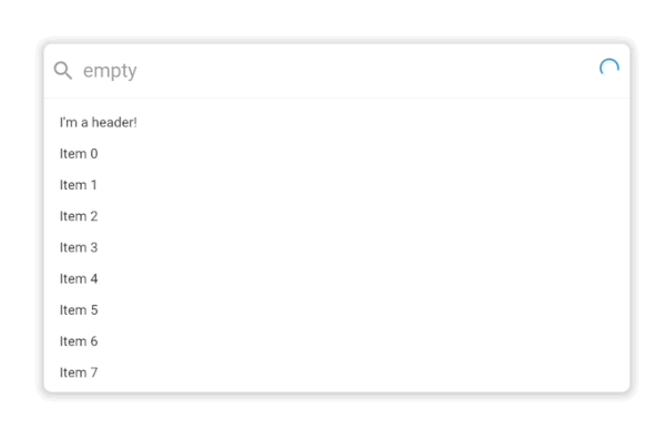
A search bar library that let's you search for items and paginate them in a results list. By default it looks like this:
.
It supports extensive customization with custom styling, headers, placeholders, footers and more powered by the Endless infinite scroll view library.
Usage
classExampleItem{
finalString title;
ExampleItem({
requiredthis.title,
});
}
PaginatedSearchBar<ExampleItem>(
onSearch: ({
required pageIndex,
required pageSize,
required searchQuery,
}) async {
// Call your search API to return a list of itemsreturn [
ExampleItem(title: 'Item 0'),
ExampleItem(title: 'Item 1'),
];
},
itemBuilder: (
context, {
required item,
required index,
}) {
returnText(item.title);
},
);
In this basic usage, all you need to get started is an onSearch function for fetching data and an itemBuilder for how it should be displayed in the search results list.
In this more advanced example, we've provided a few more customization options including an emptyBuilder and headerBuilderState. All of the builder functions like emptyBuilder provide the current BuildContext and return a widget to display. Each builder function additionally has a corresponding StateProperty builder like we see with headerBuilderState. The PaginatedSearchBar library uses the State property pattern for customizing the display of the widget based on the state of the system.
The complete list of paginated search bar states are:
enumPaginatedSearchBarState {
/// Present when the search bar is searching for items. Triggered when they update their search/// query in the input.
searching,
/// Present when the search bar is fetching a page of items either as a result of a modified search query/// or by scrolling to the bottom of the list view and triggering the next page load.
loading,
/// Present when the search bar has no matching items for the current search query.
empty,
/// Present when the search bar has no more items to fetch for the current search query. Triggered/// when the [PaginatedSearchBar.onSearch] function returns fewer than [PaginatedSearchBar.pageLimit]/// items or [EndlessPaginationDelegate.maxPage] has been reached and no more items can be fetched.
done,
/// Present the input is currently focused.
focused,
}
State properties builders then let us customize what we build based on these states. In the above example with headerBuilderState, we specified that it should only build the widget when the search results are empty.
If we instead wanted it show be shown when the search results are empty or done, we could use the state property resolveWith builder:
PaginatedSearchBar<ExampleItem>(
headerBuilderState: PaginatedSearchBarBuilderStateProperty.resolveWith((context, states) {
if (states.contain(PaginatedSearchBarState.empty) || states.contain(PaginatedSearchBarState.done)) {
returnconstText("I'm a header that only shows when the results are empty or done!");
}
}),
onSearch: ({
required pageIndex,
required pageSize,
required searchQuery,
}) async {
returnFuture.delayed(constDuration(milliseconds: 1000), () {
if (searchQuery == "empty") {
return [];
}
return [
ExampleItem(title: 'Page $pageIndex item 1'),
ExampleItem(title: 'Page $pageIndex item 2'),
];
});
},
itemBuilder: (
context, {
required item,
required index,
}) {
returnText(item.title);
},
);
The state properties are available for builders and style properties of the [PaginatedSearchBar].
Feedback
Let us know if there are any additional features or customization options you'd like to see to make a helpful search bar.

 .
