연결된 소스 저장소의 README 원문 스냅샷입니다. 최신 내용은 저장소에서 확인하세요.
Panara Dialogs
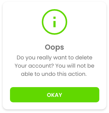
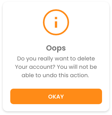
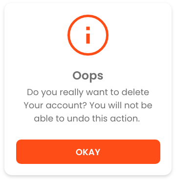
Panara Dialogs is a UI Kit for Dialog comes with 3 types of dialogs - Info Dialog, Confirmation Dialog both comes with 4 different variants as shown in below screenshots & Custom Dialog, with 7 different animations.
Preview
PanaraInfoDialog
PanaraConfirmDialog
Getting started
Add the dependency in pubspec.yaml:
dependencies:
  panara_dialogs: ^0.1.5
Usage
Then you just have to import the package with
import 'package:panara_dialogs/panara_dialogs.dart' ;
Here is how you can use PanaraInfoDialog in your flutter project.
PanaraInfoDialog .show (
context,
title: "Hello" ,
message: "This is the PanaraInfoDialog" ,
buttonText: "Okay" ,
onTapDismiss: () {
Navigator .pop (context);
},
panaraDialogType: PanaraDialogType .normal,
barrierDismissible: false ,
);
Properties of PanaraInfoDialog
Property
Type
value
imagePath
Stringpath to your local assets image
title
Stringany string value
message
Stringany string value
buttonText
Stringany string value
onTapDismiss
void Function()function to decide what will happen onTap
panaraDialogType
PanaraDialogTypesuccess, normal, warning, error, custom
color
Colordefine your own color, by selecting panaraDialogType: PanaraDialogType.custom
textColor
Colordefine your own text color
buttonTextColor
Colordefine your own button text color
margin
EdgeInsetsdefine margin
padding
EdgeInsetsdefine padding
noImage
boolIf you don't want any image set it to true. it's false by default
barrierDismissible
booldefine if dialog is dismissible by tapping outside of dialog
And Here is how you can use PanaraConfirmDialog in your flutter project.
PanaraConfirmDialog .show (
context,
title: "Hello" ,
message: "This is the PanaraConfirmDialog" ,
confirmButtonText: "Confirm" ,
cancelButtonText: "Cancel" ,
onTapCancel: () {
Navigator .pop (context);
},
onTapConfirm: () {
Navigator .pop (context);
},
panaraDialogType: PanaraDialogType .normal,
barrierDismissible: false ,
);
Properties of PanaraConfirmDialog
Property
Type
value
imagePath
Stringpath to your local assets image
title
Stringany string value
message
Stringany string value
confirmButtonText
Stringany string value
cancelButtonText
Stringany string value
onTapConfirm
void Function()function to decide what will happen onTap confirm
onTapCancel
void Function()function to decide what will happen onTap cancel
panaraDialogType
PanaraDialogTypesuccess, normal, warning, error, custom
color
Colordefine your own color, by selecting panaraDialogType: PanaraDialogType.custom
textColor
Colordefine your own text color
buttonTextColor
Colordefine your own button text color
margin
EdgeInsetsdefine margin
padding
EdgeInsetsdefine padding
noImage
boolIf you don't want any image set it to true. it's false by default
barrierDismissible
booldefine if dialog is dismissible by tapping outside of dialog
Here is how you can use PanaraCustomDialog in your flutter project.
PanaraCustomDialog .show (
context,
children: [
Text (
"Hello" ,
style: TextStyle (
fontSize: 20 ,
),
textAlign: TextAlign .center,
),
Text (
"This is the PanaraCustomDialog" ,
style: TextStyle (
fontSize: 16
),
textAlign: TextAlign .center,
),
],
mainAxisAlignment: MainAxisAlignment .center,
crossAxisAlignment: CrossAxisAlignment .center,
backgroundColor: Colors .white,
margin: EdgeInsets .all (20 ),
padding: EdgeInsets .all (20 ),
barrierDismissible: false ,
);
Properties of PanaraCustomDialog
Property
Type
value
children
List<Widget>define your own widgets
mainAxisAlignment
MainAxisAlignmentstart, center, end
crossAxisAlignment
CrossAxisAlignmentstart, center, end
backgroundColor
Colordefine background color
margin
EdgeInsetsdefine margin
padding
EdgeInsetsdefine padding
barrierDismissible
booldefine if dialog is dismissible by tapping outside of dialog
Animations for Both Dialogs
This are static methods for both Dialog Class.
method
Animation
showAnimatedFromLeft()slide animation from left
showAnimatedFromRight()slide animation from right
showAnimatedFromTop()slide animation from top
showAnimatedFromBottom()slide animation from bottom
showAnimatedGrow()grow animation from center
showAnimatedShrink()shrink animation from center
showAnimatedFade()fade animation
Feedback
Please feel free to give me any feedback or file issue helping support this plugin !