패키지, 저장소 및 앱 카테고리 검색

persistent_bottom_nav_bar 표지
패키지 상세v6.2.1

persistent_bottom_nav_bar

Flutter용으로 매우 사용자 정의 가능한 지속/정적 하단 탐색 바입니다. 최대 20가지 스타일을 포함합니다.

AndroidiOSWebmacOSWindowsLinux
30일 다운로드
1.7만
좋아요
2.4천
Pub 점수
150

패키지 설치

flutter pub add persistent_bottom_nav_bar

패키지 개요

공개 정보를 바탕으로 생성한 선택 가이드입니다.

Flutter용으로 매우 사용자 정의가 가능한 지속적인 하단 탐색 바로, 최대 20개의 서로 다른 스타일을 지원합니다. Android, iOS, Web, macOS, Windows, Linux 등 모든 플랫폼에서 일관된 네비게이션 경험을 제공합니다. 색상, 아이콘, 레이블 및 애니메이션에 대한 광범위한 사용자 정의 옵션을 통해 개발자가 일관성 있고 시각적으로 매력적인 하단 네비게이션을 쉽게 구현할 수 있습니다. 사용자 상호작용 중에도 항상 표시되는 신뢰할 수 있고 재사용 가능한 네비게이션 바가 필요한 앱에 적합합니다.

사용 사례

  • 모바일 앱 탐색
  • 크로스 플랫폼 앱
  • 대시보드 인터페이스
  • 전자상거래 앱
  • 다중 화면 애플리케이션

주요 기능

  • 최대 20개의 내장 스타일
  • 사용자 지정 가능한 색상 및 아이콘
  • 지속적인 가시성
  • 다수의 플랫폼을 지원합니다
  • 애니메이션 지원
  • pub를 통한 간편한 통합

적합한 대상

  • 모바일 중심 앱을 개발하는 개발자
  • 디자인 중심의 UI 구현
  • 일관된 탐색이 필요한 앱
  • 다중 플랫폼 호환성을 우선시하는 팀
  • 최소한의 보일러플레이트가 필요한 프로젝트

고려 사항

  • 복잡한 레이아웃을 위해 추가 스타일링이 필요할 수 있습니다
  • 하단 배치만 가능
  • 일부 스타일은 모든 디자인 시스템에 적합하지 않을 수 있습니다
  • 과도한 사용자 정의로 인한 성능 영향
  • 상태 관리에 주의 깊게 대응해야 합니다

원본 README

연결된 소스 저장소의 README 원문 스냅샷입니다. 최신 내용은 저장소에서 확인하세요.

Persistent Bottom Navigation Bar

pub package version license github stars

A persistent/static bottom navigation bar for Flutter.

NOTE: Those migrating from pre 6.0.0 version should check the latest readme and changelog as there are many breaking changes introduced in the latest update.

Persistent Behavior

Styles

Style15 Style16
style1 style10
Style1 Style9
style1 style10
Style7 Style10
style3 style5
Style12 Style13
style6 style8
Style3 Style6
style6 style8
Neumorphic Neumorphic without subtitle
neumorphic1 neumorphic2
Note: These do not include all style variations

Features

  • Highly customizable persistent bottom navigation bar.
  • Ability to push new screens with or without bottom navigation bar.
  • 20 styles for the bottom navigation bar.
  • Includes functions for pushing screen with or without the bottom navigation bar i.e. pushNewScreen() and pushNewScreenWithRouteSettings().
  • Based on flutter's Cupertino(iOS) bottom navigation bar.
  • Can be translucent for a particular tab.
  • Custom styling for the navigation bar. Click here for more information.
  • Handles hardware/software Android back button.
  • Supports animated icons.

Getting Started

In your flutter project add the dependency:

dependencies:
  persistent_bottom_nav_bar: any

Import the package:

import 'package:persistent_bottom_nav_bar/persistent_bottom_nav_bar.dart';

Persistent bottom navigation bar uses PersistentTabController as its controller. Here is how to declare it:

PersistentTabController _controller;

_controller = PersistentTabController(initialIndex: 0);

The main widget then to be declared is PersistentTabView. NOTE: This widget includes SCAFFOLD (based on CupertinoTabScaffold), so no need to declare it. Following is an example for demonstration purposes:


class MyApp extends StatelessWidget {
  const MyApp({Key key}) : super(key: key);

  @override
  Widget build(BuildContext context) {
    return PersistentTabView(
        context,
        controller: _controller,
        screens: _buildScreens(),
        items: _navBarsItems(),
        handleAndroidBackButtonPress: true, // Default is true.
        resizeToAvoidBottomInset: true, // This needs to be true if you want to move up the screen on a non-scrollable screen when keyboard appears. Default is true.
        stateManagement: true, // Default is true.
        hideNavigationBarWhenKeyboardAppears: true,
        popBehaviorOnSelectedNavBarItemPress: PopActionScreensType.all,
        padding: const EdgeInsets.only(top: 8),
        backgroundColor: Colors.grey.shade900,
        isVisible: true,
        animationSettings: const NavBarAnimationSettings(
            navBarItemAnimation: ItemAnimationSettings( // Navigation Bar's items animation properties.
                duration: Duration(milliseconds: 400),
                curve: Curves.ease,
            ),
            screenTransitionAnimation: ScreenTransitionAnimationSettings( // Screen transition animation on change of selected tab.
                animateTabTransition: true,
                duration: Duration(milliseconds: 200),
                screenTransitionAnimationType: ScreenTransitionAnimationType.fadeIn,
            ),
        ),
        confineToSafeArea: true,
        navBarHeight: kBottomNavigationBarHeight,
        navBarStyle: _navBarStyle, // Choose the nav bar style with this property
      );
  }
}


    List<Widget> _buildScreens() {
        return [
          MainScreen(),
          SettingsScreen()
        ];
    }


    List<PersistentBottomNavBarItem> _navBarsItems() {
        return [
            PersistentBottomNavBarItem(
                icon: Icon(CupertinoIcons.home),
                title: ("Home"),
                activeColorPrimary: CupertinoColors.activeBlue,
                inactiveColorPrimary: CupertinoColors.systemGrey,
                scrollController: _scrollController1,
                routeAndNavigatorSettings: RouteAndNavigatorSettings(
                    initialRoute: "/",
                    routes: {
                    "/first": (final context) => const MainScreen2(),
                    "/second": (final context) => const MainScreen3(),
                    },
                ),
            ),
            PersistentBottomNavBarItem(
                icon: Icon(CupertinoIcons.settings),
                title: ("Settings"),
                activeColorPrimary: CupertinoColors.activeBlue,
                inactiveColorPrimary: CupertinoColors.systemGrey,
                scrollController: _scrollController2,
                routeAndNavigatorSettings: RouteAndNavigatorSettings(
                    initialRoute: "/",
                    routes: {
                    "/first": (final context) => const MainScreen2(),
                    "/second": (final context) => const MainScreen3(),
                    },
                ),
            ),
        ];
    }

Navigator Functions

Note: You still can use regular Navigator functions like 'pushNamed' but be sure to check the argument routeAndNavigatorSettings your PersistentBottomNavBarItem for route settings and some other navigator related properties To push a new screen, use the following functions to control the visibility of bottom navigation bar on a particular screen. You can use your own logic to implement platform-specific behavior. One of the solutions could be to use the property withNavBar and toggle it according to the Platform.

In platform-specific behavior, while pushing a new screen, on Android it will push the screen WITHOUT the bottom navigation bar but on iOS it will persist the bottom navigation bar. This is the default behavior specified by each platform.


    PersistentNavBarNavigator.pushNewScreen(
        context,
        screen: MainScreen(),
        withNavBar: true, // OPTIONAL VALUE. True by default.
        pageTransitionAnimation: PageTransitionAnimation.cupertino,
    );


    PersistentNavBarNavigator.pushNewScreenWithRouteSettings(
        context,
        settings: RouteSettings(name: MainScreen.routeName),
        screen: MainScreen(),
        withNavBar: true,
        pageTransitionAnimation: PageTransitionAnimation.cupertino,
    );

If you are pushing a new modal screen, use the following function:


    PersistentNavBarNavigator.pushDynamicScreen(
        context,
        screen: HomeModalScreen(),
        withNavBar: true,
    );

Pop all screens until the first screen on the selected tab


    PersistentNavBarNavigator.popUntilFirstScreenOnSelectedTabScreen(
        context,
        routeName: "/", //If you haven't defined a routeName for the first screen of the selected tab then don't use the optional property `routeName`. Otherwise it may not work as intended
    );

Some Useful Tips
  • Pop to any screen in the navigation graph for a given tab:

        Navigator.of(context).popUntil((route) {
            return route.settings.name == "ScreenToPopBackTo";
        });
    
  • Pop back to first screen in the navigation graph for a given tab:

        Navigator.of(context).popUntil(ModalRoute.withName("/"));
    
        Navigator.of(context).pushAndRemoveUntil(
          CupertinoPageRoute(
            builder: (BuildContext context) {
              return FirstScreen();
            },
          ),
          (_) => false,
        );
    
  • To push bottom sheet on top of the Navigation Bar, use showModalBottomScreen and set it's property useRootNavigator to true. See example project for an illustration.

Custom Navigation Bar Styling

If you want to have your own style for the navigation bar, follow these steps:

  1. Declare your custom widget. Please keep in mind that you will have to handle the function onSelectedItem and the integer selectedIndex yourself to maintain full functionality. Also please note that you can define your own model for the navigation bar item instead of the provided PersistentBottomNavBarItem. See this example below for better understanding:

    
        class CustomNavBarWidget extends StatelessWidget {
            final int selectedIndex;
            final List<PersistentBottomNavBarItem> items; // NOTE: You CAN declare your own model here instead of `PersistentBottomNavBarItem`.
            final ValueChanged<int> onItemSelected;
    
            CustomNavBarWidget(
                {Key key,
                this.selectedIndex,
                @required this.items,
                this.onItemSelected,});
    
            Widget _buildItem(
                PersistentBottomNavBarItem item, bool isSelected) {
                return Container(
                alignment: Alignment.center,
                height: 60.0,
                child: Column(
                    mainAxisAlignment: MainAxisAlignment.center,
                    crossAxisAlignment: CrossAxisAlignment.center,
                    mainAxisSize: MainAxisSize.min,
                    children: <Widget>[
                    Flexible(
                        child: IconTheme(
                        data: IconThemeData(
                            size: 26.0,
                            color: isSelected
                                ? (item.activeColorSecondary == null
                                    ? item.activeColorPrimary
                                    : item.activeColorSecondary)
                                : item.inactiveColorPrimary == null
                                    ? item.activeColorPrimary
                                    : item.inactiveColorPrimary),
                        child: item.icon,
                        ),
                    ),
                    Padding(
                        padding: const EdgeInsets.only(top: 5.0),
                        child: Material(
                        type: MaterialType.transparency,
                        child: FittedBox(
                            child: Text(
                            item.title,
                            style: TextStyle(
                                color: isSelected
                                    ? (item.activeColorSecondary == null
                                        ? item.activeColorPrimary
                                        : item.activeColorSecondary)
                                    : item.inactiveColorPrimary,
                                fontWeight: FontWeight.w400,
                                fontSize: 12.0),
                        )),
                        ),
                    )
                    ],
                ),
                );
            }
    
            @override
            Widget build(BuildContext context) {
                return Container(
                color: Colors.white,
                child: Container(
                    width: double.infinity,
                    height: 60.0,
                    child: Row(
                    mainAxisAlignment: navBarEssentials.navBarItemsAlignment,
                    children: items.map((item) {
                        int index = items.indexOf(item);
                        return Flexible(
                        child: GestureDetector(
                            onTap: () {
                            this.onItemSelected(index);
                            },
                            child: _buildItem(
                                item, selectedIndex == index),
                        ),
                        );
                    }).toList(),
                    ),
                ),
                );
            }
        }
    
    
  2. In the main PersistentTabView widget, set the navBarStyle property as NavBarStyle.custom and pass on the custom widget you just created in the customWidget property like this:

    
    class MyApp extends StatelessWidget {
        const MyApp({Key key}) : super(key: key);
    
        @override
        Widget build(BuildContext context) {
            return PersistentTabView.custom(
                context,
                controller: _controller,
                screens: [
                    CustomNavBarScreen(
                        //You can declare route settings for custom navigation bar screen here
                        routeAndNavigatorSettings: RouteAndNavigatorSettings(
                        initialRoute: "/",
                        routes: {
                                "/first": (final context) => const MainScreen2(),
                                "/second": (final context) => const MainScreen3(),
                            },
                        ),
                        screen: MainScreen(
                            menuScreenContext: widget.menuScreenContext,
                            scrollController: _scrollControllers.first,
    
                        ),                    ),
                    CustomNavBarScreen(
                        screen: MainScreen(
                            menuScreenContext: widget.menuScreenContext,
                            scrollController: _scrollControllers[1],
    
                        ),
                    ),
                    CustomNavBarScreen(
                        screen: MainScreen(
                            menuScreenContext: widget.menuScreenContext,
                            scrollController: _scrollControllers[2],
                        ),
                    ),
                    CustomNavBarScreen(
                        screen: MainScreen(
                            menuScreenContext: widget.menuScreenContext,
                            scrollController: _scrollControllers[3],
    
                        ),
                    ),
                    CustomNavBarScreen(
                        screen: MainScreen(
                            menuScreenContext: widget.menuScreenContext,
                            scrollController: _scrollControllers.last,
                        ),
                    ),
                ],
                itemCount: 5,
                isVisible: true,
                hideOnScrollSettings: HideOnScrollSettings(
                    hideNavBarOnScroll: true,
                    scrollControllers: _scrollControllers,
                ),
                backgroundColor: Colors.grey.shade900,
                customWidget: CustomNavBarWidget(
                        _navBarsItems(),                        onItemSelected: (final index) {
                             //Scroll to top for custom widget. For non custom widget, declare property `scrollController` in `PersistentBottomNavBarItem`.
                            if (index == _controller.index) {
                                _scrollControllers[index].animateTo(0, duration: const Duration(milliseconds: 200), curve: Curves.ease);
                            }
                            setState(() {
                                _controller.index = index; // THIS IS CRITICAL!! Don't miss it!
                            });
                        },
                        selectedIndex: _controller.index,
                    ),
                ),
        }    }


    NOTE: In the 'onSelected' function of the customWidget, don't forgot to change the index of the controller

  3. Done! As we can see, some of the other properties like iconSize, items are not required here so you can skip those properties. To control the bottom padding of the screen, use bottomScreenPadding. If you give too much bottomScreenPadding but less height in the custom widget or vice versa, layout issues might appear.

Animated Icons

Animated icons are now supported in PersistentBottomNavBarItem. You will need to define and use an AnimationController and Animation<double> for it to work. Following is an example.

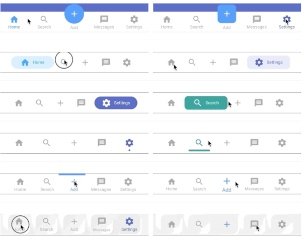
final _animationController =  AnimationController(vsync: this, duration: const Duration(milliseconds: 400));
final _animationValue = Tween<double>(begin: 0.toDouble(), end: 1.toDouble()).animate(_animationController),

final item = PersistentBottomNavBarItem(
    icon: AnimatedIcon(
    icon: AnimatedIcons.home_menu,
    progress: _animationValue,
    ),
    iconAnimationController: _animationController,
    title: "Home",
    activeColorPrimary: Colors.blue,
    activeColorSecondary: _navBarStyle == NavBarStyle.style7 || _navBarStyle == NavBarStyle.style10 ? Colors.white : null,
    inactiveColorPrimary: Colors.grey,
); 

For better understanding, refer to the example project in the official git repo.

카테고리

소스 저장소

이 패키지를 사용하는 프로젝트
