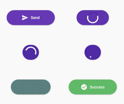
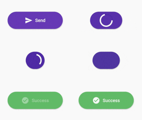
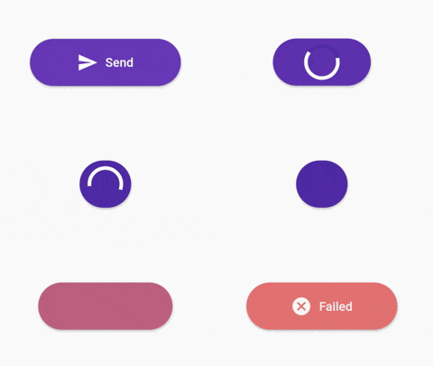
Flutter용 사용자 정의 가능한 진행률 버튼 위젯으로 Android, iOS, Web, macOS, Windows, Linux를 지원합니다. 로딩, 성공, 오류, 대기 상태와 같은 동적 상태를 가진 버튼을 만들 수 있어 폼 제출이나 API 호출과 같은 작업 중 사용자 피드백을 향상시킵니다. 이 위젯은 색상, 레이블, 아이콘, 애니메이션 등을 사용자 정의할 수 있도록 매우 유연하며 기존의 Flutter 앱에 원활하게 통합되어 플랫폼 간 일관된 경험을 제공합니다.
stateWidgets - Widgets of states
stateColors - Background color oof states
state = ButtonState.idle` - Current state of button
onPressed - onPressed function same like MaterialButton
onAnimationEnd - onAnimatedEnd function calls like that onAnimatedEnd(AnimationStatus animationStatus,ButtonState currentState).
minWidth = 200.0 - Loading state width
maxWidth = 400.0 - failed,success,idle states width
radius = 16.0 - Button radius
height = 53.0 - Button height
circularProgressIndicator - CircularProgressIndicator widget, defaultis instating with current state color.
progressIndicatorAlignment = MainAxisAlignment.spaceBetween` - ProgressIndicator aligment
progressIndicatorSize = 35.0 - size of progress indicator
padding = EdgeInsets.zero - Padding of button
minWidthStates = List of min width states, loading is the default. If you want to make small only icon states define them onthis.
animationDuration = Transition animation duration.
ProgressButton.icon() specific constructors
Map<ButtonState, IconedButton> iconedButtons- State and IconedButton map
double iconPadding: 4.0 - Padding of icon
TextStyle textStyle - TextStyle of all of states
License
This project is licensed under the MIT License - see the LICENSE.md file for details