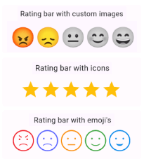
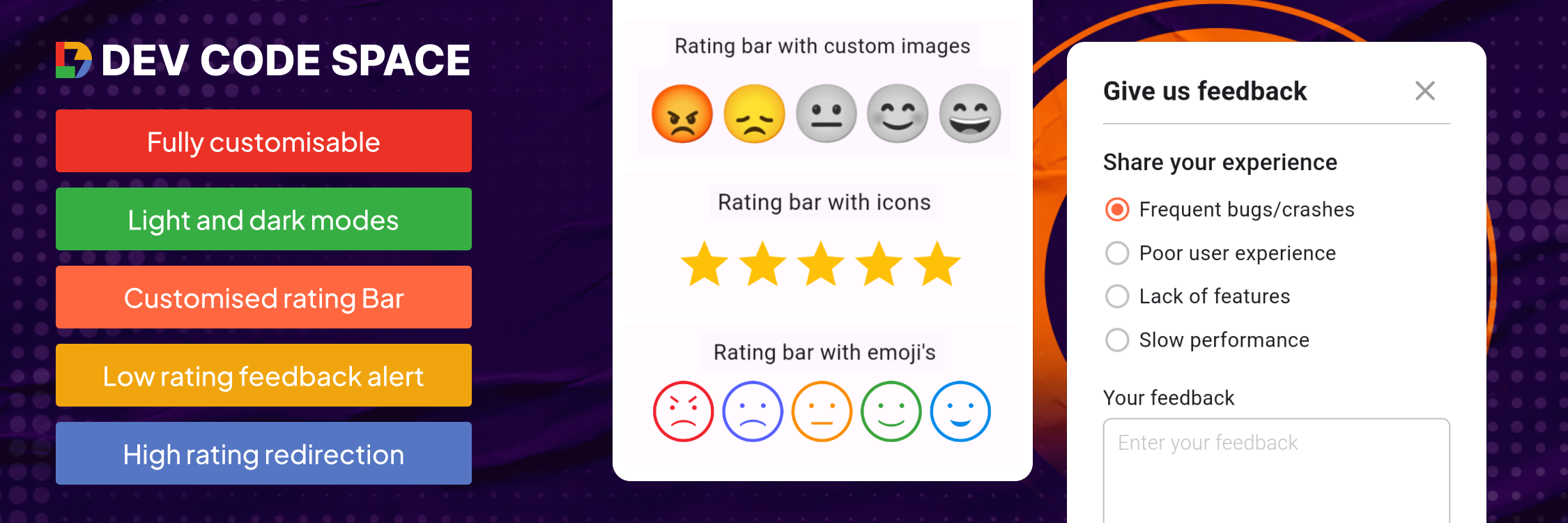
이모지, 아이콘 및 사용자 정의 이미지를 지원하는 사용자 평가와 피드백을 수집하기 위한 커스터마이즈 가능한 Flutter 패키지입니다. 반성과 전성 평가 선택, 동적 피드백 알림, 다양한 플랫폼에서 반응형 디자인을 제공합니다. 시각적 피드백 메커니즘을 통해 직관적인 사용자 참여를 추구하는 앱에 이상적입니다. 패키지는 쉽게 통합 가능하며 모바일, 웹, 데스크톱 등 여러 플랫폼을 지원합니다. 개발자는 앱 브랜딩과 UX 요구 사항에 맞춰 외관과 동작을 맞춤 설정할 수 있습니다.
사용 사례
사용자 경험 향상
앱 스토어 평점 수집
고객 만족도 설문 조사
앱 내 피드백 양식
제품 기능 평가
실시간 피드백 알림
주요 기능
이모지 기반 평가 지표
사용자 정의 이미지 및 아이콘 지원
반성급 정밀도
동적 피드백 알림 시스템
크로스 플랫폼 호환성
사용자 정의 가능한 UI 테마
적합한 대상
모바일 및 웹 애플리케이션
UX 연구 도구
피드백 기반 제품 개발
고객 서비스 통합
인터랙티브 설문 구성 요소
고려 사항
브랜드 일치를 위해 맞춤 설정이 필요합니다
복잡한 레이아웃을 위해 추가 스타일링이 필요할 수 있습니다
평가 관련 상호작용에 한정
플랫폼별 렌더링 일관성에 의존
자주 사용자 상호작용이 필요한 앱에 가장 적합
원본 README
연결된 소스 저장소의 README 원문 스냅샷입니다. 최신 내용은 저장소에서 확인하세요.
Customizable rating bars with emojis, icons, custom images with half/full rating and dynamic feedback alerts.
Features
Custom icon rating
Smiley emojis rating
Custom image rating
Feedback alert box for low ratings
Redirect to store for high ratings
Customizable UI & contents
Submission callback
Getting started
Add dependency to your pubspec.yaml file & run Pub get
Rating Bar with Icons (with full & half rating option)
RatingBar(
iconSize: 40, // Size of the rating icons
allowHalfRating: true, // Allows selection of half ratings
filledIcon: Icons.star, // Icon to display for a filled rating unit
halfFilledIcon: Icons.star_half, // Icon to display for a half-filled rating unit
emptyIcon: Icons.star_border, // Icon to display for an empty rating units
filledColor: Colors.amber, // Color of filled rating units
emptyColor: Colors.grey, // Color of empty rating units
currentRating: _rating, // Set initial rating value
onRatingChanged: (rating) { // Callback triggered when the rating is changedsetState(() { _rating = rating; });
},
),
Rating bar default emoji images
RatingBarEmoji(
imageSize: 45, // Size of image in the rating bar.
currentRating: _rating, // Set initial rating value
onRatingChanged: (rating) { // Callback triggered when the rating is changedsetState(() { _rating = rating; });
},
),
Rating Bar with Custom Image
RatingBarCustomImage(
imageSize: 45, // Size of image in the rating bar.
currentRating: _rating, // Set initial rating value
activeImages: const [
AssetImage('assets/Images/ic_angry.png'),
AssetImage('assets/Images/ic_sad.png'),
AssetImage('assets/Images/ic_neutral.png'),
AssetImage('assets/Images/ic_happy.png'),
AssetImage('assets/Images/ic_excellent.png'), ],
deActiveImages: const [
AssetImage('assets/Images/ic_angryDisable.png'),
AssetImage('assets/Images/ic_sadDisable.png'),
AssetImage('assets/Images/ic_neutralDisable.png'),
AssetImage('assets/Images/ic_happyDisable.png'),
AssetImage('assets/Images/ic_excellentDisable.png'), ],
onRatingChanged: (rating) { // Callback triggered when the rating is changedsetState(() { _rating = rating; });
},
),
Properties
Property
Types
Description
currentRating
double
set initial rating value
filledIcon (only for RatingBar)
IconData?
Icon to display for a filled rating unit
halfFilledIcon (only for RatingBar)
IconData?
Icon to display for a half-filled rating unit.
emptyIcon (only for RatingBar)
IconData?
Icon to display for an empty rating units.
filledColor (only for RatingBar)
Color?
Color of filled rating units.
emptyColor (only for RatingBar)
Color?
Color of empty rating units.
iconSize
double?
Size of the rating icons.
onRatingChanged
return double
Callback triggered when the rating is changed.
allowHalfRating (only for RatingBar)
bool?
Allows selection of half ratings.
isGoogleFont
bool?
set it true if you want to use google fonts else false
fontFamilyName
String?
set your custom font family name or google font family name
feedbackUIType
FeedbackUIType?
want to show feedback box in alert view or in bottom sheet
showFeedbackForRatingsLessThan
double?
Threshold rating value below which feedback box is shown.
feedbackBoxTitle
String?
Title for the feedback box
lowRatingFeedbackTitle
String?
Title for feedback options in the low rating feedback box.
lowRatingFeedback
List<String>?
List of feedback strings for low ratings.
showDescriptionInput
bool?
Option to show input box for user descriptions in the feedback dialog.
descriptionTitle
String?
Title for the description input box in the feedback dialog.
descriptionPlaceHolder
String?
Placeholder text for the description input box.
descriptionCharacterLimit
int?
Character limit for the description input.
submitButtonTitle
String?
Title for the submit button in the feedback dialog.
onSubmitTap
returns selectedFeedback(with index & text) & description
Callback function triggered on submission of feedback.
showRedirectToStoreForRatingsGreaterThan
double?
Threshold rating value above which the app redirects to the store for a review.
androidPackageName
String?
Android package name for the app, used in the store redirect.
iosBundleId
String?
iOS bundle ID for the app, used in the store redirect.