연결된 소스 저장소의 README 원문 스냅샷입니다. 최신 내용은 저장소에서 확인하세요.
Null-Safe Version of Responsive Scaffold
responsive_scaffold_nullsafe
View the online demo here !
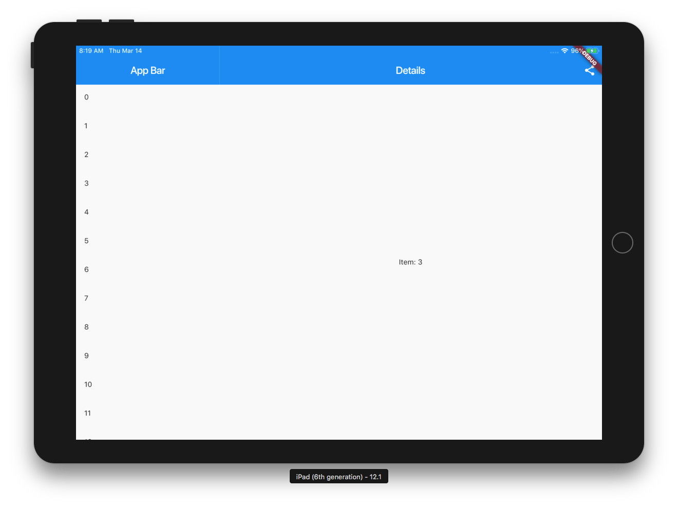
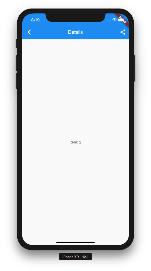
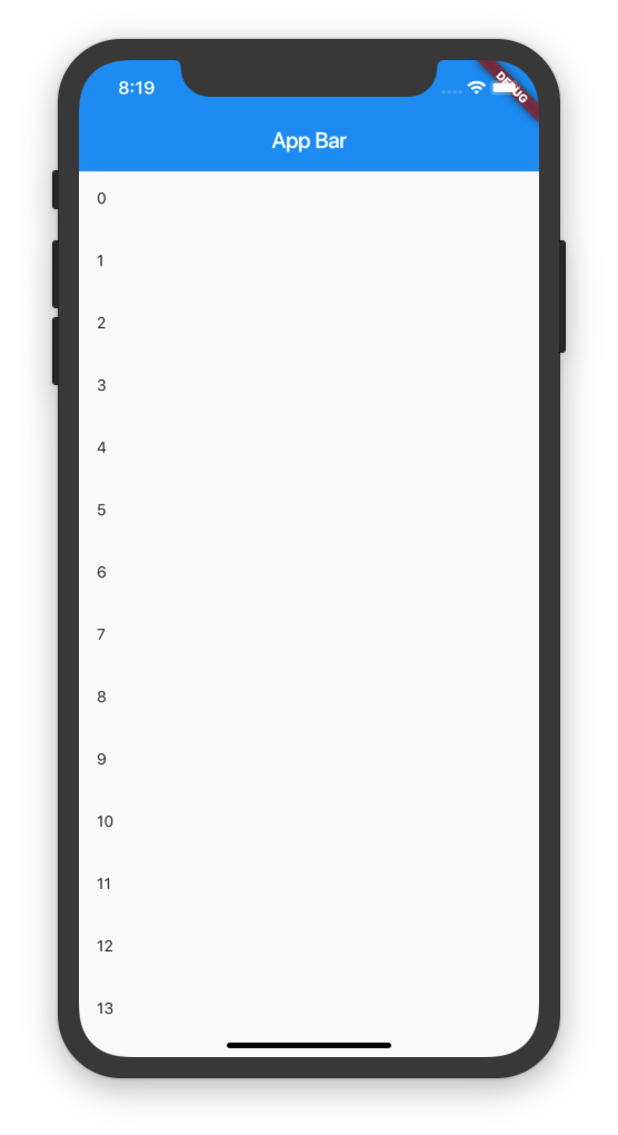
On mobile it shows a list and pushes to details and on tablet it shows the List and the selected item.
Online Demo: https://fluttercommunity.github.io/responsive_scaffold/
Getting Started
3 Column Layout
example
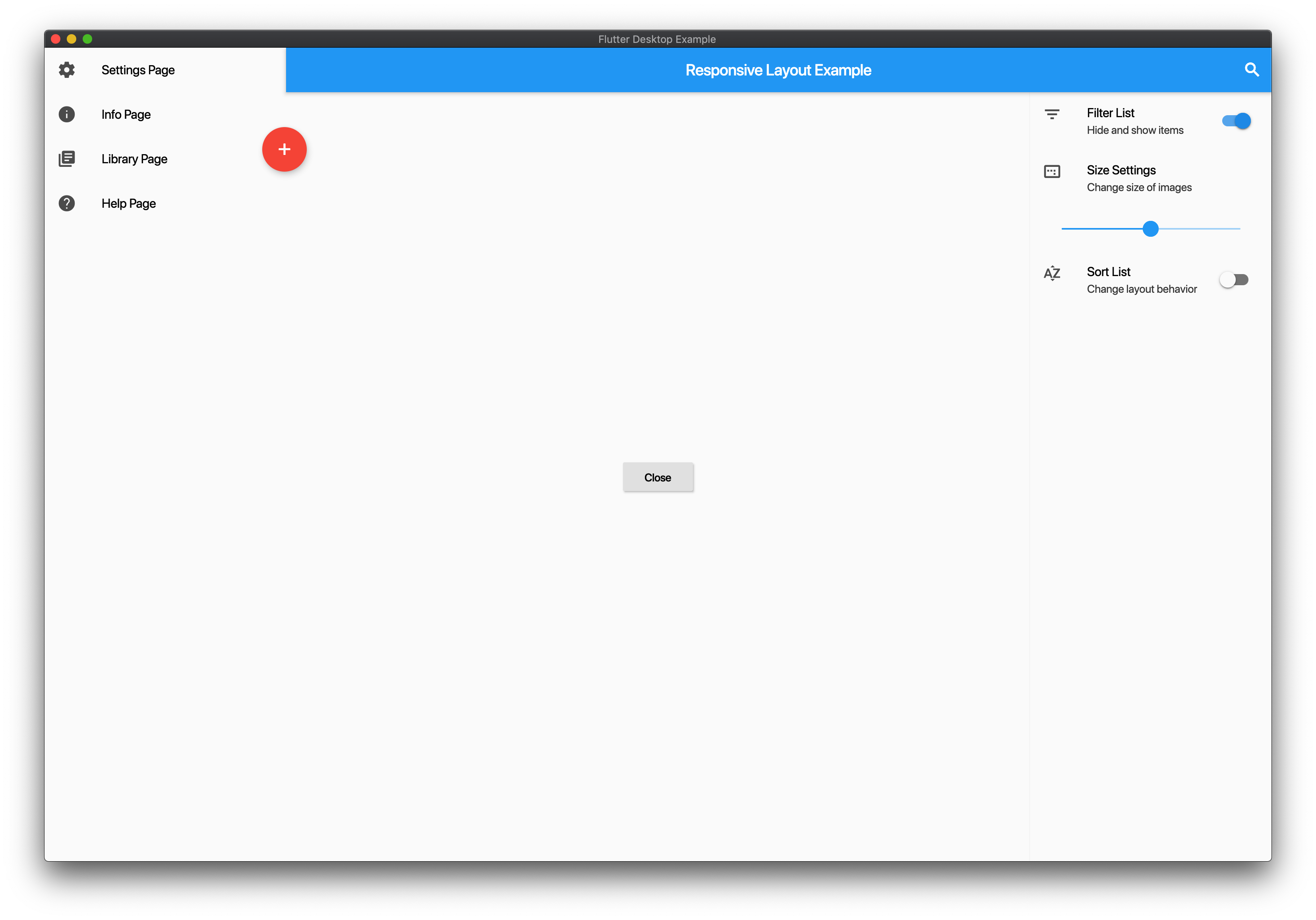
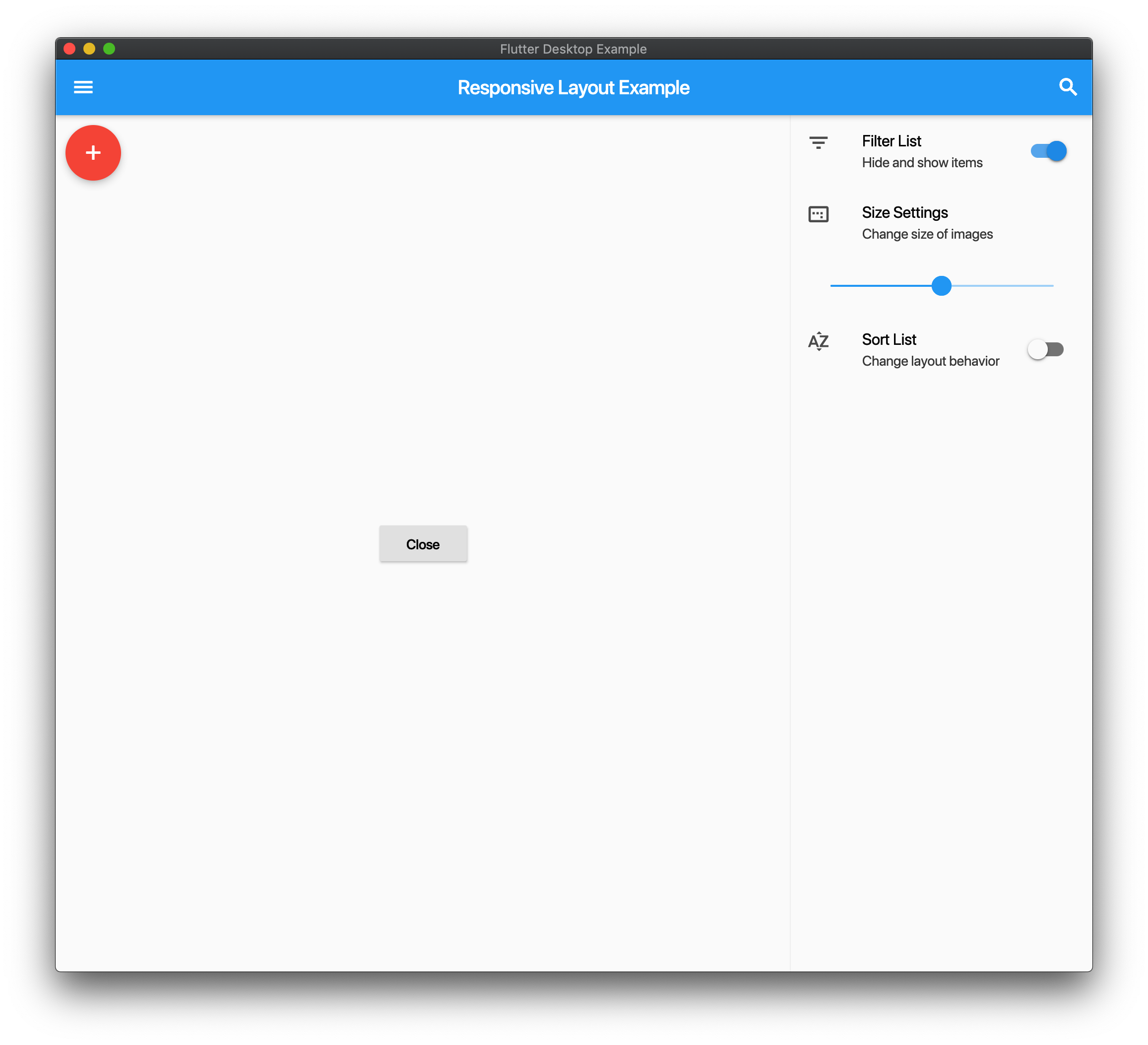
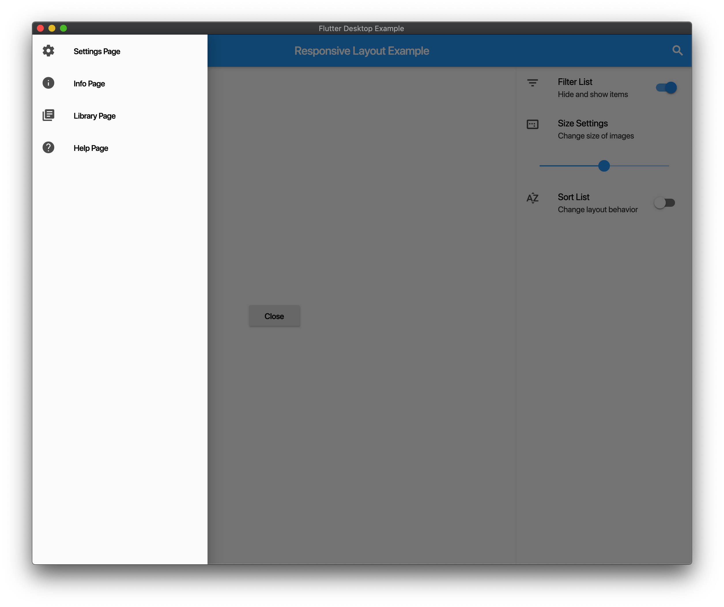
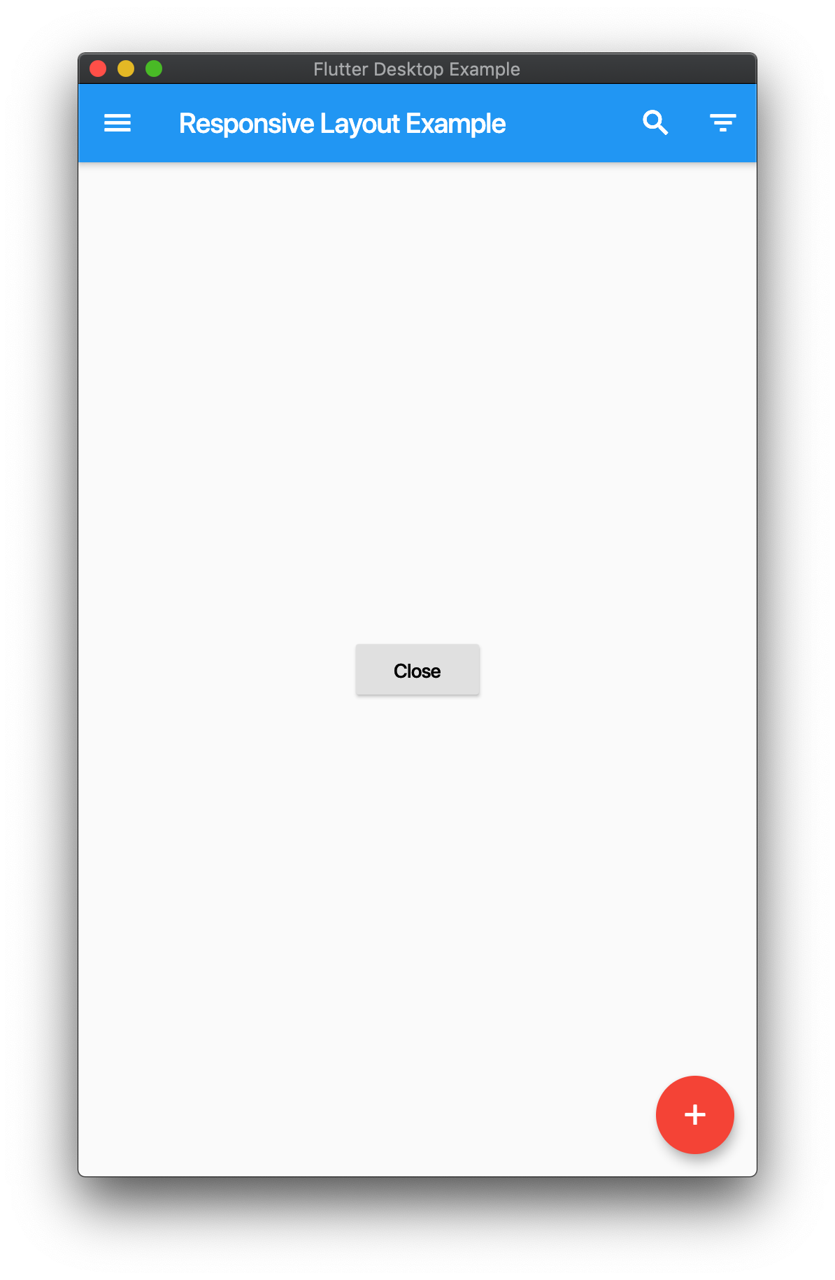
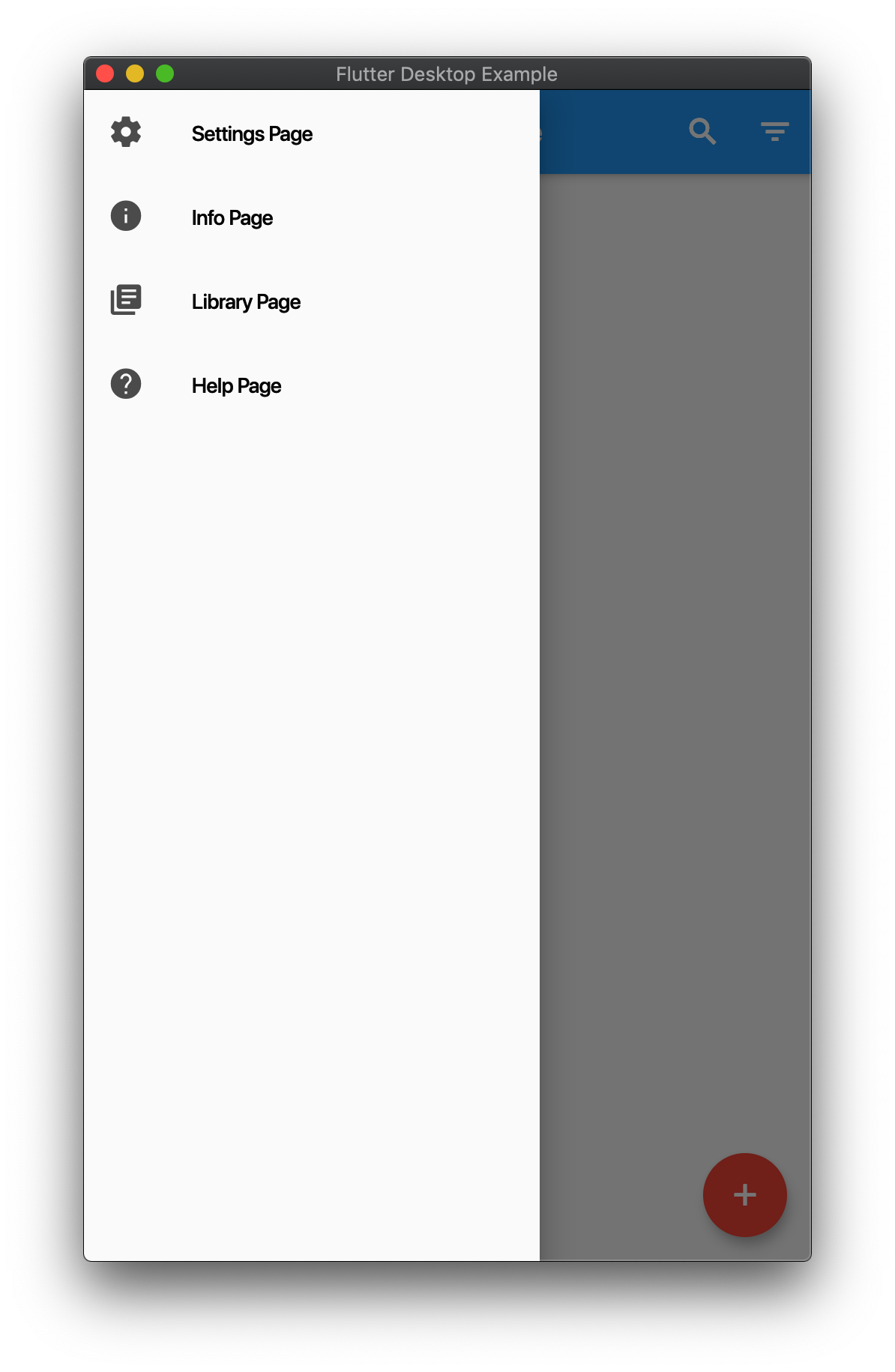
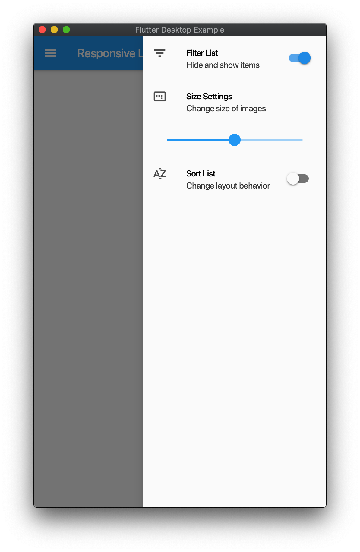
Responsive Layout
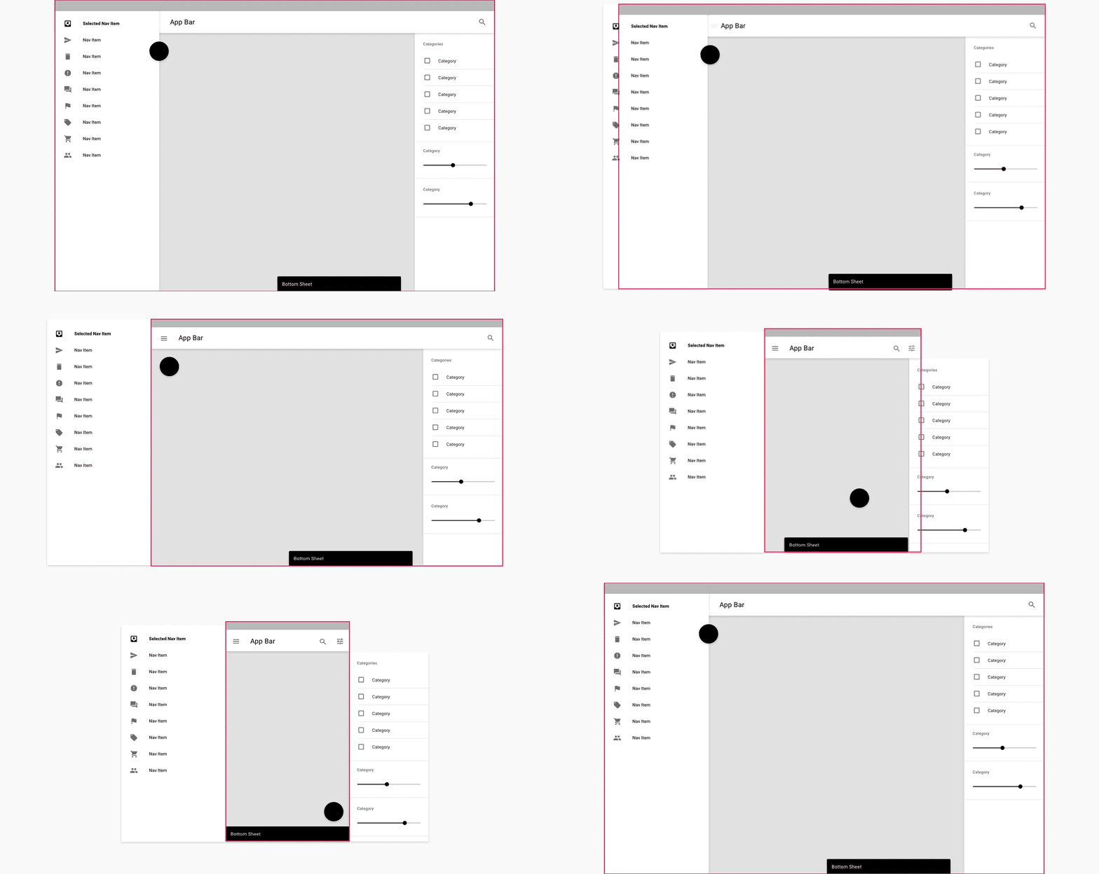
Follows Material Design Layout Docs .
Here is a demo on various sizes.
Example
import 'package:flutter/material.dart' ;
import 'package:responsive_scaffold/responsive_scaffold.dart' ;
class LayoutExample extends StatelessWidget const LayoutExample ({Key ? key}) : super (key: key);
@override
Widget build (BuildContext context) {
return ResponsiveScaffold (
title: const Text ('Responsive Layout Example' ),
drawer: ListView (
children: const <Widget >[
ListTile (
leading: Icon (Icons .settings),
title: Text ('Settings Page' ),
),
ListTile (
leading: Icon (Icons .info),
title: Text ('Info Page' ),
),
ListTile (
leading: Icon (Icons .library_books),
title: Text ('Library Page' ),
),
ListTile (
leading: Icon (Icons .help),
title: Text ('Help Page' ),
),
],
),
endIcon: Icons .filter_list,
endDrawer: ListView (
children: <Widget >[
ListTile (
leading: const Icon (Icons .filter_list),
title: const Text ('Filter List' ),
subtitle: const Text ('Hide and show items' ),
trailing: Switch (
value: true ,
onChanged: (val) {},
),
),
const ListTile (
leading: Icon (Icons .image_aspect_ratio),
title: Text ('Size Settings' ),
subtitle: Text ('Change size of images' ),
),
ListTile (
title: Slider (
value: 0.5 ,
onChanged: (val) {},
),
),
ListTile (
leading: const Icon (Icons .sort_by_alpha),
title: const Text ('Sort List' ),
subtitle: const Text ('Change layout behavior' ),
trailing: Switch (
value: false ,
onChanged: (val) {},
),
),
],
),
trailing: IconButton (
icon: const Icon (Icons .search),
onPressed: () {},
),
body: Center (
child: ElevatedButton (
onPressed: () {
Navigator .pop (context);
},
child: const Text ('Close' ),
),
),
floatingActionButton: FloatingActionButton (
backgroundColor: Theme .of (context).accentColor,
onPressed: () {},
child: const Icon (Icons .add),
),
);
}
}
Responsive List
You can use this in two modes ResponsiveListScaffold and ResponsiveListScaffold.builder.
On Mobile the ListView will push to the details screen
On Tablet it will show a Master Detail View.
You can add additional Slivers to the Scrollview and the AppBar is optional.
Example
import 'package:flutter/material.dart' ;
import 'package:responsive_scaffold/responsive_scaffold.dart' ;
class ListExample extends StatefulWidget const ListExample ({Key ? key}) : super (key: key);
@override
_ListExampleState createState () => _ListExampleState ();
}
class _ListExampleState extends State <ListExample > final _scaffoldKey = GlobalKey <ScaffoldState >();
late List <String > _items;
@override
void initState () {
_items = List .generate (20 , (int index) => "test_$index " );
super .initState ();
}
@override
Widget build (BuildContext context) {
return ResponsiveListScaffold .builder (
scaffoldKey: _scaffoldKey,
detailBuilder: (BuildContext context, int? index, bool tablet) {
final i = _items[index!];
return DetailsScreen (
body: ExampleDetailsScreen (
items: _items,
row: i,
tablet: tablet,
onDelete: () {
setState (() {
_items.removeAt (index);
});
if (!tablet) Navigator .of (context).pop ();
},
onChanged: (String value) {
setState (() {
_items[index] = value;
});
},
),
);
},
nullItems: const Center (child: CircularProgressIndicator ()),
emptyItems: const Center (child: Text ("No Items Found" )),
slivers: const <Widget >[
SliverAppBar (
title: Text ("App Bar" ),
),
],
itemCount: _items.length,
itemBuilder: (BuildContext context, int index) {
final i = _items[index];
return ListTile (
leading: Text (i),
);
},
bottomNavigationBar: BottomAppBar (
elevation: 0.0 ,
child: IconButton (
icon: const Icon (Icons .share),
onPressed: () {},
),
),
floatingActionButton: FloatingActionButton (
onPressed: () {
ScaffoldMessenger .of (context).showSnackBar (
const SnackBar (
content: Text ("Snackbar!" ),
),
);
},
child: const Icon (Icons .add),
),
);
}
}
class ExampleDetailsScreen extends StatelessWidget const ExampleDetailsScreen ({
Key ? key,
required List <String > items,
required this .row,
required this .tablet,
required this .onDelete,
required this .onChanged,
}) : _items = items,
super (key: key);
final List <String > _items;
final String row;
final bool tablet;
final VoidCallback onDelete;
final ValueChanged <String > onChanged;
@override
Widget build (BuildContext context) {
return Scaffold (
appBar: AppBar (
elevation: 0.0 ,
automaticallyImplyLeading: !tablet,
title: const Text ("Details" ),
actions: [
IconButton (
icon: const Icon (Icons .share),
onPressed: () {
onChanged ("$row ${DateTime.now().toString()} " );
},
),
IconButton (
icon: const Icon (Icons .delete),
onPressed: onDelete,
),
],
),
bottomNavigationBar: BottomAppBar (
elevation: 0.0 ,
child: IconButton (
icon: const Icon (Icons .share),
onPressed: () {},
),
),
body: Center (
child: Text ("Item: $row " ),
),
);
}
}